Account Hacked? Here’s What To Do

Many of us already know the feeling and those who don’t are likely to one day experience it. We’re talking about the gut-wrenching feeling that comes when you’re trying to post on social media for work, but the password that opened Facebook and Instagram the day before is rejected today. Instead of seeing the normal dashboard, you see some variation of an error message and a red-lettered warning. And then, as if that isn’t bad enough, you see someone else is posting or running ads on your accounts with your credit card!

For most people, there’s a  carefully-crafted four-step process for such emergencies:

  • Step 1: Panic
  • Step 2: Spread anxiety to your team
  • Step 3: Think only of worst-case scenarios
  • Step 4: Abandon social media completely

Even though Step 4 is very appealing at times like these, social media is a vital communications tool for any organization. So you can’t quit it altogether. And you can’t get kicked out, even for 24 hours, because that can blow a marketing strategy.

So let’s start with a few basic don’ts, all meant to protect your business’ social accounts from being hacked in the first place.

  • Don’t be (password) weak: We’ve all rolled our eyes when we’re creating a new account and we’re told our password of choice is “weak.”  As annoying as that is, it’s not nearly as bad as the alternative of getting hacked. So go to the work of picking strong passwords (which is a euphemism for long passwords) and avoid reusing them for other accounts. Your best bet is to use a password manager and make a plan to change your passwords at a minimum annually.
  • Don’t skip two-factor authentication: Two-factor authentication is an extra layer of security that kicks in when a new device accesses your account. The new login triggers a code, usually sent to your mobile phone, that must be entered to gain access. Without the code, illegitimate users can’t gain access.
  • Don’t allow everyone access: Limit the number of team members with the login info to two or three. With limited users you can more easily pinpoint problems, and it’s easier to keep everyone abreast of updates, changes, and new features. MJM recommends at least two users so that there’s always a back-up. Users should also carefully guard their personal accounts. More on why in the next section.
  • Don’t access work accounts using public wi-fi: As elementary as this seems, it’s a worthwhile reminder in the current mobile and virtual work settings we often find ourselves in.

Putting all of those guardrails in place is no guarantee though. Unfortunately, it’s probably not possible to be 100% secure, but it is possible to be secure enough to make it more trouble than it’s worth to get into your accounts.

If your account does get hacked, here’s what we recommend:

  • Act urgently: This is no time to wait and see or to hope for the best. If possible, change your account passwords right away. A hacked account requires your full and immediate attention.
  • Identify the problem: This can be tricky and time consuming; however, if you’ve limited administrators to just a handful, that should cut down on variables. The most common issue MJM’s team has seen is that an administrator’s personal account is compromised, and it’s affecting the business account they’re attached to. Checking in on your administrators’ personal accounts is a good place to start.
  • Revoke access: If possible, have those with administrative access evaluate third-party apps for suspicious activity and revoke access when appropriate. Likewise, take a look at the other accounts your profile/page interacts with. Are they all legitimate accounts? Delete those that look suspicious or are unknown to you.
  • Get help: Facebook and Instagram both provide  instructions on their sites that will walk you through the necessary steps for accessing your account. You’ll probably have to start by logging out, and then clicking the “get help logging in” or “reset password” options.
  • Report your own profile: If the process is moving slow, consider reporting your own profile. Most likely, you’ll be locked out of your account for 12-24 hours while it’s investigated, but it will also lock out the hacker so that further damage isn’t done while you work to recover access.

At its best, social media is a wonderful tool for business. It’s affordable, generally easy to navigate, and can reach a lot of people at once. There’s no need for it to cause you a DEFCOM 5 level of panic, and if it does, contact the experts at Matt Jensen Marketing for help. We’ll make you a posting pro in less time than it takes to scroll Instagram’s latest filters.

Nonprofit Marketing: 4 Tools that Offer Discounts

When you’re a nonprofit, every cent can truly make a difference. At Matt Jensen Marketing, we’ve discovered a lot of tricks over the years to help nonprofits develop lean and efficient marketing systems that can deliver high-impact messages while keeping operating costs low. Here are a few of our favorite services that offer special rates and features for qualifying 501(c)3s and why you should be using them.

Source: Canva

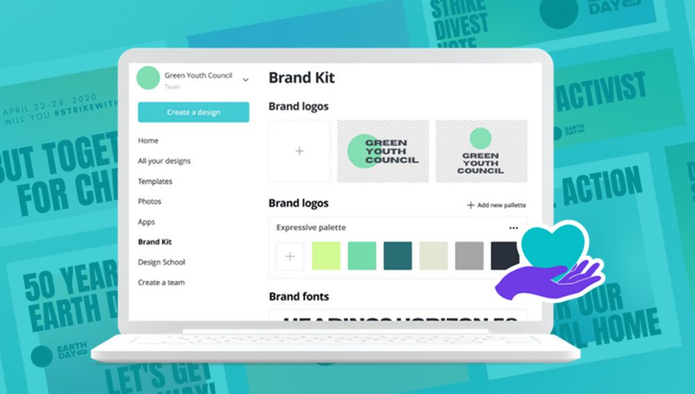
Canva

Nonprofit employees usually wear a lot of hats, designer and social media guru often among them. If you are struggling to fill your feed with consistent, on-brand messaging, Canva may be the solution. Canva is an easy-to-use design platform that allows you to create custom graphics for social media in a matter of minutes. You can even use it to create print pieces like newsletters and brochures.

While a light version of Canva is available for free, qualifying nonprofits can apply to upgrade to the premium version at no cost. The huge benefit of this is the ability to use Canva’s Brand Kit, which allows you to save your brand logos, fonts, and colors so you can easily apply them to any design. You can also create templates for your team to have at-the-ready. Learn more about Canva for nonprofits here.

Source: Shopify

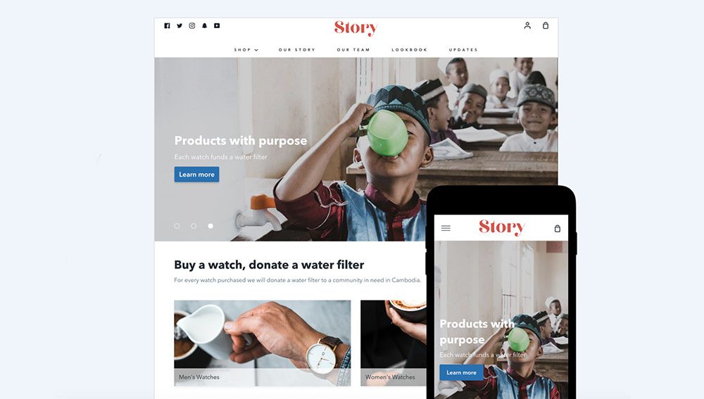
Shopify

Donors love the ease of being able to give online, but those transaction fees can really add up. Enter Shopify.

Shopify is traditionally known as an e-commerce platform, but they can also make it simple for you to process donations and even sell merchandise. Their drag-and-drop builder also allows you to easily update your website content and share your story, no coding experience necessary. Learn more about how to apply for Shopify’s discounted nonprofit rates here.

Source: Constant Contact

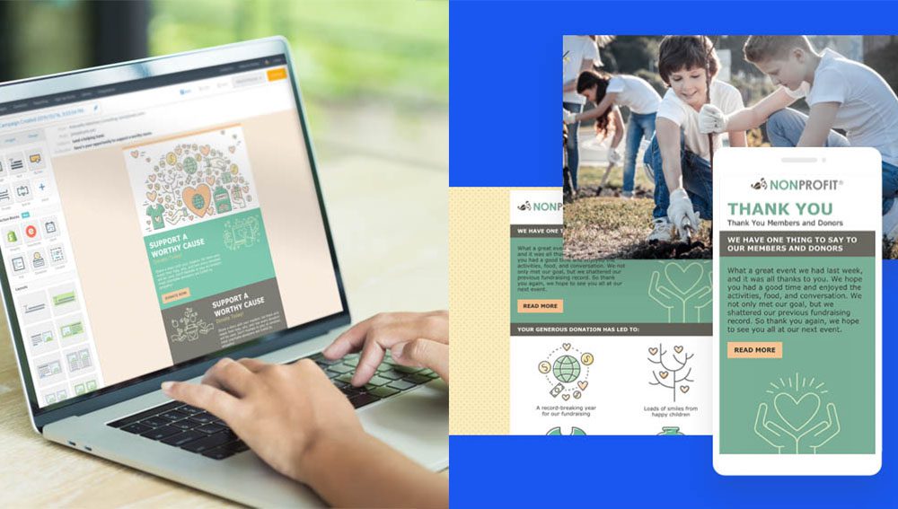
Constant Contact

Emails are the bread-and-butter of most nonprofit communications, so it’s important that they represent your mission well. Using a premium email marketing service like Constant Contact can help you put your best foot forward.

Constant Contact offers a 20–30% discount for qualifying nonprofits and includes an easy-to-use email builder as well as event sign-ups, polls, and other useful tools. They also make it easier to organize your mailing list and send targeted messages to specific segments.

Bonus Tip: If you’re using Shopify, you can integrate it with your Constant Contact account for seamless functionality.

Source: Google

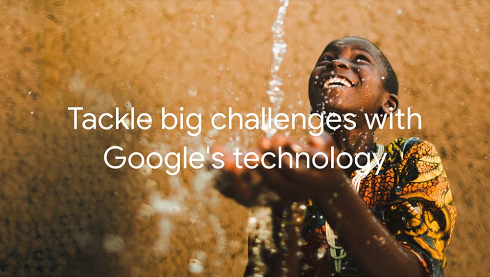
G Suite

You probably need no introduction to Google. But did you know that they offer discounts on their services for qualifying non-profits? With G Suite for nonprofits, you can set up email accounts with your domain name, making them look more professional and less likely to get trapped in spam filters.

You’ll also get more storage in Google Drive than you would with a typical free Gmail account, allowing you to create templated documents and presentations that you can easily share among your team. On top of G Suite, Google also offers nonprofit discounts and grants for Google Ads, YouTube, and Google Maps. Learn about all of Google’s nonprofit tools here.

If all of this information is still making your head spin, Matt Jensen Marketing is here to help! We have experience working with nonprofits both big and small and can provide the guidance and training your team needs to start marketing your nonprofit like a pro. Contact us to get started.

Designing for Humans in a Robot’s World

Over the last few months, I, like most people, have been asking myself a lot of questions. Small questions like, “Do I have enough toilet paper?” Hard questions like, “When will I see my friends again?” And big questions like, “What will our world look like when this is all over?”

Recently, I had the opportunity to attend WordCamp — what is usually a one-day WordPress conference in Minneapolis but now, like so much of our lives, had shifted to being entirely virtual. Where better, I thought, to start finding answers to at least some of my questions, many of which are connected to our increasing dependence on the digital world.

As someone who has designed a website or two, I have been filled with a mixture of sadness at how much of our interactions have become virtual and curiosity about how we can work to make these spaces more meaningful and more inclusive. At WordCamp, I was pleased to discover some unexpected insights that left me feeling more motivated and optimistic than before. (Although no answers on the toilet paper front.)

SEO… It’s Not Just for Bots

I will be the first to admit that I was somewhat of a reluctant web designer. My teachers would stress how important it was, and I would be like, “Yeah, but the paper—it’s so romantic!” This changed when I realized it was arrogance, not romance, that was constraining my thinking.

By forcing my own notions of “good design” on the user, I wasn’t listening to what they actually needed or wanted. I had to shift my thinking into designing for the medium that would be most beneficial to the audience I was talking to and not just the medium that I wanted to create in.

What does all of this have to do with SEO? The prevailing attitudes towards SEO are that it is either a.) A game that can be won and lost or b.) A giant pain in the butt that Google has forced upon us all. While there may be some truth in these attitudes, SEO work can become more purposeful if we spend less time obsessing about search rankings and inscrutable algorithms and more time focusing on what’s really important: the user.

In one of the sessions I attended, Tyler Goldberg of CYBERsprout explained that, contrary to popular belief, Google is not out to get you when it comes to SEO. Google’s primary goal is deliver the content that is the most relevant and useful to the user. So if your goal is the same, you will be helping Google and, in turn, Google will help you.

While the SEO game can still be conned by those with deep pockets and black hat practices, it is definitely changing for the better. Google recently announced that it will be adjusting its algorithm to reward websites who provide a good user experience. This means content that is well-formatted and engaging and designs that are intuitive and easy-to-use. In other words, good SEO is really just good human-centric design.

We All Win With an Accessible Web

Many of us have only recently begun to rely on digital-only services as a lifeline to the outside world, but for people with disabilities, the web has long been a vital tool to help them live richer and more independent lives.

I am ashamed to say that when I first began designing for the web, accessibility was not something I put too much thought into. But the more I have learned about it, the more it has provided depth and purpose to my work.

In her session about web accessibility, Mychelle Blake of Firelink (and fellow Sioux Falls resident!) shared the importance of considering it at every stage of the process. There is no plug-and-play solution that will make a website accessible—it needs to be baked in from the site structure to the content to the design.

During this session, I was struck by the eerie similarities between SEO and accessibility. When it comes down to it, they are both about having empathy for the end user and delivering them a positive experience. Often, both SEO and accessibility are afterthoughts—something that comes secondary to the overall design. But, when we stop seeing these aspects as burdens or hoops we have to jump through and start working them into our overall purpose and strategy, we can start to design a web that is better for everyone.

As our reliance on the web grows stronger, it is more imperative than ever to create a web that useful, just, and, above all, human.

Imagining How Variable Fonts Could Make A More Expressive and Accessible Web

A variable font is one font file that has flexible properties, allowing it to function as multiple fonts. Typically a typeface is available in a limited number of styles, such as the varying weights of light, regular, medium and bold, and often corresponding italics. Each style requires a separate font file. With a variable font, all of these styles and potentially infinite other instances are available using a single file. And variable fonts don’t just vary in weight – they can vary on several different axes like width, optical size, italic, and slant.

Implications for web design

Until variable fonts became a possibility on the web, designers were forced to limit the number of fonts used in a design to decrease the amount of data that must be downloaded to display a page. Each additional font adds extra load time. Waiting too long for content to load hurts the experience of interacting with a website. Variable fonts have the potential to remove this limitation. A single font file can provide the typographic expression previously only possible by loading many fonts.

Challenge the limits with variable fonts


Variable fonts for greater expression

Beyond the technical applications, variable fonts could also serve expressive purposes. Type used in buttons and navigation could change as the user interacts. A button’s label could grow increasingly bold the closer the user’s cursor comes. Numeric labels in charts and graphs could vary in correlation with data. Combined with natural language processing, qualitative information could affect how a font is displayed – a font could morph to visually express negative or positive sentiments. Maybe a news site wants to help readers identify “good news” and “bad news” quickly – a variable font could allow headlines that indicate how “good” or “bad” a story is.

Your mileage with variable fonts may vary

Variable fonts for greater accessibility

And there are implications for accessibility on the web as well. Imagine responsive websites and apps that adjust font size, weight, and other properties to cater to the specific needs of users or even the environment they are in. Perhaps fonts that increase in size or width to improve legibility for older users who may have visual limitations like cataracts. Conversely, a font could become more condensed to allow for greater information density for those with better vision. Some have postulated that variable fonts could help those with dyslexia, allowing them to customize certain parts of letters that are difficult for them to read.


View this post on Instagram


Need to relax? Let these calming waves of letters wash over you. An animation experiment with variable fonts. ?

A post shared by Matt Jensen Marketing – MJM (@mattjensenmarketing) on

Live Chat: Survival Marketing

During this live webinar our own Courtney Davidson was joined by KeyMedia Solutions CEO, Korena Keys. They offered some insight into how businesses can best respond to business challenges during this temporary crisis.

Webinar Recording

Resources

Here are some of the resources referenced in today’s webinar:

Communications Audit PDF
This communications audit will help you think through your approach to marketing during this time.

COVID-19: Ad Credits for Google Ads Small and Medium-sized Businesses
From Google: “We want to help alleviate some of the cost for small and medium-sized businesses (SMBs) to stay in touch with their customers during this challenging time.”

Facebook Small Business Grants Program
Facebook is offering $100M in cash grants and ad credits for up to 30,000 eligible small businesses.

Accessibility for All: Why Accessibility Matters and Where to Start

Web accessibility has been on a lot of people’s minds recently as everyone from presidential candidates to grocery stores have come under fire for websites that don’t comply with ADA standards.

Because we work with several eye care clinics at Matt Jensen Marketing, accessibility is doubly important because the chance that someone with a visual impairment will visit the site goes from a probability to a certainty. Because of this, I’m going to focus mostly on visual accessibility, but web accessibility actually encompasses visitors with many different needs. These users could include someone with limited mobility because of a disease such as cerebral palsy, someone who is learning English as a second language, or someone who is temporarily disabled by an injury.

In short, web accessibility is as broad and diverse a topic as humans themselves. Making a site accessible can seem like a daunting endeavor, but hopefully these suggestions will get you pointed in the right direction.

Building Accessibility from the Ground Up

While I’d love to say that we can make a few easy tweaks to make your existing site accessible, the truth is that meaningful accessibility begins in the earliest planning stages of a website. But the good news is that you can make any site more accessible without learning a bit of code.

One of the most important considerations for accessible websites is making having well-structured content. You should approach organizing content the same way you would an outline for a research paper when you were in school. There should be a clear and direct hierarchy and page names, headings, etc. should be descriptive but skimmable. This makes it easier for screen readers to scan pages and makes for a better user experience overall.

Making the Invisible Visible

As web design has advanced, it has become more and more reliant on big, splashy visuals. This is great for a lot of us who were bored looking at pages and pages of plain text, but it does make it difficult for people who rely on screen readers to get the full experience of a website.

Enter alt tags. Alt tags are descriptive meta data that are used by screen readers to describe an image on a website to someone who is visually impaired. People with full vision often don’t understand how much information we get from visual cues. So while alt tags can’t suddenly make someone who’s blind see that stellar photo of your office, they can help provide context that can be helpful for understanding the rest of the content on the page.

Along the same lines, it’s important to avoid burying text within images, especially text that conveys important information such as dates of events or how-tos. Often, people try to call out important information by turning it into graphic, but that may actually hinder many people’s access to it.

Providing Adequate Contrast

While optimizing for screen readers is important, many people who visit your site may be temporarily or only moderately visually impaired and may not require the use of screen reader. These include people who are color blind, suffering from cataracts or glaucoma, or even someone viewing the website in poor lighting conditions.

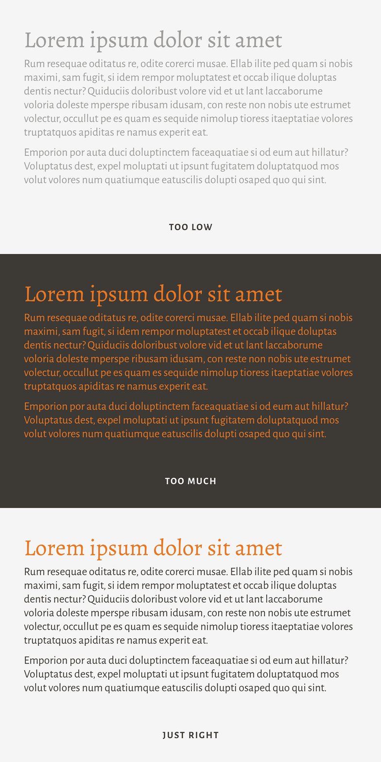
For these cases, it’s important to make sure the visual elements on your site provide adequate contrast. This means that all text should have a 4.5:1 color contrast ratio with this background. There are many tools to check to make sure your website adheres to these standards, but suffice it to say that the light gray text that has been the trend all over the internet recently probably won’t cut it. (Learn more about text readability in our blog about choosing fonts for cataract patients.)

Along with contrast, it’s also important to consider text size and whether or not it’s scalable, consistent standards for links and buttons that don’t just rely on color, and whether there’s enough room between clickable elements.

We All Need an Accessible Web

Accessibility remains a murky area and unfortunately, there are no clear-cut standards that will definitively prevent you from a lawsuit. But if you’d like to dig deeper, you can start by taking a look at the full Web Accessibility Guidelines (WCAG) established by the W3C.

But while accessibility may seem like a lot of extra work just for edge cases, the truth is that all of us will benefit from accessible websites at some point or another. Maybe you break an arm and can’t use a keyboard. Maybe you have a slow internet connection and can’t load images. Or maybe you just got bifocals and are having a hard time reading on a screen. By making the web accessible to anyone, we can create a better experience for everyone.

Can You Read Me Now: Choosing Fonts for Cataract Patients

All over the country, doctors and their teams work hard to restore vision for their patients. The ophthalmologist’s toolbox is outfitted with trusted, life-changing procedures and techniques like advanced cataract surgery with lenses that help patients rely less on their glasses. Eye care professionals help change their patients’ perspective by making the world brighter and clearer.

At MJM, we help provide clinics with educational tools, brochures, ads and websites that cater to people with cataracts. One of the tools in the designer’s toolbox is typography. From signage and directions to brochure and website fonts, legible type can set the tone for a patient’s experience.

Here are a few things we keep in mind when we make typography decisions for audiences with limited vision:

1. Choose high-contrast colors

Cataracts prevent some light from reaching parts of the eye that create an image. When text color is too similar to background color, letters and words may become muddled and difficult to distinguish. Black or very dark text on a white background is most legible.

Graphic about choosing fonts for cataract patients - choose high contrast colors

2. Choose full-bodied letters

Fonts with a tall x-height, wide letters and long descenders and ascenders are easier to discern because they take up more space and create shapes that are easily recognizable.

Graphic about choosing fonts for cataract patients - choose full-bodied letters

3. Used mixed-case type

ALL CAPS not only appears to shout, but it also can make text harder to read. So can italics. Our brains read words as shapes rather than identifying individual letters. And since we are more used to reading in sentence case, our minds can process those words more quickly.

Graphic about choosing fonts for cataract patients - use mixed-case type

4. Choose moderate stroke contrast

Find a happy medium between uniform thickness (like Futura and other trendy sans serif fonts) and super high contrast. To someone with blurred vision, an ultra-thin stem can virtually disappear from the page.

Graphic about choosing fonts for cataract patients - choose moderate stroke contrast

5. Avoid condensed fonts

They narrow the natural shape of letter forms to take up less space. But, this also means that they are more difficult to read.

Graphic about choosing fonts for cataract patients - avoid condensed fonts

6. Use serifs for paragraphs

Serifs are like little signposts telling our eyes where a letter begins and ends. In a paragraph, they direct our eye traffic as we dig into longer copy.

Graphic about choosing fonts for cataract patients - use serifs for paragraphs

7. Stay positive

Negative text (white on a dark background) gives the illusion that the letters are thinner than they actually are, making them more difficult to read.

Graphic about choosing fonts for cataract patients - stay positive

8. Size matters

Twelve-point font looks different for Futura than it does for Brandon Grotesque. Printing an example proof can help tell if the font is going to be large enough.

Graphic about choosing fonts for cataract patients - size matters

9. Embrace space

Without enough space between lines, letters and around the text block, legibility is compromised. There are a few ways to do this:

  • Increase leading (space between lines) to about 1.5 times the normal amount.
  • Increase tracking (space between letters) so letters are less likely to visually run into one another.
  • Increase the margins to appropriately frame the text.
  • Write concise copy. Adding content to a limited space can compromise legibility. Shorter copy can be compelling, especially when it gets read.

Graphic about choosing fonts for cataract patients - embrace space

Like most rules in design, there are always exceptions. A font with uniform line thickness and low x-height like Brandon Grotesque compensates by increasing the leading (space between lines) without manual adjustment. The font that populates a brochure may not be the best for an outdoor parking lot sign.

Reference: http://www.aiga.org/typography-and-the-aging-eye

Is Your Healthcare Practice Making These Digital Mistakes?

When running a successful healthcare practice in the digital age, most administrators focus on HIPAA regulations and strictly following them to keep patients’ PHI safe.

But there’s more to digital than what you can’t do online!

With the public face of your digital presence (website, social media and online listings), there’s a lot you can do to market your practice successfully (while still adhering to HIPAA).

We’d like to share five things many healthcare practices are missing or using incorrectly in their digital presence:

1. Have bad NAP?

  • NAP refers to “Name, Address and Phone Number” — the core to all online business information. These three data fields represent your business’s most valuable contact information.
  • When you originally set up your digital listings (social media, Yelp, Yellow Pages, etc.), you may not have listed your information consistently across all sites. The listing service may have also auto-generated a page by pulling information from your website.
  • When your NAP is inconsistent across the web, it creates SEO havoc. You may not be getting as high on Google or other search results pages, thus losing potential customers.
  • If your patients and clients are seeing your name or address inconsistently listed, it confuses them and erodes your brand.

2. Your site is abandoned (and sad)

  • Back in the “old days” of websites, most companies paid someone to put their brochure content online, thus building their first website…and never updating it until it was time for a new website. Luckily, websites are now easier to update with new, fresh content. It’s critical that you invest time and energy into regularly refreshing your site with new blog posts, updated doctor bios and videos, new staff listings, new services and other relevant information.
  • An abandoned site hurts your marketing efforts. When you don’t update your website frequently, search engines like Google think your site is stale and outdated which lowers it’s SEO ranking.
  • Tip: Use a content calendar to plan what you’ll post to the website, and plan to post at least a few times a month. Each time you post a blog, you create a new page on your site (and updated content for your customers).

3. Got link juice?

  • “Link juice” is what happens when you link to other sites from your site (outbound links to referring clinics, partners you work with or associations you belong to). It also accounts for links coming into your site (social media posts, online listings, partner clinics or associations you belong to, the local Chamber of Commerce or a board linking to your site).
  • Without inbound and outbound links, you can be disconnected online—floating around with no digital friends. Search engines like Google don’t like that because it makes you seem less trustworthy. Link juice shows them that you play nice with others, and that others find you relevant (like when a trusted site such as LinkedIn is linking to you 50 times—one for each blog post you’ve shared and linked back to your site). Link juice is great for SEO and will help your site get to the top page of search results.

4. Your site and social don’t match your marketing

  • Going hand-in-hand with an outdated site is a site that doesn’t match your business’ current marketing campaign. If you’ve updated your billboards, TV ads or other mass marketing messages, but your website doesn’t reflect or echo any of the current campaign, it will cause a disconnect between you and your audience.
  • This same rule goes for your social media accounts—you’ll want to match your current campaign on your Facebook cover image, especially if you have a direct offer or call to action you’d like people to take. Remember—if people see one thing in the media and another thing online, it can cause confusion, and confusion causes inaction!

5. Getting too fancy with “micro-sites”

  • Micro-sites originally seemed like a great solution to launching a new campaign or product without adding a new section to your primary website. A company would buy a new URL (web address) and build a completely new website for just one aspect of their business on this “micro-site,” then spend money to send traffic to it. This is actually detrimental to your overall user experience because it splits up your web traffic and trains your audience to go to a different website other than your primary site. Since most micro-sites were usually temporary, long-term benefits were never fully realized.
  • Don’t split hairs with your marketing. Keep everything on one site–your primary website. Then, interlink to areas you’d like your audience to see or use in-bound links directly to landing pages created for specific promotions. This will help keep your brand strong, your message clear, your SEO optimized, and your audience happy!

As a healthcare professional, you’re doing well to focus on keeping your patients’ PHI safe. But beyond HIPAA, more attention to your digital presence will strengthen your brand and allow your practice to take advantage of all the benefits of digital communication and marketing.

Facebook Messenger Options You Should Be Using

Facebook Messenger has recently launched some new options for creating auto-responders and notices that Business Pages can set up to make responding to messages quicker and to accurately set expectations for further communication with the company.

Don’t Leave Your People Hanging

When someone writes a message to your Facebook Business page, they expect to hear back from you right away. If you don’t respond quickly, you can easily be perceived as being rude, non-responsive or even ungrateful for their question. And that would be a real bummer.

Your customers and patients are hungry for you to get back to them right away. So what do you do when you don’t have someone monitoring your Facebook page 24/7? How do you let people know you’ve received their message and when you’ll get back to them?

The answer lies in utilizing Facebook Messenger’s new options. Let us show you how.

How to Set-Up Automatic Messages on Your Facebook Business Page

  1. First you’ll need to access the “Settings” menu, then click “Messaging” (You must have admin access to your page in order to access these.)
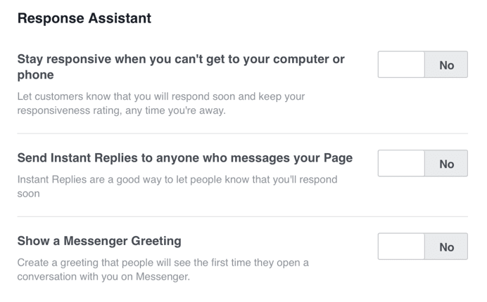
  2. Once in your “Messaging” tab, scroll down to where it says “Response Assistant”
  3. Choose from three options for setting up messages.

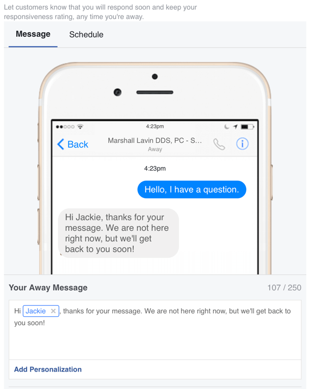
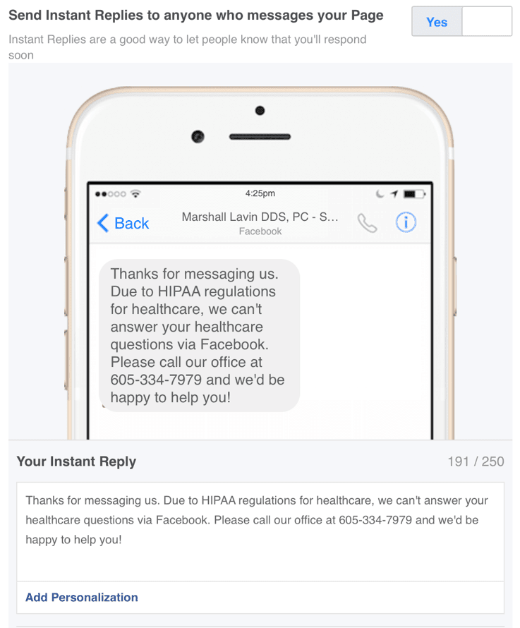
The first option will automatically send a message back to the person who messaged you with a pre-written response. Facebook calls it your “Away Message.” You should set up an away message if you have someone on staff who responds to messages daily, but not instantly.

The second option is “Instant Reply.” It will send an automatic message to your customer to let them know something specific. (Keep in mind, all people who send you a message will get this same reply.)

For healthcare, we recommend setting up an Instant Reply about your policy in regards to answering personal health questions via Facebook (HIPAA regulations). It’s best practice not to answer health questions in a Facebook message. And, conveniently with Instant Reply functionality set up, you don’t have to constantly monitor your page and respond to each person! Below is an example of an Instant Reply for an endodontist’s page.


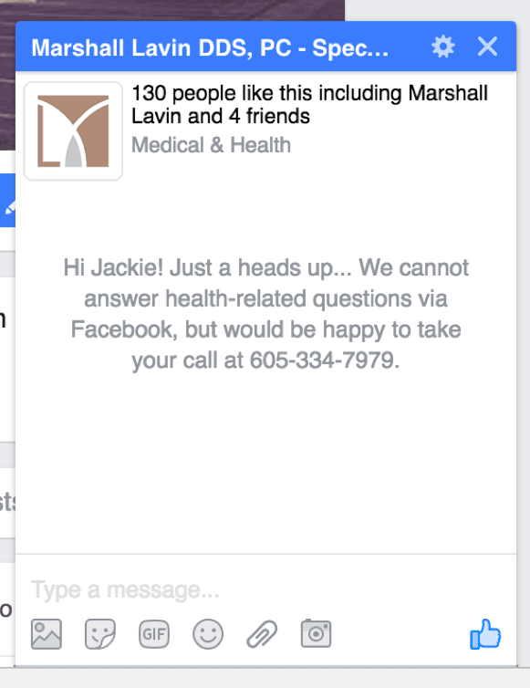
The third option, “Messenger Greeting,” is a bit different. This allows you to display a note prior to someone sending you a message. This is a handy way to let your customers know whether or not you reply via Facebook Messenger. You can also convey other important information such as office closings or technical difficulties. For example, “Our office is closed for the holiday” or “Due to a power outage, our scheduling system is down. Please call our office.”

Below is an example of a Messenger Greeting in action for the same endodontic practice Business page.

With these three new messaging options, there are endless ways to connect and communicate with your customers and patients—without being a slave to Facebook Messenger! Take the time today to set up a new automatic response message to help your team better manage client relations.

The Value of Creating Distinct Social Media Channels

Mass Media vs. Personal Relationships

There are two general approaches to how people and brands use social media channels. The first is to broadcast, trying to get as wide a distribution as possible for each piece of content. This is the way people approach traditional media like print, radio, and television.

The second approach to social media is relational—using social channels to know and be known. In the past this type of interaction only happened face-to-face, or in letters and phone calls. The people and brands that understand social media best realize that social media is a new animal—a hybrid of traditional broadcast media and personal relationships.

“Social media is a new animal—a hybrid of traditional broadcast media and personal relationships.”

Broadcasting on All Frequencies

Most people use two or three different social media platforms. Some people connect to each other and brands on only one social media channel. But most users connect to the same people on multiple platforms, which can lead to a lot of redundant content. If a brand shares identical content on each channel, they miss an opportunity to add value to their audience. There are times when it makes sense to repeat the same message on every social channel—an event cancellation, for example. More often though, your audience will be better served if you create content that is unique to each channel.

Let Your Audience Choose the Channel

I appreciate it when people I follow create focused, curated streams of content. I like to see what other designers post about design, but I’m not interested in family photos or inside jokes with people I don’t know. The opposite is also true—there are some friends I follow because I want to see their family photos and hear their jokes, but only have a passing interest in their particular industry. If I have the option, I subscribe only to the channels that interest me the most. The same is true for brands.

Screenshot of United social media channels

At one point, United Airlines gave a lot of thought to how they structured their social media channels. Each platform had a clear purpose. Because United used each platform in a unique way, they created a focused stream of content in each channel. People can ignore channels they aren’t interested in and subscribe only to the content they want.

  • Facebook: to send out updates, and to promote deals and contests
  • YouTube: a behind-the-scenes view
  • Twitter: specific, targeted travel questions
  • Instagram: to share travel photos
  • LinkedIn: to talk about new products and services, and career opportunities

Each social channel reinforces the brand and offers something unique. United customers can subscribe to the channels that are relevant to them, which means they’re more likely to find value in the content they receive. (Thanks to Matt Bailey of Site Logic for showing me this graphic some time ago.) The benefit for United is that they are able to offer content that is valuable to their audience and connect better with the people they are serving.

Saturation vs. Service

The mistake that many brands make is that they blast out the same messages on all their social media channels. That assumes that 1) all the channels are the same and interchangeable, and 2) that the people who are in those different social communities are looking for the same types of content in each channel.

In my experience neither one is true. I look on Instagram for beautiful and interesting images, and I don’t expect those images or the communication around them to be time-sensitive. On the other hand the element of time is very important to users of Twitter. Tweets are lightweight and easy to create in a moment, which is why Twitter is many people’s source for up-to-the-minute updates. (Oreo “won the marketing Super Bowl” in 2014 by creating and sending a tweet within minutes of a power outage during the game.) Use each social media channel the way your audience is using it and don’t try to shoehorn in content that doesn’t fit the channel.

If you’re a company or a brand, you should realize that you are a guest at the party—an overwhelming majority of people say they want to use social media to connect with friends and family. Don’t try to saturate your audience with your content. Instead think about how to create channels of content so your audience can find content that’s relevant, interesting, and helpful to them.