A variable font is one font file that has flexible properties, allowing it to function as multiple fonts. Typically a typeface is available in a limited number of styles, such as the varying weights of light, regular, medium and bold, and often corresponding italics. Each style requires a separate font file. With a variable font, all of these styles and potentially infinite other instances are available using a single file. And variable fonts don’t just vary in weight – they can vary on several different axes like width, optical size, italic, and slant.
Implications for web design
Until variable fonts became a possibility on the web, designers were forced to limit the number of fonts used in a design to decrease the amount of data that must be downloaded to display a page. Each additional font adds extra load time. Waiting too long for content to load hurts the experience of interacting with a website. Variable fonts have the potential to remove this limitation. A single font file can provide the typographic expression previously only possible by loading many fonts.
Variable fonts for greater expression
Beyond the technical applications, variable fonts could also serve expressive purposes. Type used in buttons and navigation could change as the user interacts. A button’s label could grow increasingly bold the closer the user’s cursor comes. Numeric labels in charts and graphs could vary in correlation with data. Combined with natural language processing, qualitative information could affect how a font is displayed – a font could morph to visually express negative or positive sentiments. Maybe a news site wants to help readers identify “good news” and “bad news” quickly – a variable font could allow headlines that indicate how “good” or “bad” a story is.
Variable fonts for greater accessibility
And there are implications for accessibility on the web as well. Imagine responsive websites and apps that adjust font size, weight, and other properties to cater to the specific needs of users or even the environment they are in. Perhaps fonts that increase in size or width to improve legibility for older users who may have visual limitations like cataracts. Conversely, a font could become more condensed to allow for greater information density for those with better vision. Some have postulated that variable fonts could help those with dyslexia, allowing them to customize certain parts of letters that are difficult for them to read.
https://mattjensenmarketing.com/wp-content/uploads/2020/06/Acumin-Variable.png8341667Brady Holmhttps://mattjensenmarketing.com/wp-content/uploads/2019/09/mjm-logo-nav.pngBrady Holm2020-06-11 15:41:042021-06-02 14:02:26Imagining How Variable Fonts Could Make A More Expressive and Accessible Web
During this live webinar, Vance Thompson Vision experts, Susan DeGroot, Clinic Director, Montana, and Janet Cox, CPC Director of Billing and Coding and veteran practice administrator and Matt Jensen Marketing Account Executive, Cindy Haskell, shared an overview of how to implement telehealth services and provide practice insights drawn from actual experience. Watch the entire webinar or download the presentation below:
https://mattjensenmarketing.com/wp-content/uploads/2020/04/iStock-1189302646-copy.jpg5671000Matt Jensen Marketinghttps://mattjensenmarketing.com/wp-content/uploads/2019/09/mjm-logo-nav.pngMatt Jensen Marketing2020-04-22 02:30:062021-06-02 15:22:43Webinar: Telemedicine in Practice
Web accessibility has been on a lot of people’s minds recently as everyone from presidential candidates to grocery stores have come under fire for websites that don’t comply with ADA standards.
Because we work with several eye care clinics at Matt Jensen Marketing, accessibility is doubly important because the chance that someone with a visual impairment will visit the site goes from a probability to a certainty. Because of this, I’m going to focus mostly on visual accessibility, but web accessibility actually encompasses visitors with many different needs. These users could include someone with limited mobility because of a disease such as cerebral palsy, someone who is learning English as a second language, or someone who is temporarily disabled by an injury.
In short, web accessibility is as broad and diverse a topic as humans themselves. Making a site accessible can seem like a daunting endeavor, but hopefully these suggestions will get you pointed in the right direction.
Building Accessibility from the Ground Up
While I’d love to say that we can make a few easy tweaks to make your existing site accessible, the truth is that meaningful accessibility begins in the earliest planning stages of a website. But the good news is that you can make any site more accessible without learning a bit of code.
One of the most important considerations for accessible websites is making having well-structured content. You should approach organizing content the same way you would an outline for a research paper when you were in school. There should be a clear and direct hierarchy and page names, headings, etc. should be descriptive but skimmable. This makes it easier for screen readers to scan pages and makes for a better user experience overall.
Making the Invisible Visible
As web design has advanced, it has become more and more reliant on big, splashy visuals. This is great for a lot of us who were bored looking at pages and pages of plain text, but it does make it difficult for people who rely on screen readers to get the full experience of a website.
Enter alt tags. Alt tags are descriptive meta data that are used by screen readers to describe an image on a website to someone who is visually impaired. People with full vision often don’t understand how much information we get from visual cues. So while alt tags can’t suddenly make someone who’s blind see that stellar photo of your office, they can help provide context that can be helpful for understanding the rest of the content on the page.
Along the same lines, it’s important to avoid burying text within images, especially text that conveys important information such as dates of events or how-tos. Often, people try to call out important information by turning it into graphic, but that may actually hinder many people’s access to it.
Providing Adequate Contrast
While optimizing for screen readers is important, many people who visit your site may be temporarily or only moderately visually impaired and may not require the use of screen reader. These include people who are color blind, suffering from cataracts or glaucoma, or even someone viewing the website in poor lighting conditions.
For these cases, it’s important to make sure the visual elements on your site provide adequate contrast. This means that all text should have a 4.5:1 color contrast ratio with this background. There are many tools to check to make sure your website adheres to these standards, but suffice it to say that the light gray text that has been the trend all over the internet recently probably won’t cut it. (Learn more about text readability in our blog about choosing fonts for cataract patients.)
Along with contrast, it’s also important to consider text size and whether or not it’s scalable, consistent standards for links and buttons that don’t just rely on color, and whether there’s enough room between clickable elements.
We All Need an Accessible Web
Accessibility remains a murky area and unfortunately, there are no clear-cut standards that will definitively prevent you from a lawsuit. But if you’d like to dig deeper, you can start by taking a look at the full Web Accessibility Guidelines (WCAG) established by the W3C.
But while accessibility may seem like a lot of extra work just for edge cases, the truth is that all of us will benefit from accessible websites at some point or another. Maybe you break an arm and can’t use a keyboard. Maybe you have a slow internet connection and can’t load images. Or maybe you just got bifocals and are having a hard time reading on a screen. By making the web accessible to anyone, we can create a better experience for everyone.
https://mattjensenmarketing.com/wp-content/uploads/2019/08/mjm-blog-accessiblity.jpg5671000Kirstie Wollmanhttps://mattjensenmarketing.com/wp-content/uploads/2019/09/mjm-logo-nav.pngKirstie Wollman2019-08-22 14:07:022021-06-02 14:02:26Accessibility for All: Why Accessibility Matters and Where to Start
All over the country, doctors and their teams work hard to restore vision for their patients. The ophthalmologist’s toolbox is outfitted with trusted, life-changing procedures and techniques like advanced cataract surgery with lenses that help patients rely less on their glasses. Eye care professionals help change their patients’ perspective by making the world brighter and clearer.
At MJM, we help provide clinics with educational tools, brochures, ads and websites that cater to people with cataracts. One of the tools in the designer’s toolbox is typography. From signage and directions to brochure and website fonts, legible type can set the tone for a patient’s experience.
Here are a few things we keep in mind when we make typography decisions for audiences with limited vision:
1. Choose high-contrast colors
Cataracts prevent some light from reaching parts of the eye that create an image. When text color is too similar to background color, letters and words may become muddled and difficult to distinguish. Black or very dark text on a white background is most legible.
2. Choose full-bodied letters
Fonts with a tall x-height, wide letters and long descenders and ascenders are easier to discern because they take up more space and create shapes that are easily recognizable.
3. Used mixed-case type
ALL CAPS not only appears to shout, but it also can make text harder to read. So can italics. Our brains read words as shapes rather than identifying individual letters. And since we are more used to reading in sentence case, our minds can process those words more quickly.
4. Choose moderate stroke contrast
Find a happy medium between uniform thickness (like Futura and other trendy sans serif fonts) and super high contrast. To someone with blurred vision, an ultra-thin stem can virtually disappear from the page.
5. Avoid condensed fonts
They narrow the natural shape of letter forms to take up less space. But, this also means that they are more difficult to read.
6. Use serifs for paragraphs
Serifs are like little signposts telling our eyes where a letter begins and ends. In a paragraph, they direct our eye traffic as we dig into longer copy.
7. Stay positive
Negative text (white on a dark background) gives the illusion that the letters are thinner than they actually are, making them more difficult to read.
8. Size matters
Twelve-point font looks different for Futura than it does for Brandon Grotesque. Printing an example proof can help tell if the font is going to be large enough.
9. Embrace space
Without enough space between lines, letters and around the text block, legibility is compromised. There are a few ways to do this:
Increase leading (space between lines) to about 1.5 times the normal amount.
Increase tracking (space between letters) so letters are less likely to visually run into one another.
Increase the margins to appropriately frame the text.
Write concise copy. Adding content to a limited space can compromise legibility. Shorter copy can be compelling, especially when it gets read.
Like most rules in design, there are always exceptions. A font with uniform line thickness and low x-height like Brandon Grotesque compensates by increasing the leading (space between lines) without manual adjustment. The font that populates a brochure may not be the best for an outdoor parking lot sign.
https://mattjensenmarketing.com/wp-content/uploads/2017/09/font-cataract-feature.jpg5671000Alison Raaenhttps://mattjensenmarketing.com/wp-content/uploads/2019/09/mjm-logo-nav.pngAlison Raaen2017-09-11 07:00:552021-06-02 14:02:26Can You Read Me Now: Choosing Fonts for Cataract Patients
When running a successful healthcare practice in the digital age, most administrators focus on HIPAA regulations and strictly following them to keep patients’ PHI safe.
But there’s more to digital than what you can’t do online!
With the public face of your digital presence (website, social media and online listings), there’s a lot you can do to market your practice successfully (while still adhering to HIPAA).
We’d like to share five things many healthcare practices are missing or using incorrectly in their digital presence:
1. Have bad NAP?
NAP refers to “Name, Address and Phone Number” — the core to all online business information. These three data fields represent your business’s most valuable contact information.
When you originally set up your digital listings (social media, Yelp, Yellow Pages, etc.), you may not have listed your information consistently across all sites. The listing service may have also auto-generated a page by pulling information from your website.
When your NAP is inconsistent across the web, it creates SEO havoc. You may not be getting as high on Google or other search results pages, thus losing potential customers.
If your patients and clients are seeing your name or address inconsistently listed, it confuses them and erodes your brand.
2. Your site is abandoned (and sad)
Back in the “old days” of websites, most companies paid someone to put their brochure content online, thus building their first website…and never updating it until it was time for a new website. Luckily, websites are now easier to update with new, fresh content. It’s critical that you invest time and energy into regularly refreshing your site with new blog posts, updated doctor bios and videos, new staff listings, new services and other relevant information.
An abandoned site hurts your marketing efforts. When you don’t update your website frequently, search engines like Google think your site is stale and outdated which lowers it’s SEO ranking.
Tip: Use a content calendar to plan what you’ll post to the website, and plan to post at least a few times a month. Each time you post a blog, you create a new page on your site (and updated content for your customers).
3. Got link juice?
“Link juice” is what happens when you link to other sites from your site (outbound links to referring clinics, partners you work with or associations you belong to). It also accounts for links coming into your site (social media posts, online listings, partner clinics or associations you belong to, the local Chamber of Commerce or a board linking to your site).
Without inbound and outbound links, you can be disconnected online—floating around with no digital friends. Search engines like Google don’t like that because it makes you seem less trustworthy. Link juice shows them that you play nice with others, and that others find you relevant (like when a trusted site such as LinkedIn is linking to you 50 times—one for each blog post you’ve shared and linked back to your site). Link juice is great for SEO and will help your site get to the top page of search results.
4. Your site and social don’t match your marketing
Going hand-in-hand with an outdated site is a site that doesn’t match your business’ current marketing campaign. If you’ve updated your billboards, TV ads or other mass marketing messages, but your website doesn’t reflect or echo any of the current campaign, it will cause a disconnect between you and your audience.
This same rule goes for your social media accounts—you’ll want to match your current campaign on your Facebook cover image, especially if you have a direct offer or call to action you’d like people to take. Remember—if people see one thing in the media and another thing online, it can cause confusion, and confusion causes inaction!
5. Getting too fancy with “micro-sites”
Micro-sites originally seemed like a great solution to launching a new campaign or product without adding a new section to your primary website. A company would buy a new URL (web address) and build a completely new website for just one aspect of their business on this “micro-site,” then spend money to send traffic to it. This is actually detrimental to your overall user experience because it splits up your web traffic and trains your audience to go to a different website other than your primary site. Since most micro-sites were usually temporary, long-term benefits were never fully realized.
Don’t split hairs with your marketing. Keep everything on one site–your primary website. Then, interlink to areas you’d like your audience to see or use in-bound links directly to landing pages created for specific promotions. This will help keep your brand strong, your message clear, your SEO optimized, and your audience happy!
As a healthcare professional, you’re doing well to focus on keeping your patients’ PHI safe. But beyond HIPAA, more attention to your digital presence will strengthen your brand and allow your practice to take advantage of all the benefits of digital communication and marketing.
https://mattjensenmarketing.com/wp-content/uploads/2017/06/practice-digital-mistakes-1.jpg5671000Jackie Johnsonhttps://mattjensenmarketing.com/wp-content/uploads/2019/09/mjm-logo-nav.pngJackie Johnson2017-06-20 09:25:372021-06-02 14:02:26Is Your Healthcare Practice Making These Digital Mistakes?
I confess that we designers and creatives tend to obsess about our tools — the ones we have and the ones we could have. While these tools undoubtedly aid us in our work, there’s one simple, free tool that can be more effective in helping with work efficiency than anything you could spend money on: organization.
Cluttered and disorganized environments cause more stress and wasted time. They also cause the output of a workspace is to be more unpredictable in terms of quality and quantity. With this in mind, organization can be a topic that is difficult to quantify. That’s where the 5S Visual Management System comes into play. Developed in Japan, the 5S System thoroughly analyzes any workspace to show what areas need strengthening in terms of visual management.
The 5S Visual Management System
The system breaks the aspects of organization down into five categories to be examined and controlled in order. The sections are Sort (Seiri), Set in Order (Seiton), Shine/Clean (Seiso), Standardize (Seiketsu), and Sustain/Discipline (Shitsuke).
Sort seperates what is necessary and what isn’t. It has also been called “The fine art of throwing away junk.”
Set in Order takes the necessary and places it in its rightful spot—making sure that it is easily accessible.
Shine/Clean makes certain that properly placed items are clean. If there’s a persistent source of dirt, find and remove it.
Standardize involves creating an easy system of repeated tasks that will measure and maintain the organization of the workspace currently.
Sustain/Discipline takes the repeated tasks of upkeep and turns them into habits for everyone involved. This step will take the longest amount of time, but with simple motivation it is very achievable.
Results
The 5S Visual Management System has proven to be an effective way of taking a workspace and moving it to the next level in terms of efficiency. Some of the world’s largest companies even implement it into their spaces. As MJM has recently moved into its new location, this is definitely something we are working towards to keep our area effective and continue creating great work.
As the digital world continues to grow, blogging can be a necessary evil when it comes to marketing. Blogging is important for many reasons including:
SEO: This buzzword (buzz-acronym) literally means Search Engine Optimization. Blogging is huge when it comes to having great SEO. This is due largely in part to the fact that Google favors websites that appear current. If your website hasn’t been updated since November 2004, Google is not going to be your biggest fan (or source of traffic).
Subject Matter Expertise: It’s important that your followers or clients know that you know your stuff. Blogging is a great way to show just how much you know.
Driving Website Traffic: As a business, we are constantly looking for ways to increase traffic to our website and get people to stay on our site longer. Spending money on ads is one way to get people to your site but blogging on relevant topics can get people in as well as get them to stay.
So we know engaging with customers and peers is important, but we often find ourselves wondering what to say. Often, what makes any creative project difficult is not having clear boundaries.
As you find yourself in need of updated web copy, ask yourself the following questions to help create your own boundaries and guide your writing:
Who is your audience?
Defining your target audience can be a great way to determine what you should write about. Are you targeting other professionals in your field, donors, kids, product users? Define what that group looks like and you’ll be one step closer to a great blog topic.
What is your goal?
So you’ve decided you are going to write to your product users. As you communicate with those users, what goals do you have? Are you hoping to educate those users on a particular product? Maybe you want to teach them about a new way to use your product. Are you hoping they will take action as a results of reading your blog and what action do you want them to take? Many great blogs can start by defining your end goals.
What topic relates to both your audience and goals?
As you’ve walked through questions 1 and 2 you have probably considered a few audiences you could address and a few things you could talk about. It is important to look at where your audience and goals intersect. For example, you may not want to talk to a teenager about donating money for your event but you may want to invite them to that event. On the other hand, if the event is a rock concert your donors may not be as interested. As you blog, consider where these question cross paths and how you can write content targeted for both your goals and your audience.
What is your content strategy?
In keeping a consistent writing schedule, it’s important to have a content strategy in place. Starting with 101 type blogs and doing follow up blogs going deeper into subject matter can be a great way to build your blog archives. These types of blogs can keep traffic coming to your site consistently and keep people on your website longer, as they see more content that relates to their interests and needs.
https://mattjensenmarketing.com/wp-content/uploads/2016/08/for-Katies-blog-1000x567.jpg5671000Katie Hugheshttps://mattjensenmarketing.com/wp-content/uploads/2019/09/mjm-logo-nav.pngKatie Hughes2016-08-16 10:50:442021-06-02 14:02:26What Should I Blog About?
We work with doctors and health care practices around the country, and there are a couple basic metrics most clinics don’t watch closely enough. If they did, it would change the way they built their site and the type of content they shared. Here are 3 metrics doctors and administrators should be watching more closely:
1. Mobile Device Usage
Like every industry, I think health care understands that more people are using their site via mobile devices than ever before. In reality, our experience is that nearly 1 in 4 visits is now mobile. That’s a lot of mobile visitors, and the number grows every year. This number is startling because so few doctors in the ophthalmology/optometry space have responsive websites that work well with mobile devices. Ask your web provider what your mobile device percentage is, and take a look at your website on a phone or tablet. If, like many doctors, you are getting 25% mobile visitors and your site is impossible to use with a mobile device, you are creating a poor experience for a bunch of current or prospective patients. It might be time for a web redesign.
2. Keyword Search
Your web analytic report can tell you the exact words people search to find you. If you need a quick and easy place to start understanding your market and what people think of you, this is where you look. Some people spend $10,000 on a “market study,” and they can be helpful. But start with your keyword list and see what words people type when they end up choosing your link. You might find that people are choosing you for reasons other than you think.
3. Top 5-10 Pages
Again, not rocket science — You should know the top pages on your site. These are the pages people are natively drawn to, the ones they send to friends to read, the ones they bookmark for future reference. These pages are working for you, and if you understand why, you can improve your overall site. Perhaps the content is great, perhaps the menu option or link is compelling, or perhaps a tool you include is helpful. Figure it out. If you combine keyword search with a look at your top five pages, you’ll have a nice start to updating your web strategy in a way that gets results.
https://mattjensenmarketing.com/wp-content/uploads/2013/06/analytics.png5671000Logan Wanghttps://mattjensenmarketing.com/wp-content/uploads/2019/09/mjm-logo-nav.pngLogan Wang2013-06-17 11:26:012021-06-02 14:02:263 Web Metrics Doctors Should Be Watching More Closely
The tragedy of the commons is an economic and ecologic dilemma in which individuals, acting in their own self-interest, collectively destroy the value of shared space through individual overuse, exploitation, and a lack of planning, even when it is obvious that it is not in anyone’s long-term interest for this to happen.
The same thing may be happening to your website right now.
For many organizations, space on the “homepage” is seen as prime real estate, and everyone wants their individual share. “Make sure my program is listed there! This exciting new technology just has to be featured this month! This is our biggest event of the year for us!” With every new addition, the collective value and usability is hurt.
Instead, lead through good design and bold decisions. Consider the following:
A prime role of leadership is to distill organizations down to key missions and messages. Tell the story — focus on the most important, valuable identity. Website design needs focused leadership (as does all design).
Consider Google’s homepage — this incredibly complex, robust organization has an incredibly simple, focused homepage. Good organizations with good leadership are always moving away from the tragedy of the commons in their webspace (and entire mission).
Understand that the idea of “homepage” means less and less as search engines help people jump straight to content-specific pages, sometimes bypassing the homepage altogether. Build great content pages and maximize their search potential, and quit sticking everything on the homepage.
If your organization avoids the tragedy of the commons, you (and your customers) win.
https://mattjensenmarketing.com/wp-content/uploads/2012/01/tragedy-commons.jpg5671000Logan Wanghttps://mattjensenmarketing.com/wp-content/uploads/2019/09/mjm-logo-nav.pngLogan Wang2012-01-14 06:20:572021-06-11 10:34:14The Tragedy of the Commons
Summarizing the last 24 months in song would be quite the contest. BJ Thomas’ “Raindrops Keep Falling on My Head” would be vying for a spot with Pink Floyd’s “The Wall” as the most appropriate song for the industry’s economic blues. Beck’s “Loser” would easily win out over a similarly titled anthem from the Beatles (“I’m a Loser”). Certainly, the last 24 months have been challenging for the refractive surgery industry. Some folks are still apprehensive about “getting back in the game,” in terms of creating demand through new or traditional marketing tactics. Many others have decided that George Harrison was right: now is the time to plan for sunnier days.
Major Marketing Decisions: The Four Ps
In the years leading to the downturn, major marketing decisions in premium practices typically fell into one of the following four categories known as the Four Ps of Marketing: product, price, place (distribution), and promotion. These variables were altered to best satisfy the practice’s customers in the desired target market. In most cases, and in the field of refractive surgery generally, emphasis was placed on these four categories to encourage a prospective patient to inquire about a practice’s offerings. As you read these definitions, pay special attention not only to their descriptions but also to the typical cataract and refractive practice’s handling of each marketing component.
Category
Description
Old Marketing Approach
Product
The product is the actual offering or service made to the patient/customer. In the case of physical products, it also refers to any services or conveniences that are part of the offering. Product decisions include aspects such as function, appearance, packaging, service, warranty, etc.
The surgery is the product.
Price
Pricing decisions should take into account profit margins and the competitive landscape. In the world of marketing, pricing includes not only the list price but also discounts, financing, and other options such as leasing.
Prices are lowered to increase demand.
Placement
Decisions regarding placement are those associated with channels of distribution that serve as the means for getting the product to the target customers.
Placement is classically regarded as “media outlets.”
Promotion
Promotional decisions are those related to communicating with and selling to potential consumers. Since these costs can be large in proportion to the product’s price, a break-even analysis should be performed when making promotional decisions. It is useful to know the value of a customer in order to determine whether additional customers are worth the cost of acquiring them. Promotional decisions involve advertising, public relations, media types, etc.
Promotion looks like refractive surgery sales.
The Industry
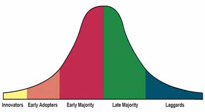
From an industry standpoint, laser vision correction volumes have been steadily decreasing as society has moved from the early-adopters stage of a product’s or service’s life cycle to the early-adopters/early-majority/middle-majority stage. Today, more than ever, patients (customers) are concerned about safety, value, and long-term stability. According to Market Scope’s quarterly survey of refractive surgeons, U.S. laser vision correction procedures declined 26.6% in 2009 when compared to 2008 [D. Harmon, personal communication, April 2010]. Although this shortfall has been met with consistent growth in the areas of IOLs and therapeutics (particularly in cataract surgery), offsetting the loss of total procedural volume and the resulting loss in net revenue will be a major challenge for refractive surgery centers in the years ahead.
The technology adoption life cycle
Moreover, an operational risk exists if this mix of growth in implants and therapeutics continues alongside decreasing volumes in laser vision correction. Basically, similar procedural volumes could result in far lower net revenue with which to run your practice unless a “refractive-style” model can be adopted in the therapeutic category.
Supplementary and Replacement Revenues
Marketing’s function is to assess the pros and cons of potential offerings and determine their ability to add value to the core mission of the vision correction industry. I mention this because the future vitality of refractive surgery lies in the industry’s ability to focus on its mission of improving vision across constituencies.Innovation rules. Practices cannot become distracted by offering other “replacement” revenues as their core business. Everything a premium practice offers must revolve around or be supplementary to the core function of correcting vision. Otherwise, a meaningful system of distribution no longer exists.
Within the confines of the mission I describe, new sources of revenue do exist. Nutritional supplements, aesthetic services, myopic treatments (not procedures),and new options for presbyopic correction can bolster the practice’s bottom line without disrupting the mission. Be mindful, however, of how consumers perceive your practice’s role in vision care and make every effort to hold that spot in their minds.
Mass Communication Is for Mass Production
Descriptions of where products or services are in their technology-adoption lifecycle are relics of goods-based economies. Goods-based economies performed best during the industrial era when phrases such as “product lifecycle” were used to describe consumers‘ purchasing tendencies across a uniform and lateral product line. Each product was made to be as identical as possible and kept as inventory until the time of purchase. Firms were more successful when they could mass produce uniform products. Customers were relatively satisfied because they had access to more offerings than ever before. The fact that an item was not exactly what the customer desired was superseded by the value and number of options available to them in the economy based on mass production.
“The concept of mass production is problematic in an economy that is now defined by customers’ experiences.”
The concept of mass production is problematic in an economy that is now defined by customers’ experiences and even more so in an environment of elective medical health care, where the push is to increase offerings to offset decreased volumes. As Joseph Pine III and James Gilmore state in their groundbreaking book The Experience Economy: Work Is Theater & Every Business a Stage, in elective health care, the intended aim is not mass production but mass customization, a strategy of uniquely serving each customer in an efficient way.1
Today, the elective health care industry is offering a transformational experience under the mass production model. I believe this is driving prices into the ground, expectations through the roof, and centers to their knees. Why? There is no reference, framework, or architecture to build from to make the experience of laser vision correction truly experiential in the mind of the customer. Even more difficult than staging a customer’s experience that is worth the price of admission is doing so in a consistent and efficient manner. I fear that our industry, manufacturers included, is still unsure of what truly motivates patients, resulting in the development of self-serving messages designed to increase marketshare, not grow the whole.
This is described by Pine and Gilmore:
We see many companies today floundering in how to market their offerings thanks to the demise of mass markets, the ineffectiveness (and unmeasurability) of advertising, and the seeming failure of using the WorldWide Web as an effective marketing vehicle. That’s why we also see a plethora of “adjective-based” marketing ideas; to name just a few, think of guerilla marketing, permission marketing, viral marketing, even emotion marketing and emotional marketing. Each type may have something valuable to say, but never really addresses the heart of the problem: People have become relatively immune to messages targeted at them. The way to reach your customers is to create an experience within them.2
Marketing Operations
Perhaps more important than your actual marketing message is the support you give it through marketing operations. The best advertisement can only make alogical prospect try your product or service once. If that consumer’s experience does not measure up to his or her expectations, the failure lies in the operations, not the advertisement. Special attention must be paid to the operational side of the practice to ensure that the experience is worth whatever was invested in the advertising budget.
Shareef Mahdavi, the president of SM2 Strategic in Pleasanton, California, said it best in a recent posting on the Premium Experience Network:
Unlike the traditional marketing or advertising budget, investing in the customer experience doesn’t require huge budgets…but does have two specific needs: your mind and your time. In fact, as the leader of your practice, it’s critical that you adopt a mindset of making the customer and their experience the key differentiator of your practice compared to other doctors of the same specialty in your area. Experience has shown that any attempts to improve the levels of service will generally fail if the physician is not wholeheartedly committed to the cause.
Time, not money, is the primary resource you will spend on the path to being world class in the eyes of your customer. With advertising, it’s the opposite. You spend significant amounts of money to generate awareness and interest in your practice and its services.But once that money is spent, it’s gone. With service, you will invest significant amounts of your time in your staff. But what you are building is a process to identify and address “service defects” and to enhance the overall experience. You are simultaneously building a culture among your staff that says “here is what’s important to our practice.” Realistically, you will spend money on training sessions, systems/hardware/software, and cosmetic improvements. But those investments are long lasting and do something advertising cannot: fulfill the hopes, desires and expectations of your customers above their role as your patients.3
In assessing your practice’s marketing operations, consider these questions:
Do you devote specific staff meetings (or separate sessions) to the topic of customer service?
Who is in charge of customer service in your practice?
How much are you spending each quarter on advertising/promotion versus improving levels of service?
Reserve time and energy to create your practice’s internal processes and structure, not just its external campaign. However, once the operations are in order, how should a practice go about creating its initial messages?
Creative Brief
The first and perhaps most important piece of your advertising communications is flagging your prospect.The best approach is to pay attention to the creative work plan, otherwise known as the creative brief in marketing circles. This document boils down the important details of an advertising message to be certain the message achieves the desired outcome. A creative brief is created by following these steps:
1. Why are you advertising?
It is critical to determine why the advertisement is being created. Otherwise, there is a tendency to throw everything but the kitchen sink into the message. If there are two reasons for creating the advertisement, develop two ads. Some reasons for an advertisement are:
The practice has a new technology that is safer and more accurate than a more traditional technology.
A new doctor is being added to the practice.
The practice has a new offering or is adding a new location.
2. To whom are you talking?
Here is where you define your target audience. For example, a practice might decide that its prime market for laser vision correction includes individuals aged 35 to 54 years, with 60% being women. Potential customers would be defined as those who would like to reduce their dependence on glasses or contact lenses but have not yet done so due to concerns about safety.
3. What do you want customers to think, feel, or do as a result of the advertisement?
Perhaps you want patients to understand how important laser vision correction can be to their quality of life. Maybe you want to appeal to their desire for spectacle independence during activities. Perhaps you simply want to position your center as the authority in vision correction. Here, this is all hashed out. However, keep in mind, the most effective use of your message is to communicate only one thing.
4. What one thing makes this offering different or better?
What is unique about this offering? Before youcommunicate with your prospective patients, be sure that you understand what the business world calls your unique selling proposition. This is what sets you apart from competitors in your category. It may be experience, technology, safety, accuracy, or exclusivity. Resist sales offerings here as they typically are not unique. The same promotion you run can be run by your competitor next week. Stick to what is unique.
5. The New Four Ps
After establishing the reasons for communicating and how these will increase reliance upon the practice’s marketing operations, the four Ps of marketing can be rearticulated in a way that instills a more customer-centric experience.
Category
Description
New Marketing Approach
Product
The product is the actual offering or service made to the patient/customer. In the case of physical products, it also refers to any services or conveniences that are part of the offering. Product decisions include aspects such as function, appearance, packaging, service, warranty, etc.
The patient is the product.
Price
Pricing decisions should take into account profit margins and the competitive landscape. In the world of marketing, pricing includes not only the list price but also discounts, financing, and other options such as leasing.
Prices are reviewed not only to understand profitability but to ensure an experience worth the price tag. Prices are increased as technology and offerings are increased.
Placement
Decisions regarding placement are those associated with channels of distribution that serve as the means for getting the product to the target customers.
“Media outlets” are replaced by networks. Rather than billboards, the patient/customer is the billboard, instantaneously sharing his or her positive or negative experience with his or her family and friends.
Promotion
Promotional decisions are those related to communicating with and selling to potential consumers. Since these costs can be large in proportion to the product’s price, a break-even analysis should be performed when making promotional decisions. It is useful to know the value of a customer in order to determine whether additional customers are worth the cost of acquiring them. Promotional decisions involve advertising, public relations, media types, etc.
Promotions are not sales based. They are seen as one of the last steps in increasing demand, after operational considerations have been taken into account.
Conclusion
Finally, remember to keep things in the proper order. When there is economic promise on the horizon, there is a rush to begin creating demand through marketing. This is a normal and natural business response. However, be certain your operational processes are in order before you begin to burden them with increased call volumes, visits from patients, and procedural volume. Otherwise, the demand created could manifest itself into an increase in substandard experiences. Now is the time to set the standards that will make your practice truly experiential in the future.This is because now, while volumes are rebounding, you and your team have time to choreograph what an optimal patient/customer experience should be like within your four walls. From there, determine what you want to say using processes like the creative work plan. This will ensure that what you say in your messages actually accomplishes what you set out to accomplish.
This article originally appeared in Premium Practice Today. Click here to download a PDF version.
1. Pine B J, Gilmore J H. The Experience Economy: Work Is Theater & Every Business a Stage. Boston, MA; Harvard Business Press; 1999.
2. Pine B J, Gilmore J H. Special Report: Experience Economy. Accessed April 1, 2010.
3. Shareef Mahdavi’s Premium Experience Network. Accessed April 15, 2010.
https://mattjensenmarketing.com/wp-content/uploads/2010/05/image-from-rawpixel-id-430786-jpeg-copy.jpg5671000Matt Jensenhttps://mattjensenmarketing.com/wp-content/uploads/2019/09/mjm-logo-nav.pngMatt Jensen2010-05-08 08:24:312021-07-12 09:06:47Here Comes the Sun: Marketing Your Premium Practice