Tag Archive for: kirstie

Charting a New Course for GA4

While most of us use Google services on a daily basis, the average person doesn’t typically keep up with the company’s latest behind-the-scenes advancements. But fear not, for MJM has been a faithful follower of Google news on your behalf.

Here’s what your business needs to know: On July 1, 2023, Google Analytics 4 (GA4) will replace Universal Analytics (UA).

We suggest you don’t wait until July to start transitioning. You may access your UA reports for a short time after July 1, but all new data will track under GA4. An early switch to GA4 means the properties will have more historical data and insights.

What Exactly are Analytics?

The mention of data measuring services can make your head spin, so let’s rewind a bit. Even if you’ve never heard of Google Analytics, you’ve probably interacted with it. More than 28 million websites use Google Analytics to track user behavior. They then use that data to help improve their user experience.

For example, if you see that a page buried deep in your menu is getting a lot of traffic, you may want to make it easier to find. Or you may discover that the majority of your users are visiting on mobile and, if your website uses a lot of video and animations, you may want to adjust the design to keep load times speedy.

And no, using data analytics won’t give robots free reign of your personal information. Analytics data is anonymized, so you can’t see who is using your site; however, it can provide useful information, like location, gender, age, and device type.

When you create your Google Analytics account, you add a piece of JavaScript measurement code to your website’s pages. This tracking code then records how users interact with each page and sends the data to Google Analytics, who processes and organizes the information into  reports. You can place filters on these reports for more selective results, such as omitting employee traffic on the site.

GA4 Benefits

MJM has basically been a 24/7 celebration since the GA4 release… well a very tame party with lots of productivity and GA4 admiring. We think you should be excited too. Here’s why:

  • GA4 gathers data from both websites and apps, which provides you with a more complete understanding of your customers. You even have access to fine-tuned controls of how GA4 gathers information.
  • While UA uses independent sessions (the amount of time a user spends on your site), GA4 uses event-based data, which tracks interactions between users and your site; as a result, you can set your own goals based on the purpose of a particular page. Example events or goals include filling out a form or following a link to another page.
  • GA4 provides users with better privacy. It does not record or store IP addresses and even offers cookieless measurement. This feature proves to be pretty important as more and more governments tighten their data privacy laws, such as the recent California Privacy Rights Act and General Data Protection Regulation in the European Union.
  • Because GA4 allows you to set your own goals and track across different mediums, it is easier to obtain the ROI data you need to see how well a particular campaign is performing.

How to Get Started

While analytics may not pique your interest, they are essential to understanding your customers and improving your site’s accessibility. If you’re looking to make the switch to GA4, head on over to your Google Analytics account for your next steps or give us a call. We’d love to help you enter the next generation of data analytics!

Why Your Website Needs a Sitemap

Imagine if the construction crew who built your house skipped the blueprint. You’d end up living in a place with doors that lead nowhere and staircases that sharply drop off — if you even have them at all.

Blueprints ensure that your home is inviting, logical, and helpful to your everyday life. A similar thing happens with your website. Like your home, it should also have a blueprint, or sitemap as it’s known in the digital world.

What is a sitemap?

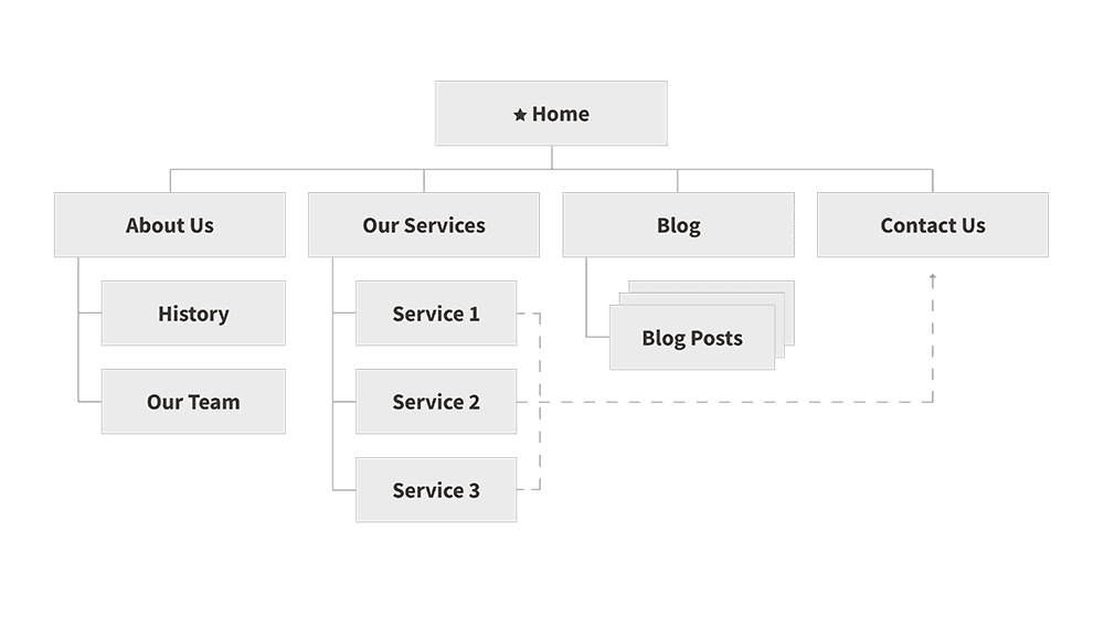
A sitemap is like a beautifully organized file cabinet (no messy manila file folders here). It organizes your website’s content in a hierarchical structure so that search engines can better locate, crawl, and index the content — all of which tells the search engine which pages are most important.

Flow chart diagrams or neat lists are the most common sitemap styles. Most sitemap diagrams display each page as a rectangle with lines which indicate the hierarchical relationship between pages. More advanced sitemaps may also show which pages link to one another. These visual connections represent the path that a user is likely to take when navigating your site.

Why do I need a sitemap?

Better organization and usability often equates with the one thing many site owners want most: better search engine optimization (SEO). Like humans, robots work better when organized. Having a well-structured sitemap will let search engines like Google crawl your website more efficiently and serve up more relevant results.

Users shouldn’t have to hunt for information on your site. Instead, your website should be navigable and help them follow a logical trail of information. For example, the homepage may lead them to your services page, which takes them to a specific service, which then leads them to an order or scheduling page; however, you may still want to place an “order now” or “contact us” button on each page to better accommodate users’ unique paths.

Moving pages around on a sitemap is much easier than doing it once the site is in development. Believe me, your developers will thank you. And once the site is live, if any new pages do need to be added, you will be able to see how they fit into the overall structure so you can find the optimal place to put them.

Sitemaps also foster better internal efficiency. Your team doesn’t need to be well-versed in computer code to read and understand your sitemap; however, you all should be familiar with your business’s content and how your consumers use it. When you know the ins and outs of your content, you can organize your sitemap in a way that optimizes the user experience and search engines’ indexing. If you’re not quite sure how your clients use your content, creating a sitemap will help you learn.

What’s next?

To get started on constructing your own sitemap:

  • Take inventory of all of the pages on your website and begin to group them in categories. Take note of overarching themes and organize content underneath each.
  • Send out a user survey to see how people are actually using your site.
  • Create a list of commonly-performed actions on your site and document the user path to completing those actions. Can you simplify the path?
  • Check your website analytics to see what pages are getting the most views and which ones are getting the least. Most-viewed pages should get more prominence and little-viewed ones can be demoted or even removed.
  • If you can access search history on your website, check to see what terms people are entering most frequently. Can you make those items easier to access?

With the new year upon us (and the organization refresh mindset at its peak), now is a great time to get your sitemap in tip-top shape. If you need an extra boost in creating or touching up your sitemap, give MJM a call — we would be delighted to help.

You Already Have the Data to Understand Your Customers

Apple’s new privacy updates are great for consumers, but they’ve left businesses worried about how to effectively target advertising. But don’t fret — chances are you already have access to a wealth of information about your customers right at your fingertips. Here are a few ways to unearth it:

Check Your Demographics

Basic data is still extremely valuable if you know how to interpret it. Anonymous information like age, gender, and device type is still compiled through Google Analytics, social media channels, and even email services like Mailchimp. It may not seem like much to go on, but with a little imagination, this data can be very useful.

For example, you may learn that the majority of your users are women aged 34 to 45 using mobile devices. This likely means that a large portion of your audience is busy moms on-the-go who are more likely to watch a 30-second video than they are to read a 1,000-word blog post. Once you’ve put a face to your audience, it becomes much easier to extrapolate what their problems are and how they go about solving them.

Be sure to check your demographics for each platform as it’s likely they’ll vary. Noticing that your email list subscribers are aged 45+ and that your Instagram followers are largely 18 to 25 is information you can’t afford to ignore. It’s a golden opportunity to adjust your tone and messaging to suit each audience.

Review Your Search Terms

Search terms can be a gold mine into figuring out what is going through customer’s minds and they are easier to get than you may think. There two types of search terms, each with their own valuable insights.

You can use Google Search Console to see what terms or phrases people are typing into a search engine to reach your website. Google Analytics, on the other hand, can be configured to give you a list of what people are searching for once they are actually on your website. Think of these terms as a free gift — people are telling you exactly what it is they’re looking for.

You can also use Google Trends to take a look at what search terms are trending in your region or across the globe. You may discover that people are asking a question that you have an answer for, so you can now make it your mission to let them know.

Talk To Your People

Data is a powerful tool, but nothing beats a boots-on-the-ground approach. If your business model allows you to interact with customers, do it! You don’t need to be pushy, but sincere curiosity can lead to valuable insights.

Even if the topic of conversation has nothing to do with the business itself, learning more about your customers’ daily lives can help you build empathy so that you can make your messaging more relatable. You don’t need to track people’s phones to find out what their favorite restaurant is or where they like to shop — if you engage with them openly and honestly, they will probably tell you themselves.

And even if you don’t deal directly with customers, someone on your team does. Your front desk and phone teams have the most direct interactions with your customers and they probably already have a list of common pain points as well as a general sense of what your customer’s lives are like. So don’t forget to ask them about it!

Conduct Formal Surveys

The old standbys of marketing research, consumer surveys do still have a place in the modern world. Depending on your scale and resources, this may be as simple as an online form or as sophisticated as an in-person focus group.

In order to get the most value from these tools though, you need to keep in mind that people are more willing to share surface-level feedback than their true feelings and opinions. A good survey will be able to dig into the why behind their feelings. That is the information you need to make sure your business is actually solving their problems.

So now that you’ve gathered the data, what do you with it? Create user personas! User personas are amalgamations of your average customers: their likes, dislikes, challenges, and needs. And now that you are armed with your customer research, the process will be much easier. Learn more about personas (and how to use them) in this post.

And if you need help along the way, Matt Jensen Marketing is here to be your guide. Contact us to learn more about how we can help you define and reach your desired audience.

Nonprofit Marketing: 4 Tools that Offer Discounts

When you’re a nonprofit, every cent can truly make a difference. At Matt Jensen Marketing, we’ve discovered a lot of tricks over the years to help nonprofits develop lean and efficient marketing systems that can deliver high-impact messages while keeping operating costs low. Here are a few of our favorite services that offer special rates and features for qualifying 501(c)3s and why you should be using them.

Source: Canva

Canva

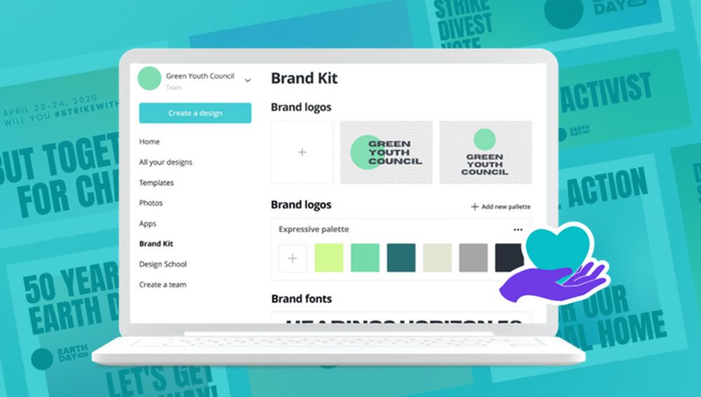
Nonprofit employees usually wear a lot of hats, designer and social media guru often among them. If you are struggling to fill your feed with consistent, on-brand messaging, Canva may be the solution. Canva is an easy-to-use design platform that allows you to create custom graphics for social media in a matter of minutes. You can even use it to create print pieces like newsletters and brochures.

While a light version of Canva is available for free, qualifying nonprofits can apply to upgrade to the premium version at no cost. The huge benefit of this is the ability to use Canva’s Brand Kit, which allows you to save your brand logos, fonts, and colors so you can easily apply them to any design. You can also create templates for your team to have at-the-ready. Learn more about Canva for nonprofits here.

Source: Shopify

Shopify

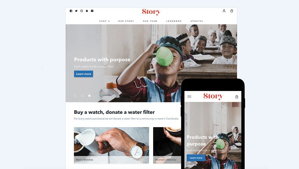
Donors love the ease of being able to give online, but those transaction fees can really add up. Enter Shopify.

Shopify is traditionally known as an e-commerce platform, but they can also make it simple for you to process donations and even sell merchandise. Their drag-and-drop builder also allows you to easily update your website content and share your story, no coding experience necessary. Learn more about how to apply for Shopify’s discounted nonprofit rates here.

Source: Constant Contact

Constant Contact

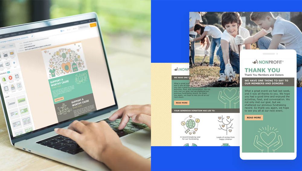
Emails are the bread-and-butter of most nonprofit communications, so it’s important that they represent your mission well. Using a premium email marketing service like Constant Contact can help you put your best foot forward.

Constant Contact offers a 20–30% discount for qualifying nonprofits and includes an easy-to-use email builder as well as event sign-ups, polls, and other useful tools. They also make it easier to organize your mailing list and send targeted messages to specific segments.

Bonus Tip: If you’re using Shopify, you can integrate it with your Constant Contact account for seamless functionality.

Source: Google

G Suite

You probably need no introduction to Google. But did you know that they offer discounts on their services for qualifying non-profits? With G Suite for nonprofits, you can set up email accounts with your domain name, making them look more professional and less likely to get trapped in spam filters.

You’ll also get more storage in Google Drive than you would with a typical free Gmail account, allowing you to create templated documents and presentations that you can easily share among your team. On top of G Suite, Google also offers nonprofit discounts and grants for Google Ads, YouTube, and Google Maps. Learn about all of Google’s nonprofit tools here.

If all of this information is still making your head spin, Matt Jensen Marketing is here to help! We have experience working with nonprofits both big and small and can provide the guidance and training your team needs to start marketing your nonprofit like a pro. Contact us to get started.

Collection: Online Learning Resources

We have a curious team at MJM, and we’re always engaged with learning to improve our work and ourselves. Having recently emerged from remote work lockdown, we asked our design team to share some of their favorite online learning resources.

Kirstie

CSS-Tricks: Lately, this has been the first place I turn to when I have a CSS question. I really appreciate how clear and approachable the style is and how in-depth they get with even the most fiddly CSS.

(Don’t miss Kirstie’s takeaways from WordCamp Minneapolis/St. Paul!)

Brady

Nielsen Norman Group publishes research on a variety of design-related topics. I particularly appreciate their short explainer articles and videos on design principles. They generally explain the principle and then show it in context on an actual design.

Farnam Street publishes articles full of “timeless ideas for life and business.” There’s a definite emphasis on the importance of lifelong learning and cross-disciplinary curiosity. Their articles are rich with links to other ideas and more of their writing, so it can be a bit of a rabbit hole! The Mental Models collection is a great place to dive in.

Tim

School of Motion: Lots of great content about all things motion, delivered through articles, interviews, and tutorials. And courses, of course – it’s called School of Motion for a reason. This is one of those sites that frequently results in “Oh! That’s how I should have done it the first time” moments.

Joel

Lynda.com: A website that offers online courses for things ranging from creative software to business skills.

Skillshare: A subscription based service that provides well-produced video classes on how to do anything from photography to calligraphy.

Spoon Graphics: A website full of tutorial videos and other content created by an excellent designer named Chris Spooner.


Designing for Humans in a Robot’s World

Over the last few months, I, like most people, have been asking myself a lot of questions. Small questions like, “Do I have enough toilet paper?” Hard questions like, “When will I see my friends again?” And big questions like, “What will our world look like when this is all over?”

Recently, I had the opportunity to attend WordCamp — what is usually a one-day WordPress conference in Minneapolis but now, like so much of our lives, had shifted to being entirely virtual. Where better, I thought, to start finding answers to at least some of my questions, many of which are connected to our increasing dependence on the digital world.

As someone who has designed a website or two, I have been filled with a mixture of sadness at how much of our interactions have become virtual and curiosity about how we can work to make these spaces more meaningful and more inclusive. At WordCamp, I was pleased to discover some unexpected insights that left me feeling more motivated and optimistic than before. (Although no answers on the toilet paper front.)

SEO… It’s Not Just for Bots

I will be the first to admit that I was somewhat of a reluctant web designer. My teachers would stress how important it was, and I would be like, “Yeah, but the paper—it’s so romantic!” This changed when I realized it was arrogance, not romance, that was constraining my thinking.

By forcing my own notions of “good design” on the user, I wasn’t listening to what they actually needed or wanted. I had to shift my thinking into designing for the medium that would be most beneficial to the audience I was talking to and not just the medium that I wanted to create in.

What does all of this have to do with SEO? The prevailing attitudes towards SEO are that it is either a.) A game that can be won and lost or b.) A giant pain in the butt that Google has forced upon us all. While there may be some truth in these attitudes, SEO work can become more purposeful if we spend less time obsessing about search rankings and inscrutable algorithms and more time focusing on what’s really important: the user.

In one of the sessions I attended, Tyler Goldberg of CYBERsprout explained that, contrary to popular belief, Google is not out to get you when it comes to SEO. Google’s primary goal is deliver the content that is the most relevant and useful to the user. So if your goal is the same, you will be helping Google and, in turn, Google will help you.

While the SEO game can still be conned by those with deep pockets and black hat practices, it is definitely changing for the better. Google recently announced that it will be adjusting its algorithm to reward websites who provide a good user experience. This means content that is well-formatted and engaging and designs that are intuitive and easy-to-use. In other words, good SEO is really just good human-centric design.

We All Win With an Accessible Web

Many of us have only recently begun to rely on digital-only services as a lifeline to the outside world, but for people with disabilities, the web has long been a vital tool to help them live richer and more independent lives.

I am ashamed to say that when I first began designing for the web, accessibility was not something I put too much thought into. But the more I have learned about it, the more it has provided depth and purpose to my work.

In her session about web accessibility, Mychelle Blake of Firelink (and fellow Sioux Falls resident!) shared the importance of considering it at every stage of the process. There is no plug-and-play solution that will make a website accessible—it needs to be baked in from the site structure to the content to the design.

During this session, I was struck by the eerie similarities between SEO and accessibility. When it comes down to it, they are both about having empathy for the end user and delivering them a positive experience. Often, both SEO and accessibility are afterthoughts—something that comes secondary to the overall design. But, when we stop seeing these aspects as burdens or hoops we have to jump through and start working them into our overall purpose and strategy, we can start to design a web that is better for everyone.

As our reliance on the web grows stronger, it is more imperative than ever to create a web that useful, just, and, above all, human.

Thoughts on 36 Days of Type 2020

36 Days of Type is a global challenge to draw, illustrate, and letter the 26 letters and ten numerals in the Latin alphabet over (you guessed it) 36 days. Artists world-wide share their letterforms on social media using #36daysoftype, creating a massive catalogue of experimental type. Our design team once again chose to participate, you can view the full 36 days on our Instagram feed. Each character could be illustrated, animated, or otherwise constructed and each composition borrowed at least one color from the letter that came before it. The designers put together some post-mortem thoughts on the project:

Tim

This year I decided to continue to explore animation, specifically in After Effects. As a team, we decided to base the color palette for each day’s letter on one or two colors from the letter created the previous day. The goal was to unify the pieces somewhat, without giving ourselves too short a leash.

A project like this is fertile creative ground because it provides two potent ingredients for creativity: a clear objective and a time constraint. Creativity loves constraints. You can make whatever you want, but (helpfully) you don’t have unlimited time. And because you have to produce a letter every day you don’t have the luxury of becoming too precious about each piece. There’s a little bit of pressure because you know there’s an audience, but you’re also free to explore because the stakes are so low—no one cares what you make.

Joel

For 36 Days of Type this year, I dove into the world of the open-source 3D design program Blender to familiarize myself with the tool and create some distinct letter explorations. What I found was a powerful program with plenty of potential for future projects. I also discovered the unique and visceral fun that designing in a 3D space can create. Watching your work come to life with the click of a render button is just one of those things that will never get old.

Kirstie

During this year‘s 36 Days of Type, one of the most important skills I gained was not a new technique or software, it was adaptability. For reasons none of us need reminding of, this year’s project didn’t exactly go according to plan. Instead of meticulously planning out my letters, I found myself transforming an Rs into Ps on the fly and choosing ideas based on how quickly I could execute them in between Zoom calls. But, rather than being a roadblock, I found it surprisingly freeing. With the complete inability to be anywhere else, I was forced to live and create in the present moment and my work was better for it.

Brady

I love the 36 Days of Type creative prompt for the opportunity to experiment and try something new. I called in the Cavalry this year to help with my animated letters. Cavalry is a new 2D animation tool built around the concept of procedural systems. It relies less on key frames (though it is incredibly well-equipped in that regard) and more on routing values from one property into another to create effects. For example, using a sine wave function to control the vertical and horizontal position of a shape, or even random noise to change its size over time. It felt a little bit more like creative coding or generative art rather than illustration, which was a good stretch for my creative muscles. I didn’t expect to find so much joy in routing data from one property into another and waiting to see what happened, but the surprises and failures were both invigorating. And while it felt much like play and experimentation, I quickly found opportunities to use the tool for project work too, solving problems that would have required much more time and effort using other more familiar tools.

Alison

36 Days of Type is a favorite collaborative project. I love seeing what the other designers come up with, and especially what techniques, colors, and forms are appealing to everyone. When I’ve got a short time to illustrate a letter, I resort to some of my favorite tools in Illustrator: the pen tool, the zig zag effect, gradients, and the blend tool. Illustration is not a daily task for me, but it is something I enjoy. 36 Days of Type is a great excuse to get back to illustration process. From sketching to shape and color exploration, I’m grateful to have projects like these to explore the sandbox.

Check out the whole set:

A Brief History of Optotype

You’re sitting in your eye doctor’s office and they pull out a chart of what appears to be a random selection of letters. You breeze through the first few lines, but by the bottom you’re starting to second-guess yourself. Is that an F or a P? Or maybe an R?

At this point you may be wondering: Where did these letters even come from? And who chose them?

With curiosity as our guide, we decided to dig deep into the history of optotype and how the Snellen Chart went from medical innovation to standard practice and all the way to pop culture ubiquity.

The Origins of Optotype

While glasses and other corrective lenses have been around for thousands of years, it wasn’t until more recent history that doctors have a had a standardized system for determining prescriptions.

The idea for the modern eye chart began with German ophthalmologist Heinrich Küchler. In 1835, Küchler cut images of various objects and animals from calendars and almanacs and pasted them onto a sheet of paper in decreasing size. Because it was difficult to control the consistency of the style and weight of these images, Küchler also published a version of the chart using blackletter text set in single lines in decreasing size in 1843.

Küchler’s chart was not widely adopted and, in 1862, Dutch ophthalmologist Herman Snellen developed his own version of the chart that is still the foundation of what is used today. Snellen’s first chart consisted of dingbats (squares, circles, plus signs, etc.) but, like Küchler, he eventually decided that letters would be easier for patients to identify and describe consistently. Unlike Küchler, however, Snellen believed that monoline letterforms of consistent size would be easier to read and he developed his own typeface, now referred to as optotype.

Herman Snellen built each letter of his optotype on a rigid 5×5 grid so that each letter is mathematically consistent and takes up the exact same amount of space.

While traditional letterforms use varying widths and heights to give the appearance of consistency, Snellen built his optotype on a rigid 5×5 grid so that each letter is truly mathematically consistent and takes up the exact same amount of space.

In 1959, Dr. Louise Sloan designed the 10 sans serif letterforms that are most commonly used in eye charts today.

In 1959, Dr. Louise Sloan of Johns Hopkins University created a new optotype with a cleaner sans serif design. Like Snellen’s, Sloan’s letters are formed within a perfect square. Both the Snellen and Sloan optotypes contain letters that were chosen for their easily identifiable verticals, horizontals, and diagonals—C, D, E F, L, O, P, T, and Z for Snellen and C, D, H, K, N, O, R, S, V, and Z for Sloan. Sloan’s letters are considered better for equal legibility and are particularly effective at identifying astigmatism. Sloan’s letters and variations on them are still commonly used in eye charts today.

How To Read a Snellen Chart

Modern Snellen charts can vary in the number of lines, length of lines, and typeface used, but most charts typically contain 11 lines that decrease in size by 25% each line. The lines of text are sized based on what the average person can read at a distance of 20 feet. Someone who can only read the top line of text can see at 20 feet what an average person can see at 200 feet, meaning they have 20/200 vision, which is considered legally blind. While 20/20 is often considered “perfect” vision, it actually means that someone is on par with what the average person can see at 20 feet. Some humans actually have 20/15 vision and many animals have 20/10 or even 20/5.

The lines of text on a Snellen Chart are sized based on what the average person can read at a distance of 20 feet.

Today, many eye doctors prefer to use the LogMAR chart developed by Ian Bailey and Jan E. Lovie-Kitchin in 1976. The LogMAR Chart uses Sloan letters in an inverted pyramid and is considered more precise than the Snellen Chart. Most doctors have also traded in their paper charts for backlit displays that provide better contrast.

Other eye charts include the Tumbling E and Landolt C charts that are used for children and adults who aren’t able to read and the Jaeger chart which measures near-vision acuity and features paragraphs of text rather than letters.

While the original Snellen chart may be falling out of use, it has taken on a new life outside the doctor’s office. The simple design makes it endlessly riffable and designers continue to find new ways to reinterpret it. So whatever form the eye chart takes next, it’s certain that Snellen’s optotype will remain a memorable intersection of medicine and design.


Reflecting on Recent Experiences

It’s been said that to craft an excellent experience for your customers, you should think of a specific person and craft the experience with them in mind. The exercise helps identify the sort of things that solve pain points or create delight for real people. As a team, we often recount experiences we’ve had with brands that have been remarkable. The end of the year is a great time to reflect on those good experiences. And learn from them for the year ahead. Below, find a few reflections on experiences that provided value to our team this year.

Kirstie

Terra Shepherd

I have always loved fashion, but the actual experience of clothes shopping? Not so much. For the past 15 years, I’ve been shopping almost exclusively online for all of my clothes. But I decided to brave the IRL shopping experience when I heard about one of Downtown’s Sioux Falls’ latest boutiques: Terra Shepherd. Like me, they have a commitment to sustainable fashion and conscious consumerism, so I thought it was worth a shot. I was the only person in the store, which normally fills me with dread because of hovering salespeople, but the staff was so warm and welcoming and made me feel like I was just trying on clothes with friends. They suggested things I would like and, much to my surprise, I actually did like them! That combined with the shared values make this an experience I will be returning to.

Brady

Wirecutter

Before becoming a father of two young children, I had much more time to thoughtfully research gift ideas for family and friends. As those margins of time have vanished, I’ve appreciated the methodology that Wirecutter applies to their product reviews. And that they explain their process with each roundup of reviews. Christmas shopping this year would have been much more stressful and incomplete without referencing their Holiday Gift Guide. When I don’t have the time to do the level of research I typically would, it gives me greater confidence to give something as a gift knowing a little about the people who are reviewing the products and what makes them uniquely qualified to do so. And as it turns out, they are usually far more qualified to do the research than I!

Cindy

Amazon Prime Online Shopping

Like many working adults, my time is at a premium. I value being able to shop online from home and not have to get into my car, find a parking place, go into a store, make a selection and then wait in line to check out. However, I think there is a price to pay for this convenience.

I have to confess I do love going onto Amazon Prime, pressing a few buttons, and having an item shipped to me for free (yes, I did pay for the membership so it’s not really free). However, I am cautious about the future of big data, protection of personal information, and changes we can anticipate as a direct result of limited competition. Is it too good to be true?

Courtney

Earthscapes Landscaping

My husband and I decided this would be the year we invested into landscaping for our backyard. We received Earthscapes name as a recommendation from another friend that had used them, and after our awesome experience, I can see why. Shane, our landscape designer, was awesome from the start and put up with all of my questions along the way.

But the one point in the process that really stood out was when we were nearing completion of our project. We had an existing retaining wall, that wasn’t a part of the project scope (other than making small repairs to the existing wall), but it didn’t look amazing. One morning, he called and told me they had some left over materials from the rest of the project and he would like to put those towards replacing the existing wall. He felt it would enhance the look of the backyard, and while it might be a few more hours of labor, it would be something they would like to do for us within our current scope. Of course I said “Heck yeah!” and now we have an even more amazing backyard and I am willing to tell all my family, friends, and co-workers about this awesome company. Such a small gesture made a huge impact on the experience we had with Earthscapes and now I can’t stop bragging about them and their work!

Notes from Design Camp 2019

Every October, MJM sends some of it’s creative team to the fall wonderland of Branierd, MN to attend Design Camp, an informal design conference with nationally renowned speakers and special workshops. Read our three campers’ reflections from this year below!

Alison

What do I love about Design Camp? First there’s the swag bag, then it’s spending time outside the office with the design team, and then there’s beautifully thoughtful powerpoint presentations that designers put together (it can be done!). The best parts are the ideas that I chew on afterwards. This year’s featured keynotes focused less on immaculate portfolios of design work and more on their purpose and how design lives in the world: as public service at White House, alongside other artists and musicians, and as a tool for huge, international corporations to work more iteratively.

One theme that stood out was the idea of love. Love for yourself, your colleagues, your clients and your users. Ashleigh Axios gave an example of putting together rapid-fire graphics that support statements made during the State of the Union address given by the president. To a room of designers, she admitted it wasn’t beautiful, crafted work, but it was accurate, legible, and delivered on time. As designers and problem solvers, we make things for people. And we should make things to the best of our ability because people deserve that.

Kirstie

This is my third time attending Design Camp and while I always leave inspired to do new work, this year I noticed a different theme to a lot of the discussions. Instead of hearing about how I should be hustling every minute of every day, I heard about the importance of recharging creatively. Instead of leaving with a list of design topics to research and skills to hone, I left with a list of what could be better described as self-help books.

One example of this was a workshop I attended called “How to Speak Unicorn: Translating Design for the Digital Age” led by Michelle Schulp. Based on other web design workshops I’ve attended, I was expecting to be inundated with a list of new software and coding languages I was supposed  to learn. But instead, the presentation focused on something I’m not used to hearing about in web design: interpersonal communication.

Schulp acknowledged how designers who crossover to digital are often expected to be a “unicorn” skilled in every stage of the process. But, she said, rather than being an expert in every aspect of web development, it’s more important to be able to communicate with people who are. Rather than trying to force print designers to learn Python, we should be working on soft skills like active listening that allow us to bridge disciplines and leverage strengths. My overall takeaway from this year’s Design Camp was that to be a better designer, first you need to be a better person. Software will come and go, but things like empathy and compassion will always be a vital part of the designer’s toolbox.

Tim, Kirstie, and Alison in their Plaidurday finest at Design Camp 2019.

Tim

One aspect of Design Camp I enjoy every year is that the ideas and the concepts I hear there percolate in my mind for months afterward. One idea that sunk particularly deep this year was the importance of being intentionally and personally connected with the creative community around you.

Creative business consultant Emily Cohen admonished her audience to “support everyone you know.” Creative work can be discouraging, isolating, and lonely work at times, and many people don’t have the benefit of working closely with like-minded people. She emphasized that the work we do is always personal before it is professional, and we ignore that truth at our peril. And she also pointed out that wanting to be supportive isn’t enough—we also have to be intentional about supporting the people around us.

I‘m blessed at MJM to work in close proximity with four incredibly talented designers (not to mention the rest of our MJM team), and it can be easy to take that degree of connection for granted. We can Slack the other designers with questions, send over screenshots of a sticky design challenge, or even just doodle our problems out on the dry erase walls around our tables. And because it‘s so easy, I sometimes underestimate how much I‘m learning from them, and how valuable that is.

Being purposeful about “supporting everyone you know” sounds simple on the surface, but Cohen’s talk echoed many of the thoughts I’ve been having in my work with AIGA South Dakota over the past few years. As I’ve worked to support and amplify the good work that other creative professionals are doing around our area, I’ve found that I am more connected to that community. And although it wasn’t my goal, I also find that the more I spend time with the people in our community who are doing great work, the more my own work is improved and sharpened by their insights and advice.