A Brief History of Optotype
You’re sitting in your eye doctor’s office and they pull out a chart of what appears to be a random selection of letters. You breeze through the first few lines, but by the bottom you’re starting to second-guess yourself. Is that an F or a P? Or maybe an R?
At this point you may be wondering: Where did these letters even come from? And who chose them?
With curiosity as our guide, we decided to dig deep into the history of optotype and how the Snellen Chart went from medical innovation to standard practice and all the way to pop culture ubiquity.
The Origins of Optotype
While glasses and other corrective lenses have been around for thousands of years, it wasn’t until more recent history that doctors have a had a standardized system for determining prescriptions.
The idea for the modern eye chart began with German ophthalmologist Heinrich Küchler. In 1835, Küchler cut images of various objects and animals from calendars and almanacs and pasted them onto a sheet of paper in decreasing size. Because it was difficult to control the consistency of the style and weight of these images, Küchler also published a version of the chart using blackletter text set in single lines in decreasing size in 1843.
Küchler’s chart was not widely adopted and, in 1862, Dutch ophthalmologist Herman Snellen developed his own version of the chart that is still the foundation of what is used today. Snellen’s first chart consisted of dingbats (squares, circles, plus signs, etc.) but, like Küchler, he eventually decided that letters would be easier for patients to identify and describe consistently. Unlike Küchler, however, Snellen believed that monoline letterforms of consistent size would be easier to read and he developed his own typeface, now referred to as optotype.
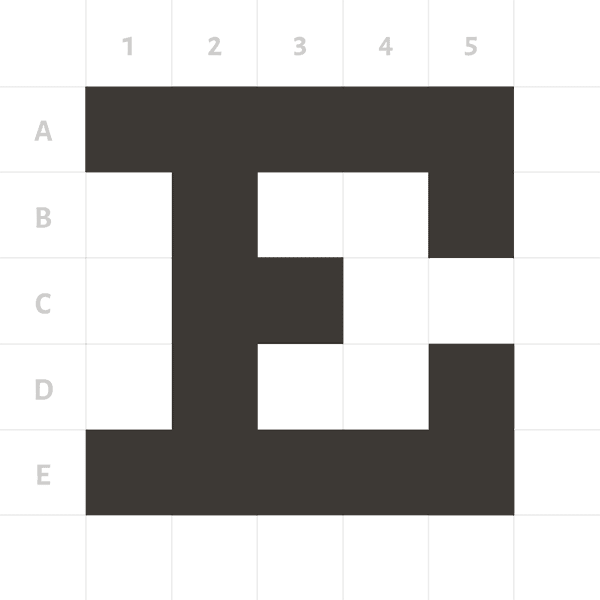
Herman Snellen built each letter of his optotype on a rigid 5×5 grid so that each letter is mathematically consistent and takes up the exact same amount of space.
While traditional letterforms use varying widths and heights to give the appearance of consistency, Snellen built his optotype on a rigid 5×5 grid so that each letter is truly mathematically consistent and takes up the exact same amount of space.
In 1959, Dr. Louise Sloan designed the 10 sans serif letterforms that are most commonly used in eye charts today.
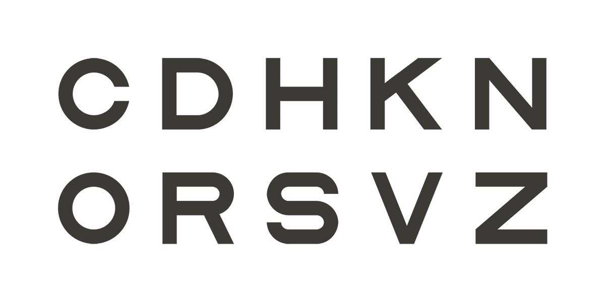
In 1959, Dr. Louise Sloan of Johns Hopkins University created a new optotype with a cleaner sans serif design. Like Snellen’s, Sloan’s letters are formed within a perfect square. Both the Snellen and Sloan optotypes contain letters that were chosen for their easily identifiable verticals, horizontals, and diagonals—C, D, E F, L, O, P, T, and Z for Snellen and C, D, H, K, N, O, R, S, V, and Z for Sloan. Sloan’s letters are considered better for equal legibility and are particularly effective at identifying astigmatism. Sloan’s letters and variations on them are still commonly used in eye charts today.
How To Read a Snellen Chart
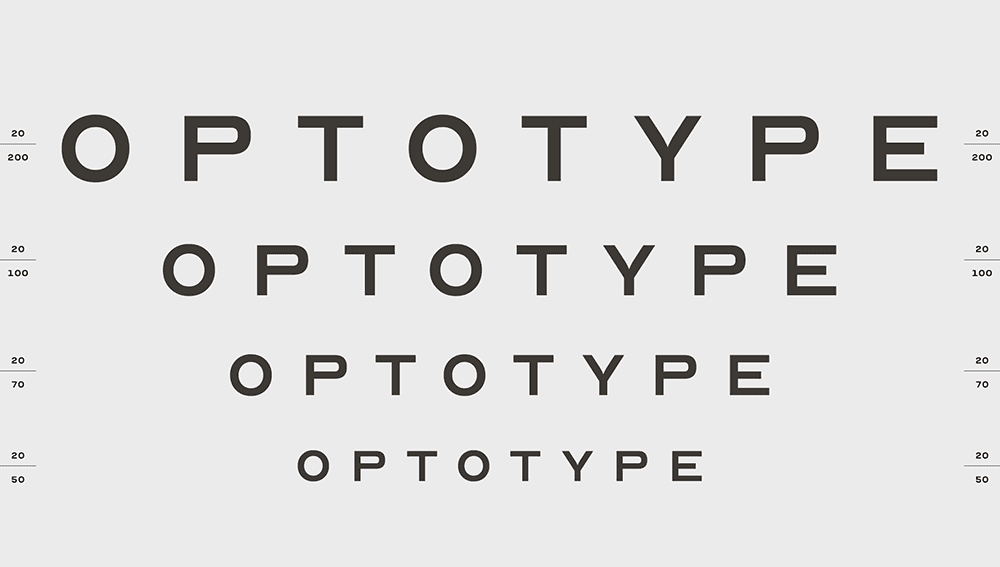
Modern Snellen charts can vary in the number of lines, length of lines, and typeface used, but most charts typically contain 11 lines that decrease in size by 25% each line. The lines of text are sized based on what the average person can read at a distance of 20 feet. Someone who can only read the top line of text can see at 20 feet what an average person can see at 200 feet, meaning they have 20/200 vision, which is considered legally blind. While 20/20 is often considered “perfect” vision, it actually means that someone is on par with what the average person can see at 20 feet. Some humans actually have 20/15 vision and many animals have 20/10 or even 20/5.
The lines of text on a Snellen Chart are sized based on what the average person can read at a distance of 20 feet.
Today, many eye doctors prefer to use the LogMAR chart developed by Ian Bailey and Jan E. Lovie-Kitchin in 1976. The LogMAR Chart uses Sloan letters in an inverted pyramid and is considered more precise than the Snellen Chart. Most doctors have also traded in their paper charts for backlit displays that provide better contrast.
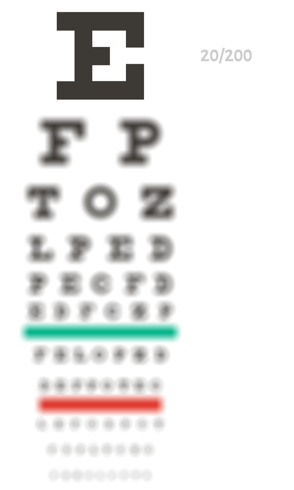
Other eye charts include the Tumbling E and Landolt C charts that are used for children and adults who aren’t able to read and the Jaeger chart which measures near-vision acuity and features paragraphs of text rather than letters.
While the original Snellen chart may be falling out of use, it has taken on a new life outside the doctor’s office. The simple design makes it endlessly riffable and designers continue to find new ways to reinterpret it. So whatever form the eye chart takes next, it’s certain that Snellen’s optotype will remain a memorable intersection of medicine and design.
Sources
“Who Made That Eye Chart?,” New York Times
“What Are Optotypes? Eye Charts in Focus,” I Love Typography
“What’s an Eye Test? Eye Charts and Visual Acuity Explained,” All About Vision
Kirstie is a Senior Designer and Web Lead at Matt Jensen Marketing.


