Tag Archive for: tim

MJM’s New Space Is Helping Us Grow and Explore New Ground

It feels a little like we just moved out of our parents’ house and into our own place. We had to buy our own microwave, scrounge a toaster from a friend and buy a couch or two. And some plates. And a broom.

MJM is growing up.

The front entry of MJM's new space

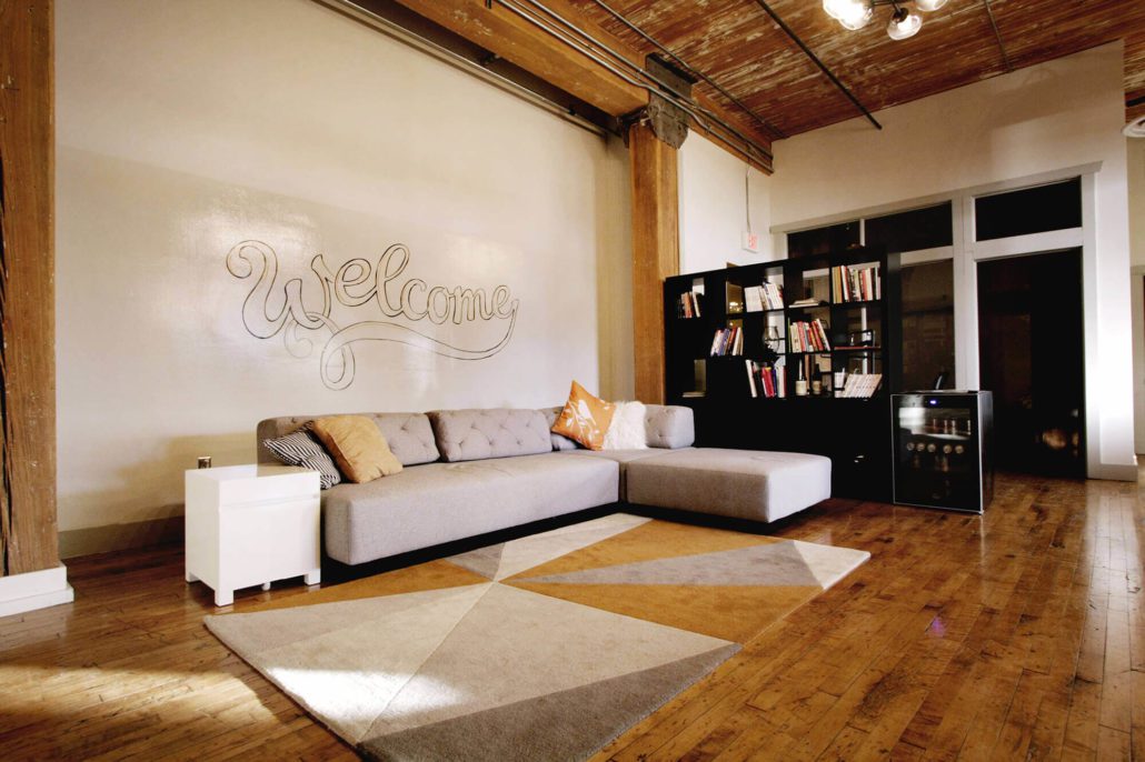
Welcome to MJM’s new space! And thanks to Alison for the great hand-lettered sign!

Meeting rooms in MJM's new space

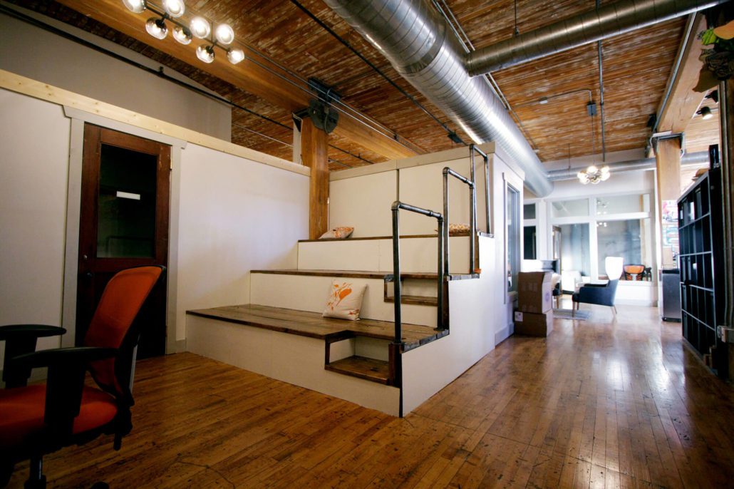
Dedicated meeting rooms have helped improve our workflow and collaboration, and provided spaces for meeting with clients or for smaller team meetings.

Where we’ve been — the MJM origin story

Once upon a time, MJM was a loose collection of freelancers and collaborators gathered to tackle specific projects. We all worked from our homes or coffee shops and checked in with each other with on a regular morning video call.

As we began to tackle larger and more complex projects and started representing national brands and well-known nonprofits, we grew and began to feel the need for a shared space. Because of our unique relationship with Vance Thompson Vision (beyond being one of our first clients, we also share Matt Jensen as CEO) it made sense for MJM to build out a portion of VTV’s overflow space to house our growing team.

Work stations in MJM's new space

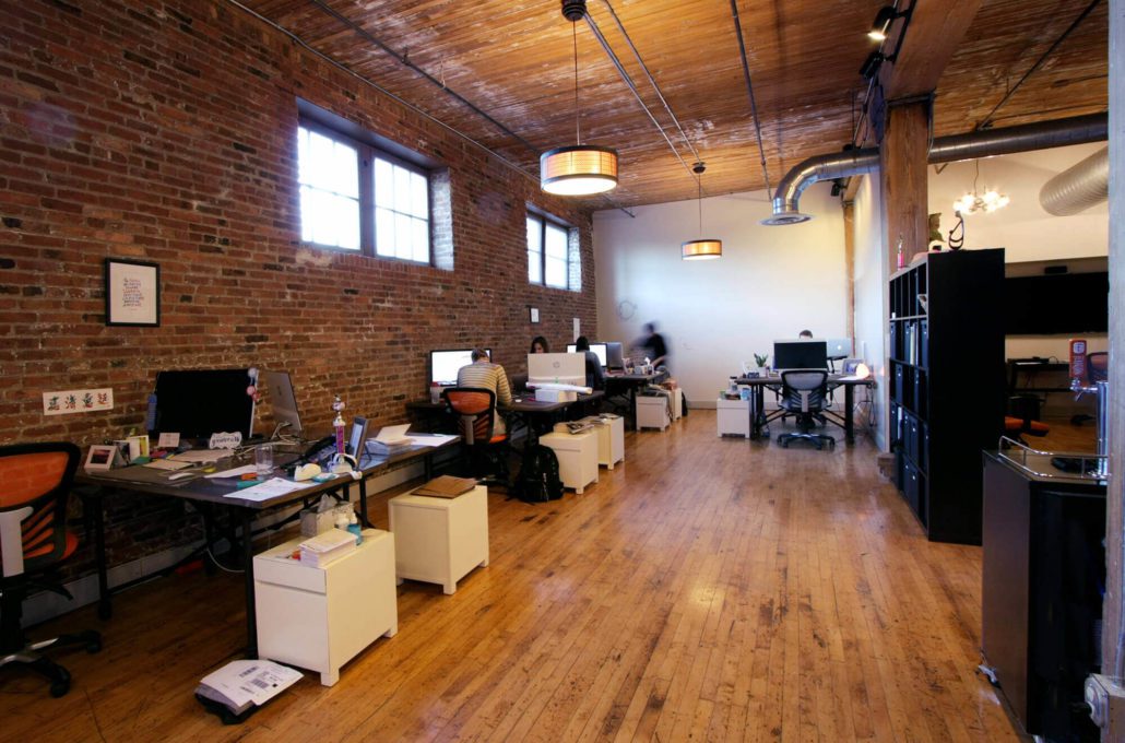
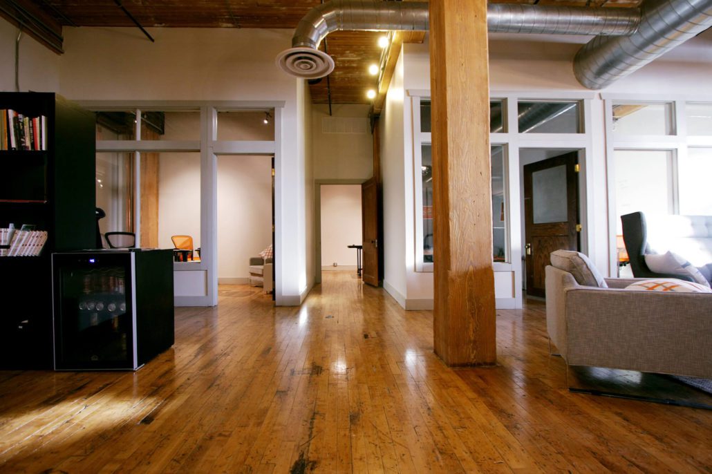
We have lots of room to spread out and work, and whiteboard walls to collaborate and work through ideas together.

Stadium seating in MJM's new space

In what we affectionately call the Theater, we have our virtual morning meetings with the rest of our team around the country.

Moving into our own space

We loved being part of the VTV community and sharing life with them for a season (not to mention their well-stocked break room and great coffee). But as VTV and MJM both grew, VTV was ready to expand into their overflow space and MJM was at a point where we needed more space to work, create and collaborate.

MJM was at a point where we needed more space to work, create and collaborate.

And now we have it! Late last year, we moved into our new digs downtown and we’ve been settling in. We did feel a little bit like college kids moving into our first real apartment. We bought a microwave. We hung some of our posters up on the wall. Got some great coffee (thanks Corey and Wes) and then bought a coffee maker of our own, just like real grown-ups.

Kitchen in MJM's new space

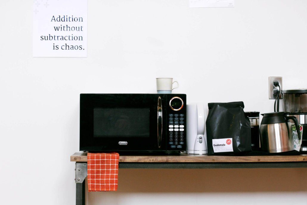
We moved out and bought our own microwave and coffee maker. But we still plan to take all our laundry back to VTV every weekend. (Just kidding, Dr. Thompson.)

Space for creative collaboration

Like most organizations, we rely heavily on digital tools to organize our thoughts and collaborate (Slack, Redbooth, Dropbox and Paper make up the four walls of our digital workspace). But one of the things we’ve enjoyed most about MJM’s new home is that we have a lot of physical spaces set apart for creative collaboration. As much as we might be tempted to forget it, we are physical beings and we think and work in physical space. There’s no substitute for spreading out a stack of papers and images on a table or trading ideas back and forth on a whiteboard.

“The dedicated rooms are really nice—no more juggling meeting spaces!” –Brady

In the past we haven’t had a separate meeting space of our own to use—now we have four, each with room to work and whiteboard walls to work through our ideas together. As Brady said, “the dedicated rooms are really nice—no more juggling meeting spaces!” We’re also developing a dedicated making space, with room and tools to work on mockups to show clients how their materials will look and feel.

Sound control and a state of “flow”

I’m not sure it’s the same for everyone on the team, but my concentration isn’t very durable. I’m distracted easily, especially by other people’s conversations. One of the hardest things about sharing space with other people is that they sometimes need to talk to each other. (If you can imagine.) When your focus is as fragile as a soap bubble,* it doesn’t take much to break your concentration.

Animation of a bubble popping

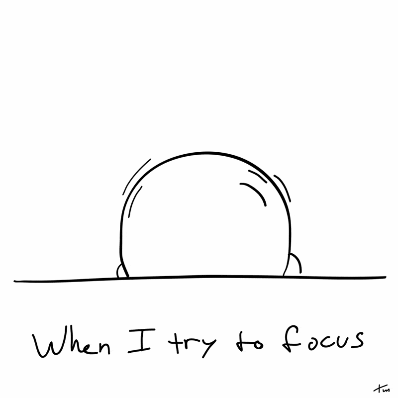
*I actually made this animation in the middle of that sentence, as an accidental and delightfully appropriate case study.

Our new dedicated meeting spaces help our team create and maintain a state of flow in their daily work by eliminating distractions and helping us stay immersed in the work. (Heaven knows, some of us need all the help we can get.)

Phone booths in MJM's new space

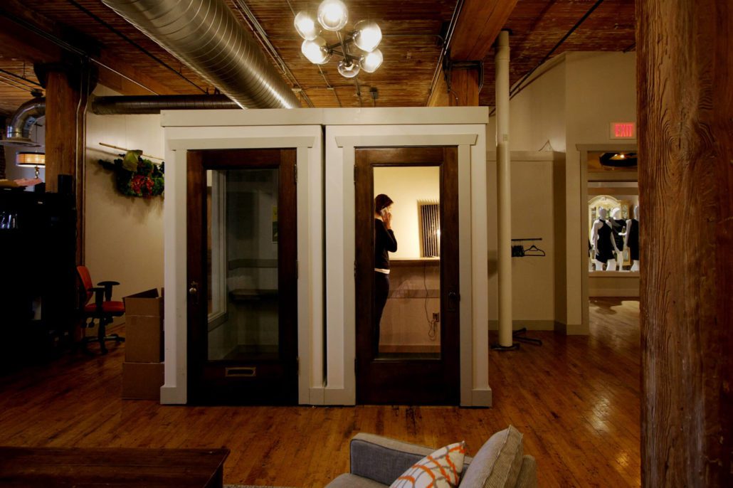
Phone booths help everyone on both sides of the glass concentrate better. Also we have mannequins next door. They’re good neighbors, pretty quiet.

Doing good work in an old building — feeling connected to the city

One thing several members of the team have mentioned is that moving into this new space has given us a renewed sense of MJM’s relationship to the community. When we need a brain break, Falls Park (the city’s namesake) is right outside our door and some of our favorite restaurants and coffee shops are now within easy walking distance.

”I like the historic feel of the area… it feels more like we’re a part of Sioux Falls.” – Shannan

There’s also something grounding about working in a building with solid bones and a deep history. The beams that hold this place up are massive and the brick walls are easily 18 inches thick. For the MJM team, “we love good work” has become something of a mantra—we value craftsmanship and place a premium on doing our work well for the sake of the work itself.

This reclaimed industrial building is a wise old mentor as we create new, well-made work for our clients.

Finding a new sense of ourselves

As we go through the process of settling into our new home, it has given us even more of a sense of who we are and what we want to be. We value learning and curiosity; being present where we are; we value guts, taking risks to grow and try new and hard things; we value being accountable to each other and to our clients, and at the same time we value having a strong sense of fun and mirth.

“I feel like having this empty space to fill has pushed us to really evaluate who and what MJM is.” – Kirstie

As we continue to develop this our sense of where MJM is headed, our brand and identity will continue to develop as well, to reflect who we are. And if you haven’t seen the new space, get in touch with us and we’ll pour you a Fernson or a coffee and show you around.

We’ve come a long way, and we’re excited to see what the next few miles hold for MJM.

Bookcases in MJM's new space

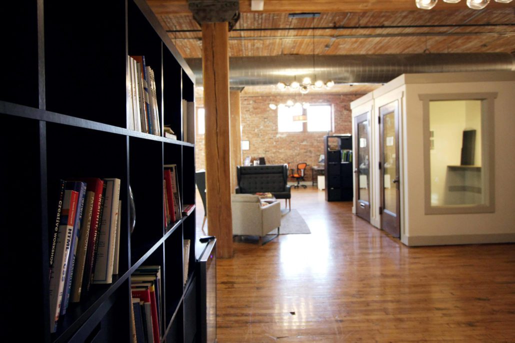
We now have a home for our library of design and customer experience books, and a comfortable place to read them.

Fernson keg in MJM's new space

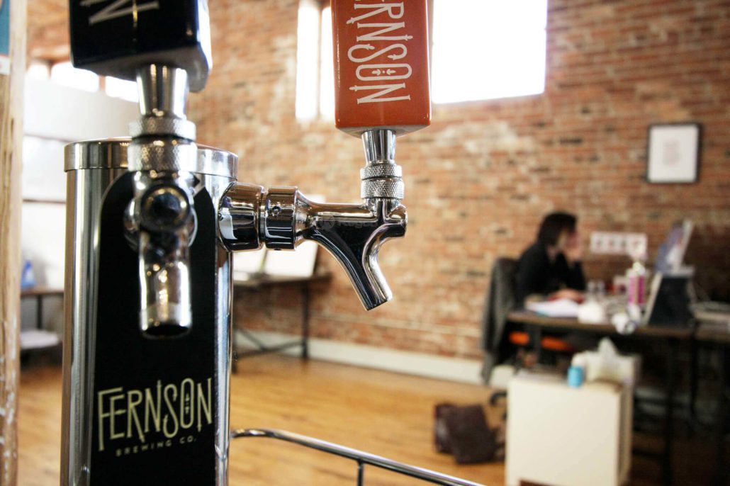
If you haven’t seen the new space, get in touch with us and we’ll pour you a Fernson or a coffee and show you around.

The Value of Creating Distinct Social Media Channels

Mass Media vs. Personal Relationships

There are two general approaches to how people and brands use social media channels. The first is to broadcast, trying to get as wide a distribution as possible for each piece of content. This is the way people approach traditional media like print, radio, and television.

The second approach to social media is relational—using social channels to know and be known. In the past this type of interaction only happened face-to-face, or in letters and phone calls. The people and brands that understand social media best realize that social media is a new animal—a hybrid of traditional broadcast media and personal relationships.

“Social media is a new animal—a hybrid of traditional broadcast media and personal relationships.”

Broadcasting on All Frequencies

Most people use two or three different social media platforms. Some people connect to each other and brands on only one social media channel. But most users connect to the same people on multiple platforms, which can lead to a lot of redundant content. If a brand shares identical content on each channel, they miss an opportunity to add value to their audience. There are times when it makes sense to repeat the same message on every social channel—an event cancellation, for example. More often though, your audience will be better served if you create content that is unique to each channel.

Let Your Audience Choose the Channel

I appreciate it when people I follow create focused, curated streams of content. I like to see what other designers post about design, but I’m not interested in family photos or inside jokes with people I don’t know. The opposite is also true—there are some friends I follow because I want to see their family photos and hear their jokes, but only have a passing interest in their particular industry. If I have the option, I subscribe only to the channels that interest me the most. The same is true for brands.

Screenshot of United social media channels

At one point, United Airlines gave a lot of thought to how they structured their social media channels. Each platform had a clear purpose. Because United used each platform in a unique way, they created a focused stream of content in each channel. People can ignore channels they aren’t interested in and subscribe only to the content they want.

  • Facebook: to send out updates, and to promote deals and contests
  • YouTube: a behind-the-scenes view
  • Twitter: specific, targeted travel questions
  • Instagram: to share travel photos
  • LinkedIn: to talk about new products and services, and career opportunities

Each social channel reinforces the brand and offers something unique. United customers can subscribe to the channels that are relevant to them, which means they’re more likely to find value in the content they receive. (Thanks to Matt Bailey of Site Logic for showing me this graphic some time ago.) The benefit for United is that they are able to offer content that is valuable to their audience and connect better with the people they are serving.

Saturation vs. Service

The mistake that many brands make is that they blast out the same messages on all their social media channels. That assumes that 1) all the channels are the same and interchangeable, and 2) that the people who are in those different social communities are looking for the same types of content in each channel.

In my experience neither one is true. I look on Instagram for beautiful and interesting images, and I don’t expect those images or the communication around them to be time-sensitive. On the other hand the element of time is very important to users of Twitter. Tweets are lightweight and easy to create in a moment, which is why Twitter is many people’s source for up-to-the-minute updates. (Oreo “won the marketing Super Bowl” in 2014 by creating and sending a tweet within minutes of a power outage during the game.) Use each social media channel the way your audience is using it and don’t try to shoehorn in content that doesn’t fit the channel.

If you’re a company or a brand, you should realize that you are a guest at the party—an overwhelming majority of people say they want to use social media to connect with friends and family. Don’t try to saturate your audience with your content. Instead think about how to create channels of content so your audience can find content that’s relevant, interesting, and helpful to them.

Automated “Social” Media

The Handshake Machine

Imagine setting up a machine at your front door to shake hands with everyone who comes to visit. (This would actually be a great gimmick for the first person to do with it, but bear with the analogy for now.) This marvelous handshake machine greets your guests automatically as soon as they walk in. The machine shows your clients and friends that you’re great at automation and savvy about gizmos, but it doesn’t create much of a connection. Automating social media interactions can have the same effect — they feel inauthentic and forced, and can actually alienate your audience.

The Impersonal Autofollow

Consider these two automated “social” interactions: some time ago I mentioned Typegenius in a tweet. Typegenius is a website that suggests font pairings — Brandon Grotesque goes well with Petrona or Merriweather, or Lato would look really sharp with Roboto Slab. In the tweet, I compared them to a “sommelier” who suggests wine pairings. Within minutes, I was followed by a wine distributor — their automated follow mechanism obviously didn’t understand the simile. (They have since unfollowed me, probably automatically. I do see the irony in referencing an automated font pairing resource in this context.)

Screenshot of Typegenius

In a similar way, I posted this to Instagram a while ago, and got a “Like” by a selfie stick manufacturer who also later unliked (disliked?) it. Neither of those tone-deaf interactions is much of a problem for those brands, especially since I’m probably not their target market. But it does point to the inherent problem with automating your “social” interactions — you’re not actually being social. Instead of building a relationship, you’re highlighting the fact that your “relationship-building” is inauthentic.

Screenshot of Instagram photo of selfie stick

Autoposting Across Channels

Automatically reposting can be done well, if you’re intentional about creating something of value for your audience. A clumsy autopost from one social channel to another tells your audience in the second channel that their platform of choice is second tier to you. You risk alienating or annoying them, especially if the posts from the first channel don’t repost well. Don’t post a link on Twitter to your post on Facebook, for example. “I just posted this” followed by a link isn’t very compelling. Instead give careful thought to how you use different social channels for different audiences.

Antisocial vs. Social Media

There’s a case to be made for letting an algorithm take care of the mundane tasks in your online life, but go too far in that direction and you’ll miss out on a chance to connect to the people on the other side. Social media gives individuals and brands an opportunity to connect to a wide variety of people in a meaningful way. This opportunity is unprecedented in history and creates unique possibilities to engage with people who you would otherwise never meet.

Harvesting “likes” or getting a high follower count isn’t a great end goal. Don’t waste those possible connections by having your algorithms and autofollower do all the work. “Automated personal interactions” is an oxymoron, and a wasted opportunity.

What Are All These Image File Types my Marketing Team Talks About?

What is a raster image? What other kind of image is there?

You might think that a picture is a picture but when it comes to using your images in print or on the web, there are some very important distinctions to be made. The most important of these distinctions is between vector images and raster images.

Vector images appear smooth and clean no matter what size they are displayed.

When a raster image is scaled up, you begin to see the individual blocks of color.

What are vector graphics?

A vector graphic isn’t an image so much as a mathematical recipe for building the image and doesn’t have any limitations in terms of size. Vector graphics are infinitely scalable–if you have your logo in a vector format, you can use that file for a business card or for a billboard and the image quality will be the same. (Common vector file types include .AI, .EPS, .PDF (sometimes) and .SVG files.

So what is a raster image?

Put simply, raster images are built out of blocks of color (pixels), and vector images are built out of a series of mathematical instructions. A raster image only contains enough information to display the image of a logo (or a cat, for most of the internet) at a certain size. If you display that raster image at a larger size than it was created to cover, it begins to appear as blocks of color rather than smooth shapes.

A raster image is built of small blocks of color. When scaled up those blocks are scaled as well and look pretty rough, especially on curves.

Pixels: Little blocks of color

Most images used by most people are raster images, and are pixel-based file types. The raster image file types that I use on a daily basis are GIF, TIF, PSD, RAW, JPG, and PNG. Each one was developed for a different reason and each file type has it’s own hidden superpower. (Some were developed in an unsuccessful attempt replace the others.)

GIF

The Graphics Interchange Format, or GIF, was one of the earliest image formats but is still a mainstay of the visual internet. Of all the schisms in the design world, the divide over the pronunciation of this file type is possibly the most bitter. This might be the best answer.) Limited to 256 colors, the GIF can’t display images in a way that takes advantage of the full range of most modern screens. That limitation, along with a patent issue, was one of the main reasons for the development of the PNG format. Unlike the other image file types listed here, GIFs can be strung together into short video animations. Animated or still, the humble GIF remains one of the most common image types on the internet. Avoid using GIFs in print, though–especially the animated ones. That’s just not going to work.

Superpower: Movement. GIFs can be animated, creating compelling or inane little repeating videos.

TIF

Tagged Image File Format is a less common image type, but it’s a powerful tool in the toolbox. The TIF is a “lossless” file format, meaning that no image information is lost when saving. TIF images can also be layered like a PSD, and can contain vector clipping masks making them an ideal format for high resolution print production. The downside of all that uncompressed information is that TIFs are often massive files, and can’t be read by many devices and users.

Superpower: Memory. The TIF is a high resolution, lossless image format. Also layers!

JPG

The JPG (or sometimes JPEG) is named after the Joint Photographic Experts Group who created it and is one of the workhorse image types in use today. It’s the default image type created by digital cameras and is used widely both in print and online. The JPG is capable of rendering images in a “Lossy compression”, and this compression is both its strength and its biggest weakness. (Let’s all reflect for a moment on this metaphor for the dual nature of our own strengths and weaknesses. Done? Great–on we go.) These images show both the advantages and downsides of the JPG compression:

This image (with the same pixel dimensions) when compressed from 5.6 megabyte (on the left) is 900kb (center) and 185kb (right). In the context of a complicated image, especially in high contrast images, the compression artifacts are not as apparent, and the savings in terms of file size might be worth the quality loss in some situations.

If this image were going to be used at larger scales, the artifacts would be distracting.The JPG compression algorithm is especially harsh in areas that should be smooth gradients and subtle variations in color.

Even in a simple gradient the way that the compression algorithm averages areas of color creates banding at first and then large unsightly blocks of color at the extreme end.

Superpower: Adaptability. Variable compression and a jack of all trades. When in doubt, use a JPG–they’re versatile and can be viewed by most users on most devices. 

PNG

Portable Network Graphics, or PNGs, Transparent, more common on the web. The first image here is a JPG, 600px x 300px at 150ppi (pixels per inch), and there’s nothing wrong with the image, especially if you like white boxes around your logos. The second image is a PNG, also 600px x 300px at 150ppi.

Both the images are the same size and present colors and gradients equally well, but the PNG file type supports a transparent background. No unsightly white boxes, thank you.

Superpower: Invisibility. PNGs can have transparent backgrounds.

RAW

The RAW format is not as common for most casual image users, but it’s a go-to file format for serious photographers. Digital cameras are essentially little computers equipped with a lens and a sensor. The lens can gather infinite amounts of information, and the sensor receives and allows the processor to record some fixed amount of that information. Even in a simple image, there is a vast amount of information available—the amount of light, the tone and color of the light, the degree of detail present, etc. When those images are recorded as JPGs, the default for most cameras, the majority of the visual information the lens and the sensor gather are discarded. This creates a manageable file size and still produces a decent image.

The advantage that the RAW format has is that it records and retains a much larger range of that original image. The photographer can then access that original information later when they are processing the photo. If the captured image was too dark, or if the white balance was off, they can adjust those settings almost as if they were retaking the photo.

Superpower: Time travel, basically. RAW files contain scads of information from the moment the photo was taken, allowing photographers to go back and “retake” the photo using different settings.

PSD

The Photoshop Document, the mighty PSD, is the godfather of all other image types. You begin by defining the resolution and the size of your document in pixels, but there the line between vector and raster image begin to blur a bit. Adobe Photoshop, and therefore the PSD format, has gotten more and more complex–recent iterations of the program handle vector graphics (as “Smart Shapes”). Users can compose and create just about any image they can dream up. Users can edit a PSD in layers (and layers and layers and layers) so it’s easy to go back and edit and compose with separate elements and effects. They can also have transparent backgrounds.

Photoshop documents are only accessible to users who have, well, Adobe Photoshop, but once the composition is made those images can be exported as any of the other image file types. There’s a good chance that many images in circulation have spent time as a PSD at some point in their story. For designers, the PSD’s capabilities make it the ideal vehicle for most image art assets.

Superpower: Composition. PSDs contain layers.

PSB

The Photoshop Document we just talked about is pretty amazing, but it does have its limitations. One of those limitations has to do with the image’s size. A PSD can only be a maximum of 2 gigabytes, which is usually plenty of digital elbow room for most projects. There are times when you have to go beyond that, especially in large format and grand format printing, and for that you’ll have to convert your PSD to a Large Document Format, or PSB. (PSB may actually stand for “Photoshop Big”, which sounds ridiculous, but is accurate enough.)

Superpower: Giant. PSBs can be massive, supporting images up to 300,000 pixels in any direction.

For more information on these image types, and to read about the more esoteric formats check out Adobe’s file format guide.

So what about vector image file types?

I’m working on an equally nerdy article about vector file types, which talks about the difference between them and which formats are best for which situations. (Why I often use .EPS files instead of .AI in my normal Illustrator workflow, for example, and how the .PSD blurs the lines between vector and raster images.)

Why You Need a Good Design Brief

Try this next time you’re at a restaurant:

–What can I get for you, sir?
–Well, I’m hungry but I’m not sure what I want.
–Do you want me to give you more time with the menu?
–No, why don’t you just make some things and bring ’em out. I think I’ll know what I want when I see it.
–Oh. Um…are you thinking something light, like an appetizer? Or dessert? Dinner?
–I’m not sure–let’s just get the process started and I’ll let you know as we go.

That sort of exchange in a restaurant would probably end abruptly and you would leave hungry. Why should you approach a conversation with your creative team in the same way? Before the designers start their work, make sure everyone on both sides of the table has a clear idea of what they’re going to be working on. One way to do that is to take some time before diving into the project to develop a design brief.

What to include in your design brief

There are a lot of ways to approach it, but here are some things to consider when developing a good design brief:

Purpose

Before you answer any other questions, you should know why you’re even talking with a designer. What do you want this proposed project to accomplish? How will you know if it’s working?

Target Audience

Who is going to be reading or viewing this piece? How is the audience going to receive this piece? Will it be something to give to them in a face-to-face meeting? Or is it sent through the mail? Through social media?

Context

Nothing is produced in a vacuum.What other materials will accompany this piece? Unless you’re considering a complete rebrand, your current project is going to be used alongside your existing materials. If you are rebranding, your rebrand is going to be layered on top of the perceptions your audience currently has. Both clients and the designers should work to understand the context around the new project.

Style and Tone

What should this piece feel like? Is it informal and friendly like a warm cup of coffee? That might lead your designer towards a more casual look, perhaps with hand-drawn elements and organic textures. Should this piece feel formal and precise like a luxury car? Your designer might create a piece with a sleek gloss finish, crisp lines and dark colors. In this conversation, identifying what you don’t want is as helpful as what you do want. It’s also extremely helpful if you can provide your designer with examples of other materials you’ve seen that have the style and tone that you’re going for.

Color

It’s always helpful to have very specific color information about your brand. There is an infinite variety of shades of blue, for example–if the blue on this new piece is going to match the rest of your materials, your designer will need to know the exact color information for your brand–hex codes for web projects, and Pantone colors or specific CMYK values for print.

Content

What is this piece going to say? It’s especially important to define 1) who is going to be developing the content and 2) how much content there’s going to be. A 3-page Word document won’t fit on a business card, and shouldn’t fit on a billboard. The content should be finalized before the project moves to layout, to save on design time and costs.

Production Specifications: Size and Quantity

It may seem like the most boring aspect of the brief, but both the designer and the client need to have a clear understanding of what size the final deliverable should be. Be precise, down to the exact pixel dimensions or the exact trim size. Even small changes to the dimensions after the project has gone to layout can result in a lot of extra design hours. If you’re creating a physical piece, make sure that you talk early in the process about how many you’d like to produce–your designer may be able to lower your print costs if they know your quantities from the beginning.

Timeline and Milestones

You should both agree on when each phase of the project should be done (initial concepts, first drafts, revisions, etc.) as well as when the final materials should be delivered.

A good design brief means good expectations

One advantage of taking the time to create a design brief is that everyone’s expectations will come out in the process. Expectations are funny–you only realize that you have expectations when they haven’t been met. It’s invaluable to have a document that you can both refer back to as you develop the project. That common reference point will make future conversations about the project more productive.

You only realize that you have expectations when they haven’t been met.

Developing the design brief may mean a slower start initially, but it’s worth the time. The process will go smoother, with less wasted time and frustration on all sides. You’ll save time and money by communicating clearly from the beginning.

Your Next Project Is Not Going To Be Easy

Possibilities usually come disguised as hard work. Don’t expect your next project to be easy.

Things fall apart

Anyone who tries to make something or do something finds that there is resistance. It’s an accepted fact of life that things tend toward disorder–cars break down, paint peels, joints begin to ache as we age. We expect that things left to themselves will fall into disorder. But it is also the nature of things to resist being brought into order in the first place. The world around us not only tends toward chaos, it also drags its feet when we try to make something out of that chaos.

There will always be problems–something will break, or blow up, or you’ll have to scrap the whole thing and start over. The problems only reveal themselves as you dig into the work.

Go looking for trouble

The reality is that most projects have inherent obstacles, stubborn sticking points, intractable awkward aspects that only reveal themselves as you dig into the work. If you begin your project expecting to not run into obstacles, you’re setting yourself up for unnecessary discouragement. If on the other hand, you start the work with the expectation that some things will probably go awry, you’ll be pleasantly surprised when they immediately do. You’ll be able to tell your friends how clever you were to see it coming.

Include extra grit in your budget

It’s normal to build in extra time and money in your estimates on a given project, to cover unforeseen contingencies. The trick is to also mentally set aside a store of patience and perseverance so that when problems do arise, you’ll be resilient enough to follow the work through whatever obstacles come up. Because there will always be problems–something will break, or blow up, or you’ll have to scrap the whole thing and start over. That can sound pessimistic but it’s really not. We’re not looking for problems so that we can be defeated. Without knowing what they will be, we can anticipate that there will be problems and mentally prepare ourselves for the task of figuring out how to solve them.

Honest Marketing

When people in college told me they were studying marketing, they might as well have told me they studying to make fur hats out of kittens. I thought it was universally acknowledged that marketers were in the same camp as payday loan peddlers, Ponzi schemers and email spammers. I remember wondering if you had to sell your soul in the second or third year, or if that was more of a capstone, a Faustian final project in exchange for your diploma.

Marketing as a zero-sum game

“Marketing” doesn’t have to be dirty business where one side manipulates the other into acting a certain way. What I was reacting against at the time, and I what I still reject, is the kind of marketing that appeals to the lowest desires in a person and causes them to act in a way that is not actually in their best interest. Marketing that flatters, belittles or bullies its audience into a response that only serves the organization’s interest is mere manipulation and a waste of creative energy.

Marketing, and marketers, should not:

  1. Create a false ”need“
  2. Appeal to the worst in people (our vanity, our pride, our hatred)
  3. Prey on people’s vulnerabilities (our insecurities, our fear, our ignorance)

I’m not interested in spending my time to do any of those things. Marketing or advertising that pits itself against the audience creates an adversarial sort of relationship, as in a zero-sum game. (In games like basketball there is no limit to how many times each side can score, and one side’s points don’t alter the number of points their opponent has. In zero-sum games like poker, the winner gains only as much as the other players lose.) But there is a way to “market” that is collaborative — one where both sides win.

So what should marketing do?

Honest marketing should tell the truth about the product, and it should also keep people from believing things that are not true about themselves. Companies have products to sell, and organizations have messages to promote. At the same time, if those products or messages are legitimate, valid and useful, their customers or audiences have a real need to buy those products or hear those messages. In this case, both sides benefit from marketing done well.

Marketing that is legitimate:

  1. Communicates what a brand is clearly and accurately
  2. Connects people with products and messages that help them live their lives
  3. Helps companies or organizations meet their goals

Tell your story well

A few years ago we developed some materials for a cabinet maker and carpenter to help him showcase his work. He’s a craftsman, and his work is beautiful, and in some ways his work speaks for itself. But the fact was that his work couldn’t speak for itself unless his audience and potential customers saw it. We took photographs that showed off his work. We developed a logo and a visual style for his printed material that matched the style of his work and his personality. We helped him create a web presence that was easy to find and to navigate. We “marketed” him and his work, but I think a more accurate way to describe it is that we told his story well. We didn’t try to show him as something he was not, or create false need for his products. We represented him well and people that were looking for products like his began to find him. Everybody wins.

Good Design Gets Out of the Way

When you study something intently, you sometimes lose sight of what made you want to study it.

For better or worse, the words of the Bible have been studied and parsed and dissected to an extraordinary degree. The pages of most Bibles are littered with notes, numbers and other study aids. But the power of the text can get overshadowed by the clutter of the “helpful” material that has been added. For the most part, Bible designers have been primarily concerned about arming the reader with all of the information he or she might need to interpret the text, and less concerned about the reading experience. While presenting the text along with the scholarly apparatus might help readers to study the text, all that information hovering in the margins and gutter makes it more difficult to read the text.  (For more on readability and “the physical form of the Good Book” see J. Mark Bertrand’s Bible Design Blog.)

When readers begin paying attention to a book’s design, it is usually because the design is getting in the way.

The Good Book, Designed

Biblioteca, a project being funded through Kickstarter, is aimed at presenting a book (in four volumes) that is meant to be read. The goal of the Biblioteca project is to present the text of the Bible simply and beautifully, with a focus on clean design and “classic and elegant typography” uncluttered by notes and numbers.

I’m looking forward to seeing the finished volumes later this year, for spiritual and professional reasons. The first “book design” project I undertook was motivated by exactly the same reason, with myself as the client. I found myself distracted by the notes and especially the verse and chapter numbers in my reading of the Bible. (To be fair, it doesn’t take much to distract me.) I decided to take the book I was studying and redesign it as simply as I could, with ample space for marginal notes, a narrow measure, and a careful treatment of the poetry sections.

Good design gets out of the way

When reading a book, what is the reader most interested in: the content, or the form in which the content is presented? Most likely, the reader has picked up a book because she is interested in the information, or the story, or the ideas presented. Unless the book is a design portfolio, where the goal is to display the work of its designer, or a textbook intended to inform about and present examples of design, the reader has only passing interest in how the material is presented visually.

When readers begin paying attention to the features of a book’s design, it is usually because those features are getting in the way–margins too narrow for the reader to hold the book without covering up the text, page numbers that are hard to find, text that is too cramped to follow comfortably, and so on. Good design presents the material and stays out of the way. You could almost say that as soon as the reader becomes aware of the design of the book, the designer has failed in his first goal: present the text to the reader.

It’s OK To Look Back and Cringe

One of the cold hard facts of the creative life is that we all have some past work that we’re not proud of. We’ve all put our names on projects in the past (maybe not even the very distant past) that we now hope will be forgotten. Sometimes the most painful part of seeing old projects is remembering how much I liked them at the time. That introspective regret is probably a common experience in any line of work, but in creative work it can be especially discouraging.

It’s okay to look back and cringe. As creatives, if you aren’t looking back and cringing you aren’t getting better.
—@SusanGKoge via @99u

“It’s ok to look back and cringe.”

A few days ago, I saw this quotation from a talk by Susan Gregg Koger, Founder & Chief Creative Officer of ModCloth. She was speaking at the 99u conference and what she said made an impression on a number of people, for good reason: It’s a refreshing reminder that all of us are in process.

As we develop, we’ll have good reason to critique the work of our younger selves. The work that we’re not happy with might not disappear as quickly as we’d like, but there’s no reason to lament that. If your goal is to have a perfect record, you’re not going to do much–you’ll be too scared to try things. The only reason to think about what you don’t like in your old projects is to do something different in your new projects. Looking in the rearview mirror is useful at times, but it’s a bad way to drive.

Focusing on the creative act, not the final product

Our interns (5 and 3 years old) create a prodigious amount of artwork. My sweet five-year-old girl loves coloring and has recently added mixed media to her portfolio, cutting and gluing things together in all manner of combinations. Some things she has made we’ve kept for years, and it’s interesting to see her find them again. She turns them around, half-remembering the crayon lines and bits of paper. Even more interesting is that she doesn’t linger on those old pieces very long. She’s too young to be embarrassed about the past, and usually too busy making her current project to give it much thought. She’s more engaged in the creative act, and less worried about the final products.

The reality is that there will be lots of “final” products, and some of them will be cringe-worthy when you see them again in a year or five years. Take those cringing moments as a sign that your taste is being refined, and your design sensibilities are being sharpened, and move on. There’s a lot more work to do.

Creative Momentum

My first ideas are usually terrible.

My next ideas are a little bit less terrible, but still not great. Worse still, it takes me a relatively long time to develop those first not-great ideas. But those first attempts aren’t a waste of time, because the process of working through bad ideas is what makes good ideas possible.

The process of working through bad ideas is what makes good ideas possible.

It’s a common experience for anyone doing creative work, and I imagine that the same is true in a lot of professions. Friends who are writers tell me that the first few paragraphs, or even the first few pages of a project, are sometimes painfully slow and that the early ideas are often difficult, stunted half-starts. Much of the early material gets thrown out along the way, but those initial faltering steps are the only way to get to the finished product.

”Sing in me, O Muse…”

Once the creative momentum has started, the work flows more easily and naturally. It can feel like the ideas have a life of their own. It’s easy to see how the Greeks spoke of the Muses–how it seemed to them that their ideas were coming, fully formed, from some outside source. Homer starts the Odyssey by saying, “Sing in me, O Muse–through me tell the story…” We get caught up by the momentum of the work and it carries us along almost effortlessly.

Part of the creative process

My sketchbook is full of abandoned layout concepts, half-finished logo ideas, and doodles and scribbles that will never be seen by the client. But most of my finished projects can be traced back to one of those sketches. They weren’t the product of wasted time or effort–they were a part of the process, and an indispensable step along the way. The only way to get to the good ideas is to work through the bad ones.