Tag Archive for: brady

Save Time, Dollars, and Guesses with Customer Personas

There are plenty of marketing strategies that aren’t worth the time, dollars, or guesswork.

Building customer personas isn’t one of them.

The vast reach of social media and the web in general can be a siren song to many marketers and business leaders — it seems logical that the more people who see and hear your message, the better.

But the reality is, blanketing your message to large groups that only meet your basic demographics is diluting the message for your true prospects and wasting it on people who never were your prospects in the first place.

Enter the customer persona. A well-researched one will lessen your workload and target your marketing dollars toward your best prospects.

Personas also help you empathize with your customers. It’s easy to only think about what your business wants from those who use your products and services without considering what they need from your business. Increasingly, consumers are seeking companies they trust. One way to build trust? Empathy. One way to empathize with your customers? Personas.

What exactly is a persona?

A persona is a fictitious character who represents a group of real customers with common traits. Creating a persona is much like a novelist creating the heroine for his next bestseller. Except in this case, instead of using your imagination, you’ll draw from research. This can include surveys, data analysis, and demographics.

However, since data points can’t be marketed to, personas must also include details about customer attitudes, beliefs, goals, and motivations. It’s not enough to know that most cataract patients are in their late 60s to early 70s and are 60% female. You need to note that on the day of their surgery they’re likely to clear their calendar, dress a little nicer, arrive with plenty of extra time, and feel nervous.

A persona is useless unless it gives insight into what your customers are thinking, feeling, and doing while they try to meet their needs. That’s the information you need in order to see how best to help them succeed.

How do you build a persona?

Like many things, there’s no one right way to create a customer persona; however, at MJM we recommend these steps to our clients who are just starting out.

Step 1

Gather your customer data. This likely begins with basic demographic information. Here’s a quick tutorial on how to glean that data from your Google Analytics and website logs. This will give you a base you can use to build your persona. Demographic data largely reinforces what you already know so use it only to begin seeking insights you may not already have.

Step 2

Identify customers you can talk to and ask them lots of questions. MJM strongly recommends gathering as much firsthand insight as possible. The only way to truly do that is to take the time to talk (and listen!) to your customers. You may even consider specifically seeking out those whose experience was less than ideal as their assessment can point out gaps in service your satisfied customers may overlook.

Step 3

Group customers and look for patterns. Find similar responses and traits from the customers you’ve spoken to and build a persona around them. Highlight the beliefs, goals, and frustrations that bring this group to life. Give your fictitious customer a name or title and attach a photo to make the character memorable and more realistic.

Have fun with this! Some of our clients have found that they enjoy the process and when it’s done, they’re relieved to have that “person” to return to time and again to make wise marketing decisions.

The MJM team loves personas! And we’d love to help you with yours. Download our starter worksheet or contact us for a consultation.

Collection: Online Learning Resources

We have a curious team at MJM, and we’re always engaged with learning to improve our work and ourselves. Having recently emerged from remote work lockdown, we asked our design team to share some of their favorite online learning resources.

Kirstie

CSS-Tricks: Lately, this has been the first place I turn to when I have a CSS question. I really appreciate how clear and approachable the style is and how in-depth they get with even the most fiddly CSS.

(Don’t miss Kirstie’s takeaways from WordCamp Minneapolis/St. Paul!)

Brady

Nielsen Norman Group publishes research on a variety of design-related topics. I particularly appreciate their short explainer articles and videos on design principles. They generally explain the principle and then show it in context on an actual design.

Farnam Street publishes articles full of “timeless ideas for life and business.” There’s a definite emphasis on the importance of lifelong learning and cross-disciplinary curiosity. Their articles are rich with links to other ideas and more of their writing, so it can be a bit of a rabbit hole! The Mental Models collection is a great place to dive in.

Tim

School of Motion: Lots of great content about all things motion, delivered through articles, interviews, and tutorials. And courses, of course – it’s called School of Motion for a reason. This is one of those sites that frequently results in “Oh! That’s how I should have done it the first time” moments.

Joel

Lynda.com: A website that offers online courses for things ranging from creative software to business skills.

Skillshare: A subscription based service that provides well-produced video classes on how to do anything from photography to calligraphy.

Spoon Graphics: A website full of tutorial videos and other content created by an excellent designer named Chris Spooner.


How To Cultivate Lifelong Learning

Do we really value lifelong learning?

The value of lifelong learning has long been extolled. For those of us that are knowledge workers, it’s essential. But as much as we tout that as a value, our behavior rarely reflects it. It’s easy to become distracted and even complacent with our learning, more so than ever with the barrage of information from an explosion of new sources and media.

I’ve always held that staying curious and learning is a personal value. And yet I often find that even when I’m digging into a large volume of information, it can feel like mindlessly reaching into a bag of snacks. New ideas are fun and addictive. It is a thrill to encounter them, but merely encountering them does not result in knowledge or wisdom gained.

I read a large number of articles and am in the middle of several books. I listen to a variety of podcasts and watch keynote talks and interviews. All with the hope of gaining some valuable insight. But without a strategy for managing the inflow of all that information and putting it into use, a great deal of the potential is lost. For information to become knowledge, it needs personal context. “Knowledge is information in action.”

Lifelong learning in action

Feeling stagnant in my growth, I recently set about building a personal system to manage my learning. After a month or so of tinkering there are some strategies, and tools to enable them, that seem to be working well. In the process, I stumbled into the field of Personal Knowledge Management (PKM) and learned that this is a journey many have been on long before me.

PKM is about capturing information and ideas that we encounter in our lives and cultivating knowledge out of all of it. There are a few broad movements within: seeking information, making sense of information so it becomes knowledge, and ultimately sharing that knowledge with others. Keep in mind that we’re running with the idea that information and knowledge are distinct things. Knowledge is information that we have personal context for. A personal knowledge management system cultivates knowledge when it facilitates the creation of personal context around information.

A functional knowledge management system enables a set of essential skills related to information. Seven of these skills are identified by Paul Dorsey and his colleagues at Millikin University:

  1. Retrieving information
  2. Evaluating information
  3. Organizing information
  4. Analyzing information
  5. Presenting information
  6. Collaborating around information
  7. Securing information

It’s worth reading their original paper to go deeper into what each of these skills entail. All seven activities contribute to the creation of knowledge. And each skill builds upon or contributes to the others.

It’s important to evaluate the information we retrieve for both quality and intent (what we intend to do with that information). And by organizing the information flowing into our minds (and perhaps a knowledge management system), we help make sense of it, connect it to other ideas, and even analyze it in relation to other information. You can see how the skills start to build.

Learning to share

These seven skills have been helpful as I evaluate the strategies I’ve put in place to manage my lifelong learning. And they’ve opened my eyes to one other observation: that lifelong learning can often be a selfish endeavor when we leave out presentation and collaboration skills from the mix. Maybe this is what stops so many of us from living out our lifelong learning value. We don’t experience the joy of cultivating new ideas in community with others. If value is created in relationships with others, the value of lifelong learning may very well be in sharing what we’ve learned.

Remote Collaboration for Arranging Space

As our local team began planning the return to our office space, we needed a plan for rearranging our office layout in light of social distancing guidelines necessitated by COVID-19. In the past, we gathered together in a conference room or around a whiteboard wall for this task. Or we just started moving furniture around to see how it felt. This time would have to be different. This time we would need dedicated remote collaboration space to plan how we’d rearrange our physical space.

Finding the right tool

Thankfully we had been exploring some remote collaboration tools to help recreate some of the benefits of shared physical space. We recently tested Milanote for collaborative visual tasks like assembling mood boards, and Miro for facilitating remote workshop type activities. Both tools have features that allow for organizing (and reorganizing) ideas spatially. This is a key ingredient for recreating some of the magic of a shared physical space.

For our office layout, we chose to use a collaborative Miro board and run this a bit like an asynchronous, remote workshop.

Creating space for remote collaboration

To start, we created a template that had two necessary components: a floor plan of the office space, to scale, and multiple copies of desk diagram demarcated with social distancing safe zones, also drawn to scale. And we set some parameters and principles to guide the exploration. The goal was to arrive at an office layout that allowed for socially distant socializing and collaboration. The principles and goals were noted alongside the floor plan to keep them always at hand.

With the basic template created, we set up individual workspaces for each team member to test desk arrangements. We each had several days to explore on our own, playing games of Tetris with our office furniture between project work. All the layouts were visible to the team – this allowed for some cross-pollination to occur. We saw clever ideas for efficient use of space used in one layout cascade across others.

Once everyone had some time to test their ideas, we came together to share our layouts and discuss. This discussion was invaluable as we each found insights that altered how we approached our own solution to the challenge. And the collaborative tools in Miro allowed us to test some of these new ideas together during our video meeting. We gave everyone a few additional days to make some revisions based upon insights gleaned, and then reconvened for a dot voting exercise to identify the layout the team felt best achieved our objectives.

What we learned

Having a tool to capture and spatially organize your team’s ideas in a virtual setting can do a lot for recreating that sense of shared space.

Group brainstorming can have fantastic outcomes, but one of its shortfalls is it frequently doesn’t allow for individual time to think and explore. Those who prefer time to process and develop their ideas are often uncomfortable inserting themselves into live brainstorming sessions. Their ideas often go unspoken and unappreciated. Building in some time on the front end for individual processing is crucial to ensure teams don’t miss out on these ideas. And it can help inject some initial quality into the developing ideas of all members of the team.

Thankfully, one of the advantages to working remotely is the opportunity to rethink normal work activities like group brainstorms.

From our experience facilitating a remote workshop with our team, we found there is a general pattern to effective group brainstorming. Start with a group briefing, allow for individual time to think and process, then gather together to discuss and develop ideas further. This pattern can be built into remote collaboration activities – or completely live brainstorms, too. It requires some forethought and initial setup, but it pays dividends when you see the outcomes.

Imagining How Variable Fonts Could Make A More Expressive and Accessible Web

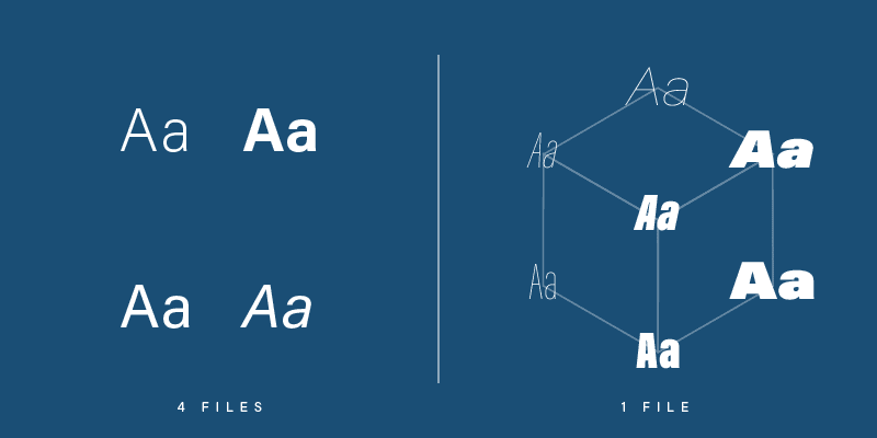
A variable font is one font file that has flexible properties, allowing it to function as multiple fonts. Typically a typeface is available in a limited number of styles, such as the varying weights of light, regular, medium and bold, and often corresponding italics. Each style requires a separate font file. With a variable font, all of these styles and potentially infinite other instances are available using a single file. And variable fonts don’t just vary in weight – they can vary on several different axes like width, optical size, italic, and slant.

Implications for web design

Until variable fonts became a possibility on the web, designers were forced to limit the number of fonts used in a design to decrease the amount of data that must be downloaded to display a page. Each additional font adds extra load time. Waiting too long for content to load hurts the experience of interacting with a website. Variable fonts have the potential to remove this limitation. A single font file can provide the typographic expression previously only possible by loading many fonts.

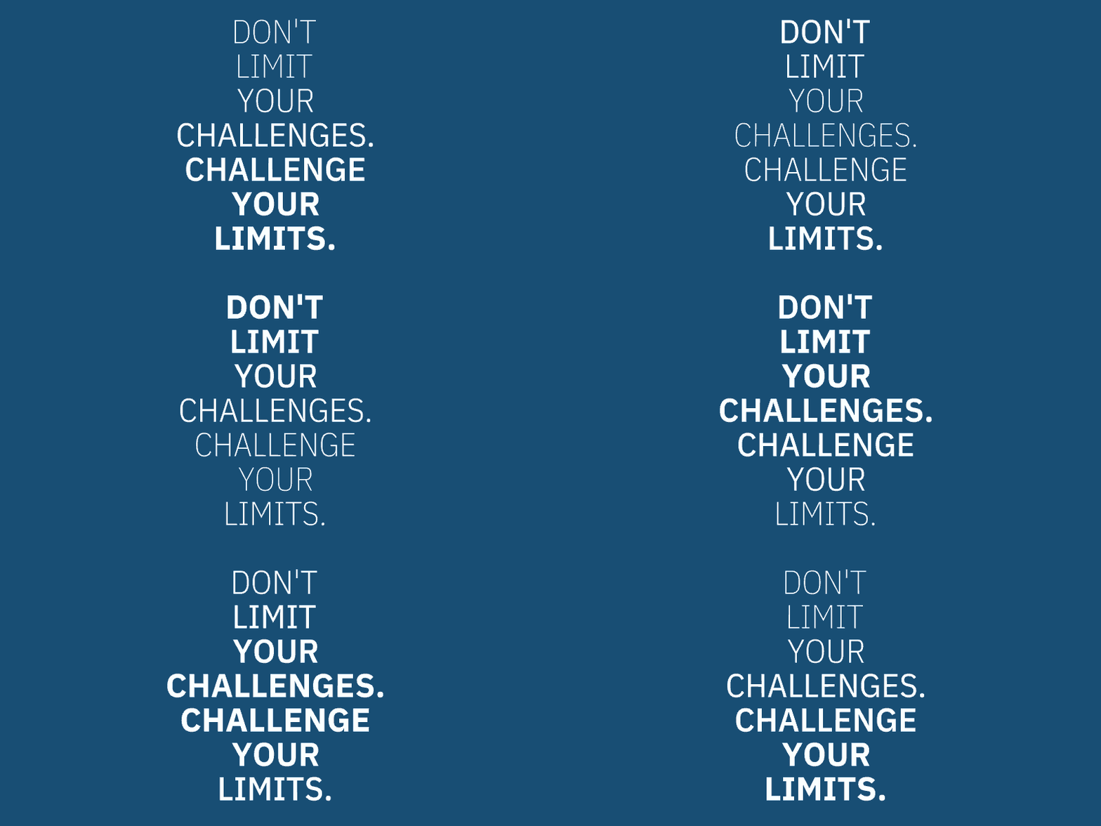
Challenge the limits with variable fonts


Variable fonts for greater expression

Beyond the technical applications, variable fonts could also serve expressive purposes. Type used in buttons and navigation could change as the user interacts. A button’s label could grow increasingly bold the closer the user’s cursor comes. Numeric labels in charts and graphs could vary in correlation with data. Combined with natural language processing, qualitative information could affect how a font is displayed – a font could morph to visually express negative or positive sentiments. Maybe a news site wants to help readers identify “good news” and “bad news” quickly – a variable font could allow headlines that indicate how “good” or “bad” a story is.

Your mileage with variable fonts may vary

Variable fonts for greater accessibility

And there are implications for accessibility on the web as well. Imagine responsive websites and apps that adjust font size, weight, and other properties to cater to the specific needs of users or even the environment they are in. Perhaps fonts that increase in size or width to improve legibility for older users who may have visual limitations like cataracts. Conversely, a font could become more condensed to allow for greater information density for those with better vision. Some have postulated that variable fonts could help those with dyslexia, allowing them to customize certain parts of letters that are difficult for them to read.


View this post on Instagram


Need to relax? Let these calming waves of letters wash over you. An animation experiment with variable fonts. ?

A post shared by Matt Jensen Marketing – MJM (@mattjensenmarketing) on

Thoughts on 36 Days of Type 2020

36 Days of Type is a global challenge to draw, illustrate, and letter the 26 letters and ten numerals in the Latin alphabet over (you guessed it) 36 days. Artists world-wide share their letterforms on social media using #36daysoftype, creating a massive catalogue of experimental type. Our design team once again chose to participate, you can view the full 36 days on our Instagram feed. Each character could be illustrated, animated, or otherwise constructed and each composition borrowed at least one color from the letter that came before it. The designers put together some post-mortem thoughts on the project:

Tim

This year I decided to continue to explore animation, specifically in After Effects. As a team, we decided to base the color palette for each day’s letter on one or two colors from the letter created the previous day. The goal was to unify the pieces somewhat, without giving ourselves too short a leash.

A project like this is fertile creative ground because it provides two potent ingredients for creativity: a clear objective and a time constraint. Creativity loves constraints. You can make whatever you want, but (helpfully) you don’t have unlimited time. And because you have to produce a letter every day you don’t have the luxury of becoming too precious about each piece. There’s a little bit of pressure because you know there’s an audience, but you’re also free to explore because the stakes are so low—no one cares what you make.

Joel

For 36 Days of Type this year, I dove into the world of the open-source 3D design program Blender to familiarize myself with the tool and create some distinct letter explorations. What I found was a powerful program with plenty of potential for future projects. I also discovered the unique and visceral fun that designing in a 3D space can create. Watching your work come to life with the click of a render button is just one of those things that will never get old.

Kirstie

During this year‘s 36 Days of Type, one of the most important skills I gained was not a new technique or software, it was adaptability. For reasons none of us need reminding of, this year’s project didn’t exactly go according to plan. Instead of meticulously planning out my letters, I found myself transforming an Rs into Ps on the fly and choosing ideas based on how quickly I could execute them in between Zoom calls. But, rather than being a roadblock, I found it surprisingly freeing. With the complete inability to be anywhere else, I was forced to live and create in the present moment and my work was better for it.

Brady

I love the 36 Days of Type creative prompt for the opportunity to experiment and try something new. I called in the Cavalry this year to help with my animated letters. Cavalry is a new 2D animation tool built around the concept of procedural systems. It relies less on key frames (though it is incredibly well-equipped in that regard) and more on routing values from one property into another to create effects. For example, using a sine wave function to control the vertical and horizontal position of a shape, or even random noise to change its size over time. It felt a little bit more like creative coding or generative art rather than illustration, which was a good stretch for my creative muscles. I didn’t expect to find so much joy in routing data from one property into another and waiting to see what happened, but the surprises and failures were both invigorating. And while it felt much like play and experimentation, I quickly found opportunities to use the tool for project work too, solving problems that would have required much more time and effort using other more familiar tools.

Alison

36 Days of Type is a favorite collaborative project. I love seeing what the other designers come up with, and especially what techniques, colors, and forms are appealing to everyone. When I’ve got a short time to illustrate a letter, I resort to some of my favorite tools in Illustrator: the pen tool, the zig zag effect, gradients, and the blend tool. Illustration is not a daily task for me, but it is something I enjoy. 36 Days of Type is a great excuse to get back to illustration process. From sketching to shape and color exploration, I’m grateful to have projects like these to explore the sandbox.

Check out the whole set:

Eye Charts in Popular Culture

Growing up, I saw more than my fair share of the optometrist’s office. My dad is an optometrist, so my brothers and I were plenty familiar with the exam rooms, the walls of stylish frames flanked by mirrors, and of course the phoropter.

But there is one piece of optometric design that I can’t claim to have seen more than anyone else: the visual acuity chart. You know, the one the eye doctor uses to check your vision, with the lines of increasingly smaller letters. It’s everywhere.

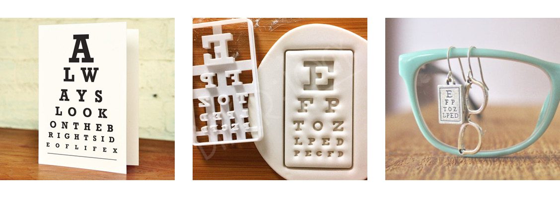
The eye chart is all over Etsy

On Etsy you can find eye chart greeting cards, cookie cutters, and charm earrings to name but a few. Do a quick search for “eye chart” and you’ll see what we mean.

It famously featured in a scene from the 2001 film America’s Sweethearts in which the visual acuity chart spells out “I-L-O-V-E-Y-O-U.”


"Read from the top line, Sasha."

“Read from the top line, Sasha.”


The chart imposes some fairly strict creative limitations but offers a format that is instantly recognizable to the general public. Much like a Venn diagram, it is a playground for creativity. And a breeding ground for visual puns.


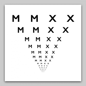
The year MMXX


If you’re curious about some of the history of the eye chart, we’ve got you covered.

I’m pretty sure my dad had a necktie with those big black block letters printed on it. In Dad’s defense, it was the 90’s, they put anything and everything on neckties. Hindsight is 2020.

Brand vs Brand Identity: Is There a Difference?

A brand is not a logo.

Nor is it just a combination of logo, typeface, and color. And it’s not just the products and services the company offers. It’s a bit more. It might seem like a silly distinction to draw, but we believe it’s an important one to recognize.

So, let’s set some quick definitions.

Brand identity is the tangible, visual component of a company (name, logo, communications, how the collateral looks and feels). And then there are touchpoints. Touchpoints are moments in time where people interact with a product or service. Touchpoints and identity are the parts we can see, touch, feel, and interact with. Every product or service ties together multiple touchpoints into what some might call a journey.

Does the sum of all this equal a brand?

Not quite.

It’s like a relationship.

The brand itself is more of an intangible thing – the gut feeling (as Marty Neumeier describes it in his book The Brand Gap) about the company that its customers have. Brands are an abstraction that exist in the minds of those who interact with them. The brand itself is not created by a company alone – it is also created by the people who interact with the company’s offering. Their gut feelings, memories, or experience will be anchored or attached to the brand identity. The visual identity becomes a symbol to hold all of that meaning. When they see the logo for the company or hear its name, they quickly recall those positive or negative feelings. Ideally that identity feels authentic and an appropriate fit for the associations it takes on.

In that sense, a brand is like a relationship between two people. The relationship isn’t a physical thing you can drop on your foot, but it’s very real and represents an emotional connection you have with another person. Over the course of time, that relationship takes on meaning through shared experiences, future expectations, and how we choose to talk about it.

What does this all mean?

You can’t create a great brand just by having a clever name or creating a cool logo. Just like you can’t develop a strong friendship by only looking like an interesting person. Branding as a discipline is more than slapping a coat of glossy paint on at the end. It takes time and intention.

You can’t create a great brand just by having a clever name or a cool logo, any more than you can develop a strong friendship just by looking like an interesting person.

Creating a visually stunning brand identity can do more harm than good. If the company is not operationally sound and is creating a negative experience for its customers a strong identity will serve as a lightning rod for negativity and brand terrorism.

A strong brand identity will make it easier to identify the good and the bad alike. Before you invest in a new identity, make sure that the experience you offer customers is a quality one. And then craft an identity that will help solidify the connection between hard-earned good experiences and your company.

The Shape of Our New Business Cards

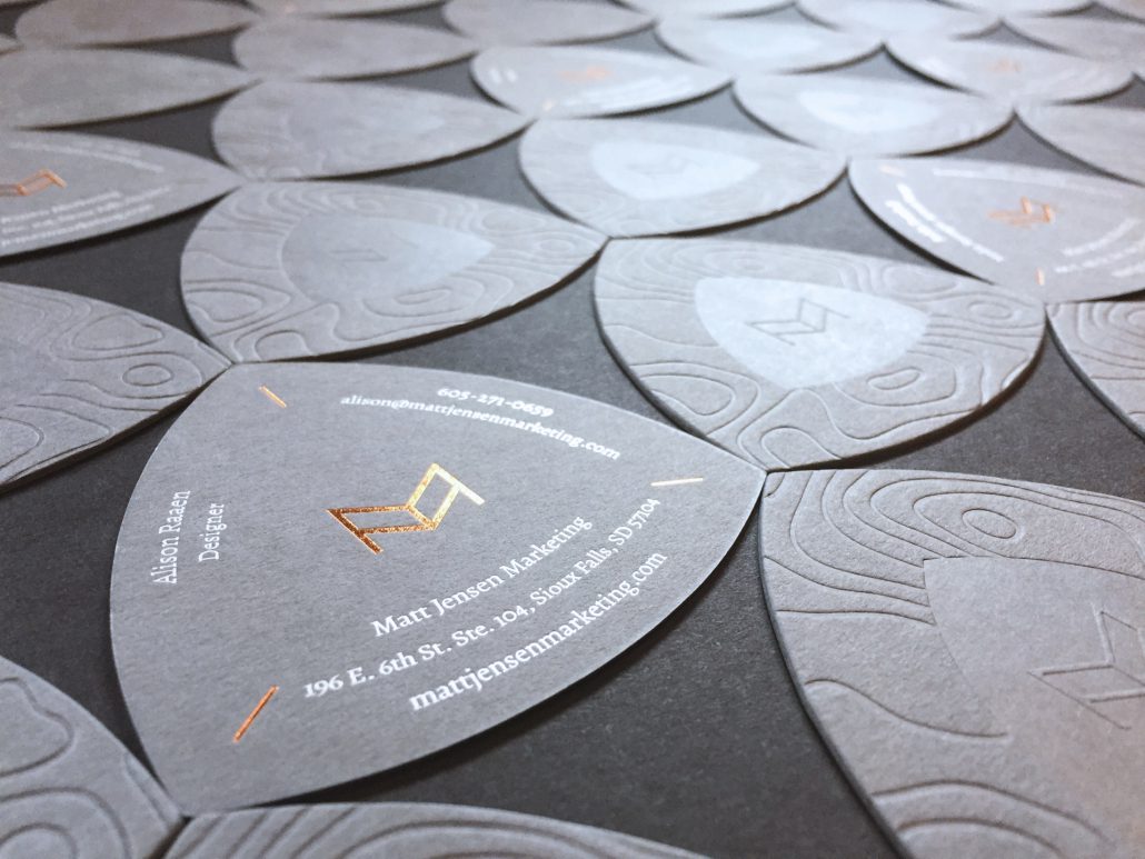
When we set out to redesign our business cards, we knew we didn’t want to go the standard route – we wanted something that would help tell our story. We had already been digging into the symbolism and imagery of wayfinding when we redesigned our logo. In that process we stumbled upon a fascinating shape called the reuleaux triangle – and it was perfect.

Reuleaux: /roo – LOH/

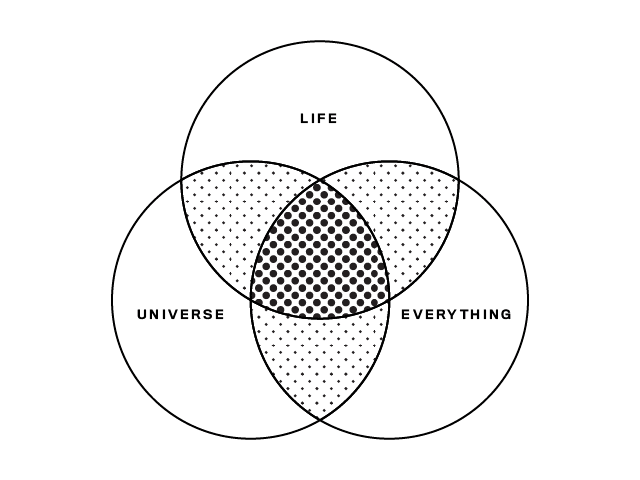
The reuleaux triangle has been used in many applications, from architecture to mathematics and map making. The overlapping section in the center of a three-set Venn diagram? That shape is the reuleaux triangle.

three-set venn diagram

Reuleaux triangles are geometrically beautiful shapes with surprising properties. They have been used as clever solutions to a variety of challenges in engineering and other fields. Its shape has a constant width – the diameter is the same no matter the orientation. It can rotate within a square while constantly touching all four sides, which allows for the creation of a drill bit that can create a square hole. How’s that for squaring the circle? Pencils in the shape of a reuleaux triangle have a couple of benefits: users often find them more comfortable to hold, and because they are not perfectly cylindrical, they are less likely to roll off tables and under your coworkers’ chair.

As creative guides for strategic journeys, the reuleaux triangle’s rich history in map making and trail signage is what ultimately captured our imagination. Leonardo da Vinci used the shape in an early map projection of the earth. It has been used in trail signage to help hikers find their way, such as along the Lewis and Clark National Trail. So it felt appropriate as the shape for our business cards, which help you find members of our team.

the cards tile into interesting patterns

We knew we wanted to feature topographic textures on the cards. But it couldn’t just be an image of topography – there needed to be some actual topography to our cards. They had to be tactile, where you could literally feel the terrain under your fingers. So of course we had them letterpressed! We are very pleased with the results.

Reflecting on Recent Experiences

It’s been said that to craft an excellent experience for your customers, you should think of a specific person and craft the experience with them in mind. The exercise helps identify the sort of things that solve pain points or create delight for real people. As a team, we often recount experiences we’ve had with brands that have been remarkable. The end of the year is a great time to reflect on those good experiences. And learn from them for the year ahead. Below, find a few reflections on experiences that provided value to our team this year.

Kirstie

Terra Shepherd

I have always loved fashion, but the actual experience of clothes shopping? Not so much. For the past 15 years, I’ve been shopping almost exclusively online for all of my clothes. But I decided to brave the IRL shopping experience when I heard about one of Downtown’s Sioux Falls’ latest boutiques: Terra Shepherd. Like me, they have a commitment to sustainable fashion and conscious consumerism, so I thought it was worth a shot. I was the only person in the store, which normally fills me with dread because of hovering salespeople, but the staff was so warm and welcoming and made me feel like I was just trying on clothes with friends. They suggested things I would like and, much to my surprise, I actually did like them! That combined with the shared values make this an experience I will be returning to.

Brady

Wirecutter

Before becoming a father of two young children, I had much more time to thoughtfully research gift ideas for family and friends. As those margins of time have vanished, I’ve appreciated the methodology that Wirecutter applies to their product reviews. And that they explain their process with each roundup of reviews. Christmas shopping this year would have been much more stressful and incomplete without referencing their Holiday Gift Guide. When I don’t have the time to do the level of research I typically would, it gives me greater confidence to give something as a gift knowing a little about the people who are reviewing the products and what makes them uniquely qualified to do so. And as it turns out, they are usually far more qualified to do the research than I!

Cindy

Amazon Prime Online Shopping

Like many working adults, my time is at a premium. I value being able to shop online from home and not have to get into my car, find a parking place, go into a store, make a selection and then wait in line to check out. However, I think there is a price to pay for this convenience.

I have to confess I do love going onto Amazon Prime, pressing a few buttons, and having an item shipped to me for free (yes, I did pay for the membership so it’s not really free). However, I am cautious about the future of big data, protection of personal information, and changes we can anticipate as a direct result of limited competition. Is it too good to be true?

Courtney

Earthscapes Landscaping

My husband and I decided this would be the year we invested into landscaping for our backyard. We received Earthscapes name as a recommendation from another friend that had used them, and after our awesome experience, I can see why. Shane, our landscape designer, was awesome from the start and put up with all of my questions along the way.

But the one point in the process that really stood out was when we were nearing completion of our project. We had an existing retaining wall, that wasn’t a part of the project scope (other than making small repairs to the existing wall), but it didn’t look amazing. One morning, he called and told me they had some left over materials from the rest of the project and he would like to put those towards replacing the existing wall. He felt it would enhance the look of the backyard, and while it might be a few more hours of labor, it would be something they would like to do for us within our current scope. Of course I said “Heck yeah!” and now we have an even more amazing backyard and I am willing to tell all my family, friends, and co-workers about this awesome company. Such a small gesture made a huge impact on the experience we had with Earthscapes and now I can’t stop bragging about them and their work!