In the United States, nonprofit marketing can be a mercilessly competitive arena. Based on some estimates, there are up to 3,000 charitable organizations started every day, many of which don’t succeed beyond a couple of years. Donor solicitation is ubiquitous, whether in person, direct mail, telemarketing, or through a bevy of digital mediums. “Giving Units” are bombarded with blanket and targeted asks, and that’s on top of the 10,000+ ad exposures they receive daily from for-profit companies.
The Tendency To Say Too Much
In the midst of such fierce competition and noise, it’s easy to see why many non-profits respond by trying to say more. We have a tendency to equate “more” with “louder” and “louder” with “effective.” As a result, we create vision statements that resemble small novels and mission statements that do everything. We share overwhelming statistics of great need and match them with equally abstract numbers about our response. We try to tell all of our stories in all of their deserved nuance. We think the donor wants to hear everything about organizations that do everything.
We have a tendency to equate “louder” with “effective.”
The Need for Clarity
What we don’t realize is that, in a jumbled field full of noise, donors only want to hear one thing — clarity.
They want the clarity of a simple vision that can inspire.
They want the clarity of a focused mission they can easily remember.
They want the clarity of a simple story that embodies the emotion of the recipients and volunteers alike and demonstrates the tangible impact of your work.
A wise client of ours once told me that simplicity is always on the other side of complexity. We start with the complex story we want to tell and then winnow until we can’t say it any more simply and clearly. In a country where 1.5 million non-profits are competing for your donors, the clear message will always stand out.
https://mattjensenmarketing.com/wp-content/uploads/2016/07/less-is-more-1.jpg5671000Justin Mootzhttps://mattjensenmarketing.com/wp-content/uploads/2019/09/mjm-logo-nav.pngJustin Mootz2016-07-01 08:15:492021-06-02 13:58:36The One Thing Donors Want to Hear About Your Nonprofit
There are two general approaches to how people and brands use social media channels. The first is to broadcast, trying to get as wide a distribution as possible for each piece of content. This is the way people approach traditional media like print, radio, and television.
The second approach to social media is relational—using social channels to know and be known. In the past this type of interaction only happened face-to-face, or in letters and phone calls. The people and brands that understand social media best realize that social media is a new animal—a hybrid of traditional broadcast media and personal relationships.
“Social media is a new animal—a hybrid of traditional broadcast media and personal relationships.”
Broadcasting on All Frequencies
Most people use two or three different social media platforms. Some people connect to each other and brands on only one social media channel. But most users connect to the same people on multiple platforms, which can lead to a lot of redundant content. If a brand shares identical content on each channel, they miss an opportunity to add value to their audience. There are times when it makes sense to repeat the same message on every social channel—an event cancellation, for example. More often though, your audience will be better served if you create content that is unique to each channel.
Let Your Audience Choose the Channel
I appreciate it when people I follow create focused, curated streams of content. I like to see what other designers post about design, but I’m not interested in family photos or inside jokes with people I don’t know. The opposite is also true—there are some friends I follow because I want to see their family photos and hear their jokes, but only have a passing interest in their particular industry. If I have the option, I subscribe only to the channels that interest me the most. The same is true for brands.
At one point, United Airlines gave a lot of thought to how they structured their social media channels. Each platform had a clear purpose. Because United used each platform in a unique way, they created a focused stream of content in each channel. People can ignore channels they aren’t interested in and subscribe only to the content they want.
Facebook: to send out updates, and to promote deals and contests
YouTube: a behind-the-scenes view
Twitter: specific, targeted travel questions
Instagram: to share travel photos
LinkedIn: to talk about new products and services, and career opportunities
Each social channel reinforces the brand and offers something unique. United customers can subscribe to the channels that are relevant to them, which means they’re more likely to find value in the content they receive. (Thanks to Matt Bailey of Site Logic for showing me this graphic some time ago.) The benefit for United is that they are able to offer content that is valuable to their audience and connect better with the people they are serving.
Saturation vs. Service
The mistake that many brands make is that they blast out the same messages on all their social media channels. That assumes that 1) all the channels are the same and interchangeable, and 2) that the people who are in those different social communities are looking for the same types of content in each channel.
In my experience neither one is true. I look on Instagram for beautiful and interesting images, and I don’t expect those images or the communication around them to be time-sensitive. On the other hand the element of time is very important to users of Twitter. Tweets are lightweight and easy to create in a moment, which is why Twitter is many people’s source for up-to-the-minute updates. (Oreo “won the marketing Super Bowl” in 2014 by creating and sending a tweet within minutes of a power outage during the game.) Use each social media channel the way your audience is using it and don’t try to shoehorn in content that doesn’t fit the channel.
If you’re a company or a brand, you should realize that you are a guest at the party—an overwhelming majority of people say they want to use social media to connect with friends and family. Don’t try to saturate your audience with your content. Instead think about how to create channels of content so your audience can find content that’s relevant, interesting, and helpful to them.
https://mattjensenmarketing.com/wp-content/uploads/2016/05/social-channels-robot.png5671000Tim Murrayhttps://mattjensenmarketing.com/wp-content/uploads/2019/09/mjm-logo-nav.pngTim Murray2016-05-13 11:58:492021-06-02 13:58:36The Value of Creating Distinct Social Media Channels
The American Marketing Association (AMA) defines a brand as a “name, term, sign, symbol or design, or a combination of them intended to identify the goods and services of one seller or group of sellers and to differentiate them from those of other sellers.”
Branding in a Medical Context
How does this relate to a medical practice? Our patients today have access to more information than ever before to help them make a decision as to whom they choose for their medical procedure. There are markets and target audiences for everything but it’s your job as a medical practitioner to be crystal clear about the image for which you’re aiming and how that influences everything from services performed to pricing to patient experience.
Maria Ross, in Develop Your Brand Voice, Three Keys to Killer Messaging says, “The goal of the brand-building game is to get prospects to know, like and trust you so that when the need for your product or service arises – when they are most ready to buy – they think of you first.”
According to Laura Lake in What is Branding and How Important is it to Your Marketing Strategy?, the objectives that a good brand will achieve include:
Delivers the message clearly
Confirms your credibility
Connects your target prospects emotionally
Motivates the buyer
Concretes user loyalty
To succeed in branding you must understand the needs and wants of your customers and prospects. You do this by integrating your brand strategies through your company at every point of public contact.
Your brand resides within the hearts and minds of customers, clients and prospects. It is the sum total of their experiences and perceptions.
Branding and Social Media
How does social identity affect your brand? A patient’s first encounter with a physician is often through its online presence. 90% of 18 to 24 year olds surveyed said they would trust medical information shared by others on social media networks. 41% of patients said that social media would affect their choice of a specific doctor, hospital or medical facility. 60% of doctors say social media improves quality of care that patients receive. Providers should take advantage of the trust consumers have for them over other health companies.
Creating and establishing a brand takes time and effort. Maria Ross offers:
“Brand is a three-legged stool: It is conveyed visually, verbally and experientially. Visually is the easy part: your logo, your colors, your design, your packaging. Verbally is how you talk, what you say, and which messages you convey. For example, do you lead with price, or do you lead with value? Does your company speak in conservative, authoritarian tones, or are you more playful and whimsical in your copy? Ideally, your visual and verbal promises should align and lead to where the rubber hits the road: experience. In other words, once you’ve promised me the potential customer or client, something verbally and visually, does the experience match that promise?”
A Consistent Brand Builds Trust
Einstein once said, “If you can’t explain it to a six-year-old, you don’t understand it yourself.” Look to what you do know about the very essence of your practice and emulate that in a simple statement that can guide your brand in every aspect of your business. Be consistent and use that brand to define the visual image, verbal communication and the patient experience in all encounters.
If you fall short in maintaining the customer promise of your brand at any stage, the relationship and implied trust will be at risk. Instead, create the best possible experience for your patients and establish a long-lasting brand that will work for you.
https://mattjensenmarketing.com/wp-content/uploads/2016/04/brand-defined.png5671000Cindy Haskellhttps://mattjensenmarketing.com/wp-content/uploads/2019/09/mjm-logo-nav.pngCindy Haskell2016-04-17 12:37:572021-06-02 13:58:36The Importance of Branding in the Medical Practice
Imagine setting up a machine at your front door to shake hands with everyone who comes to visit. (This would actually be a great gimmick for the first person to do with it, but bear with the analogy for now.) This marvelous handshake machine greets your guests automatically as soon as they walk in. The machine shows your clients and friends that you’re great at automation and savvy about gizmos, but it doesn’t create much of a connection. Automating social media interactions can have the same effect — they feel inauthentic and forced, and can actually alienate your audience.
The Impersonal Autofollow
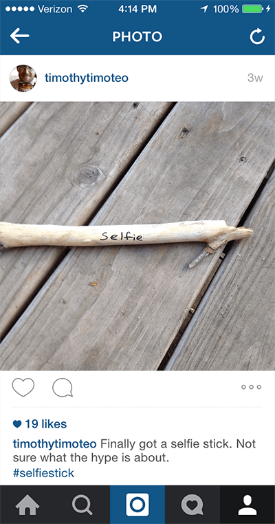
Consider these two automated “social” interactions: some time ago I mentioned Typegenius in a tweet. Typegenius is a website that suggests font pairings — Brandon Grotesque goes well with Petrona or Merriweather, or Lato would look really sharp with Roboto Slab. In the tweet, I compared them to a “sommelier” who suggests wine pairings. Within minutes, I was followed by a wine distributor — their automated follow mechanism obviously didn’t understand the simile. (They have since unfollowed me, probably automatically. I do see the irony in referencing an automated font pairing resource in this context.)
In a similar way, I posted this to Instagram a while ago, and got a “Like” by a selfie stick manufacturer who also later unliked (disliked?) it. Neither of those tone-deaf interactions is much of a problem for those brands, especially since I’m probably not their target market. But it does point to the inherent problem with automating your “social” interactions — you’re not actually being social. Instead of building a relationship, you’re highlighting the fact that your “relationship-building” is inauthentic.
Autoposting Across Channels
Automatically reposting can be done well, if you’re intentional about creating something of value for your audience. A clumsy autopost from one social channel to another tells your audience in the second channel that their platform of choice is second tier to you. You risk alienating or annoying them, especially if the posts from the first channel don’t repost well. Don’t post a link on Twitter to your post on Facebook, for example. “I just posted this” followed by a link isn’t very compelling. Instead give careful thought to how you use different social channels for different audiences.
Antisocial vs. Social Media
There’s a case to be made for letting an algorithm take care of the mundane tasks in your online life, but go too far in that direction and you’ll miss out on a chance to connect to the people on the other side. Social media gives individuals and brands an opportunity to connect to a wide variety of people in a meaningful way. This opportunity is unprecedented in history and creates unique possibilities to engage with people who you would otherwise never meet.
Harvesting “likes” or getting a high follower count isn’t a great end goal. Don’t waste those possible connections by having your algorithms and autofollower do all the work. “Automated personal interactions” is an oxymoron, and a wasted opportunity.
Many of us have heard the term “SEO” but aren’t sure what it means. We only know, this is important to our company and we need more of it. The acronym SEO stands for search engine optimization. Rather than having “more” SEO, we actually want to improve SEO. Improving our SEO means our company is more easily found in web searches and that we have a good reputation with search engines, making them more willing to help us show up near the top of search results. Here are some simple ways to improve your overall SEO. While it is best to do all of them, even doing one of the following can help improve your rank.
1. Create consistency between reviews and listing sites
To improve your reputation with search engines, it is important that you have consistency between sites. An easy acronym to help you remember what to look for is NAP which stands for Name Address Phone number. The first step to creating consistency is to make a list of any website your business is listed on. This can include Google Plus, Yelp, Facebook, and more. Once you have the list created, visit each site and make note of how your name, address, and phone appear. After you have collected this information, you will be able to see which listings are incorrect and need to be changed. Update those listings and voila, you are on the road to improving your SEO.
2. Increase inbound links
An important component to improve SEO is creating a system of links. Basically, whenever another business posts your URL on their website, search engines see you as more credible. Within your social and business networks, it is easy to mutually improve your search engine optimization by linking to your business partners and asking them to link back to you.
3. Improve keyword density
Keyword density is important for helping search engines understand the topic of your website and its pages. There are many ways to improve the keyword density of your site but all of these methods start with the same thing. The initial step to improving keyword density is to simply identify what you want to talk about. If you run an eye clinic, it is important to talk about eyes. When creating web content, try to think what the end user might be searching for and that will help you decide what to focus on. It is important to identify which keywords should appear on which pages. Having those keywords appear multiple times on their respective pages will vastly improve your SEO.
4. Curate your social media presence
Similar to creating listing consistency like in number one, it is important that your social media presence is consistent as well. Make a list of all the social networks you use for your business and how you use them. Take a look at what content is performing well and try to identify why that content is performing well. Though each social network may serve different audiences, it is important that your brand is represented consistently to each audience. As you think about what to post on LinkedIn versus Facebook, consider what those audiences will be most interested in and the type of content that will be most relevant to them. It is important to find a happy medium between catering to your audience and having a consistent brand message.
5. Focus on content marketing to continually improve SEO
This is the most time consuming of the five tips but can also be the most valuable. Content marketing is a fancy way of saying, you need to constantly be creating blogs or other content for your website. Search engines will find your business more reputable if you are constantly posting current information than if you build your website and don’t touch it for two years. Blogs don’t have to be long and should focus on information your audience may find helpful. Remember to keep each blog keyword dense to focus on the topic at hand.
There you have it. Five simple steps that will jumpstart your SEO today. For more information about improving your company’s SEO and what Matt Jensen Marketing can do to help, contact us today.
https://mattjensenmarketing.com/wp-content/uploads/2016/03/grass-with-dew.png5671000Katie Hugheshttps://mattjensenmarketing.com/wp-content/uploads/2019/09/mjm-logo-nav.pngKatie Hughes2016-03-10 10:06:572021-06-02 13:58:365 Surprisingly Easy Ways to Improve SEO
What is a raster image? What other kind of image is there?
You might think that a picture is a picture but when it comes to using your images in print or on the web, there are some very important distinctions to be made. The most important of these distinctions is between vector images and raster images.
Vector images appear smooth and clean no matter what size they are displayed.
When a raster image is scaled up, you begin to see the individual blocks of color.
What are vector graphics?
A vector graphic isn’t an image so much as a mathematical recipe for building the image and doesn’t have any limitations in terms of size. Vector graphics are infinitely scalable–if you have your logo in a vector format, you can use that file for a business card or for a billboard and the image quality will be the same. (Common vector file types include .AI, .EPS, .PDF (sometimes) and .SVG files.
So what is a raster image?
Put simply, raster images are built out of blocks of color (pixels), and vector images are built out of a series of mathematical instructions. A raster image only contains enough information to display the image of a logo (or a cat, for most of the internet) at a certain size. If you display that raster image at a larger size than it was created to cover, it begins to appear as blocks of color rather than smooth shapes.
A raster image is built of small blocks of color. When scaled up those blocks are scaled as well and look pretty rough, especially on curves.
Pixels: Little blocks of color
Most images used by most people are raster images, and are pixel-based file types. The raster image file types that I use on a daily basis are GIF, TIF, PSD, RAW, JPG, and PNG. Each one was developed for a different reason and each file type has it’s own hidden superpower. (Some were developed in an unsuccessful attempt replace the others.)
GIF
The Graphics Interchange Format, or GIF, was one of the earliest image formats but is still a mainstay of the visual internet. Of all the schisms in the design world, the divide over the pronunciation of this file type is possibly the most bitter. This might be the best answer.) Limited to 256 colors, the GIF can’t display images in a way that takes advantage of the full range of most modern screens. That limitation, along with a patent issue, was one of the main reasons for the development of the PNG format. Unlike the other image file types listed here, GIFs can be strung together into short video animations. Animated or still, the humble GIF remains one of the most common image types on the internet. Avoid using GIFs in print, though–especially the animated ones. That’s just not going to work.
Superpower: Movement. GIFs can be animated, creating compelling or inane little repeating videos.
TIF
Tagged Image File Format is a less common image type, but it’s a powerful tool in the toolbox. The TIF is a “lossless” file format, meaning that no image information is lost when saving. TIF images can also be layered like a PSD, and can contain vector clipping masks making them an ideal format for high resolution print production. The downside of all that uncompressed information is that TIFs are often massive files, and can’t be read by many devices and users.
Superpower: Memory. The TIF is a high resolution, lossless image format. Also layers!
JPG
The JPG (or sometimes JPEG) is named after the Joint Photographic Experts Group who created it and is one of the workhorse image types in use today. It’s the default image type created by digital cameras and is used widely both in print and online. The JPG is capable of rendering images in a “Lossy compression”, and this compression is both its strength and its biggest weakness. (Let’s all reflect for a moment on this metaphor for the dual nature of our own strengths and weaknesses. Done? Great–on we go.) These images show both the advantages and downsides of the JPG compression:
This image (with the same pixel dimensions) when compressed from 5.6 megabyte (on the left) is 900kb (center) and 185kb (right). In the context of a complicated image, especially in high contrast images, the compression artifacts are not as apparent, and the savings in terms of file size might be worth the quality loss in some situations.
If this image were going to be used at larger scales, the artifacts would be distracting.The JPG compression algorithm is especially harsh in areas that should be smooth gradients and subtle variations in color.
Even in a simple gradient the way that the compression algorithm averages areas of color creates banding at first and then large unsightly blocks of color at the extreme end.
Superpower: Adaptability. Variable compression and a jack of all trades. When in doubt, use a JPG–they’re versatile and can be viewed by most users on most devices.
PNG
Portable Network Graphics, or PNGs, Transparent, more common on the web. The first image here is a JPG, 600px x 300px at 150ppi (pixels per inch), and there’s nothing wrong with the image, especially if you like white boxes around your logos. The second image is a PNG, also 600px x 300px at 150ppi.
Both the images are the same size and present colors and gradients equally well, but the PNG file type supports a transparent background. No unsightly white boxes, thank you.
Superpower: Invisibility. PNGs can have transparent backgrounds.
RAW
The RAW format is not as common for most casual image users, but it’s a go-to file format for serious photographers. Digital cameras are essentially little computers equipped with a lens and a sensor. The lens can gather infinite amounts of information, and the sensor receives and allows the processor to record some fixed amount of that information. Even in a simple image, there is a vast amount of information available—the amount of light, the tone and color of the light, the degree of detail present, etc. When those images are recorded as JPGs, the default for most cameras, the majority of the visual information the lens and the sensor gather are discarded. This creates a manageable file size and still produces a decent image.
The advantage that the RAW format has is that it records and retains a much larger range of that original image. The photographer can then access that original information later when they are processing the photo. If the captured image was too dark, or if the white balance was off, they can adjust those settings almost as if they were retaking the photo.
Superpower: Time travel, basically. RAW files contain scads of information from the moment the photo was taken, allowing photographers to go back and “retake” the photo using different settings.
PSD
The Photoshop Document, the mighty PSD, is the godfather of all other image types. You begin by defining the resolution and the size of your document in pixels, but there the line between vector and raster image begin to blur a bit. Adobe Photoshop, and therefore the PSD format, has gotten more and more complex–recent iterations of the program handle vector graphics (as “Smart Shapes”). Users can compose and create just about any image they can dream up. Users can edit a PSD in layers (and layers and layers and layers) so it’s easy to go back and edit and compose with separate elements and effects. They can also have transparent backgrounds.
Photoshop documents are only accessible to users who have, well, Adobe Photoshop, but once the composition is made those images can be exported as any of the other image file types. There’s a good chance that many images in circulation have spent time as a PSD at some point in their story. For designers, the PSD’s capabilities make it the ideal vehicle for most image art assets.
Superpower: Composition. PSDs contain layers.
PSB
The Photoshop Document we just talked about is pretty amazing, but it does have its limitations. One of those limitations has to do with the image’s size. A PSD can only be a maximum of 2 gigabytes, which is usually plenty of digital elbow room for most projects. There are times when you have to go beyond that, especially in large format and grand format printing, and for that you’ll have to convert your PSD to a Large Document Format, or PSB. (PSB may actually stand for “Photoshop Big”, which sounds ridiculous, but is accurate enough.)
Superpower: Giant. PSBs can be massive, supporting images up to 300,000 pixels in any direction.
For more information on these image types, and to read about the more esoteric formats check out Adobe’s file format guide.
So what about vector image file types?
I’m working on an equally nerdy article about vector file types, which talks about the difference between them and which formats are best for which situations. (Why I often use .EPS files instead of .AI in my normal Illustrator workflow, for example, and how the .PSD blurs the lines between vector and raster images.)
https://mattjensenmarketing.com/wp-content/uploads/2015/10/Screen-Shot-2015-10-27-at-10.50.34-AM.jpg5671000Tim Murrayhttps://mattjensenmarketing.com/wp-content/uploads/2019/09/mjm-logo-nav.pngTim Murray2015-10-29 12:24:572021-06-02 14:17:47What Are All These Image File Types my Marketing Team Talks About?
Laser vision correction is transformative. A patient can enter your office one day with a visual acuity of 20/400 and return the following day 20/15.
That is no small feat. Years of research and development, FDA approvals, and just plain hard work have made LASIK one of the safest and most effective surgeries in the world. That is a big deal. LASIK is not the only option for correction; if a person is not a candidate for LASIK, there are implant procedures as well as flapless techniques. The capabilities that accompany using advanced technology are truly awesome, and no other field of medicine can boast similar effectiveness and safety.
When it comes to LASIK surgery and millennials, however, it is important to remember two things beyond other more philosophical generalizations about what they want, how they work, and how they will contribute to society. First, millennials are going to be alive for a long time, and they have their entire adult lives in front of them. Second, as specialists in refractive and implant vision correction, you can help them see and, ultimately, experience life as it happens. In short, LASIK is an experiential offering.
LASIK will not change a person’s lifestyle, and it will not change who he or she is as a person; it will, however, transform how he or she sees the world or observe the detail on a butterfly’s wings. Your practice has the technology and the experience to make it happen. How can you invite millennials to learn more about LASIK and, perhaps, schedule appointments for LASIK consultations?
Reaching Millennials
Millennials use a whole cohort of social media tools to learn about news, catch up with friends, and view videos, television shows, or stream music. They are digital natives, after all, having grown up with the boom of the Internet and all the gadgets that have popped up since. If they are watching a show on television, it is likely that they are simultaneously interacting with another device such as a phone or tablet. If their phone is not in their pocket, it is likely nearby.
What does this mean for your practice? It means that you need to have a mobile marketing plan and you need to be mindful of how your website looks from a phone. Your website needs to have a responsive design that will accommodate viewing on devices with varying screen sizes. Google has announced that responsive websites will rank higher in searches than websites that are not, and that makes responsiveness even more important for your practice. Do you want to rank highly in Google searches for LASIK? Your practice’s website needs to be responsive.
In addition to the responsive site, your practice needs to be mindful of how your social presence looks for mobile users and consider if you are sharing content that is easily accessible from a mobile device. Is your practice’s Facebook profile image easily read from a mobile device? Are you making sure that the links your page shares are easily read from a mobile device? What is your social strategy? These are important questions.
Along with the increasing use of new devices, faster Internet speeds, and more intuitive website designs have come more helpful ways to measure how many visitors your website attracts on a daily basis and how they interact with different pages of your website. Using Google Analytics, for instance, we can see that the Vance Thompson Vision website attracts several hundred unique visitors every day and that those visitors most often move from the website’s homepage to biographical pages about our doctors. From the doctors’ pages, we can see that they then might jump to pages about LASIK, cataract surgery, or glaucoma treatment. Knowing how people use our website informs our team how they can improve it.
At a Glance
When it comes to LASIK surgery and millennials, remember that millennials are going to be alive for a long time and they their entire adult lives in front of them.
As a refractive and implant vision correction specialist, you can help them see and, ultimately, experience life as it happens. LASIK is experiential!
Millennials care about costs, positive referrals, brand reputation, and the experience. Most importantly, they trust their friends.
Millennials want to be remarkable, and they want to spend their money on experiences worth talking about, worth sharing with friends, and worth sharing with their families.
Brand Loyalty and Millennials
A recent survey conducted to learn more about millennials, media consumption, and brand loyalty, found that “60% of Millennials said that social advertising has the most influence over them in how they perceive a brand and a brand’s value. This compares with TV at 70%. Traditional media outside of TV fell flat.”1
When a friend sent this survey to me via email recently, I knew it was significant. Although billboards and newspaper ads may still be relevant to our mature customers, for whom traditional media has always been significant, there is no question that the eyes of most millennials are on smaller screens.
Even on our practice’s Facebook page, we have consistently seen that more users interact with our page from a mobile device. In a Facebook ad campaign for our practice, with equal emphasis on serving ads to desktop and mobile users, 95% of the people interacting with our ad did so from a mobile device. The number of people served our ad on a mobile device was more than 10 times the number of people served ads on a desktop.
Importance of Digital Referrals
Just because our practice is active on Facebook does not mean what we post holds a higher value than word-of-mouth posts. The same study referenced previously found, “Fifty-five percent of young shoppers said that a recommendation from a friend is one of the strongest influencers in getting them to try a new brand. Forty-seven percent consider brand reputation to be almost as important. Product quality ranks fourth at 35%, while price has the most sway at 62%.”
In another recent study, milennials showed that their generation favors exciting, firsthand experiences in lieu of money and careers: “Seventy-eight percent of Millennials would rather spend money on a desirable experience than buy coveted goods.”2 When asked where they plan to spend their money in the next year, millennials overwhelmingly respond with events and experiences in lieu of physical items (Figure).
We can learn a lot from these findings:
Millennials care about costs.
Millennials care about positive referrals.
Millennials care about brand reputation.
Millennials want an experience.
Most importantly, millennials trust their friends.
Creating Remarkable Experiences
By any estimate, these are not groundbreaking findings; we have known for a long time that referrals are gold and that money is important to our customers.
Millennials want to be remarkable, and they want to spend their money on experiences worth talking about, worth sharing with friends, worth sharing with their families. In our practices, we need to be diligent about how we stage our customer experiences so that a laser vision correction experience is remarkable—not just in the actual transformation of the patient’s vision but also how the experience is designed and how it is possible for it to be captured.
When millennials call your office, do they have to listen to a recording and press buttons, or are they immediately in touch with a person from your office who can answer questions and schedule appointments? When millennials arrive for their consultation, are they welcomed like honored guests? Can they sit in a private area? Are there customizable beverage options? Do you offer public WiFi? When a millennial is going through the appointment, do your doctors and staff take the time to answer every question and address the risks involved with treatment? How do you educate millennials on the variety of options available for vision correction?
Create opportunities for patients to capture their experiences. If a patient expresses excitement about his or her eyes or about watching the surgery, make sure he or she has the opportunity to have a photo taken with the surgeon along with a video of the procedure. During a consultation, show and explain the topographical images of the patient’s eye, so patients can see what your instruments capture and see their eyes from a new perspective.
Keep in mind the friends and family members who accompany your patients. What do they see and hear during their experiences in your office? In our office, we have specially designed observation rooms that overlook our laser suites. One of our staff will narrate the procedure so that everyone watching can know what is happening. Ultimately, you should craft your patients’ experiences for all involved parties.
Conclusion
Although patients’ experiences should be important for all visitors to your office, the lean toward experiential spending will likely increase as more Millennials start families, relocate for jobs, and work toward making their lives remarkable.
https://mattjensenmarketing.com/wp-content/uploads/2015/08/glasses-and-phone.jpg5671000Matt Jensenhttps://mattjensenmarketing.com/wp-content/uploads/2019/09/mjm-logo-nav.pngMatt Jensen2015-08-11 12:43:512021-06-02 13:58:36Millennials and the LASIK Experience
–What can I get for you, sir?
–Well, I’m hungry but I’m not sure what I want.
–Do you want me to give you more time with the menu?
–No, why don’t you just make some things and bring ’em out. I think I’ll know what I want when I see it.
–Oh. Um…are you thinking something light, like an appetizer? Or dessert? Dinner?
–I’m not sure–let’s just get the process started and I’ll let you know as we go.
That sort of exchange in a restaurant would probably end abruptly and you would leave hungry. Why should you approach a conversation with your creative team in the same way? Before the designers start their work, make sure everyone on both sides of the table has a clear idea of what they’re going to be working on. One way to do that is to take some time before diving into the project to develop a design brief.
What to include in your design brief
There are a lot of ways to approach it, but here are some things to consider when developing a good design brief:
Purpose
Before you answer any other questions, you should know why you’re even talking with a designer. What do you want this proposed project to accomplish? How will you know if it’s working?
Target Audience
Who is going to be reading or viewing this piece? How is the audience going to receive this piece? Will it be something to give to them in a face-to-face meeting? Or is it sent through the mail? Through social media?
Context
Nothing is produced in a vacuum.What other materials will accompany this piece? Unless you’re considering a complete rebrand, your current project is going to be used alongside your existing materials. If you are rebranding, your rebrand is going to be layered on top of the perceptions your audience currently has. Both clients and the designers should work to understand the context around the new project.
Style and Tone
What should this piece feel like? Is it informal and friendly like a warm cup of coffee? That might lead your designer towards a more casual look, perhaps with hand-drawn elements and organic textures. Should this piece feel formal and precise like a luxury car? Your designer might create a piece with a sleek gloss finish, crisp lines and dark colors. In this conversation, identifying what you don’t want is as helpful as what you do want. It’s also extremely helpful if you can provide your designer with examples of other materials you’ve seen that have the style and tone that you’re going for.
Color
It’s always helpful to have very specific color information about your brand. There is an infinite variety of shades of blue, for example–if the blue on this new piece is going to match the rest of your materials, your designer will need to know the exact color information for your brand–hex codes for web projects, and Pantone colors or specific CMYK values for print.
Content
What is this piece going to say? It’s especially important to define 1) who is going to be developing the content and 2) how much content there’s going to be. A 3-page Word document won’t fit on a business card, and shouldn’t fit on a billboard. The content should be finalized before the project moves to layout, to save on design time and costs.
Production Specifications: Size and Quantity
It may seem like the most boring aspect of the brief, but both the designer and the client need to have a clear understanding of what size the final deliverable should be. Be precise, down to the exact pixel dimensions or the exact trim size. Even small changes to the dimensions after the project has gone to layout can result in a lot of extra design hours. If you’re creating a physical piece, make sure that you talk early in the process about how many you’d like to produce–your designer may be able to lower your print costs if they know your quantities from the beginning.
Timeline and Milestones
You should both agree on when each phase of the project should be done (initial concepts, first drafts, revisions, etc.) as well as when the final materials should be delivered.
A good design brief means good expectations
One advantage of taking the time to create a design brief is that everyone’s expectations will come out in the process. Expectations are funny–you only realize that you have expectations when they haven’t been met. It’s invaluable to have a document that you can both refer back to as you develop the project. That common reference point will make future conversations about the project more productive.
You only realize that you have expectations when they haven’t been met.
Developing the design brief may mean a slower start initially, but it’s worth the time. The process will go smoother, with less wasted time and frustration on all sides. You’ll save time and money by communicating clearly from the beginning.
https://mattjensenmarketing.com/wp-content/uploads/2014/12/design-brief-1024x581.png5811024Tim Murrayhttps://mattjensenmarketing.com/wp-content/uploads/2019/09/mjm-logo-nav.pngTim Murray2014-12-10 10:59:372021-06-02 13:58:37Why You Need a Good Design Brief
When people in college told me they were studying marketing, they might as well have told me they studying to make fur hats out of kittens. I thought it was universally acknowledged that marketers were in the same camp as payday loan peddlers, Ponzi schemers and email spammers. I remember wondering if you had to sell your soul in the second or third year, or if that was more of a capstone, a Faustian final project in exchange for your diploma.
Marketing as a zero-sum game
“Marketing” doesn’t have to be dirty business where one side manipulates the other into acting a certain way. What I was reacting against at the time, and I what I still reject, is the kind of marketing that appeals to the lowest desires in a person and causes them to act in a way that is not actually in their best interest. Marketing that flatters, belittles or bullies its audience into a response that only serves the organization’s interest is mere manipulation and a waste of creative energy.
Marketing, and marketers, should not:
Create a false ”need“
Appeal to the worst in people (our vanity, our pride, our hatred)
Prey on people’s vulnerabilities (our insecurities, our fear, our ignorance)
I’m not interested in spending my time to do any of those things. Marketing or advertising that pits itself against the audience creates an adversarial sort of relationship, as in a zero-sum game. (In games like basketball there is no limit to how many times each side can score, and one side’s points don’t alter the number of points their opponent has. In zero-sum games like poker, the winner gains only as much as the other players lose.) But there is a way to “market” that is collaborative — one where both sides win.
So what should marketing do?
Honest marketing should tell the truth about the product, and it should also keep people from believing things that are not true about themselves. Companies have products to sell, and organizations have messages to promote. At the same time, if those products or messages are legitimate, valid and useful, their customers or audiences have a real need to buy those products or hear those messages. In this case, both sides benefit from marketing done well.
Marketing that is legitimate:
Communicates what a brand is clearly and accurately
Connects people with products and messages that help them live their lives
Helps companies or organizations meet their goals
Tell your story well
A few years ago we developed some materials for a cabinet maker and carpenter to help him showcase his work. He’s a craftsman, and his work is beautiful, and in some ways his work speaks for itself. But the fact was that his work couldn’t speak for itself unless his audience and potential customers saw it. We took photographs that showed off his work. We developed a logo and a visual style for his printed material that matched the style of his work and his personality. We helped him create a web presence that was easy to find and to navigate. We “marketed” him and his work, but I think a more accurate way to describe it is that we told his story well. We didn’t try to show him as something he was not, or create false need for his products. We represented him well and people that were looking for products like his began to find him. Everybody wins.
To be more precise, that is the question organizations often unwittingly face as they seek to stand out in an ever-growing sea of smartly branded products and enterprises. And while the question of differentiation may not seem as existentially vital as Shakespeare’s original soliloquy, the wrong choices may leave your group suffering self-inflicted blows that fortune wouldn’t have dared strike.
Differentiation is no longer a buzzword in marketing and communications circles, it has passed into the less thoughtful realm of cliché. The danger with clichés is that their assumed meaning is often superficial and unhelpful. The “clichéd” definition of differentiation is a simple truncation of the word — to be different.
The unfortunate side effect is that aiming for “different” can lead to inauthentic attempts to stand out among the crowd… often by being louder or bigger or more risqué than the rest. In the 21st century, no matter how “different” you are, if it’s inauthentic you certainly won’t win the day. Worse still, in the long term, different for the sake of difference will dilute your brand and water down your organization’s voice. And, in an ironic twist, these inauthentic attempts at difference often make you quite similar to the rest of the crowd, like a hipster hanging out in a Brooklyn coffee shop.
Differentiation, on the other hand, is a distinct concept. When your organization can be true to itself, and creatively speak from within its voice and personality across a series of mediums, you can truly be differentiated. In the same way that no snowflake is the same, so it also goes with organizations; living up to your unique personality and the special ways you relate to your audience is in fact a simple way to differentiate. Moreover, being authentically differentiated cultivates a trusting relationship with those to whom you relate.
In the end, what does this mean in practice? I recently worked with a nonprofit whose identity is built around honesty in good times and bad. They were crafting a monthly newsletter to report on an initiative they had just launched. Some of the groundwork for the program hadn’t gone as smoothly as they had hoped. As they reported on progress to their donors, they were clear about their struggles. They didn’t include unnecessary details, but were extremely transparent nonetheless. As opposed to scaring donors away, it appears more people than normal read the newsletter. And the response was overwhelmingly positive. They were true to their personality and differentiated from countless other organizational newsletters that mundanely and predictably trumpet flawless performances. Most of all, it appears they deepened the trusting relationship with their audience.
So there it is. Be yourself. Do it creatively. And you will be differentiated from the rest.
https://mattjensenmarketing.com/wp-content/uploads/2014/05/Different-or-Differentiated-01-1024x581.png5811024Justin Mootzhttps://mattjensenmarketing.com/wp-content/uploads/2019/09/mjm-logo-nav.pngJustin Mootz2014-05-21 12:53:192021-06-02 13:58:37Differentiated from the Rest