Q&A: Giving Great Feedback on Creative Work
There’s a mock-up of an event invitation in your inbox.
Can you give feedback? your co-worker asked.
You’d love to, but everyone knows that good feedback is more than chiming in with your two cents. It’s thoughtful and keeps both your organization and your audience in mind. Plus, your thoughts have to be communicated to the designer.
How do you accomplish all that without taking up your whole day?
The next time you’re asked to offer feedback, use these tips from MJM’s Abby Rogers. She’s worked on both sides of graphic design — first as a designer and now as an account executive —, making her the perfect teacher to help you evaluate mock-ups. She answers the questions we all ask when the invitation (or brochure or digital ad) lands in our inbox.
What should we look for first?
A focal point and a hierarchy throughout. There has to be someplace for your eye to focus first and travel a logical path. Varying sizes and thicknesses also help give visual cues for where to start so you get the story in the right order.
To test this, pay close attention to where your eye goes first, second, third. Something’s wrong if what you’re drawn to most is the disclaimer at the bottom.
Anything else?
Even when it seems obvious, there should always be a clear call to action. Tell readers what you want them to do next — call, sign-up, RSVP — and make sure you’ve given them the tools to do it.
What shouldn’t be there?
Chaos. Thick headings, italics, bold, intricate graphic elements — it’s too much all at once. Good design should feature only a handful of elements.
Large blocks of text also should be checked carefully. They aren’t likely to be read, and harsh as it may sound, can contain details that only matter to you and not to your reader. Trim whenever possible.
How do you keep the end product in mind?
As much as possible, assess mock-ups in their final format. If it’s digital, view it on your phone and computer screen. If it’s paper, print it out, cut it to size, and fold it as needed. For print projects, consider if your audience will be impressed or annoyed by complicated folds or fasteners.
That’s not to say things can’t be fun and artistic, but make sure it carries the main message and is the best method for those who will receive it.
Repetition can be a good thing. What’s worth repeating?
I’d say the benefits and the call to action. The rest can be on your landing page or in a brochure.
What common mistakes do you see?
Typos! You can spend a ton of time on an awesome piece, but if there’s a typo, the only thing that’s remembered is what was wrong. You can’t proofread too much.
What’s one thing we need to be reminded of?
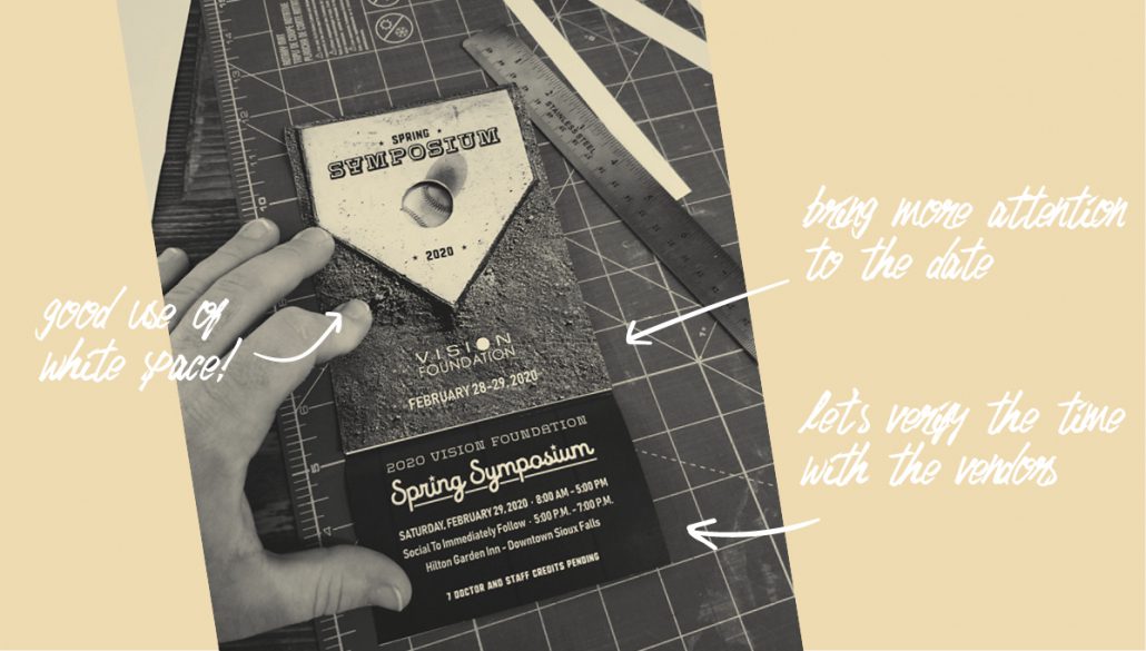
White space is your friend! It keeps your reader from getting overwhelmed. Leaving white space doesn’t mean you haven’t spent your money well. It means you’ve been considerate of your audience.
Anything else?
Two things. Look for brand consistency. It’s tempting to introduce new colors and images, but, even though you’re sometimes worn out on your palette, your audience doesn’t see it often enough to get tired of it. Your brand is like a capsule wardrobe; its pieces are designed to look nice together.
Second, your logo doesn’t always have to be the main, hero image. Sometimes you need another hook to peak a reader’s interest.
Know someone who will use these tips? Share this post!


