MicroSurgical Technology (MST) is a designer and manufacturer of innovative tools for ophthalmic surgeons. Many of their individual products, such as the Malyugin Ring, have strong name recognition within the ophthalmic industry, but they needed to redesign their product catalog to show off their entire range of products with a style that was distinctly MST to unify them.
Making the Complex Simple
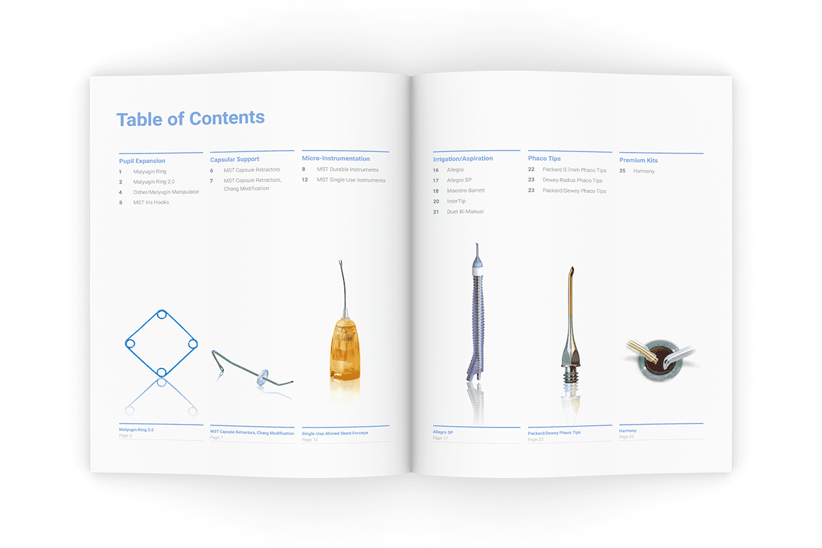
Before we could even begin reimagining the MST product catalog, we needed to spend some quality time making sense of spreadsheets full of product information. MST helped us define product categories and sub-categories that we used to define the hierarchy of information into sections and spreads
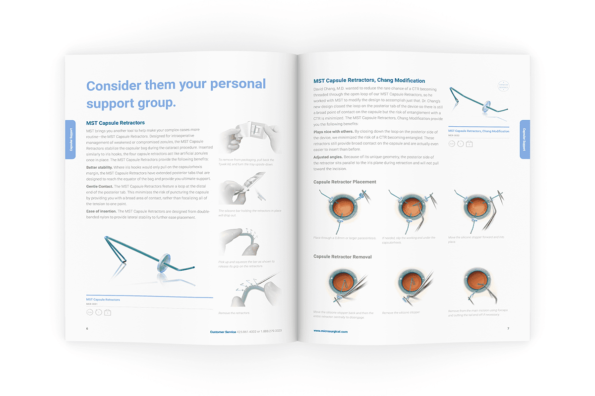
In their previous catalog, the product descriptions, technical information and ordering information spread throughout multiple pages. To tighten this up and reduce the risk of confusion and unnecessary flipping back and forth, we made sure that each product had all of the pertinent information directly under the photo of the product itself. We also integrated instructional diagrams that were previously included as separate cards in the back of the catalog.
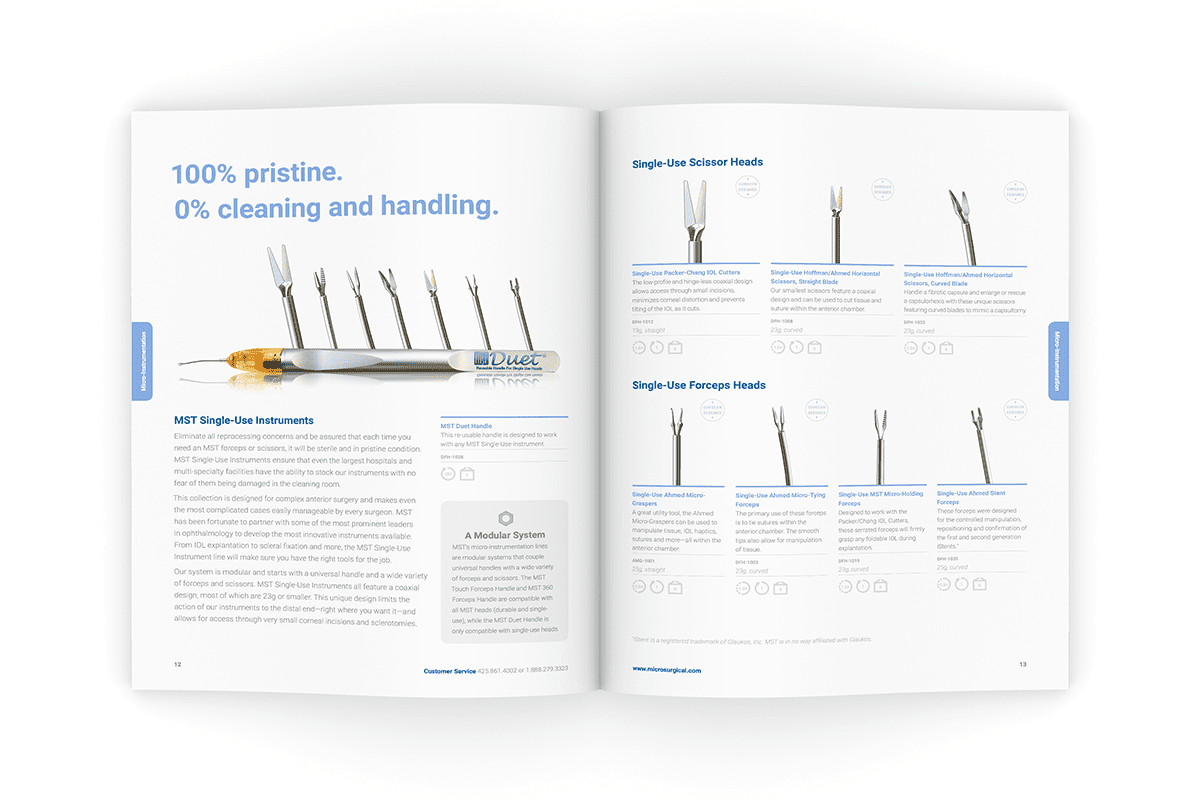
Another challenge was that the amount of information required for each product could vary greatly, so we had to design a system that was consistent but still scalable. It also needed to be easy-to-read as products that seemed similar might have minute differences. We isolated three pieces of information that were necessary for almost every product (recommended incision size, number of uses and shipped quantity) and created icons that could be read at-a-glance. We also used a series of badges that indicates special features of the product—such as being surgeon-designed or having a special warranty. Along with consistent type use, this graphic system made it easier to move around the catalog and find the necessary information for each piece.

The product category is shown in tabs along the side that delineate the different sections even the catalog is closed.
Icons indicate recommended incision size, number of uses and shipped quantity for each product.
Badges indicate special features such whether the product is surgeon-designed or has a special warranty.
Product names, descriptions and numbers are in one place for easy location.
Shining a Light on the Product
This catalog was one of the first major pieces in a brand pivot for MST. They wanted the brand to center around what they do best: design and manufacture quality products. They already had high-quality imagery of their instruments and we made these the star of the show, eliminating unnecessary distractions.
They also wanted to lighten it up a bit. Their previous catalog and other print pieces had predominantly black backgrounds with white text, so we reversed it. The ample white space focuses the attention on the products and gives the whole catalog a modern, weightless feel. It also allows the periwinkle blue from their logo to really stand out, providing a distinctive reference point that they were after.
MST takes pride in crafting high-quality instruments that are designed by surgeons for surgeons. We wanted to apply the same thoughtfulness to their catalog—making it as simple, elegant and user-centric as the products it contains.


