The Problem
After years of working to connect and celebrate creative individuals in the region, OTA was facing two challenges. First, although they had generated a lot of great content that would inspire and challenge their target audience of creatives and entrepreneurs, most of that content wasn’t available to the public. Second and more pressing, the grant that had been the primary source of their operating budget was coming to an end. OTA needed to transition to a leaner, less personnel-intensive project that could carry on its work and mission without the support of full-time staff.
As the organization moves into this new phase, OTA needed an online presence that would support its ongoing operations and preserve it’s legacy, while also making publicly available the wealth of content OTA has helped create. This new web platform needed to be robust enough to meet those requirements without needing much ongoing management by the OTA team.
The Process
We explored ways to promote and unify the content, and at the same time to downplay the presence of OTA’s brand. We wanted to allow readers to find the content they were most interested in, while at the same time preserving some of the serendipity you might find in the speaker line-up at an OTA event where it’s not surprising to hear from a biochemist, then a sociologist, and then a photographer.
At the same time, the OTA branding itself needed to change to reflect OTA’s new direction. In the past, the OTA mark and branding needed to be prominent enough to help its audience recognize and identify the organization’s voice. In this new phase, OTA as an organization needed to be lessprominent so that the focus could shift towards the people in the region that OTA aims to support.
The Solution
Essentially, our task was two sides of the same coin–make OTA less prominent, less visible while putting the focus on the people and content that OTA was founded to promote. OTA, both the organization and the website, needed to become a “crystal goblet”—a vessel that presents it’s contents without drawing attention to itself.
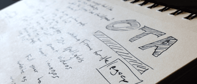
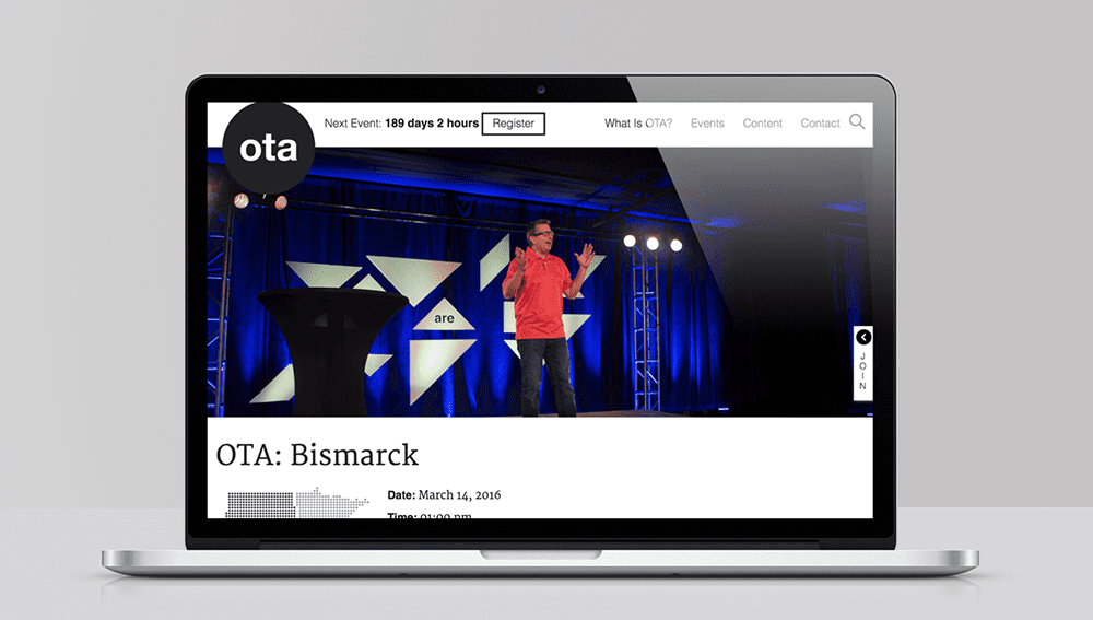
To accomplish this, we redesigned the OTA logo to be purposefully inconspicuous. We used Helvetica which is ubiquitous to the point of being invisible and a neutral black circle that reduces the idea of connection to it’s most basic symbolism.
To carry the metaphor further, the logo on the redesigned website literally fades as you read the content. It’s there to let you know you’re in the right place and to introduce you to the content. Then it gets out of the way and leaves you in the company of some of the best creatives in the region.
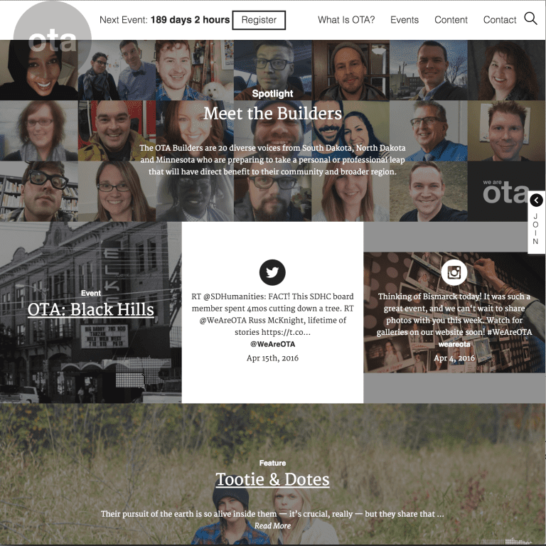
The overall layout of the website accomplishes the second goal by literally putting the faces of the people in the OTA region front and center. It is a constantly evolving collage of features, interviews, and social media posts that sends the message that the region is dynamic and alive. The overall goal of this website was to show that OTA is not just an organization or a conference or even a physical place, but instead a collection of people united by their desire to move this region forward.


