Inspiration is one of the most necessary tools in a designer’s arsenal. It can also be one of the most dangerous if used incorrectly. Pablo Picasso once said “Inspiration exists, but it has to find us working.” There are a few meanings to this, but the core message is that inspiration is something that shouldn’t necessarily be chosen preemptively to the start of the process. Expressive inspiration will reveal itself after one has done their homework.
In the design world, paying close attention to the trends others are establishing and following is essential to staying modern. There has never been a successful designer who didn’t watch closely what others were making. A terrific way to do this is paying attention to what is winning awards. This watchfulness is absolutely necessary, but it can also be a trap. If one merely spends their career replicating trends, everything that person creates will ultimately be homogenized and undifferentiated.
Replication is the downfall of the effective graphic designer. Peering at works at face value and simply following those exact guidelines in their work is not how one should approach their process. The effective designer will use inspiration, but before they can use it, they must do their own studying. They need to break it down and understand what exactly about the designs they are analyzing makes them successful and if any of the same elements have a place in their project. It is entirely likely that an element that works so well in one project may completely ruin something else.
Once a designer understands what concepts will strengthen their own, this allows them to branch out from that inspiration. Branching out from here allows the designer to use their plentiful creativity to build on top of their concepts and step into new lands design-wise. At this very point, they’ve now crossed over into creating something that is entirely their own, but with a foundation of understanding good design elements. Understanding this process can be the real difference between a sufficient designer and an award winner.
Returning to what Picasso said, finding inspiration is not the first task. Developing a path that will lead a person to the most appropriate inspiration and building from there should be. The end product will be that much better because of it.
When you study something intently, you sometimes lose sight of what made you want to study it.
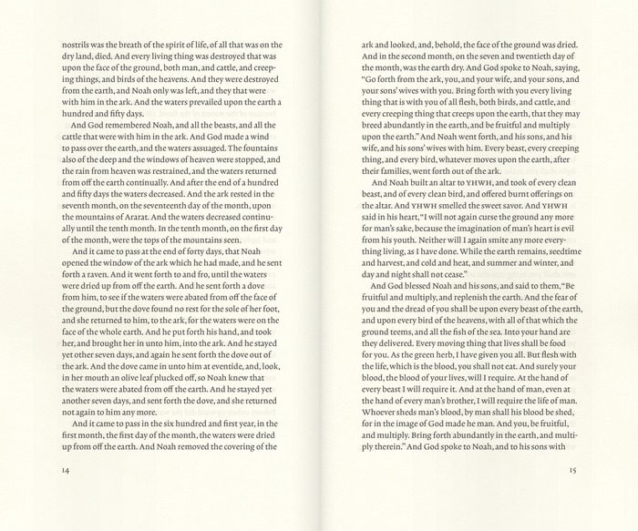
For better or worse, the words of the Bible have been studied and parsed and dissected to an extraordinary degree. The pages of most Bibles are littered with notes, numbers and other study aids. But the power of the text can get overshadowed by the clutter of the “helpful” material that has been added. For the most part, Bible designers have been primarily concerned about arming the reader with all of the information he or she might need to interpret the text, and less concerned about the reading experience. While presenting the text along with the scholarly apparatus might help readers to study the text, all that information hovering in the margins and gutter makes it more difficult to read the text. (For more on readability and “the physical form of the Good Book” see J. Mark Bertrand’s Bible Design Blog.)
When readers begin paying attention to a book’s design, it is usually because the design is getting in the way.
The Good Book, Designed
Biblioteca, a project being funded through Kickstarter, is aimed at presenting a book (in four volumes) that is meant to be read. The goal of the Biblioteca project is to present the text of the Bible simply and beautifully, with a focus on clean design and “classic and elegant typography” uncluttered by notes and numbers.
I’m looking forward to seeing the finished volumes later this year, for spiritual and professional reasons. The first “book design” project I undertook was motivated by exactly the same reason, with myself as the client. I found myself distracted by the notes and especially the verse and chapter numbers in my reading of the Bible. (To be fair, it doesn’t take much to distract me.) I decided to take the book I was studying and redesign it as simply as I could, with ample space for marginal notes, a narrow measure, and a careful treatment of the poetry sections.
Good design gets out of the way
When reading a book, what is the reader most interested in: the content, or the form in which the content is presented? Most likely, the reader has picked up a book because she is interested in the information, or the story, or the ideas presented. Unless the book is a design portfolio, where the goal is to display the work of its designer, or a textbook intended to inform about and present examples of design, the reader has only passing interest in how the material is presented visually.
When readers begin paying attention to the features of a book’s design, it is usually because those features are getting in the way–margins too narrow for the reader to hold the book without covering up the text, page numbers that are hard to find, text that is too cramped to follow comfortably, and so on. Good design presents the material and stays out of the way. You could almost say that as soon as the reader becomes aware of the design of the book, the designer has failed in his first goal: present the text to the reader.
https://mattjensenmarketing.com/wp-content/uploads/2014/06/bibliotheca.jpg5671000Tim Murrayhttps://mattjensenmarketing.com/wp-content/uploads/2019/09/mjm-logo-nav.pngTim Murray2014-06-30 15:57:192021-05-21 10:03:34Good Design Gets Out of the Way
One of the cold hard facts of the creative life is that we all have some past work that we’re not proud of. We’ve all put our names on projects in the past (maybe not even the very distant past) that we now hope will be forgotten. Sometimes the most painful part of seeing old projects is remembering how much I liked them at the time. That introspective regret is probably a common experience in any line of work, but in creative work it can be especially discouraging.
It’s okay to look back and cringe. As creatives, if you aren’t looking back and cringing you aren’t getting better.
—@SusanGKoge via @99u
“It’s ok to look back and cringe.”
A few days ago, I saw this quotation from a talk by Susan Gregg Koger, Founder & Chief Creative Officer of ModCloth. She was speaking at the 99u conference and what she said made an impression on a number of people, for good reason: It’s a refreshing reminder that all of us are in process.
As we develop, we’ll have good reason to critique the work of our younger selves. The work that we’re not happy with might not disappear as quickly as we’d like, but there’s no reason to lament that. If your goal is to have a perfect record, you’re not going to do much–you’ll be too scared to try things. The only reason to think about what you don’t like in your old projects is to do something different in your new projects. Looking in the rearview mirror is useful at times, but it’s a bad way to drive.
Focusing on the creative act, not the final product
Our interns (5 and 3 years old) create a prodigious amount of artwork. My sweet five-year-old girl loves coloring and has recently added mixed media to her portfolio, cutting and gluing things together in all manner of combinations. Some things she has made we’ve kept for years, and it’s interesting to see her find them again. She turns them around, half-remembering the crayon lines and bits of paper. Even more interesting is that she doesn’t linger on those old pieces very long. She’s too young to be embarrassed about the past, and usually too busy making her current project to give it much thought. She’s more engaged in the creative act, and less worried about the final products.
The reality is that there will be lots of “final” products, and some of them will be cringe-worthy when you see them again in a year or five years. Take those cringing moments as a sign that your taste is being refined, and your design sensibilities are being sharpened, and move on. There’s a lot more work to do.
https://mattjensenmarketing.com/wp-content/uploads/2014/05/emm-art-1000.jpg5671000Tim Murrayhttps://mattjensenmarketing.com/wp-content/uploads/2019/09/mjm-logo-nav.pngTim Murray2014-05-15 11:33:282021-05-21 10:06:04It’s OK To Look Back and Cringe
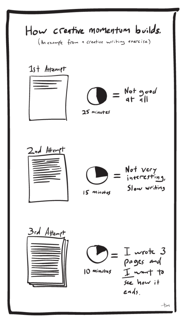
My next ideas are a little bit less terrible, but still not great. Worse still, it takes me a relatively long time to develop those first not-great ideas. But those first attempts aren’t a waste of time, because the process of working through bad ideas is what makes good ideas possible.
The process of working through bad ideas is what makes good ideas possible.
It’s a common experience for anyone doing creative work, and I imagine that the same is true in a lot of professions. Friends who are writers tell me that the first few paragraphs, or even the first few pages of a project, are sometimes painfully slow and that the early ideas are often difficult, stunted half-starts. Much of the early material gets thrown out along the way, but those initial faltering steps are the only way to get to the finished product.
”Sing in me, O Muse…”
Once the creative momentum has started, the work flows more easily and naturally. It can feel like the ideas have a life of their own. It’s easy to see how the Greeks spoke of the Muses–how it seemed to them that their ideas were coming, fully formed, from some outside source. Homer starts the Odyssey by saying, “Sing in me, O Muse–through me tell the story…” We get caught up by the momentum of the work and it carries us along almost effortlessly.
Part of the creative process
My sketchbook is full of abandoned layout concepts, half-finished logo ideas, and doodles and scribbles that will never be seen by the client. But most of my finished projects can be traced back to one of those sketches. They weren’t the product of wasted time or effort–they were a part of the process, and an indispensable step along the way. The only way to get to the good ideas is to work through the bad ones.
A friend asked me a few days ago about the pros and cons of doing freelance work along with your primary design job. Even though I approach the question as it relates to my work as a graphic designer, I think there are general principles here that apply to any profession.
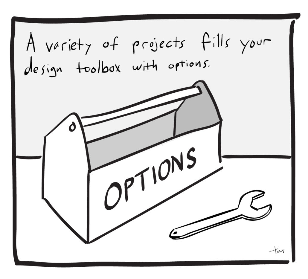
The biggest benefits to pursuing side projects that I see relate to the variety of work. Along with my freelance design work, I get to work with this solid group of people at MJM, and I’m fortunate that there’s a lot of variety even within MJM. (MJM spends about half its energy and time working for non-profit clients, and about half working with clients in vision care and related fields.) The more I thought about the pros and cons of working on outside projects as well, the more benefits I saw.
Everyone wins
A broad range of work is good for everyone involved.
Your clients (all of them) get work that is more sophisticated, informed by a wide range of past projects. When a designer works in one brand or one voice for a number of years, it’s easy to let everything have that flavor. On the other hand, if a designer is regularly working in several contexts, it’ll be much harder to fall into a creative rut.
Working with a variety of clients, and therefore a variety of styles and voices, is one of the best ways to keep your mind and your fingers nimble. It may be the only way.
But clients aren’t the only ones to benefit. Your employers will find themselves working with a designer who is much more versatile, able to adapt his or her style with an agility developed by constant practice.
The designer may be the one who benefits most in the long run, in plain quality of life. None of us wanted to work in a creative field so that we could churn out the same work day after day. Working with a variety of clients, and therefore a variety of styles and voices, is one of the best ways to keep your mind and your fingers nimble. It may be the only way.
Access to a wide variety of styles
Working in a wide variety of projects give you access to a wide variety of styles and voices.
Along with our non-profit clients, MJM works with a number of organizations related to health care. The danger with health care design is that a lot of design in the industry ends up looking pretty similar. A lot of white space, clean, sparse layouts, blues and greens, nothing edgy or alarming (a lot like the interior of most hospitals, actually.) The value of having my hands in a lot of different projects is that each project influences and shapes the others. When I start designing a brochure for an eye care clinic, I may have just spent the morning developing a website for a non-profit, or laying out spreads for a cookbook. It’s likely, and I think beneficial, that elements of those projects will inform the clinic brochure. The clinic brochure will tend to be a warmer, more human, and more accessible piece than it would have been if I’d spent the morning designing other pieces for the health care industry.
The same principle applies in the opposite direction. When I’m working on the website for the non-profit, I’ll be able to selectively apply some of the tone and visual language of the clinic brochure, helping to give the non-profit a credible, trustworthy voice. Even though the aesthetic might be less formal, the information still needs to be well-organized and easy to follow, and I can also draw from the tools that I used in the clinic brochure to do that.
Renaissance men and polymaths
Working in a variety of fields helps give you a broader understanding of each field.
Having worked on a variety of projects in various fields, I have a toolbox full of strategies and styles to choose from.
Part of our role as designers is to organize and present information in ways that are accessible to a wide audience. We’re not generally designing for other designers, or even for other people in our same demographic. To be successful, my eye clinic brochure needs to be equally accessible to a 20-something college student, a 55-year-old farmer, or a 35-year-old IT worker. Having worked on a variety of projects in various fields, I have a toolbox full of strategies and styles to choose from. But working on that wide variety of projects has also given me the opportunity to learn a lot about a range of topics.
In the spirit of the ideal Renaissance Man, a broad range of knowledge and experience makes it possible to make connections that might otherwise be missed. (Leonardo da Vinci was a painter, but also a sculptor, architect, mathematician, inventor, engineers, etc.) When we know and understand more, we are better teachers, and we’re better equipped to present information to our audiences.
The dangers
There are some dangers, of course. There’s a limit to how much you can keep track of in the one head you have, and the more clients and projects you have, there is always the increased chance of losing the thread on a particular project. There is also the potential for the occasional conflict of interest between your primary job and a freelance client, or odd political situations to be aware of, but an open line of communication between all parties and an ongoing dialogue with co-workers should avoid or defuse those situations.
Moving back and forth between several styles and voices allows a sort of cross-pollination between those projects. That interchange of creative ideas gives me as the designer ready access to more options than I would have had otherwise. (And often speeds up the process, which is always a welcome thing.)
If nothing else, your side projects are a place to explore new ideas and learn new skills without asking permission or risking the credibility of the organization you work for.
https://mattjensenmarketing.com/wp-content/uploads/2014/03/toolbox-full-of-options.png5671000Tim Murrayhttps://mattjensenmarketing.com/wp-content/uploads/2019/09/mjm-logo-nav.pngTim Murray2014-03-24 14:12:252021-05-21 11:40:16The Value of Side Projects
Years ago, I read in the preface of a collection of a photographer’s work about a book that was impossible to make. The book he was describing would never exist because it was a collection of images that had never been created. This photographer (whose name I’ve forgotten) was referring to the missed images — the moment when a spectator walked in front of the lens, the moment his finger missed the button, the moment just before the picture was taken, or just after. The idea intrigued me enough that it’s stayed in my mind ever since.
I have a similar body of work. In the process of creating logos, or layout projects, or web designs, a lot of decent material hits the cutting room floor and is never seen by anyone. In a logo design, for example, we create a series of initial concepts, and a small selection of the ideas generated are shown to the client. The client identifies one or two as possibilities, and then we refine those further. The final logo is chosen and the art is finalized.
The process works well, but at each phase a lot of good ideas are discarded. The question is what to do with those good ideas? Some of the general ideas may apply to other projects, but if we’ve done our job well, those concepts and design solutions are unique to that client’s situation.
Unlike the collection of the photographer I mentioned earlier, the ideas in this collection aren’t lost — they’re on my hard drive gathering digital dust. It’s hard to imagine a context where that collection might be displayed. Most clients would not like to have a handful of alternate, non-approved design pieces floating around with their names on it. Because the concepts are inextricably bound up with the names and identities of the organizations they were created for, it’s impossible to make them anonymous without destroying the idea.
I’ve thought about ways to present this collection in the future, either on our site or in print, but for now our graveyard of good ideas is closed to the public.
(If anyone knows who this photographer is, please let me know.)
https://mattjensenmarketing.com/wp-content/uploads/2013/05/graveyard-of-good-ideas_long-1024x581.png5811024Tim Murrayhttps://mattjensenmarketing.com/wp-content/uploads/2019/09/mjm-logo-nav.pngTim Murray2013-05-01 10:42:302021-07-12 09:00:58The Graveyard of Good Ideas
A recent study has found that reading works of fiction has a strong correlation with increased empathy. As a designer, seeking to understand a client’s perspective, as well as their audience, is vital to an effective design solution. Which means I’m swapping out a tome on typography for C.S. Lewis’ Space Trilogy (thanks for the recommendation, Tim!).
Consider the details of the research study and you too might be convinced to put down that dull technical book you are reading for work and grab your favorite piece of literature that’s been collecting dust on the shelf. The researchers found that people who read fictional stories and experienced emotional transportation into the narrative showed increased empathy over the course of one week. The important qualifier there is that readers are emotionally transported — without that key element the study found that readers actually experienced decreased empathy. And those who read non-fiction displayed no signs of either positive or negative changes in empathy.
This is more evidence of the power of storytelling. If you want your customers to be emotionally engaged with your brand, build a narrative around it. Share testimonies in a compelling way, but don’t just share the stories of your patients or customers—tell your story as well. I’m not suggesting that communication between brand and audience be fictional. Rather, we should critically consider the ways in which we communicate to ensure this key element of emotional transportation is present. Be authentic, be engaging. And when your audience tells your story they will be, too.
It’s not easy to consider the forms of letters without taking into consideration their meaning.
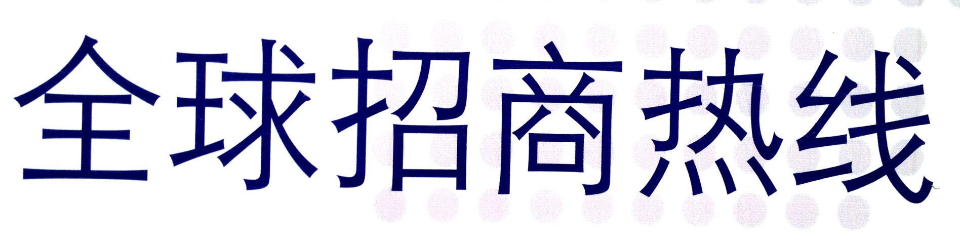
I recently traveled to see some friends and family in China and Korea. While I was there, I was intrigued by the variety of typefaces used in signage and printed material for both Mandarin and Korean. It presented a unique opportunity to evaluate a typeface or font without being influenced by the meaning. (I arrived knowing next to nothing of either language, and managed to preserve my ignorance largely intact after spending a week in each country.) When I look at a typeface containing words I can read, the meaning colors my impression of the typeface.
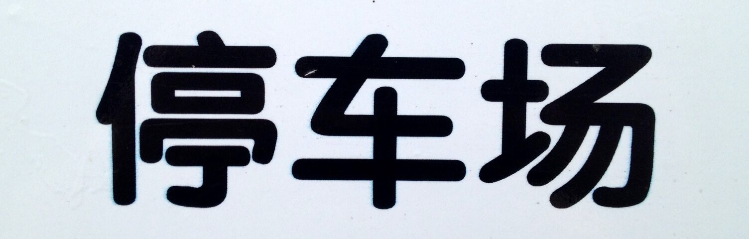
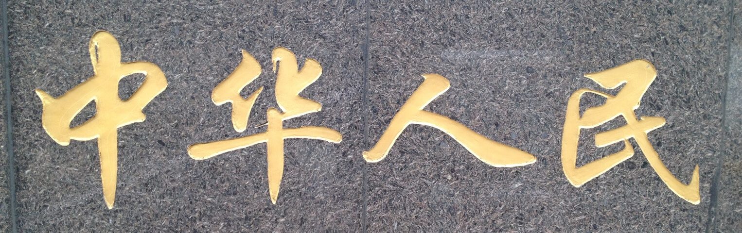
When I saw Chinese characters, however, I didn’t have any choice. The only thing I could understand about the signs and ads in China was the emotional tone or mood created by the way the characters were presented. Take these two signs, for example:
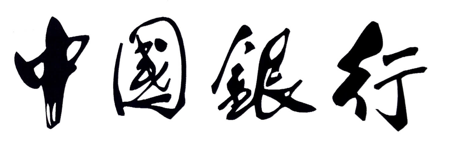
The first, by its crisp lines, conservative coloring and clean presentation, is clearly intended to be taken seriously. It presents itself as professional and respectable; dependable but not stuffy, modern but not informal. This sort of typography would be appropriate for a bank or real estate office, perhaps, but would feel flat on a sports drink or coffee shop.
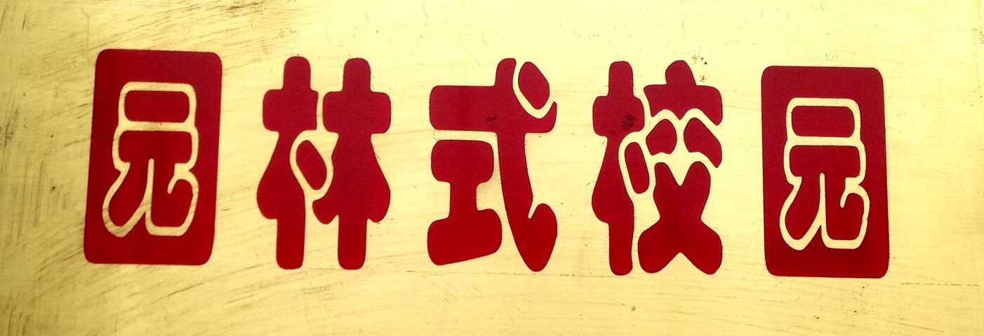
The typography in the second image is loose, playful, casual. The informal shapes of the characters, with their thick, bubbly lines, along with the coloring of the sign, implies a relaxed atmosphere, a business or service where fun is more important than precision. This sort of typography would be appropriate for a pet store or fast food restaurant, but not for an insurance agency or auto mechanic.
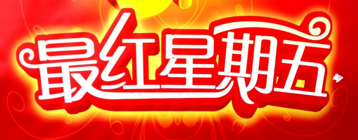
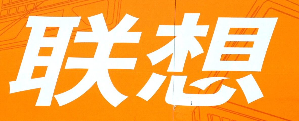
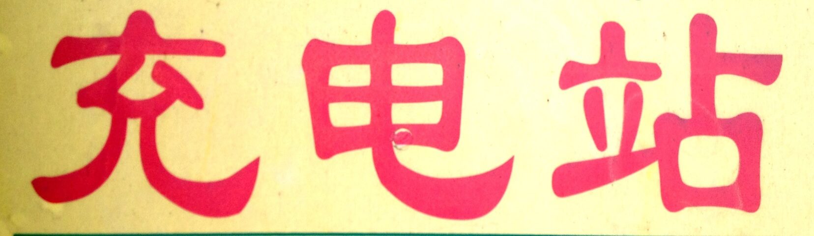
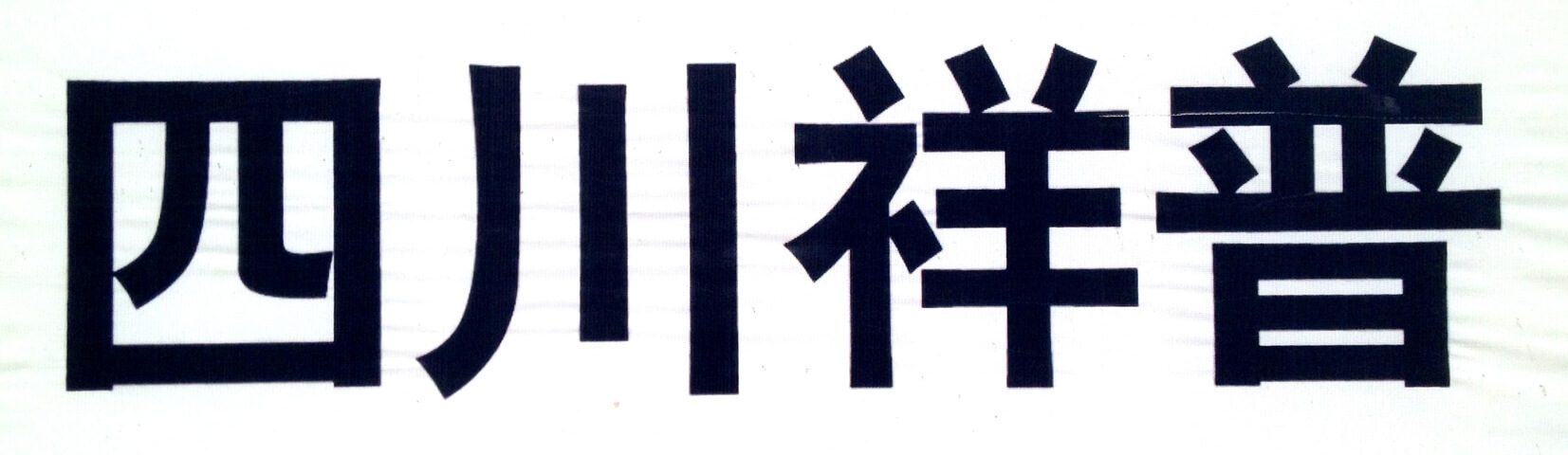
I’ve included some other samples of Mandarin typefaces that I found in the streets of Chengdu. They include hand-drawn characters, “serifs” and “sans-serif” varieties, and illustrated letterforms.
https://mattjensenmarketing.com/wp-content/uploads/2012/10/typography-form-and-content.jpg5671000Tim Murrayhttps://mattjensenmarketing.com/wp-content/uploads/2019/09/mjm-logo-nav.pngTim Murray2012-10-12 08:45:182021-05-21 10:29:02Typography: Form and Content