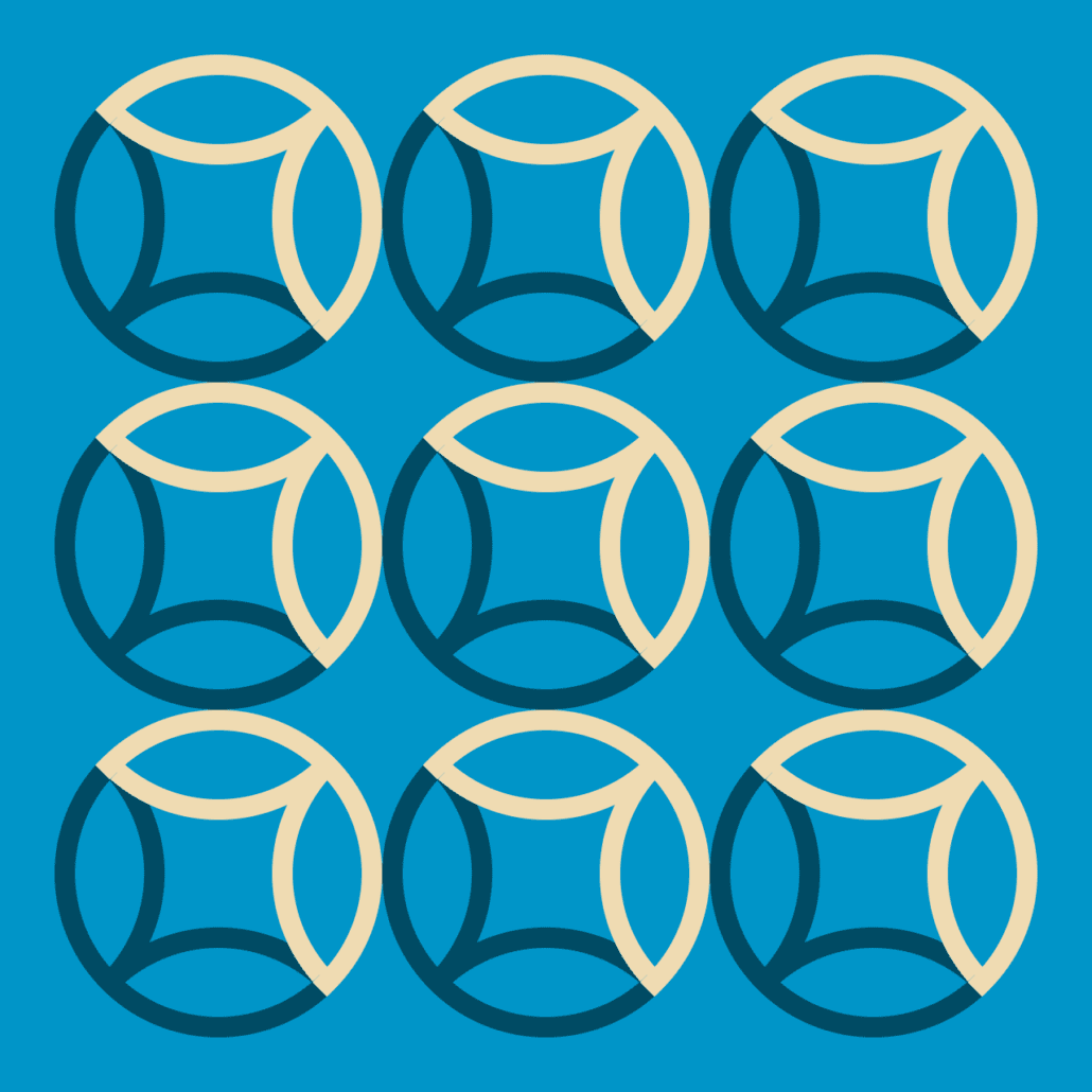
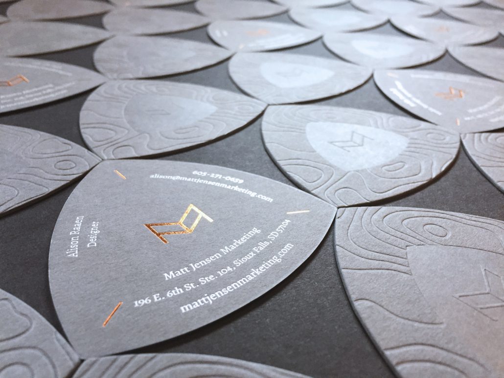
When we set out to redesign our business cards, we knew we didn’t want to go the standard route – we wanted something that would help tell our story. We had already been digging into the symbolism and imagery of wayfinding when we redesigned our logo. In that process we stumbled upon a fascinating shape called the reuleaux triangle – and it was perfect.
Reuleaux: /roo – LOH/
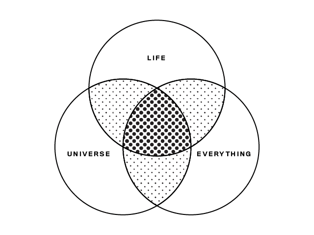
The reuleaux triangle has been used in many applications, from architecture to mathematics and map making. The overlapping section in the center of a three-set Venn diagram? That shape is the reuleaux triangle.
Reuleaux triangles are geometrically beautiful shapes with surprising properties. They have been used as clever solutions to a variety of challenges in engineering and other fields. Its shape has a constant width – the diameter is the same no matter the orientation. It can rotate within a square while constantly touching all four sides, which allows for the creation of a drill bit that can create a square hole. How’s that for squaring the circle? Pencils in the shape of a reuleaux triangle have a couple of benefits: users often find them more comfortable to hold, and because they are not perfectly cylindrical, they are less likely to roll off tables and under your coworkers’ chair.
As creative guides for strategic journeys, the reuleaux triangle’s rich history in map making and trail signage is what ultimately captured our imagination. Leonardo da Vinci used the shape in an early map projection of the earth. It has been used in trail signage to help hikers find their way, such as along the Lewis and Clark National Trail. So it felt appropriate as the shape for our business cards, which help you find members of our team.
We knew we wanted to feature topographic textures on the cards. But it couldn’t just be an image of topography – there needed to be some actual topography to our cards. They had to be tactile, where you could literally feel the terrain under your fingers. So of course we had them letterpressed! We are very pleased with the results.
https://mattjensenmarketing.com/wp-content/uploads/2020/01/Photo-Jan-08-1-01-07-PM-Adjusted-Cropped.jpg10801920Brady Holmhttps://mattjensenmarketing.com/wp-content/uploads/2019/09/mjm-logo-nav.pngBrady Holm2020-01-29 17:10:592021-05-21 09:05:08The Shape of Our New Business Cards
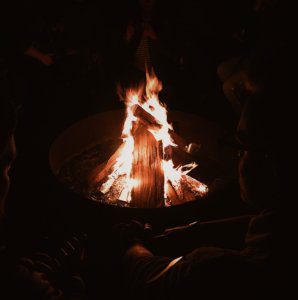
Every October, MJM sends some of it’s creative team to the fall wonderland of Branierd, MN to attend Design Camp, an informal design conference with nationally renowned speakers and special workshops. Read our three campers’ reflections from this year below!
Alison
What do I love about Design Camp? First there’s the swag bag, then it’s spending time outside the office with the design team, and then there’s beautifully thoughtful powerpoint presentations that designers put together (it can be done!). The best parts are the ideas that I chew on afterwards. This year’s featured keynotes focused less on immaculate portfolios of design work and more on their purpose and how design lives in the world: as public service at White House, alongside other artists and musicians, and as a tool for huge, international corporations to work more iteratively.
One theme that stood out was the idea of love. Love for yourself, your colleagues, your clients and your users. Ashleigh Axios gave an example of putting together rapid-fire graphics that support statements made during the State of the Union address given by the president. To a room of designers, she admitted it wasn’t beautiful, crafted work, but it was accurate, legible, and delivered on time. As designers and problem solvers, we make things for people. And we should make things to the best of our ability because people deserve that.
Kirstie
This is my third time attending Design Camp and while I always leave inspired to do new work, this year I noticed a different theme to a lot of the discussions. Instead of hearing about how I should be hustling every minute of every day, I heard about the importance of recharging creatively. Instead of leaving with a list of design topics to research and skills to hone, I left with a list of what could be better described as self-help books.
One example of this was a workshop I attended called “How to Speak Unicorn: Translating Design for the Digital Age” led by Michelle Schulp. Based on other web design workshops I’ve attended, I was expecting to be inundated with a list of new software and coding languages I was supposed to learn. But instead, the presentation focused on something I’m not used to hearing about in web design: interpersonal communication.
Schulp acknowledged how designers who crossover to digital are often expected to be a “unicorn” skilled in every stage of the process. But, she said, rather than being an expert in every aspect of web development, it’s more important to be able to communicate with people who are. Rather than trying to force print designers to learn Python, we should be working on soft skills like active listening that allow us to bridge disciplines and leverage strengths. My overall takeaway from this year’s Design Camp was that to be a better designer, first you need to be a better person. Software will come and go, but things like empathy and compassion will always be a vital part of the designer’s toolbox.
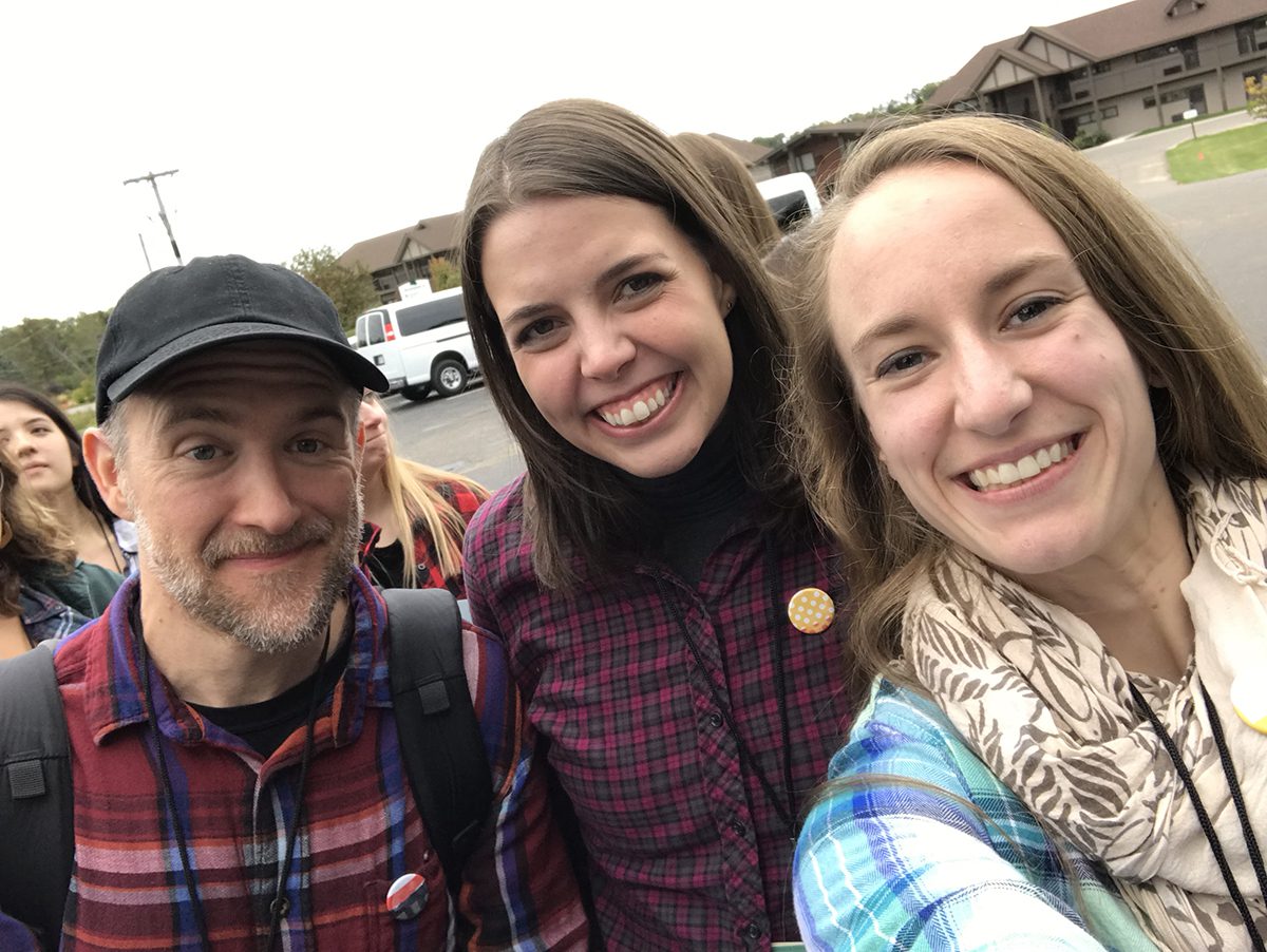
Tim, Kirstie, and Alison in their Plaidurday finest at Design Camp 2019.
Tim
One aspect of Design Camp I enjoy every year is that the ideas and the concepts I hear there percolate in my mind for months afterward. One idea that sunk particularly deep this year was the importance of being intentionally and personally connected with the creative community around you.
Creative business consultant Emily Cohen admonished her audience to “support everyone you know.” Creative work can be discouraging, isolating, and lonely work at times, and many people don’t have the benefit of working closely with like-minded people. She emphasized that the work we do is always personal before it is professional, and we ignore that truth at our peril. And she also pointed out that wanting to be supportive isn’t enough—we also have to be intentional about supporting the people around us.
I‘m blessed at MJM to work in close proximity with four incredibly talented designers (not to mention the rest of our MJM team), and it can be easy to take that degree of connection for granted. We can Slack the other designers with questions, send over screenshots of a sticky design challenge, or even just doodle our problems out on the dry erase walls around our tables. And because it‘s so easy, I sometimes underestimate how much I‘m learning from them, and how valuable that is.
Being purposeful about “supporting everyone you know” sounds simple on the surface, but Cohen’s talk echoed many of the thoughts I’ve been having in my work with AIGA South Dakota over the past few years. As I’ve worked to support and amplify the good work that other creative professionals are doing around our area, I’ve found that I am more connected to that community. And although it wasn’t my goal, I also find that the more I spend time with the people in our community who are doing great work, the more my own work is improved and sharpened by their insights and advice.
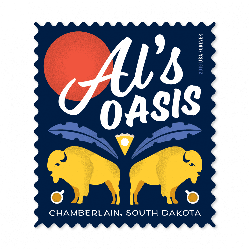
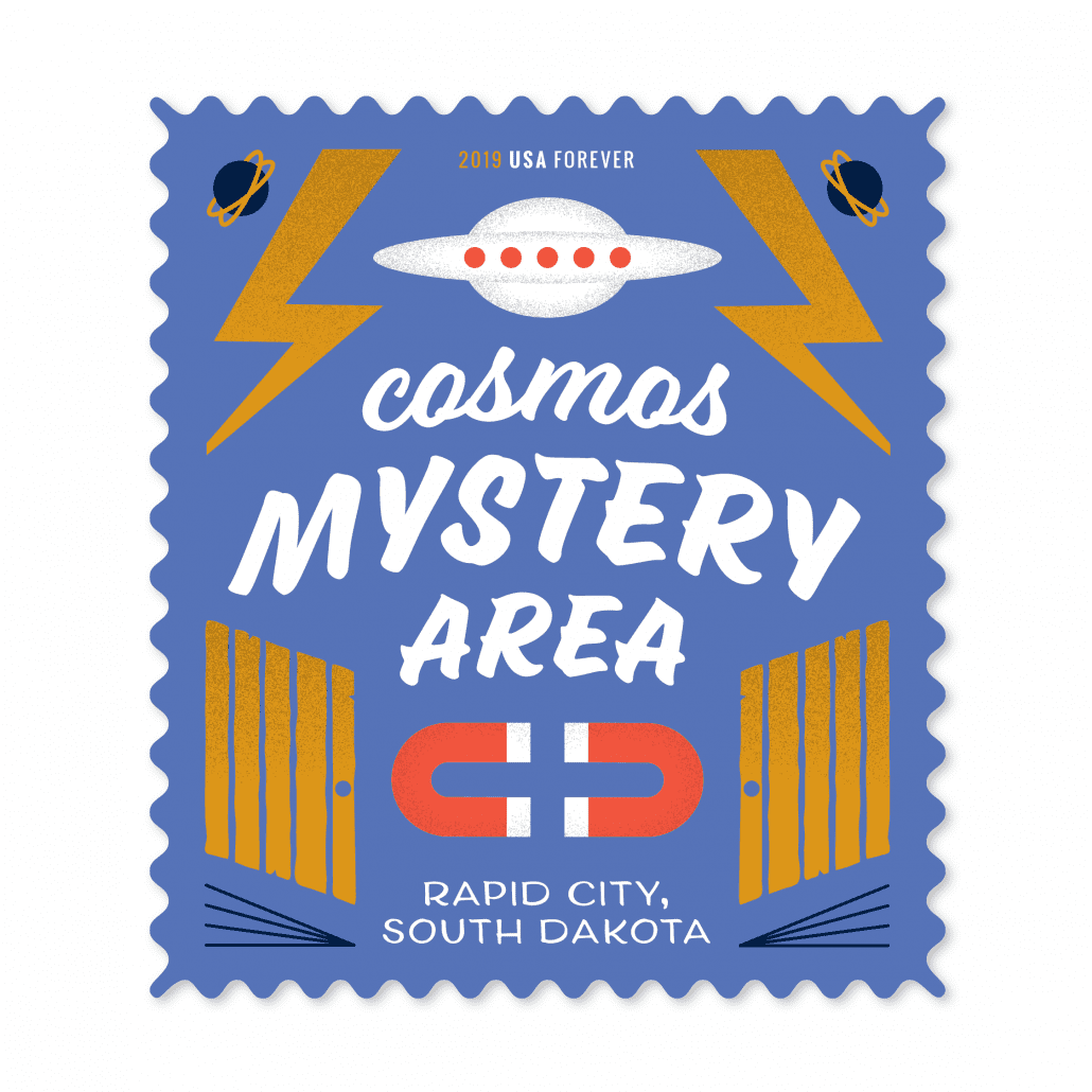
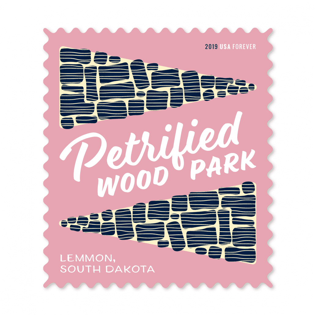
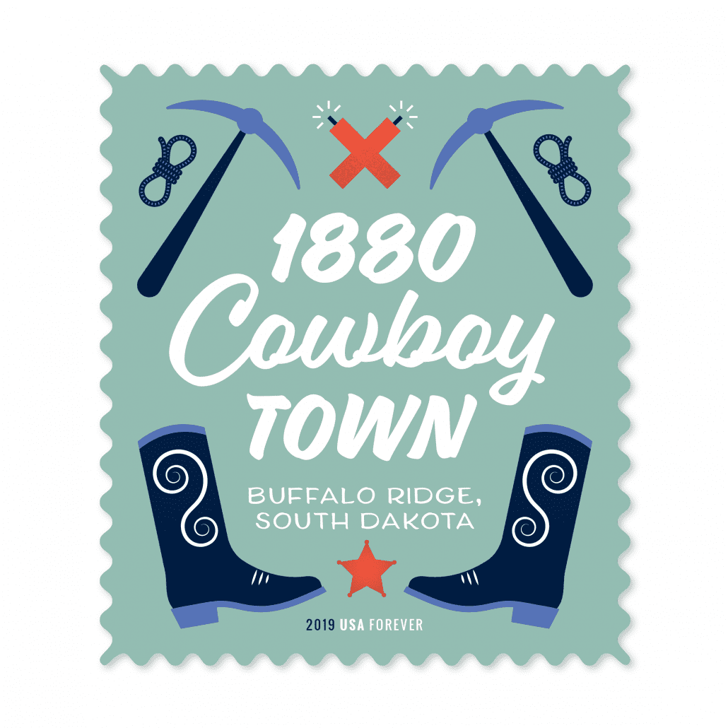
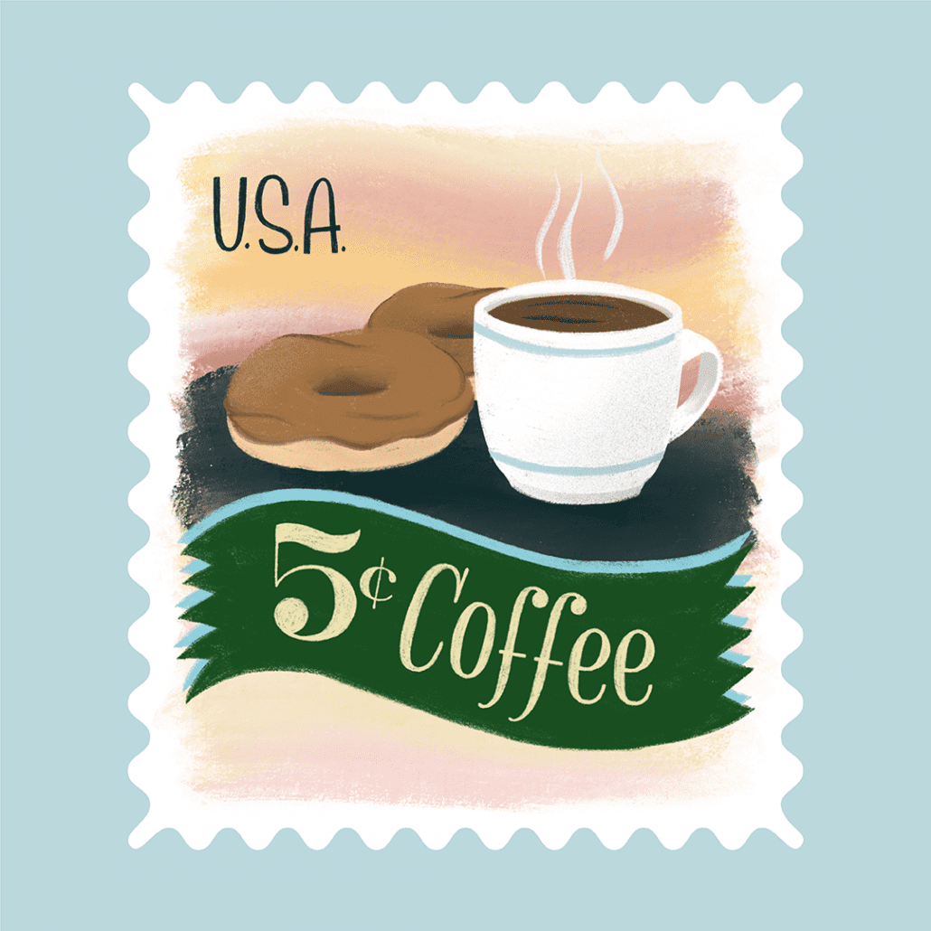
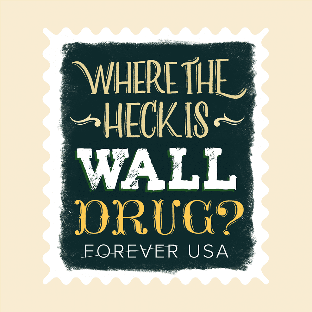
Earlier this month, we had the opportunity to participate in a group show created by AIGA South Dakota — the South Dakota Stamp Show. For this show, AIGA asked 13 area designers to each create a set of five concept postage stamps around a topic related to our fair state. There was a lot of good work in this show, and you can still see it at the Sioux Falls Design Center for a limited time.
Here the designers at MJM talk about their process and work:
Deadwood
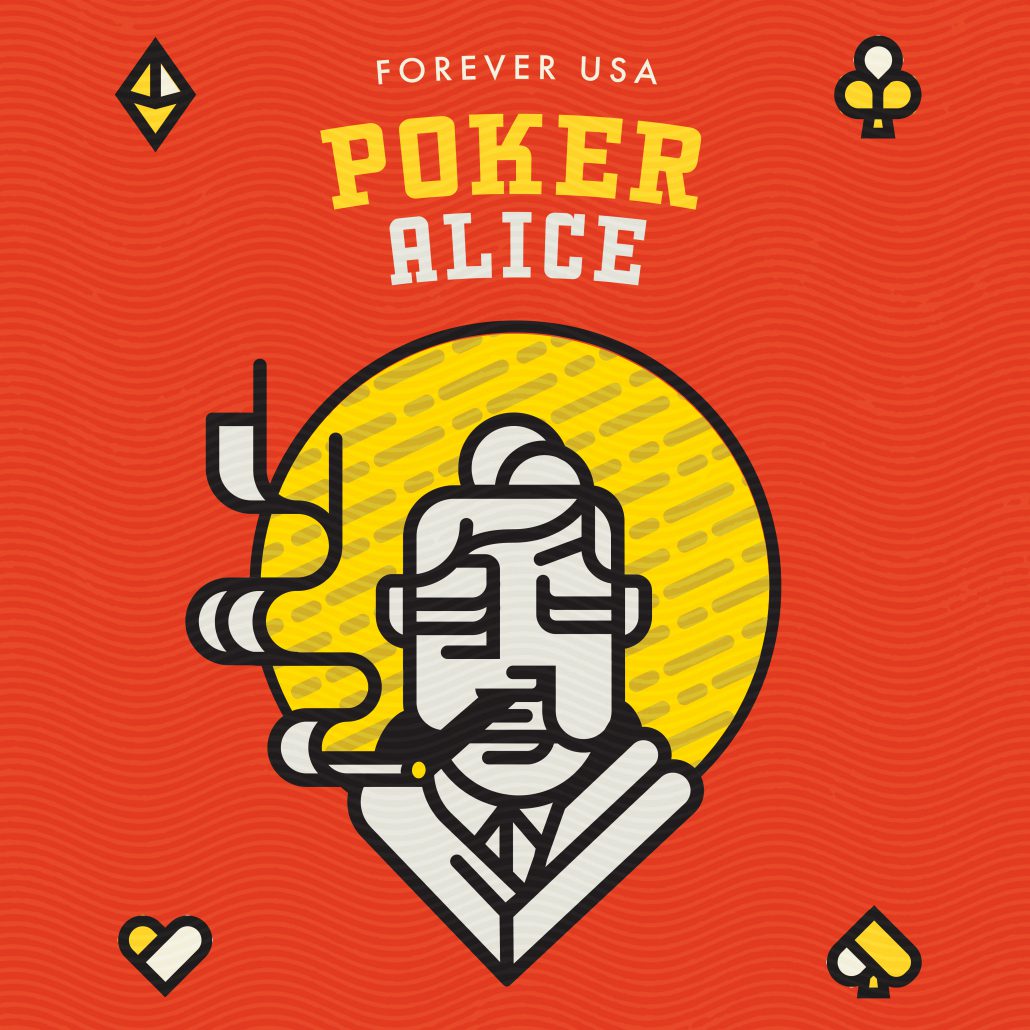
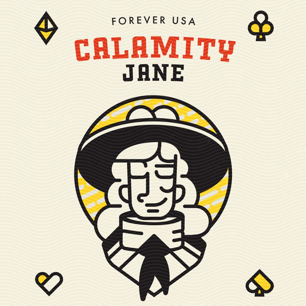
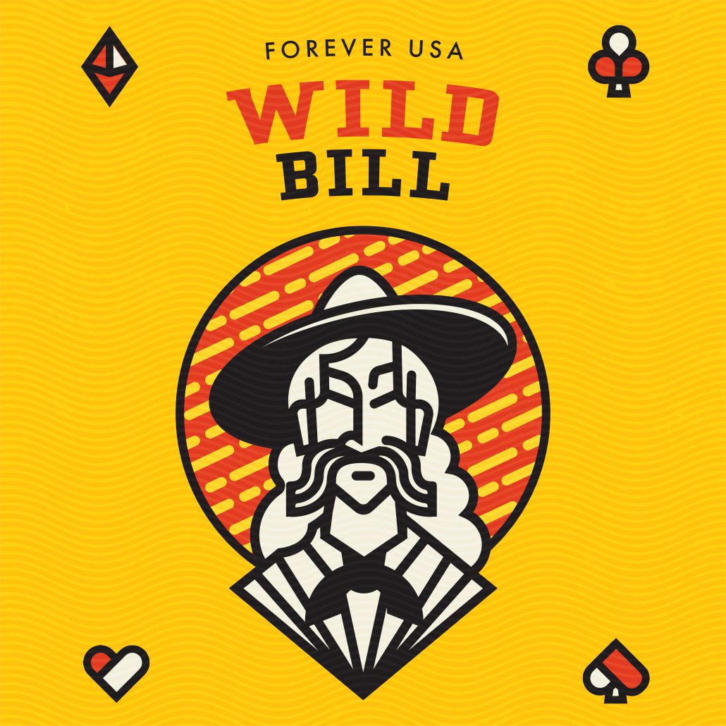
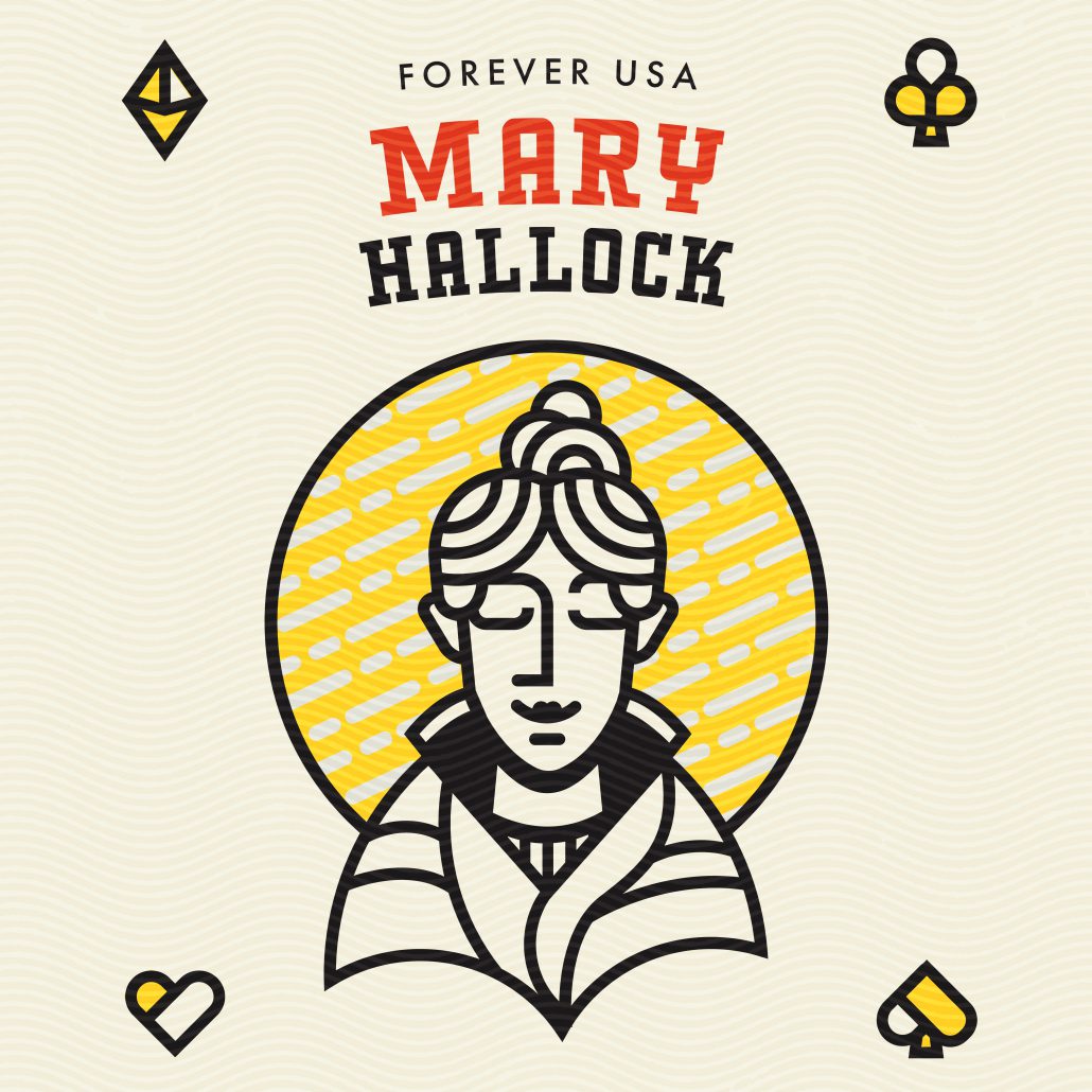
Deadwood is deceiving town.If you were to visit the area today, it presents itself as an unassuming South Dakota town and (aside from some gambling and historic displays) you wouldn’t guess its rich history. With this topic, I saw an opportunity to highlight the people from a long-gone era that made Deadwood a household name. People like Poker Alice and Wyatt Earp. As I researched these historic individuals, I found myself thinking of them as more characters in a drama and less actual people that lived out their lives in our rural region. With names like Wild Bill and Calamity Jane, it’s difficult not to. Because of this, I chose to make the goal of this stamp series is to spotlight that juxtaposition of real person and western legend with a set of minimalist caricatures of some of the most famous people to reside in Deadwood.
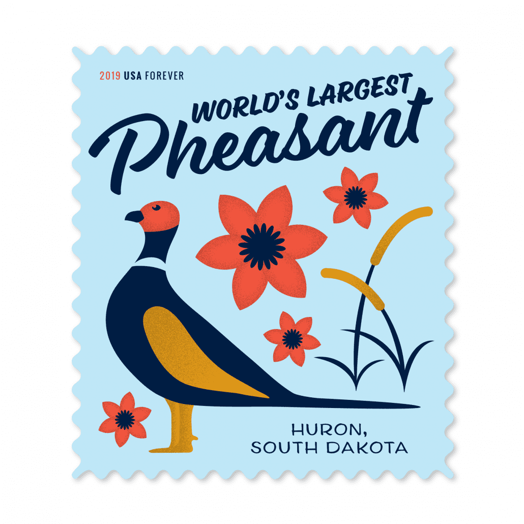
South Dakota has mastered the art of the roadside attraction. Drive down any highway in the state and you’ll be bombarded with billboards advertising sites ranging from the delightfully kitschy to the straight-up bizarre. Are they desperate money grabs? Maybe. But you have to admire the ingenuity of people who have found a way to use whatever resources they have at their disposal to capture people’s attention. The kind of ingenuity that sees some old pieces of wood and turns them into a forest or sees an abandoned town and fills it with animatronic cowboys. Because, why not? In a state as vast and unpopulated as South Dakota, it takes a little bit more effort to remind people that you exist. To honor these beacons of the prairie, I wanted to design stamps that were, above all, fun. South Dakota is usually expressed in shades of greens and browns and I wanted to bring in some vivid technicolor that screams, “I’m here! Look at me!”
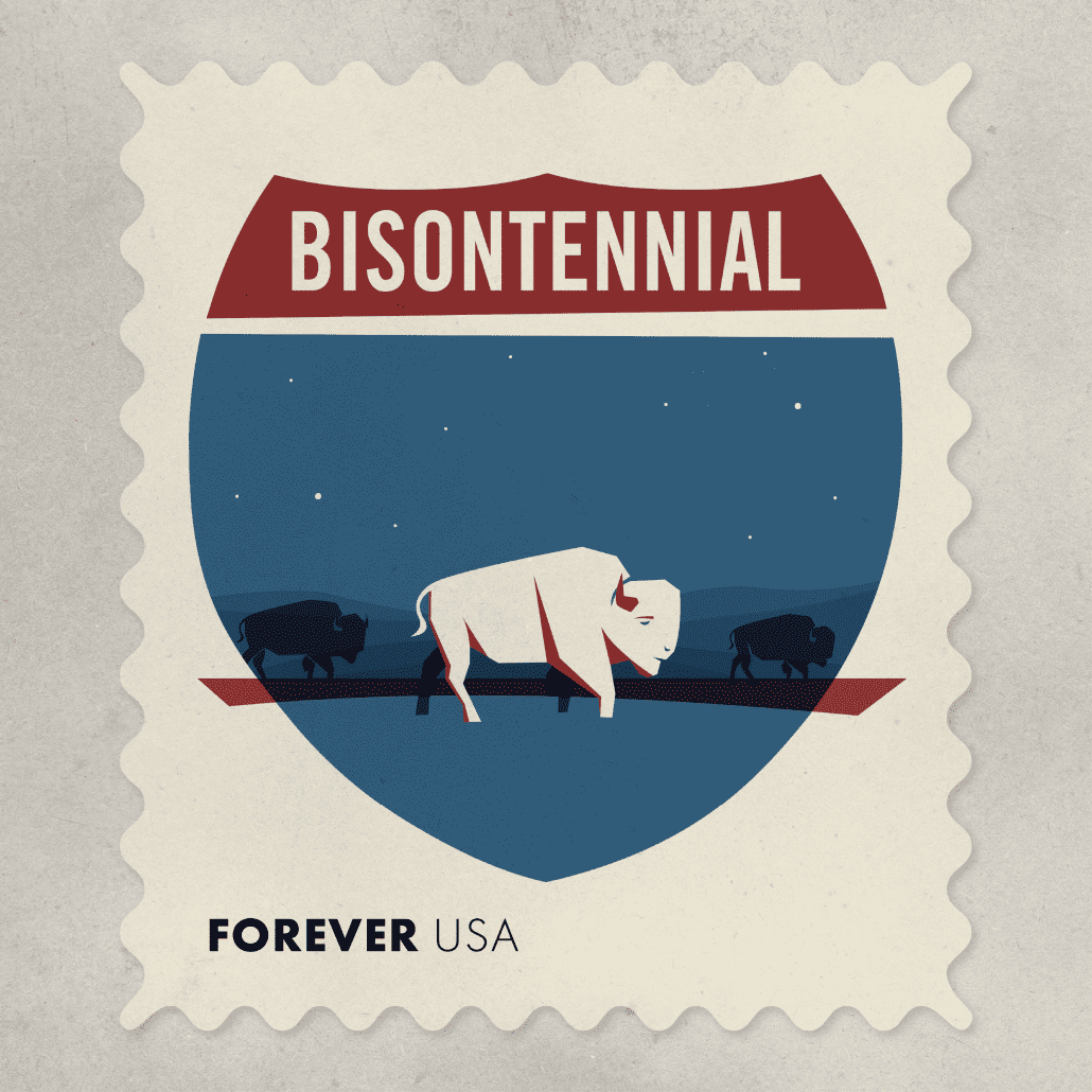
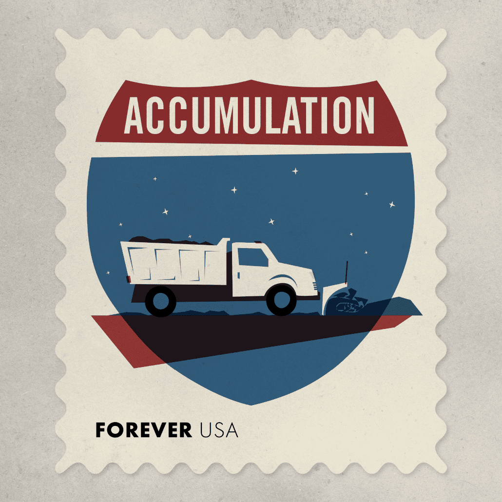
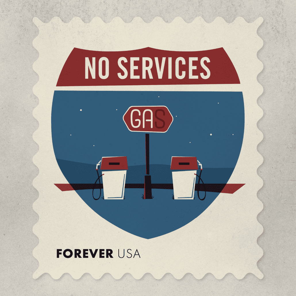
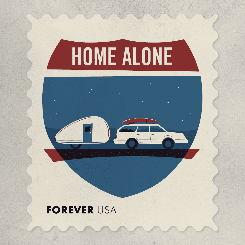
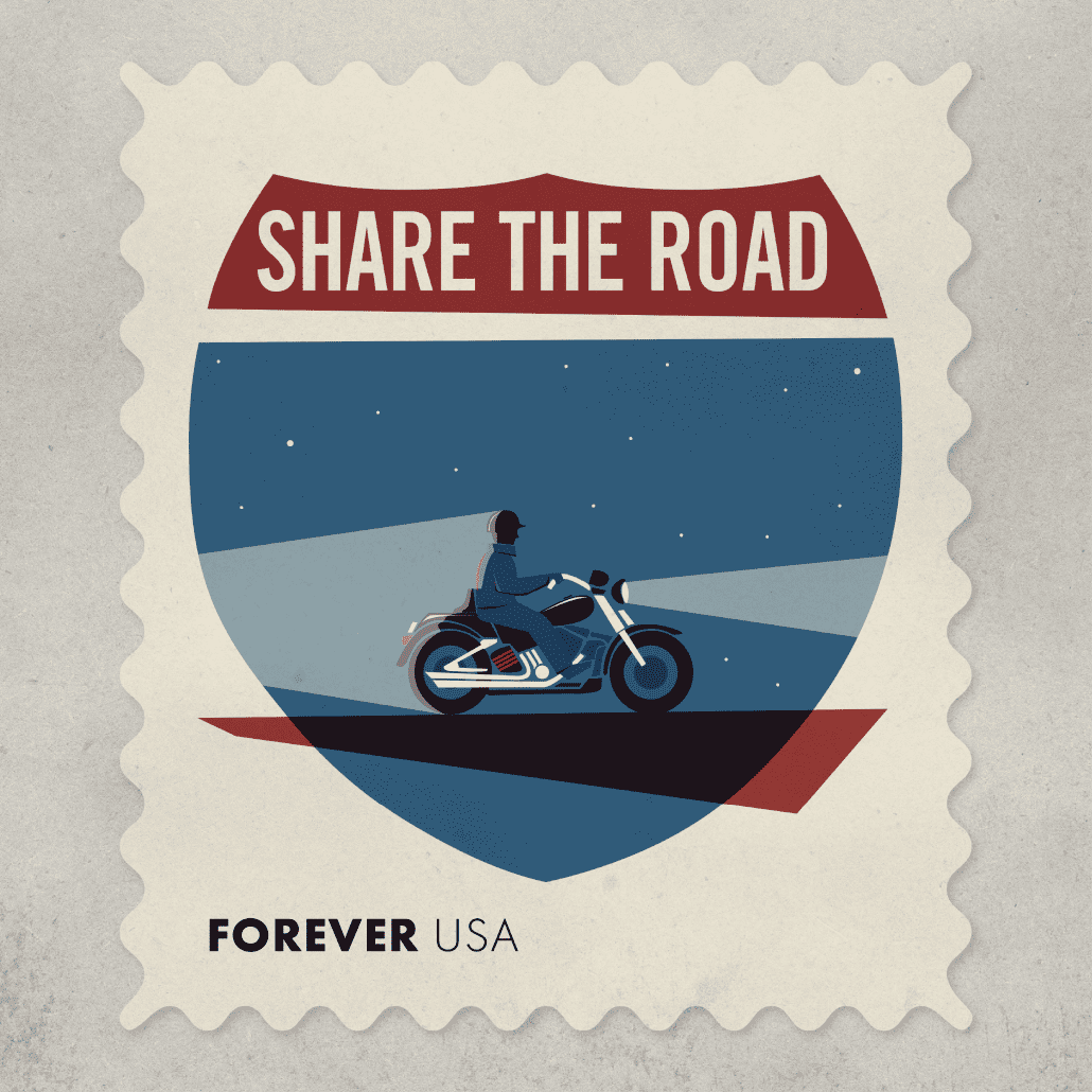
Interstate 90 runs through the center of the state and is the main artery of travel for most people moving through South Dakota. I-90 unifies the state, and touches on a lot of common elements of the experience of living here.
Bisontennial: 200 years ago there were an estimated 75 million bison roaming the countryside. By 1895, that number was cut to 800 due to reckless and wasteful hunting. Now, after 200 years, the North American bison is again thriving in commercial herds and roaming in both wild and protected places. The population is now estimated to be about 500,000.
Accumulation: In a state that averages between 30 to 70 inches of annual snowfall, snow (and snow removal) is a large feature of life. For every mile of interstate, South Dakota spends more than $2,800 on winter maintenance. So if you get a chance, buy a coffee for one of the 400 or so workers who are driving the state DOT’s snowplows this year.
No Services: With the straight lines created by the 1956 Interstate Highway Act, small towns that found themselves too far off the interstate gradually lost ground to those communities that were closer. Sometimes towns bypassed by the interstate saw business come to a standstill literally overnight.
Home Alone: My first car was a 1984 Subaru GL station wagon, light blue and relatively reliable. I loved that I could throw everything I needed in the back and drive wherever I needed to go. I put Christmas lights in the back windows and installed a switch by the gear shift—I’m lucky the whole thing didn’t catch on fire. My second car was a 1990 Subaru Legacy station wagon—no Christmas lights but just as great. I’ve never owned a kayak or a teardrop trailer, but maybe someday.
Share the Road: Of the 546 motorcycle accidents reported last year, 51% involved another motor vehicle. And I drew a helmet on this guy because in 245 (or 55%) of last year’s accidents the riders weren’t wearing helmets.
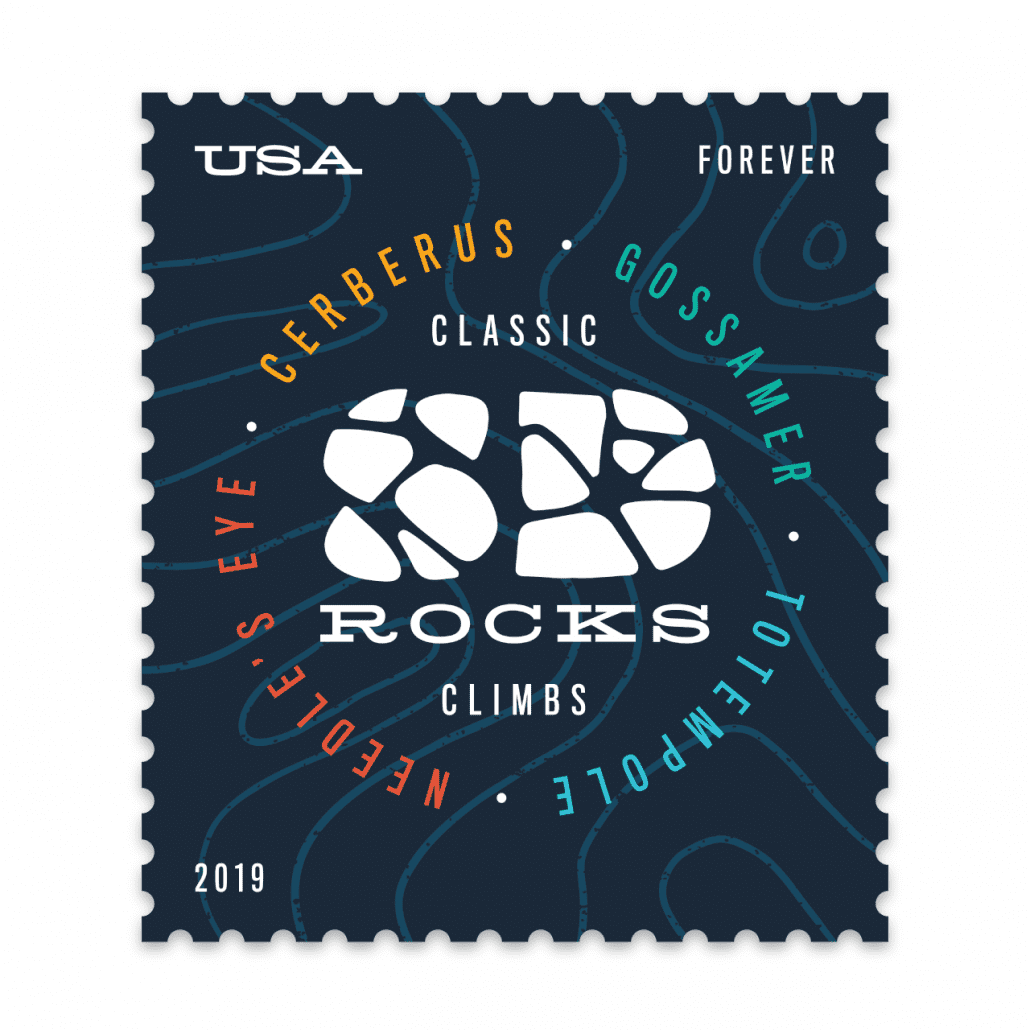
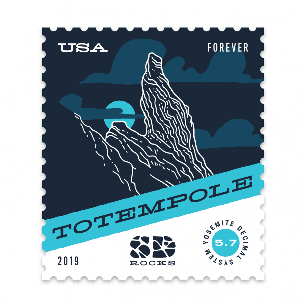
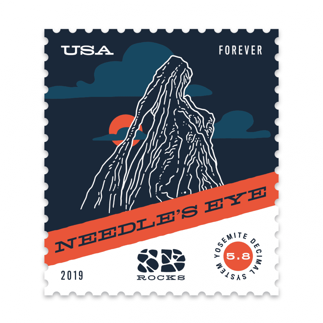
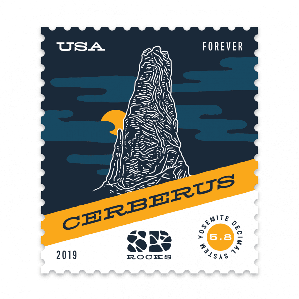
Rock climbing strikes me as a very physical test of strength and endurance, but also one of creativity—finding a route up what appears at first to be an unscalable rock face. So it’s only appropriate that one must also exercise creativity in naming a newly devised route—an honor given to the first climber to ascend (or “send” in climbing lingo) a new route. South Dakota’s Black Hills region features granite spires and limestone canyons that provide for spectacular rock climbing, and which give birth to even more spectacular names.
In rock climbing there are both good and bad names. Poor names are childish or in poor taste; the worst names are misogynistic or racist. A good name can put a new climb on the map, attracting more climbers and elevating it to the status of legendary. The best names describe the rock or route itself with fitting imagery or a clever reference. In that sense it can be like the task of naming a new business, or designing an appropriate logo for it. Cerberus, a climb in Custer State Park, is on a spire with three little peaks at the top—a reference to the three-headed hound that guards the gates of the underworld in Greek mythology. The name lends enough antagonism to feel like a challenge or foe to overcome, inviting intrepid climbers to try and best the beast.
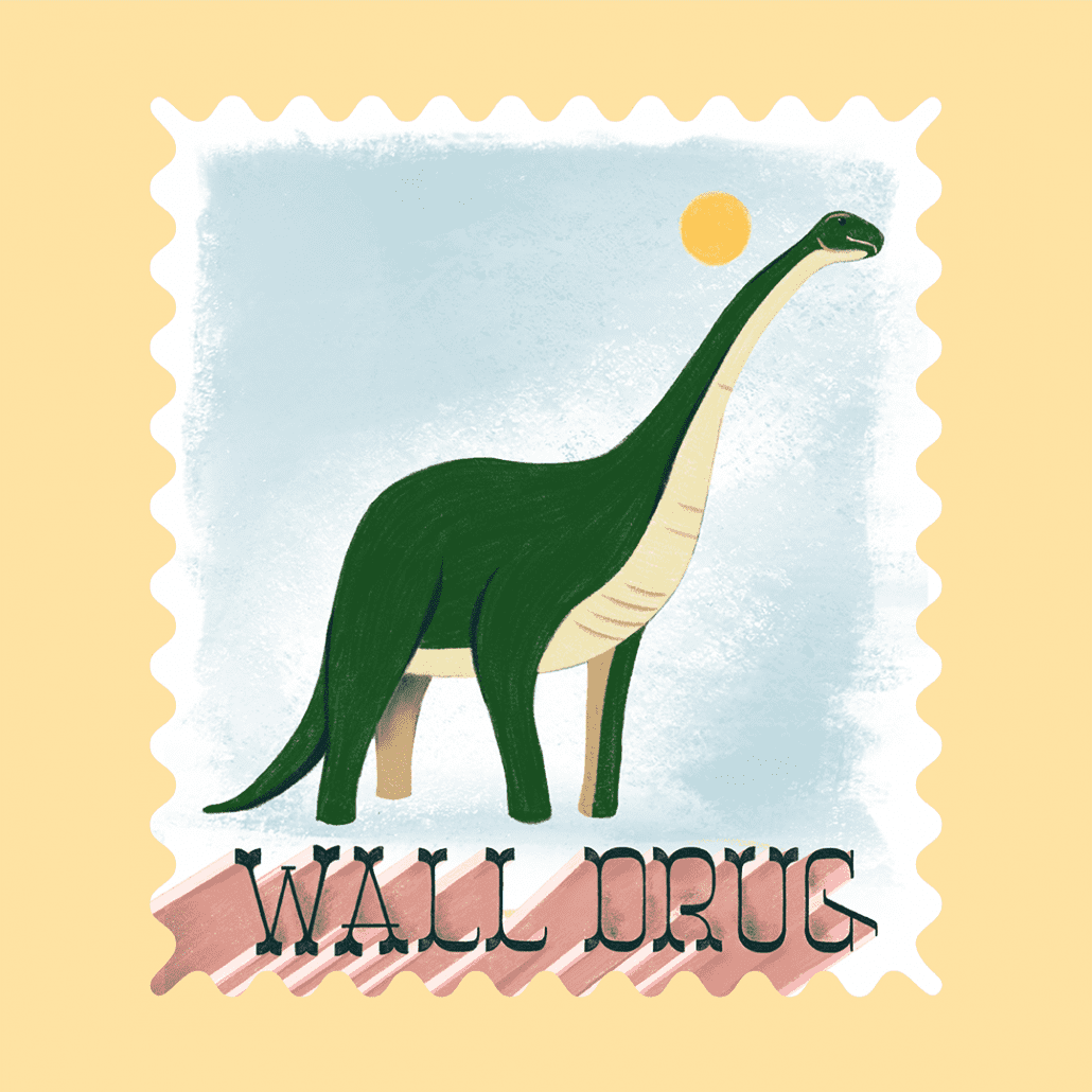
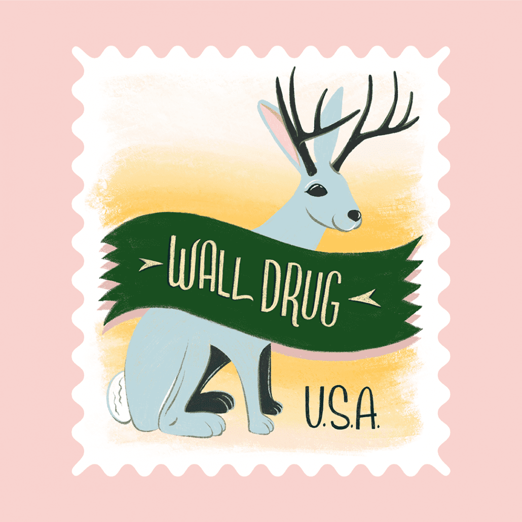
Wall Drug is a wonderfully weird place. It’s the ultimate American road trip stop attracting 2 million people* per year—but why is it so popular? I think some people just need to see what all the fuss is about. Hand-painted billboards advertising Free Ice Water put Wall Drug on the map decades ago and led to a national and international network of billboards that point back to this obscure corner of South Dakota. The climbable jackalope, the 80-foot dinosaur, homemade donuts, and iconic signage are the most popular tourist photos at Wall Drug. I drew them with a brush tool that gives it some roughness reminiscent of a fading billboard. The pastel color palette borrows from that early-morning light and shadowy landscape you get on a long road trip. I, the bleary-eyed kid in the back seat of this road trip, wakes up and thinks, “Where in the world are we?” We pull up to a parking space. The sign says “Welcome to Wall Drug” and it smells like donuts.
*To put it this number into perspective, there are less than 1 million people living in both North and South Dakota combined.
https://mattjensenmarketing.com/wp-content/uploads/2019/10/MJM-Stamp-Show-Blog-Feature.jpg11812083Kirstie Wollmanhttps://mattjensenmarketing.com/wp-content/uploads/2019/09/mjm-logo-nav.pngKirstie Wollman2019-10-23 19:10:382021-06-02 15:21:03MJM Designers Participate in AIGA South Dakota Stamp Show
At Matt Jensen Marketing, we use a wide range of creative tools during our design process, but there’s no tool more important to a designer than his or her vision.
Joel Jochim, graphic designer and beard wizard, relies on his vision throughout the design process to create great visual work for our clients. After a decade of wearing contacts and experiencing discomfort in recent years, Joel went to Vance Thompson Vision to see if they could help. He wanted to see if they had a laser vision correction option to help him reduce or eliminate his need for contacts (while preserving and protecting his vision). Through a series of diagnostics, Joel learned he was a candidate for Photorefractive Keratecomy, or PRK. We sat down to ask him about his experience:
Q: What went into the decision to get this process started?
Joel Jochim (JJ): I had been wearing contacts for more than ten years, and most of those years had been fine and without issue. Eventually, my eyes started feeling uncomfortable on a daily basis, which is when I realized I needed a change. I had my eyes checked out to see if anything was wrong and it turned out my contacts were irritating my eyes to the point that they were leaving scars on my cornea, and even could have effectively left me blind. After the doctors at Vance Thompson Vision discovered that, they decided the scarring was significant enough to have the PRK procedure versus a more common approach like LASIK.
Q: What was your experience like with the doctors at Vance Thompson Vision?
JJ: The staff at Vance Thompson Vision was extremely personable and helpful. They were the only ones to alert me to what was actually happening with my eyes and gave me a clear path forward to improve my vision. Beyond that, they educated me about the treatment that was right for my unique situation. Q: What was your recovery like? How is your vision now?
JJ: PRK is more uncomfortable in the recovery phase when compared to LASIK. While the procedure is quick and painless, I still took it easy the first week, especially in bright light. That being said, after that first week my eyes cleared up and felt better than they had in years. Six months later, my eyes feel completely normal and I have better than 20/20 vision. I genuinely couldn’t be happier with my choice to have PRK. Q: What is one aspect of your life that has been improved, besides your vision, after this procedure?
JJ: The doctors at Vance Thompson Vision and the PRK procedure have made it so I don’t have “bad eye days” anymore, which occurred often in my life before the surgery. Making plans no longer depends on whether my eyes will be irritated or not. Now, I see better than I ever did with glasses or contacts and don’t have to worry.
In February 2018, I parked my car for my first interview at MJM, and as soon as I walked towards the door I fell up the ice-covered-steps within the first thirty seconds upon my arrival. Amazing, isn’t it? As I confirmed the secrecy of my fall, I brushed the snow off my pants and walked into the office as if nothing had happened.
That afternoon, though started with personal embarrassment, quickly turned into warm hellos as I walked into the office with wet knees from the snow and went into an interview turned full blown conversation of the office’s beginnings, discussion of strengths, and an affirmation that MJM is where I wanted to be.
As I reflect on just under a year from that wet-kneed interview, I’m very confident that infamous up-the-stairs-tumble was an accurate representation of how my time would be here—an experience of falling upwards.
My first couple of weeks as an intern, trust me, there was a motif of falling and embarrassment. In such a fast-paced world like marketing, things are ever-changing with the trends and the moment an account manager tells you one thing, it already changed by the time you’re gathering your own information. My creativity bloomed for practices to pretend I knew what I was doing in those first two weeks.
Though there was some adjustment to working, there also was a welcoming feeling as I started to settle into the office—just like my initial interview. It was the giggles on the couch with the account managers, the constructive feedback I got when I got off track, and the launch of my skills I didn’t know I had to develop my writing skills far beyond what I ever learned in school. Even if I were to fall, I would still catch myself on a higher platform from where I was before, each of my mistakes giving me more insight into how this industry works.
There’s a couch in the MJM space, which I like to call “my office,” that I work on most days that allows me to take a step back and allow me to really observe. From “my office,” I can hear the bathroom door that absolutely slams behind me every so often and the pitter patter of dogs running in the apartment above us. On the contrary, there’s also this aura of creativity that emerges when I see a group gathered around a computer working on a project, the determination coming from the design team when they’re deep in a project, and the ambiance of all of the creative and tactical minds functioning in perfect (and sometimes imperfect) harmony.
I came into this office with snow-covered jeans but will leave with an absolute remodel of my knowledge about all things marketing. I touched client work ranging eye care practices, aesthetics companies, virtual training platforms, amongst many more. Did I mention on one of my first weeks our CEO made me draw and label an eye in front of some of this country’s leading ophthalmologists? It’s truly a whirlwind around here.
Though I’ve stayed on part-time as I “fell-up” back into my school year, this internship has given me a chance to reflect and analyze what I want to be doing in the future. If it’s anything like my time here at MJM, I’ll be just fine.
https://mattjensenmarketing.com/wp-content/uploads/2019/05/Anna-BW-IMG_9843-a.jpg5671000Anna Striteckyhttps://mattjensenmarketing.com/wp-content/uploads/2019/09/mjm-logo-nav.pngAnna Stritecky2019-05-09 16:39:042021-06-02 16:09:49Falling Up
At MJM, our team wears many hats while completing the diverse client projects; we fulfill the roles of designers, writers, storytellers, experience makers, account managers, videographers, carpenters, and many more. But last October, our team members took on a hat never worn before: Formula One Race Car Drivers.
Working with our partners at ZEISS, Logan, Abby, and Courtney took the lead for planning and executing an event celebrating the FDA approval of the SMILE astigmatism treatment indication in the United States at the American Academy of Ophthalmologists (AAO). Using a Formula One theme, the MJM team was able to create a wonderful evening of education, conversation, and enjoyment on a beautiful rooftop in Chicago.
In addition to the overall success of the event, here are a couple lessons our team took away from the event:
Logistics are very, very important!
This event celebrated the approval of the SMILE laser in the US for astigmatism treatment, which makes it a more useful technology for practices and more accessible to patients. SMILE is one of the first major innovations in refractive eye surgery in the past 5-10 years, which has brought energy and life to the doctors who are deciding to offer it.
Our partnership with ZEISS started when we helped create the first practice launch kit for SMILE, and the partnership continued as we helped curate and design this event. After moodboards, strategic goal discussions, MJM team brainstorming sessions, and dozens of calls, the event landed on a theme: Formula One Racing.
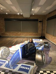
Courtney poses as a driver. The account team found a Chicago chalk artist who created a massive perspective drawing that put attendees behind the wheel of a F1 racing car.
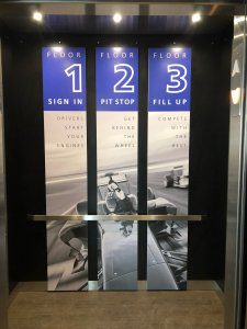
Our team developed all the graphics and layouts based on the theme and curated a three-floor immersive event experience, which included specialty cocktails and an interactive art installation. At the event, doctors attended six “pit stops”, where they interacted with a short presentation from an expert on SMILE, and were eventually lead to Dr. Dan Reinstein, a doctor and professor who wrote the first and preeminent textbook on how to perform SMILE for patients. Attendees who completed all the education pit stops had the opportunity to receive a signed copy of Dr. Reinstein’s textbook to take home to their practice.
The valuable takeaway is this: when your event marketing team is able to be a part of the planning, mockups, mood board, and event execution, it’s more efficient to facilitate coordination with the vendors. It took a full team to perfectly produce the event, which illustrates the importance of coordinated effort, time, and planning.
Experiences are met with experiments
Of course, we admit this event didn’t go off without a hitch (or three). From a change of speaker the night before, all the way to Logan putting his Exacto-knife skills to the test due to a mishap with program printing, the team encountered a number of unplanned hurdles that needed to be overcome.
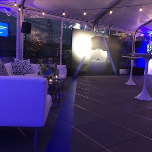
The event was spread between three floors of the venue. Custom elevator signage helped theme each step of the way and direct event attendees to food, entertainment and education.
We also know there are peak experiences that are remembered far beyond any mishaps. As the attendees started arriving and moving from experience to experience at the event, they began to discover, enjoy, and be captivated by all of the small details created by our team. Meeting new people, interacting with the art, enjoying the signature cocktails, and learning new things achieved success beyond what our team had planned. These signature moments, and the culmination of all the moments into a signature experience, will be a lasting memory and takeaway for both the ZEISS and MJM teams.Beyond the night of the event, the work our team did to pull off the theme and overall event was extensive. The theming, attention to detail, venue, and overall event flow, and outcome were executed carefully and with high attention to detail. Members from our team also traveled to Chicago before the event to meet with vendors face-to-face because we understand how important it is to create those relationships in case we do need to call on them to overcome challenges on the night of the event. Each experience we curated was met with an experiment on how to accomplish it.
Time spent for each event is worth it
When you work with clients that are excited about their company, it makes throwing an event that much more successful. The time that went into planning with ZEISS was met with excitement and enthusiasm that their product had been approved.
ZEISS challenged us to immerse their audience in something more than just a traditional AAO event or brochure handout, so we designed a custom experience for their guests, including hiring a local street artist to create a race car photo opportunity right in the middle of the building. We wanted to share our love for experiences and make the ophthalmologists feel welcome and feel comfortable learning about the revolutionary procedure in a simple and organized way. It wasn’t just about the centerpieces and the lighting—it was about the guests that left and remembered why they were there and knew there was something worth celebrating that night.
It’s important to celebrate major innovations and milestones in product development. It’s good for the industry and good for patients. Events like this are one of the only times ZEISS can bring doctors together and immerse them in a brand experience. So much of their sales cycle involves going out to the doctor’s office, where they have no real control of the time, space, and environment. This event was a major opportunity to bring doctors together and shape the ZEISS brand experience, with full control of most of the details. MJM was proud to be a lead partner in building the experience.
A ZEISS blue racing stripe runs through the venue helping to direct traffic and pull the theme together.
As we reflect on our experience through this event, we learned there is a major difference between just hosting an event and designing an event. We design and theme at MJM to use our knowledge of experience design and customer/client psychology. This event reminded us that every company, every product, and every type of customer deserves and loves to be delighted and surprised by a well-executed event. That’s why we love what we do at MJM.
MJM and ZEISS will continue partnering on projects in 2019 and beyond.
https://mattjensenmarketing.com/wp-content/uploads/2019/01/Zeiss-MJM-Event-coordinators-copy.jpg11051250Anna Striteckyhttps://mattjensenmarketing.com/wp-content/uploads/2019/09/mjm-logo-nav.pngAnna Stritecky2019-01-17 16:00:022021-06-02 16:16:18Client Celebration: Staging a ZEISS Formula 1 Racing Event Experience
The holiday season has arrived, bringing with it a strong reason for joy, celebration, and gift-giving. While some may curse the cold and snow, we revel in the abundance of the year and what the holiday season means to each of us at Matt Jensen Marketing. For our CEO in particular, Christmas time is about taking gift giving to a whole other level by creating experiences far beyond spending money on an object, and celebrating how these experiences shape how we remember this time of year.
Q: How is giving experiences instead of things more than just a trend?
Matt Jensen (MJ): Inanimate objects tend to lose their luster over time. This time of year, we are always reminded of what it’s like to be a kid wanting a new Atari Video Game System, a shiny new bike, or that illustrious Red Ryder Lever Action BB Gun. If we think back to wanting those gifts as a child, the most prominent memory about the season isn’t the thing itself. It was all of the tension, anxiety, prayer, begging,and reasoning that went into our asking for it. Anticipation in and of itself is an experience.
That’s why, this holiday season, we should imagine how much more meaningful gifts can be. It isn’t just the anticipation of each holiday season but also the emotions. The fear, adrenaline, suspense, surprise, and resolution all coming together to make these different emotions hinge to an experience. Which creates a greater memory: a set of baking sheets, or lessons from a local dessert maker? The beginner guitar, or a one-on-one session with the concert guitar player? Listening to Beethoven’s 5th on a CD, or being able to walk into a theater with a tuxedo and Chuck Taylor converse and raising the baton to lead the symphony as a 16-year-old? These are the things that memories are made of and memories last far longer.
Q: Can you create an experience for everyone in your life?
MJ: The premium we pay for experience is our own time, so you create these peaks for people if you’re willing to invest your time in them. I’m a believer that you can design an experience around anybody if you stop and get to know them well enough.
My wife’s 40th birthday, for example: I took her on a trip to wine country and though we both enjoyed the good food and wine, it was the fact that I had coordinated with all of her friends that flew in and surprised her one night that made the trip so memorable. How much can that bottle of wine really be worth when you’re enjoying the night away with the people that mean the most to you?
Q: Where do you find experiences that you can give as a gift? What counts as an experience?
MJ: The most creative business owners and best entrepreneurs create an experience around their product. Wouldn’t we all rather take a tour of the factory of the chocolates that we just bought and smell the caramel being melted, watch the chocolatiers designing the marshmallow top, and see each one of your treats being packaged with care? That’s a chocolate-making experience, not just a sale.
Q: How do you wrap up an experience?
MJ: To make every experience spectacular, you have to extend it past the natural beginning and end. Imagine this: A concert where they put electronic wristbands under each seat which lights up different colors when the band is playing their set. The next morning, that bracelet calculates which song danced to the hardest the night before measured on the activity from the and starts blasting that song to wake us up in the morning. Now that bracelet carried on that amazing experience from the night before, and also leaves concertgoers telling the story of how they woke up that morning over, and over, and over again. We would leave on a peak, and that’s what is to be remembered years down the road instead of all the traffic to the concert or money spent.
Q: So, how do you go about creating an experience for someone?
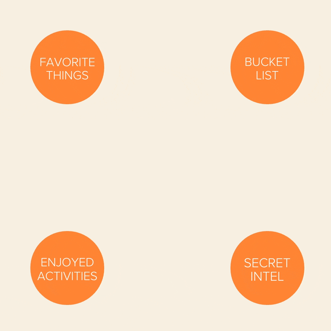
MJ: Look into their favorite things, their interests, their bucket list, and peg an experience where those all intersect. Sometimes an experience is easier to generate than originally thought.
So as we dive into the holiday season, let us take the time to create these experiences and marinate in those moments. We at Matt Jensen Marketing know it’ll be worth it.
https://mattjensenmarketing.com/wp-content/uploads/2018/12/mjm-blog-giving-experiences.jpg5671000Anna Striteckyhttps://mattjensenmarketing.com/wp-content/uploads/2019/09/mjm-logo-nav.pngAnna Stritecky2018-12-17 21:20:282021-06-02 14:01:49How to Give Experiences Instead of Things
Our content team voyaged north to Design Camp for inspiration from leading creatives, technique sharing and time together. Here were some takeaways from the team:
The theme of this year’s Design Camp was “Inside Out” and the goal was for everyone to put it all on the table—personally, professionally and creatively. As a classic reserved Midwesterner, my first reaction when I heard this was, “No, thank you.” But as I listened to the speakers and presenters share their stories, the more I started to think that maybe I do have a story of my own to tell. I have always shied away from doing personal work, believing that my purpose as a designer could only be derived by creating things for other people. But the presentations left me questioning the assumption that creating something for myself is inherently incompatible with creating things for other people.
This idea culminated in the final keynote from illustrator Andy J. Pizza who talked about how looking at gig posters had helped him dig himself out of a depression. Something that was meant to be functional and ephemeral had become someone’s lifeline. As designers, we have very little control over what happens to our work once it has been released into the world. Most often, we worry about people misunderstanding or even ruining our work, but isn’t magical to think that our work could be thing to turn someone’s life around?
So, still being a Midwesterner, I of course did not voice any of the ideas that were running around in my head during the actual weekend, but it has got me thinking about how I can use design to tell my own story. Because, maybe, there is someone out there who needs to hear it.
– Kirstie
Plaidurday 2018
Design Camp 2018 was a great opportunity to glean new techniques and meet skilled designers, but the most important takeaway I had from the experience was that even the most veteran designers out there undergo the same brief moments of doubt and near-burnout that all creatives do. Not only do they have these moments, but their experiences have taught them how to systematically push through these obstacles and return to creating their best work. We able to hear these and learn from these stories thanks to the vulnerability the keynote speakers were willing to show us, so I think we can all agree that we’re endlessly thankful.
– Joel
Design Camp was a fantastic weekend of fellowship and learning for our design team. We studied and discussed the creative process, inspiration, and collaboration and came home with some great tools to improve our work. One teaching theme emerged for me from a number of the speakers, and reflects a comment from a famous athlete:
”It seems like the harder I work, the luckier I get.”
A number of speakers reflected on how they fought through low periods of creativity or dead periods of work. For those that found their way through these periods, a common theme was ”just keep working.“ Work projects, personal projects, passion projects—find a way to keep working and producing. It was often this work borne in low periods that created the exposure or inspiration for future successful work. This kind of ”luck,” obviously, is created through dedication and intentional focus, and all creatives need to find a way to fight through their low periods and breakthrough. At MJM, having a great team of creatives around to work with and create with definitely helps support each individual creative as they work hard and create more luck!
– Logan
I have one core or foundational belief about creativity. It’s that new ideas are simply new combinations of familiar things. This concept of combinatorial creativity is only reinforced by conferences like Design Camp. It’s incredibly invigorating to spend a weekend retreat with like-minded designers and thinkers, getting inspired by the journey others have taken and the things they’ve learned along the way.
One of the workshops outlined a technique for ”Bulletproof Ideation” by combining ideas in a methodical fashion. We learned about the Bedno Diagram – a tool invented by designer and educator Ed Bedno—which provides a framework for seeing and exploring the intersection of multiple ideas. The process was very familiar, but I had never seen it implemented so thoroughly and methodically. And I was inspired by the suggestion to use the technique to reverse engineer ideas that have inspired me, to understand how their creator may have arrived at that solution. It was a good reminder that good ideas don’t come out of thin air, delivered by a muse in a ”eureka” moment. They are intentionally crafted and combined, and are accessible to all who are willing to work rigorously for them.
That last point connects back to the final keynote speaker, Andy J. Pizza. He shared the highs and lows of his creative journey, and wisdom he gained along the way, with the ultimate conclusion that there are no shortcuts for a fulfilling creative career. You have to do the work. And sometimes you have to struggle for it. That struggle might look like an exhaustive Bedno diagram, or piles of discarded concepts on the way to one workable solution. Learning to enjoy the process and to see it as intrinsically valuable is the key to going far.
– Brady
No matter what you want to learn, most skills and ideas are available to anyone who is interested through YouTube tutorials and Skillshare classes. You don’t need to drive halfway to Canada to find inspirational speakers or to learn interesting new techniques, but our design team does exactly that every year.
AIGA Minnesota’s Design Camp is a yearly retreat just outside Brainerd, MN. Each fall the MJM design team makes the trek up to northern Minnesota, and while the workshops and the speakers’ portfolios are interesting, to my mind they are not the most valuable part of the experience. The reward that compels me to make the trip is perspective.
This year that perspective had less to do with design methodology, new paper options, or printing techniques—it was something deeper. I felt like I heard two different answers to the question, “What is your work for?” Some of the speakers I heard and the designers I met talked about the scope of their portfolio and the size of their audience; they spoke about their personal brand and their career path. Good work equals more glory. Other people focused on the lives they had touched, the students they had taught, and the relationships they had formed with clients and colleagues over the course of their career. Good work means better relationships with people.
“What is your work for?”
Looking at my own past work, some of it has held up well, but much of it has not. Projects I worked on even 6 months ago can sometimes cause me to cringe. But the relationships I’ve developed with coworkers, students and clients are evergreen. Last year’s projects are getting stale; last year’s relationships are still a source of joy. Do the work, and enjoy the process, but don’t look to your work to make you happy. The work (whatever it is) is valuable, but it’s really only a backdrop to the things that matter most.
Our very own graphic designer/copywriter/baking extraordinaire, Alison Raaen, has been selected as one of two recipients of the South Dakota AIGA’s Idea Fund, a grant that helps fund designer-initiated projects that impact the community.
Her goal is to create a Sioux Falls coloring book inspired by the culture, landmarks, and ecology of the Sioux Falls community. Each page will be based on something found in the Sioux Falls area. This may include Falls Park, the Great Plains Zoo, the Butterfly House, farmer’s markets, or local cuisine. Alison has had the idea for a while, but the grant gave her the motivation she needed for the project to come to fruition.
As the designer of this project, she is focused on the “colorability” of the book, or how she can make people sit down and experience Sioux Falls in a brand new way. She wants as many people as possible to be able to share in the community and activity that the City of Sioux Falls brings. Raaen swears that this entire project is a learning process, so the book will evolve as time goes on.
“It’s tricky because I’ve never been formally trained as an artist by any means,” said Raaen. “I’ve just been sitting down and drawing each page off an app on my iPad. I think this also brings a message that this book is for everybody, not just those who are artistically inclined.”
She is focused on using her personality of naturally being a “maker” of doodles and design and channel it into a project. Though anybody can take a picture of a Sioux Falls landmark, Raaen hopes to bring a sense of abstract and vibrancy to the pages through her illustrations.
Raaen has six months to complete the project and will present the completed book at 2018 Sioux Falls Design Week. Beyond that, she is working to find cost-effective printing options with vendors and looking to have local stores carry the coloring book upon completion.
“It’s a mix of exciting yet scary being both the designer and director on this project,” said Raaen. “I’m not usually wearing both hats simultaneously at MJM, just because my projects are dictated by client need and now it’s just me and my imagination.”
As for long-term goals, Raaen said she would consider making a series of these books, one for each season. For now, she is just thankful for a beautiful city for inspiration, monetary support from AIGA, and a sense of community that goes along with Sioux Falls.
“I think it’s great that AIGA wanted to support the community to get people like me who wouldn’t have the time to create something we can share,” said Raaen. “With projects like this, it just gets everybody to care a little more about design.”
Check out the video below to learn more about Alison’s inspiration!
You make the MJM office proud, Alison! We can’t wait to stock up on coloring books come October.
https://mattjensenmarketing.com/wp-content/uploads/2018/07/Screen-Shot-2018-07-12-at-11.34.34-AM.png552982Anna Striteckyhttps://mattjensenmarketing.com/wp-content/uploads/2019/09/mjm-logo-nav.pngAnna Stritecky2018-07-12 12:46:422021-06-02 16:18:04A Call for a Community Coloring Book
Each day a new character, and in our case, a new designer as we passed around the alphabet to explore type, animation, illustration, storytelling and more. Designers and illustrators around the world participated in 36 Days of Type by posting to instagram and connected with the #36DaysOfType hashtags. We decided to tackle the challenge as a team this April and May. Repetition invites creativity and crafting. We also invited the opportunity to try new techniques. We stuck (somewhat) to our original color palette and prescribed dimensions and dove in.
I always appreciate projects like 36 Days of Type for creating opportunities to try new tools and solutions in a design setting. I used much of that opportunity to explore computer-generated three-dimensional design and animation. While there are quite a few examples of this in the library of type we created, this “Inflatable C” is one of my favorite results of that exploration. While it’s quite minimal, it shows off some of the new options that the third dimension can create for designers like convincing depth in the subject and a more robust use of simulated physics. Along with all of that, this piece just makes me think of summer.
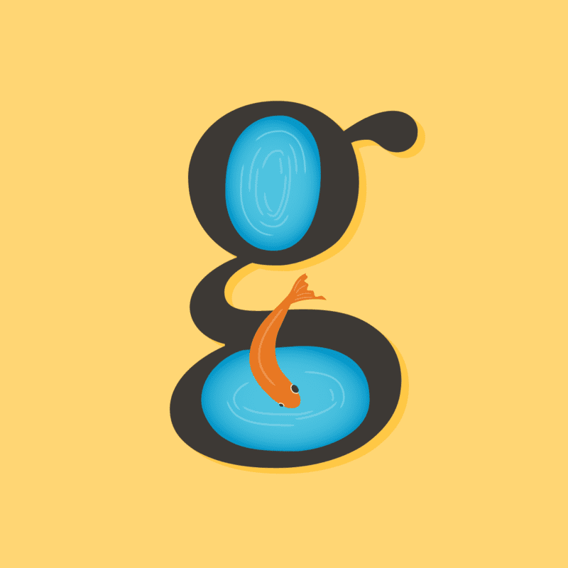
G
Kirstie
The double-story (or looptail) “g” is one of my all-time favorite letterforms. Even though it’s mostly superfluous, difficult to write and unrecognizable to the majority of population, I love how it seems to capture all of the personality of a typeface and its designer. For this illustration, I wanted to take full advantage of the letterform and do something playful to link the two counters. The shapes reminded me of pools of water, so I turned them into little ponds and, in the name of the letter “g,” added a goldfish leaping between the two. It’s a quirky little fish at home in a quirky little letter.
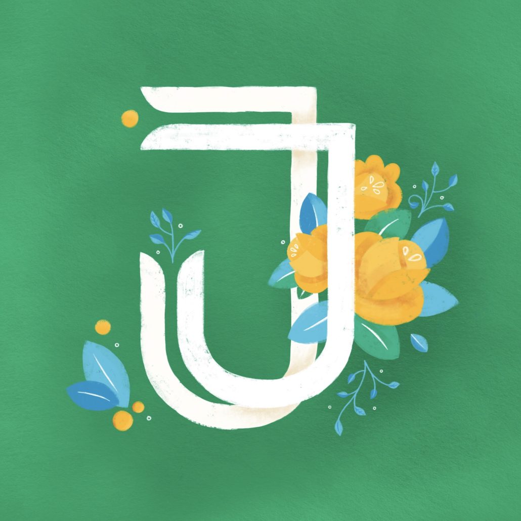
J
Alison
I think the most interesting part of a capitalized J is its arm. Many sans serif fonts do away with it for simplicity’s sake, but I like the way it can balance the otherwise asymmetrical form. I started with a grid paper sketch to articulate my idea. On paper I could visualize how to fit the two scoops of each J shape together and experiment with softly curved terminals. Then I moved to the Procreate app for iPad. I used a chalky brush to give body to the letter, and then used the eraser tool to define the edges and corners. Procreate allows layers so I could add illustrated florals between the tall, narrow J and the more squat, overreaching J tucked in where I wanted—and still have each piece editable. I fit organic shapes and ornaments in and around the ribbons to complete the bright composition.
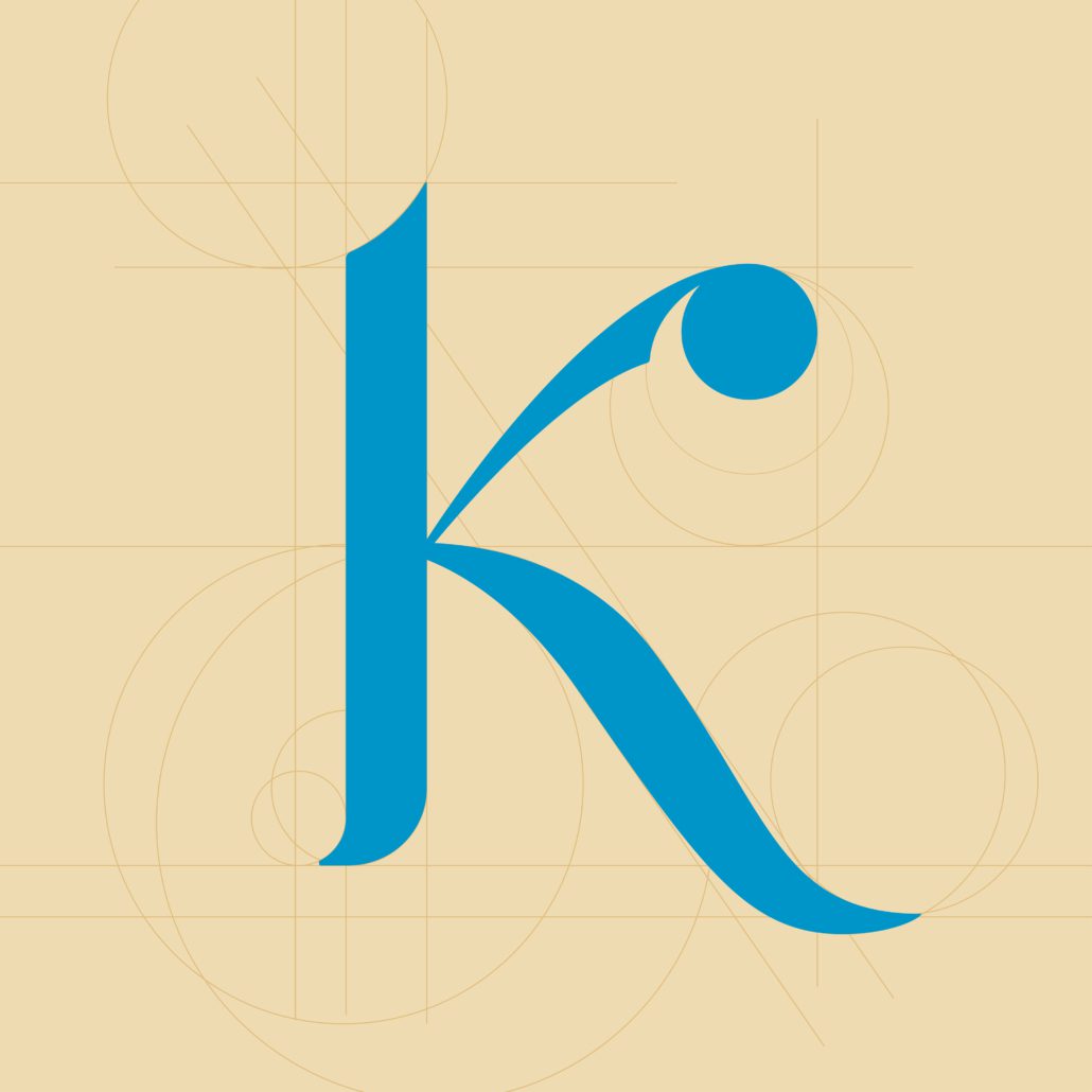
K
Tim
One of my favorite aspects of the 36 Days of Type project was that it gave us freedom within a rigid structure. That sounds like a contradiction but it’s not—the project was completely open-ended, with no direction or client feedback, but at the same time, the content was inflexible (the letter of the day), the timeframe was limited (one letter each day) and as a team we also chose to limit ourselves to a common color palette. Freedom within constraints can lead to remarkably creative solutions.
For some of my letters I tried to build a formal letter shape, conforming to typographic traditions and crafted for legibility and grace. This K is an example. After looking at other K shapes in a variety of fonts and calligraphy I identified some of the geometric “bones” that I wanted to build my K around.
In other letter explorations, I chose a more conceptual approach. I thought it would be fun to build the letter P shape out of large, oversized pixels. In the animated version of this “P is for Pixels” composition, I created a digital sort of shimmer by slowly fading each block between a few different values of blue.
X
Brady
I love projects that require a series of explorations around the same prompt. Eventually your typical approach to the problem starts to feel tired and uninspired and you are forced to try something you might not normally consider. 36 Days of Type was that sort of project for me (even in just the 7 or so iterations I completed as part of our team approach).
Part way through my initial explorations began to lose their initial spark and I started looking around my environment at home for inspiration. We have a variety of patterned fabrics and other materials around the house, from curtains to coasters, and while studying them one evening I started to imagine how those patterns would look in motion. One pattern in particular happens to feel very much like a grid of geometric letter X’s.
Once I tested the idea with X, I wondered about the same concept applied to a different pattern-letter combination. It was interesting approaching the problem from the other direction the second time around, starting with a particular letter or number and trying to discover it in an already existing pattern.
You can see the whole set from the MJM design team on our Instagram account or by watching the video below!
https://mattjensenmarketing.com/wp-content/uploads/2018/06/MJM-36-days-of-type-grid-2018-for-blog.jpg383676Alison Raaenhttps://mattjensenmarketing.com/wp-content/uploads/2019/09/mjm-logo-nav.pngAlison Raaen2018-06-19 20:50:212019-09-05 22:03:50Designers Tackle the 36 Days of Type 2018


 The theme of this year’s Design Camp was “Inside Out” and the goal was for everyone to put it all on the table—personally, professionally and creatively. As a classic reserved Midwesterner, my first reaction when I heard this was, “No, thank you.” But as I listened to the speakers and presenters share their stories, the more I started to think that maybe I do have a story of my own to tell. I have always shied away from doing personal work, believing that my purpose as a designer could only be derived by creating things for other people. But the presentations left me questioning the assumption that creating something for myself is inherently incompatible with creating things for other people.
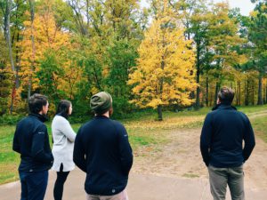
 I have one core or foundational belief about creativity. It’s that new ideas are simply new combinations of familiar things. This concept of combinatorial creativity is only reinforced by conferences like Design Camp. It’s incredibly invigorating to spend a weekend retreat with like-minded designers and thinkers, getting inspired by the journey others have taken and the things they’ve learned along the way.