But before you assume that I only “make pretty things” for a living, let me explain what I really do.
Before anything can be made attractive, a designer has to become a puzzle solver who takes the constraints, wants, and needs of clients and moves them from nebulous ideas to concrete deliverables such as brand identities, billboards, slide decks, websites, social media pages, the occasional boat wrap (!) and, of course, an array of printed materials.
It’s rare for our clients to know exactly what they want at the beginning of a project so we bring shape to their thoughts. We work through scenarios and solutions — often for weeks and even months — and, only once all the obstacles have been overcome, do we package it all in an attractive way.
Designers — especially my colleagues at MJM — also tend to take criticism and feedback with grace. We know that the honest input of others is vital to getting a project over the finish line and without it we’re only as good as our own perspective. That’s not to say we’re pushovers; we’ll share our perspective as needed. We’re just more interested in everyone else’s thoughts.
Admittedly, everybody designs things in some capacity or another. Canva and the like have made it accessible and that’s a good thing — the more people who understand what it takes to pull together something simple like a Facebook post, the better.
A full-time designer, however, has special skill sets that can span the multiple demands of a project. We never stop learning new technology and techniques for photography, illustration, animation, video, social media, and on the list goes.
Maybe most notably, we’ll hang in there until the very end. We may miss the mark at times, but we’ll always try again…and again until we get it right for our clients. Not only are we puzzle solvers, we’re addicted to progress, to the process of making something better than it was when we started, to seeing it evolve into something that delights our clients and drives home their message.
https://mattjensenmarketing.com/wp-content/uploads/2021/06/MJM-Designer-Blog-Image-2021.jpg6811200Joel Jochimhttps://mattjensenmarketing.com/wp-content/uploads/2019/09/mjm-logo-nav.pngJoel Jochim2021-06-28 12:33:162021-06-29 12:40:48What Designers Really Do and Why You Need One
In the era of social distancing and quarantining, it can be easy to believe that designing personal experiences for your customers is an impossible task. Since some of the key principles of experience design rely on using of the five senses to create the largest impact possible at each touch point, it would seem that those efforts would be rendered useless in these times of social distancing and virtual meetings. But we believe that these principles have never been more important.
With COVID-19, people are experiencing physical and even mental isolation. They miss even the most mundane aspects of what used to be normal, from reading a book at the coffee shop, to visiting their parents, and even making spontaneous trips to a big city. We believe that experiences with customers and patients can be redesigned to help create a new, healthy normal for these customers looking so hard for what used to be just another day.
To design compelling experiences in “the new normal” one must first consider
What is different
What is the same, and
What can we do to adjust and create personal experiences for our customers in these circumstances.
What Is Different
What Is Different? Designing virtual experiences is more important than ever
What Can We Do? Enhance your virtual presence
People are far less likely to make the first point of contact with you in-person these days. This mean that it is time to modernize your phone systems, social media, and web elements to create a more intimate and personalized journey for the customer or patient.
What is Different? Safety is a primary concern in any interaction
What Can We Do? Create and message your safe in-person environments
Make it clear how you have taken every consideration possible to make a visitor’s experience a safe one. Post pleasant reminders to maintain safe distances and wear face coverings.
What Is Different? Financial struggles have been exacerbated for both businesses and families
What Can We Do? Avoid pushy messaging and ensure you are building relationships with your audience
The hard sell is (and always was) a bad approach. Instead of pushing sales and discounts, it is more important than ever to build a relationship with your customers and patients through social media, advertising, and other channels. If they feel that empathy and understanding is genuine, they will be far more likely to return to you when financial burdens have minimized.
What Is Different? People are yearning for elements of normalcy and socialization
What Can We Do? Make the visitor the star
With fewer people visiting in-person locations, you have an opportunity to spend extra time tending to those visitors and making them feel heard and appreciated. The benefit of this is two-fold: visitors will feel even more important AND potentially feel like the entire experience is more tailored to them than would have been possible in the old normal.
What Is the Same
What Is the Same? The experience is the marketing
What Can We Do? Reexamine every point of contact with your business or practice as part of your marketing
The experience of calling to plan an appointment should be considered as important as the actual experience of visiting or any ad campaign you have running. Creating memorable interactions throughout the customer or patient’s journey will always be the highest priority, no matter the circumstances.
What Is the Same? Mass customization is still a key to personalized experiences
What Can We Do? Skillfully tailoring offerings and journeys to an individual’s needs and wants will build a relationship
Think of the experience as more than just a transaction. During that customer or patient’s experience, look for elements that can be personalized just for them with little effort or cost to you. Do this well, and you’ll be well on your way to sustainably establishing a relationship with that audience member.
What Is the Same? In-person interactions are still largely impacted by considering the five senses
What Can We Do? Highlight the senses that we still can use to their fullest extent: Sight and Sound
Although masks and extra sanitation requirements limit our ability to appeal to all 5 senses, we still have plenty of room to use them. Warm cookies and coffee may not work right now, but you can still curate the visual and auditory experience of your interactions to make them unforgettable. Now is the time to consider how to make the visual appeal of your facilities match the tone of your brand and determine if there are any ways to personalize the audio experience of a visit to the smaller groups of customers and patients at your physical locations.
While this pandemic has found its ways to separate us, it’s our task to find new ways that experience design principles can connect you with your customers and patients. Though some of the approaches may be outside of our usual tendencies, we think that this shows how agile these principles can truly be for making real, personal connections with your audience.
https://mattjensenmarketing.com/wp-content/uploads/2020/10/New-Normal-Spin.gif10801920Joel Jochimhttps://mattjensenmarketing.com/wp-content/uploads/2019/09/mjm-logo-nav.pngJoel Jochim2020-10-30 12:14:162021-06-02 14:01:49Designing Experiences in the New Normal
We have a curious team at MJM, and we’re always engaged with learning to improve our work and ourselves. Having recently emerged from remote work lockdown, we asked our design team to share some of their favorite online learning resources.
Kirstie
CSS-Tricks: Lately, this has been the first place I turn to when I have a CSS question. I really appreciate how clear and approachable the style is and how in-depth they get with even the most fiddly CSS.
Nielsen Norman Group publishes research on a variety of design-related topics. I particularly appreciate their short explainer articles and videos on design principles. They generally explain the principle and then show it in context on an actual design.
Farnam Street publishes articles full of “timeless ideas for life and business.” There’s a definite emphasis on the importance of lifelong learning and cross-disciplinary curiosity. Their articles are rich with links to other ideas and more of their writing, so it can be a bit of a rabbit hole! The Mental Models collection is a great place to dive in.
Tim
School of Motion: Lots of great content about all things motion, delivered through articles, interviews, and tutorials. And courses, of course – it’s called School of Motion for a reason. This is one of those sites that frequently results in “Oh! That’s how I should have done it the first time” moments.
Joel
Lynda.com: A website that offers online courses for things ranging from creative software to business skills.
Skillshare: A subscription based service that provides well-produced video classes on how to do anything from photography to calligraphy.
Spoon Graphics: A website full of tutorial videos and other content created by an excellent designer named Chris Spooner.
36 Days of Type is a global challenge to draw, illustrate, and letter the 26 letters and ten numerals in the Latin alphabet over (you guessed it) 36 days. Artists world-wide share their letterforms on social media using #36daysoftype, creating a massive catalogue of experimental type. Our design team once again chose to participate, you can view the full 36 days on our Instagram feed. Each character could be illustrated, animated, or otherwise constructed and each composition borrowed at least one color from the letter that came before it. The designers put together some post-mortem thoughts on the project:
Tim
This year I decided to continue to explore animation, specifically in After Effects. As a team, we decided to base the color palette for each day’s letter on one or two colors from the letter created the previous day. The goal was to unify the pieces somewhat, without giving ourselves too short a leash.
A project like this is fertile creative ground because it provides two potent ingredients for creativity: a clear objective and a time constraint. Creativity loves constraints. You can make whatever you want, but (helpfully) you don’t have unlimited time. And because you have to produce a letter every day you don’t have the luxury of becoming too precious about each piece. There’s a little bit of pressure because you know there’s an audience, but you’re also free to explore because the stakes are so low—no one cares what you make.
For 36 Days of Type this year, I dove into the world of the open-source 3D design program Blender to familiarize myself with the tool and create some distinct letter explorations. What I found was a powerful program with plenty of potential for future projects. I also discovered the unique and visceral fun that designing in a 3D space can create. Watching your work come to life with the click of a render button is just one of those things that will never get old.
During this year‘s 36 Days of Type, one of the most important skills I gained was not a new technique or software, it was adaptability. For reasons none of us need reminding of, this year’s project didn’t exactly go according to plan. Instead of meticulously planning out my letters, I found myself transforming an Rs into Ps on the fly and choosing ideas based on how quickly I could execute them in between Zoom calls. But, rather than being a roadblock, I found it surprisingly freeing. With the complete inability to be anywhere else, I was forced to live and create in the present moment and my work was better for it.
I love the 36 Days of Type creative prompt for the opportunity to experiment and try something new. I called in the Cavalry this year to help with my animated letters. Cavalry is a new 2D animation tool built around the concept of procedural systems. It relies less on key frames (though it is incredibly well-equipped in that regard) and more on routing values from one property into another to create effects. For example, using a sine wave function to control the vertical and horizontal position of a shape, or even random noise to change its size over time. It felt a little bit more like creative coding or generative art rather than illustration, which was a good stretch for my creative muscles. I didn’t expect to find so much joy in routing data from one property into another and waiting to see what happened, but the surprises and failures were both invigorating. And while it felt much like play and experimentation, I quickly found opportunities to use the tool for project work too, solving problems that would have required much more time and effort using other more familiar tools.
36 Days of Type is a favorite collaborative project. I love seeing what the other designers come up with, and especially what techniques, colors, and forms are appealing to everyone. When I’ve got a short time to illustrate a letter, I resort to some of my favorite tools in Illustrator: the pen tool, the zig zag effect, gradients, and the blend tool. Illustration is not a daily task for me, but it is something I enjoy. 36 Days of Type is a great excuse to get back to illustration process. From sketching to shape and color exploration, I’m grateful to have projects like these to explore the sandbox.
https://mattjensenmarketing.com/wp-content/uploads/2020/05/MJM-36-DOT-Feature-Image-2020-05-19.jpg11812083Alison Raaenhttps://mattjensenmarketing.com/wp-content/uploads/2019/09/mjm-logo-nav.pngAlison Raaen2020-05-28 10:55:302021-05-21 08:58:56Thoughts on 36 Days of Type 2020
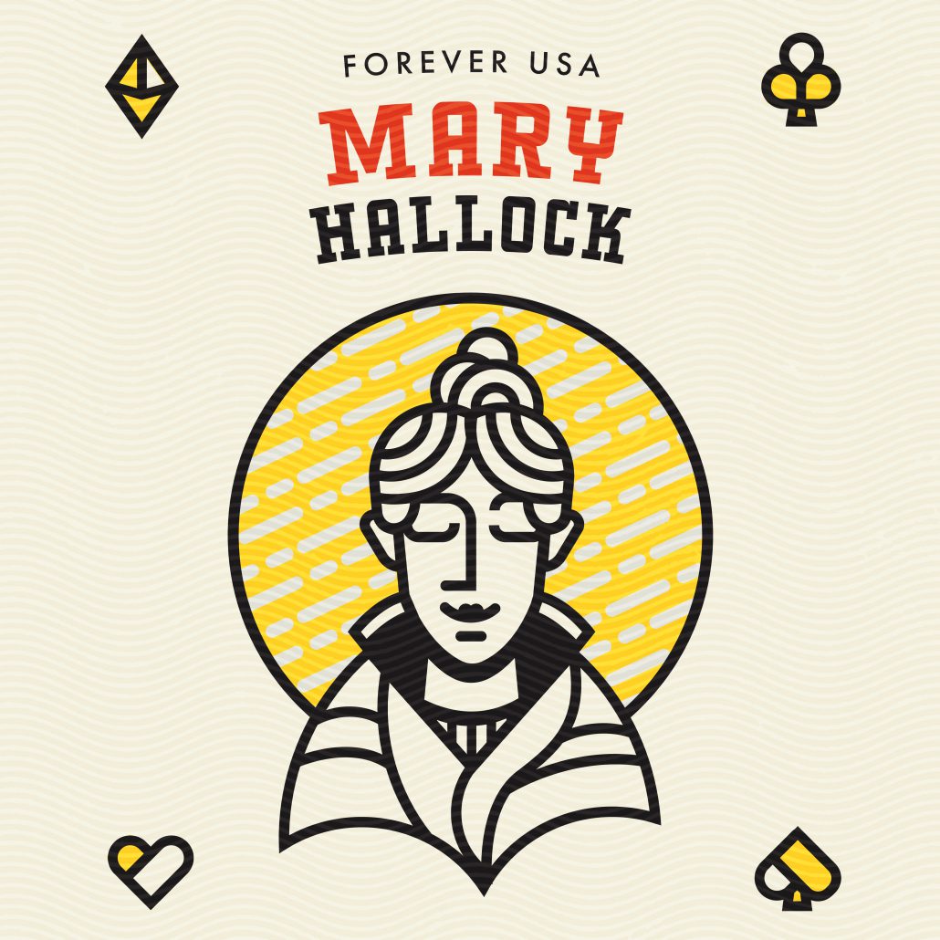
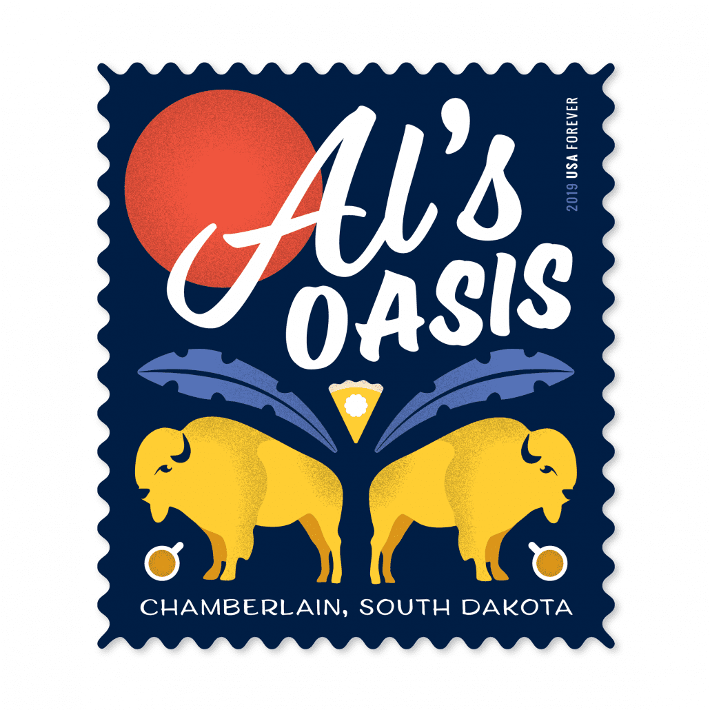
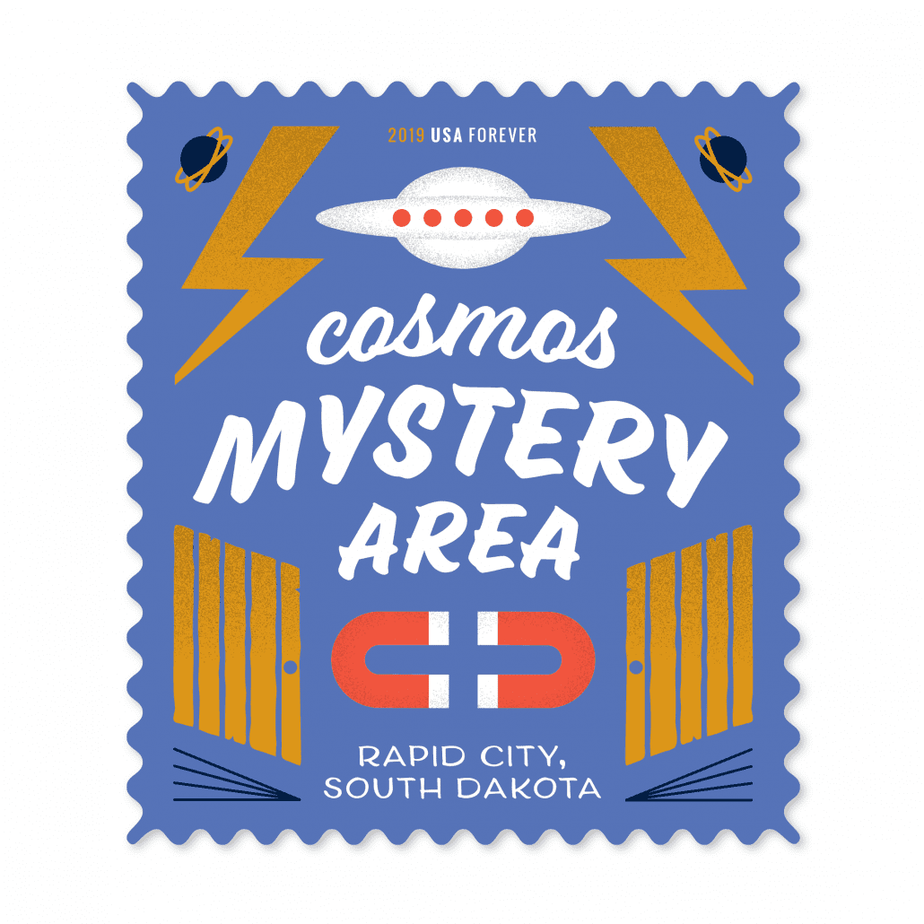
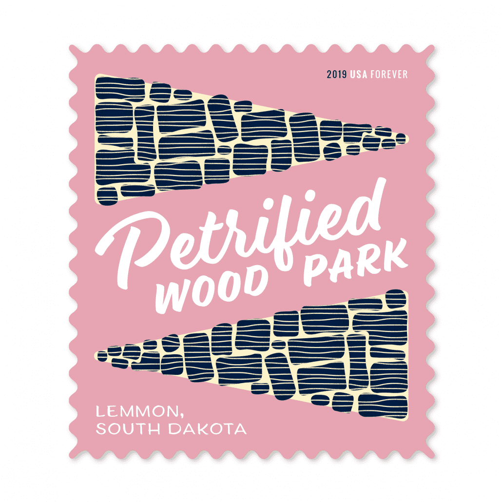
Earlier this month, we had the opportunity to participate in a group show created by AIGA South Dakota — the South Dakota Stamp Show. For this show, AIGA asked 13 area designers to each create a set of five concept postage stamps around a topic related to our fair state. There was a lot of good work in this show, and you can still see it at the Sioux Falls Design Center for a limited time.
Here the designers at MJM talk about their process and work:
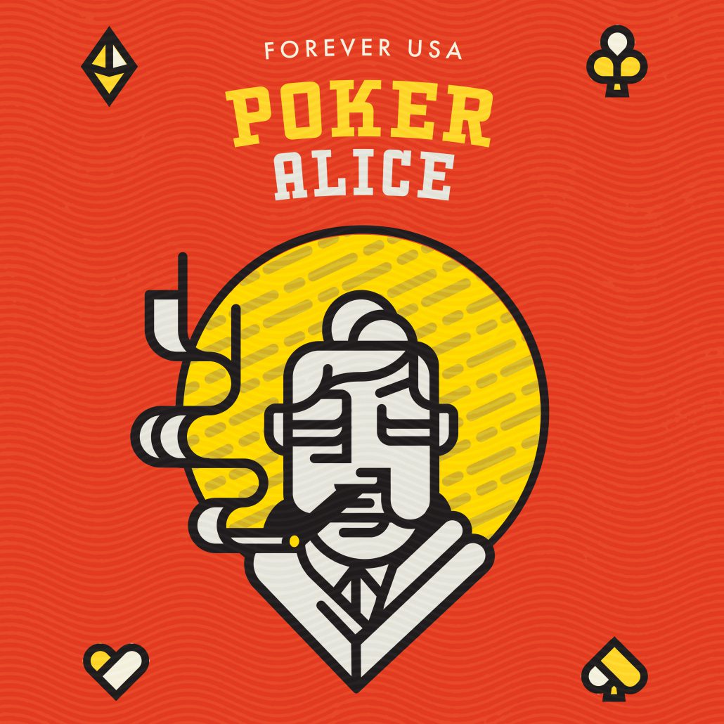
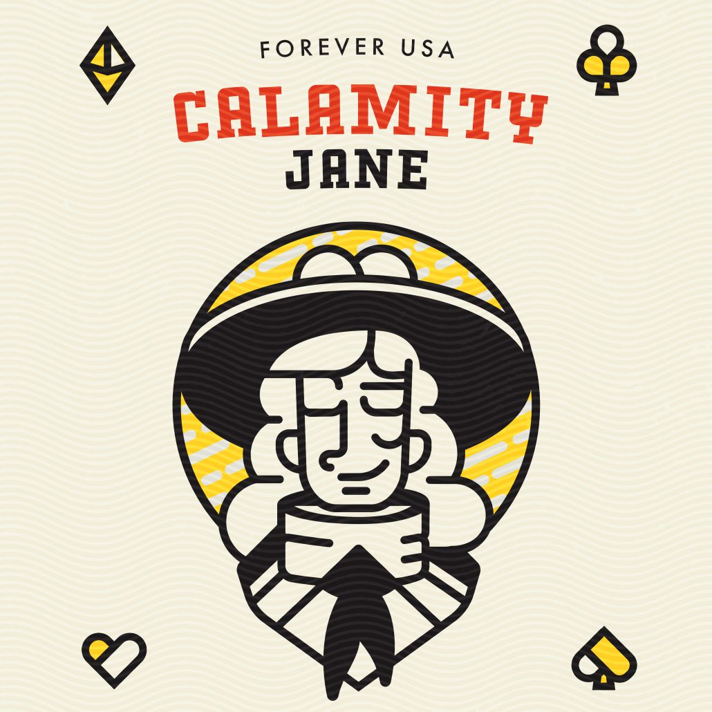
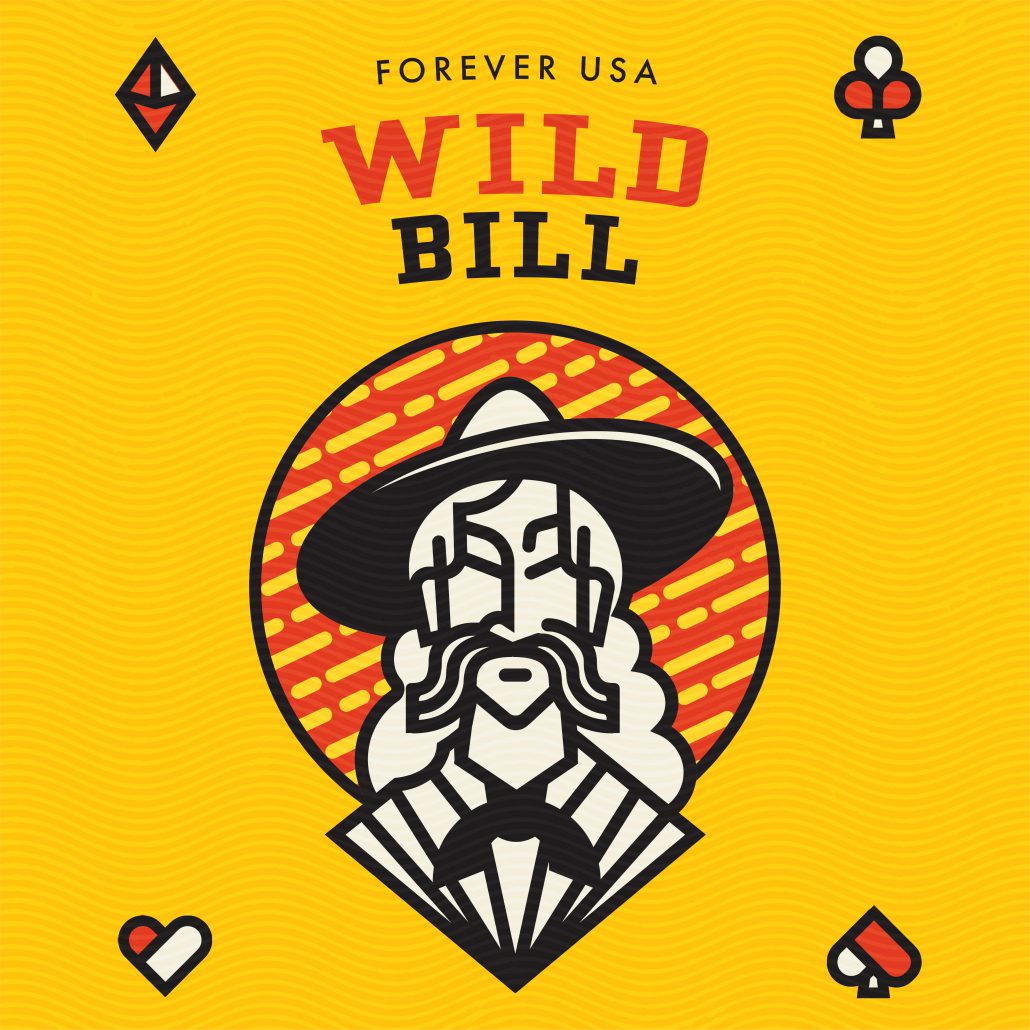
Deadwood
Deadwood is deceiving town.If you were to visit the area today, it presents itself as an unassuming South Dakota town and (aside from some gambling and historic displays) you wouldn’t guess its rich history. With this topic, I saw an opportunity to highlight the people from a long-gone era that made Deadwood a household name. People like Poker Alice and Wyatt Earp. As I researched these historic individuals, I found myself thinking of them as more characters in a drama and less actual people that lived out their lives in our rural region. With names like Wild Bill and Calamity Jane, it’s difficult not to. Because of this, I chose to make the goal of this stamp series is to spotlight that juxtaposition of real person and western legend with a set of minimalist caricatures of some of the most famous people to reside in Deadwood.
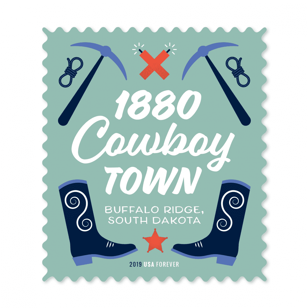
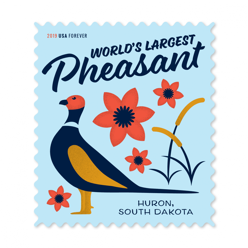
South Dakota has mastered the art of the roadside attraction. Drive down any highway in the state and you’ll be bombarded with billboards advertising sites ranging from the delightfully kitschy to the straight-up bizarre. Are they desperate money grabs? Maybe. But you have to admire the ingenuity of people who have found a way to use whatever resources they have at their disposal to capture people’s attention. The kind of ingenuity that sees some old pieces of wood and turns them into a forest or sees an abandoned town and fills it with animatronic cowboys. Because, why not? In a state as vast and unpopulated as South Dakota, it takes a little bit more effort to remind people that you exist. To honor these beacons of the prairie, I wanted to design stamps that were, above all, fun. South Dakota is usually expressed in shades of greens and browns and I wanted to bring in some vivid technicolor that screams, “I’m here! Look at me!”
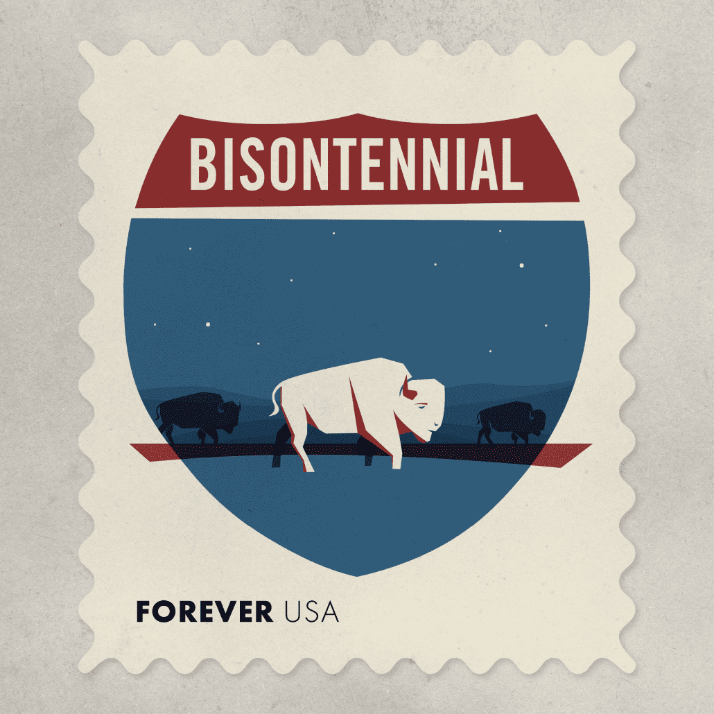
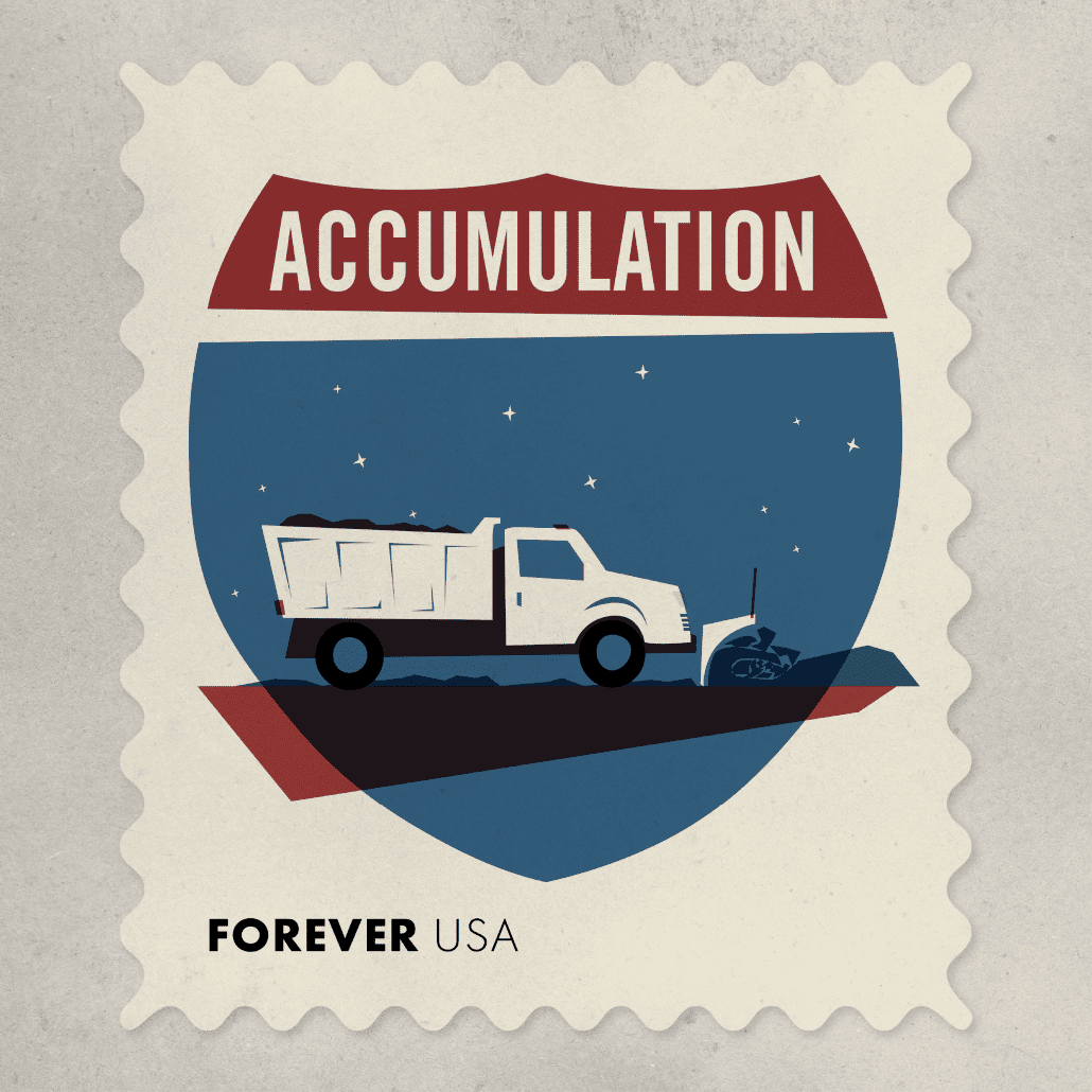
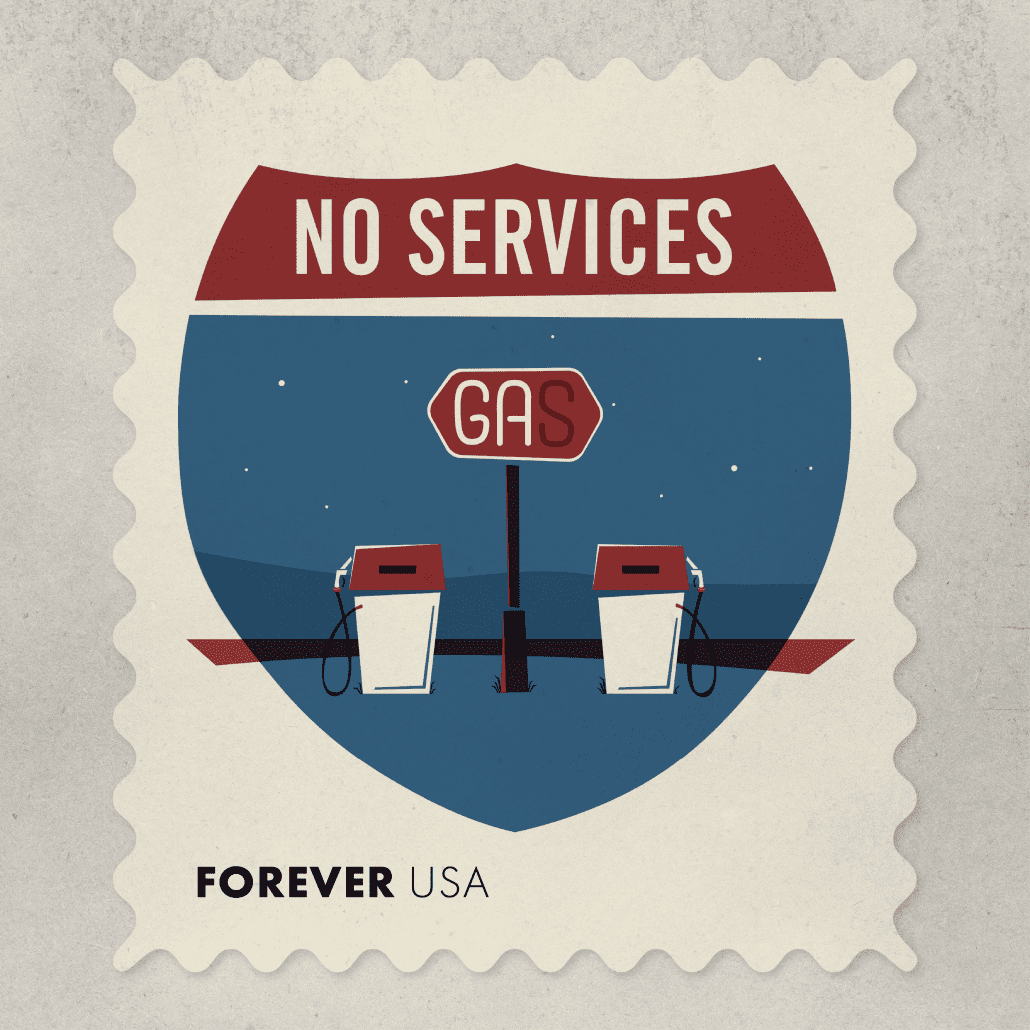
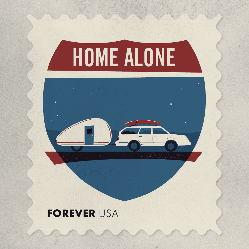
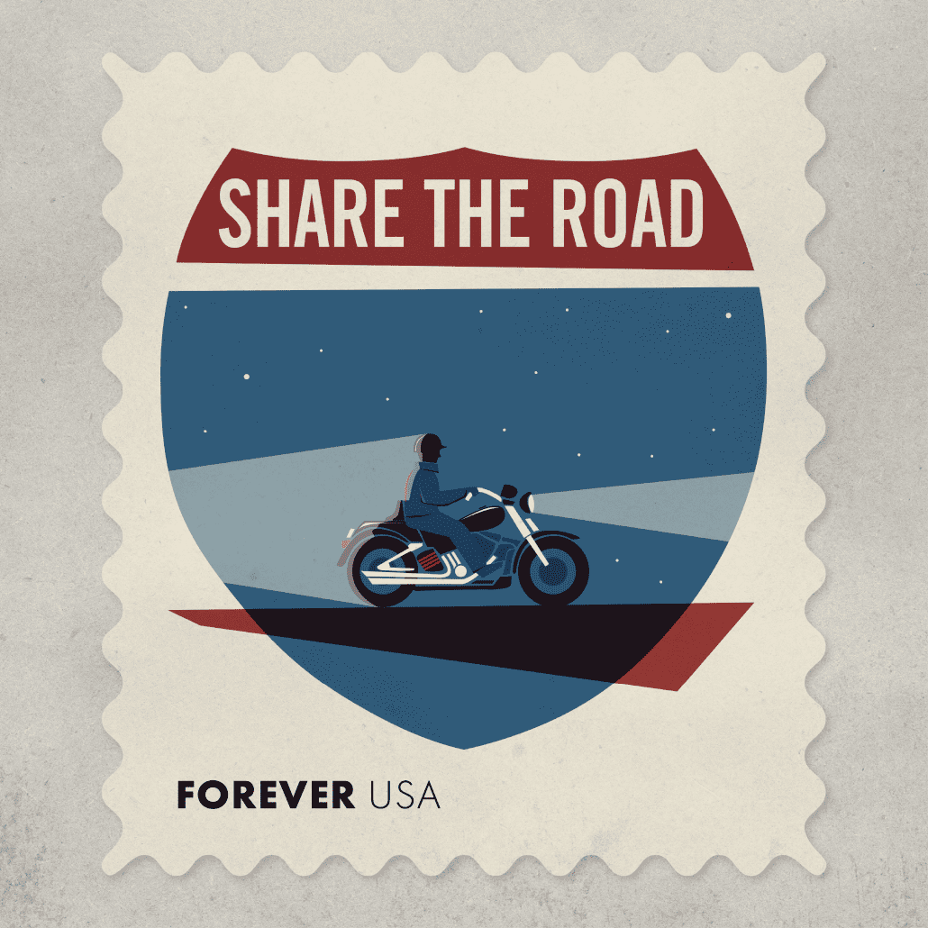
Interstate 90 runs through the center of the state and is the main artery of travel for most people moving through South Dakota. I-90 unifies the state, and touches on a lot of common elements of the experience of living here.
Bisontennial: 200 years ago there were an estimated 75 million bison roaming the countryside. By 1895, that number was cut to 800 due to reckless and wasteful hunting. Now, after 200 years, the North American bison is again thriving in commercial herds and roaming in both wild and protected places. The population is now estimated to be about 500,000.
Accumulation: In a state that averages between 30 to 70 inches of annual snowfall, snow (and snow removal) is a large feature of life. For every mile of interstate, South Dakota spends more than $2,800 on winter maintenance. So if you get a chance, buy a coffee for one of the 400 or so workers who are driving the state DOT’s snowplows this year.
No Services: With the straight lines created by the 1956 Interstate Highway Act, small towns that found themselves too far off the interstate gradually lost ground to those communities that were closer. Sometimes towns bypassed by the interstate saw business come to a standstill literally overnight.
Home Alone: My first car was a 1984 Subaru GL station wagon, light blue and relatively reliable. I loved that I could throw everything I needed in the back and drive wherever I needed to go. I put Christmas lights in the back windows and installed a switch by the gear shift—I’m lucky the whole thing didn’t catch on fire. My second car was a 1990 Subaru Legacy station wagon—no Christmas lights but just as great. I’ve never owned a kayak or a teardrop trailer, but maybe someday.
Share the Road: Of the 546 motorcycle accidents reported last year, 51% involved another motor vehicle. And I drew a helmet on this guy because in 245 (or 55%) of last year’s accidents the riders weren’t wearing helmets.
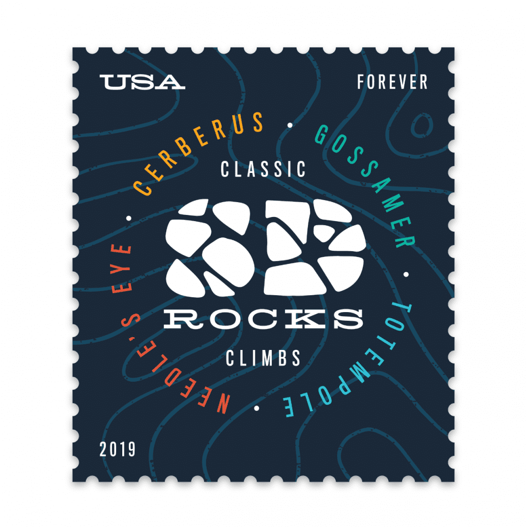
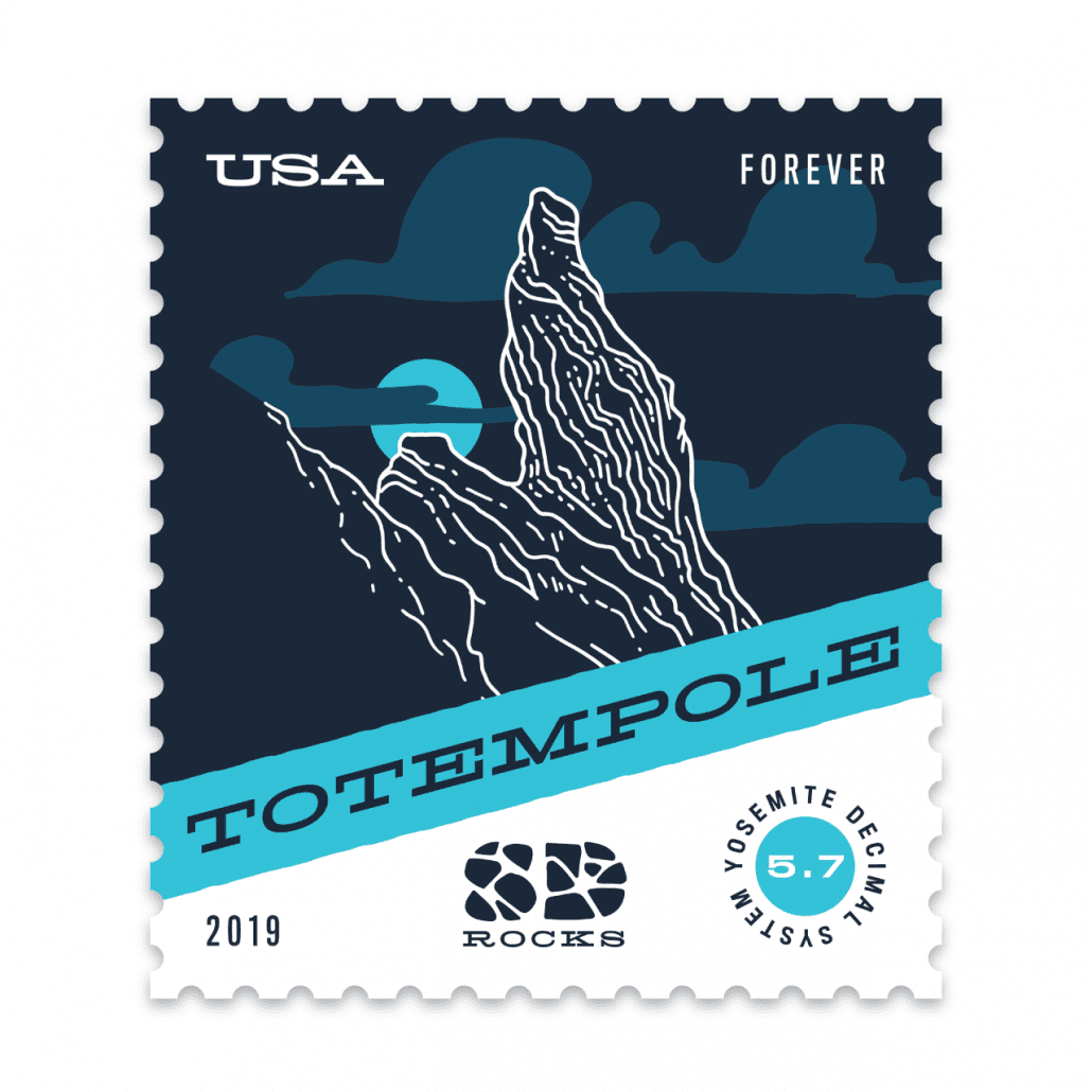
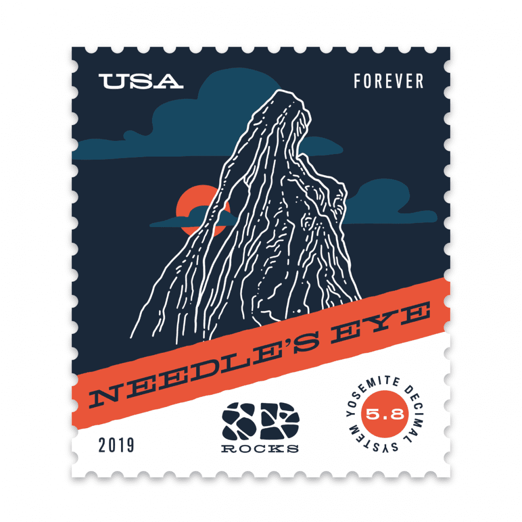
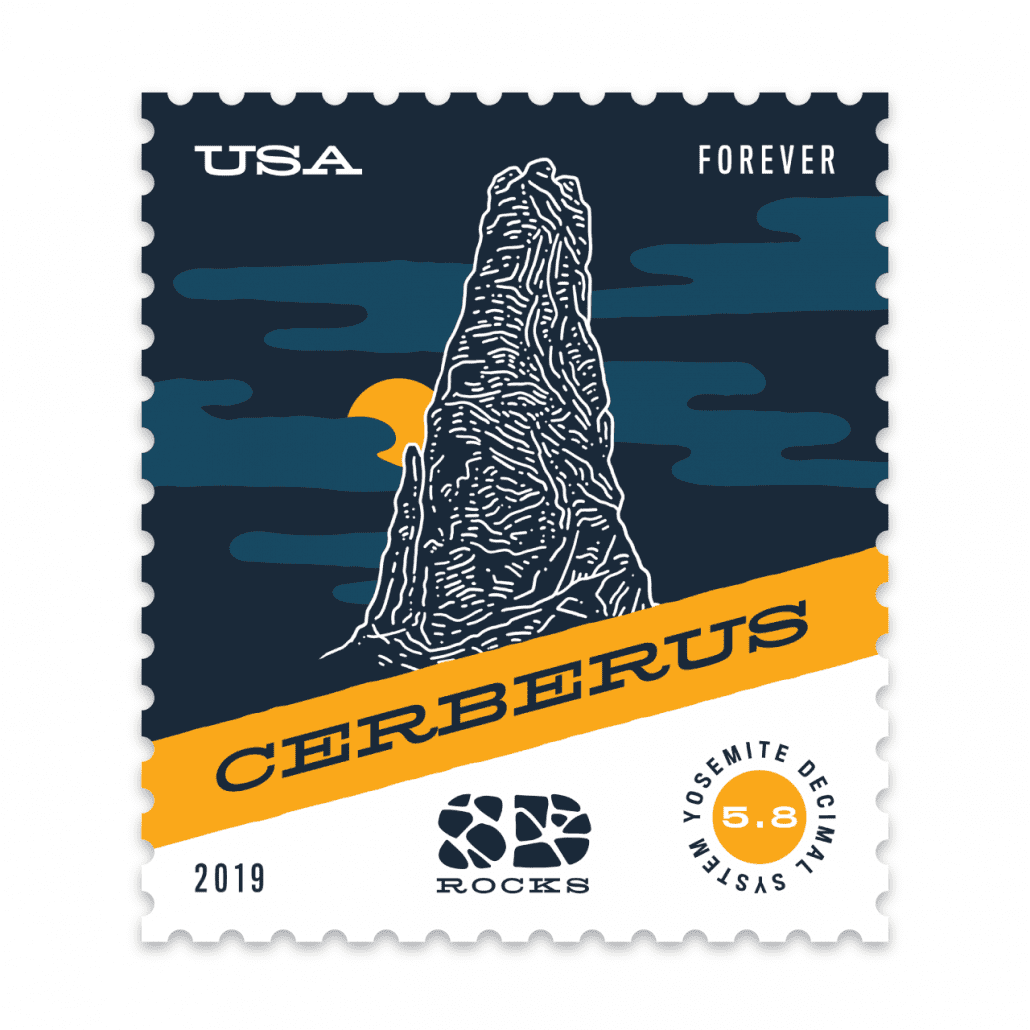
Rock climbing strikes me as a very physical test of strength and endurance, but also one of creativity—finding a route up what appears at first to be an unscalable rock face. So it’s only appropriate that one must also exercise creativity in naming a newly devised route—an honor given to the first climber to ascend (or “send” in climbing lingo) a new route. South Dakota’s Black Hills region features granite spires and limestone canyons that provide for spectacular rock climbing, and which give birth to even more spectacular names.
In rock climbing there are both good and bad names. Poor names are childish or in poor taste; the worst names are misogynistic or racist. A good name can put a new climb on the map, attracting more climbers and elevating it to the status of legendary. The best names describe the rock or route itself with fitting imagery or a clever reference. In that sense it can be like the task of naming a new business, or designing an appropriate logo for it. Cerberus, a climb in Custer State Park, is on a spire with three little peaks at the top—a reference to the three-headed hound that guards the gates of the underworld in Greek mythology. The name lends enough antagonism to feel like a challenge or foe to overcome, inviting intrepid climbers to try and best the beast.
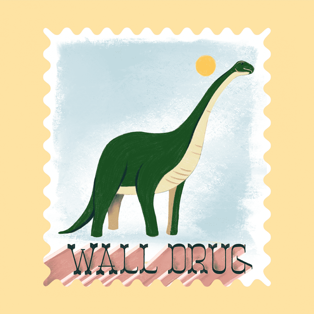
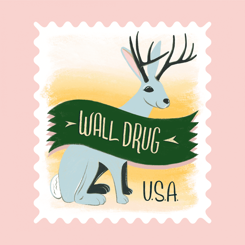
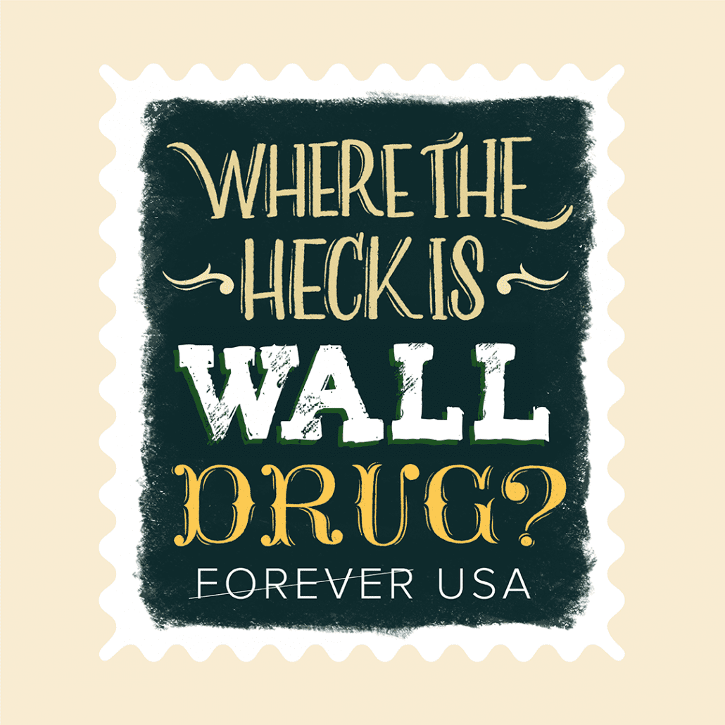
Wall Drug is a wonderfully weird place. It’s the ultimate American road trip stop attracting 2 million people* per year—but why is it so popular? I think some people just need to see what all the fuss is about. Hand-painted billboards advertising Free Ice Water put Wall Drug on the map decades ago and led to a national and international network of billboards that point back to this obscure corner of South Dakota. The climbable jackalope, the 80-foot dinosaur, homemade donuts, and iconic signage are the most popular tourist photos at Wall Drug. I drew them with a brush tool that gives it some roughness reminiscent of a fading billboard. The pastel color palette borrows from that early-morning light and shadowy landscape you get on a long road trip. I, the bleary-eyed kid in the back seat of this road trip, wakes up and thinks, “Where in the world are we?” We pull up to a parking space. The sign says “Welcome to Wall Drug” and it smells like donuts.
*To put it this number into perspective, there are less than 1 million people living in both North and South Dakota combined.
https://mattjensenmarketing.com/wp-content/uploads/2019/10/MJM-Stamp-Show-Blog-Feature.jpg11812083Kirstie Wollmanhttps://mattjensenmarketing.com/wp-content/uploads/2019/09/mjm-logo-nav.pngKirstie Wollman2019-10-23 19:10:382021-06-02 15:21:03MJM Designers Participate in AIGA South Dakota Stamp Show
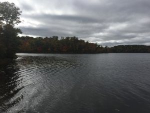
Our content team voyaged north to Design Camp for inspiration from leading creatives, technique sharing and time together. Here were some takeaways from the team:
The theme of this year’s Design Camp was “Inside Out” and the goal was for everyone to put it all on the table—personally, professionally and creatively. As a classic reserved Midwesterner, my first reaction when I heard this was, “No, thank you.” But as I listened to the speakers and presenters share their stories, the more I started to think that maybe I do have a story of my own to tell. I have always shied away from doing personal work, believing that my purpose as a designer could only be derived by creating things for other people. But the presentations left me questioning the assumption that creating something for myself is inherently incompatible with creating things for other people.
This idea culminated in the final keynote from illustrator Andy J. Pizza who talked about how looking at gig posters had helped him dig himself out of a depression. Something that was meant to be functional and ephemeral had become someone’s lifeline. As designers, we have very little control over what happens to our work once it has been released into the world. Most often, we worry about people misunderstanding or even ruining our work, but isn’t magical to think that our work could be thing to turn someone’s life around?
So, still being a Midwesterner, I of course did not voice any of the ideas that were running around in my head during the actual weekend, but it has got me thinking about how I can use design to tell my own story. Because, maybe, there is someone out there who needs to hear it.
– Kirstie
Plaidurday 2018
Design Camp 2018 was a great opportunity to glean new techniques and meet skilled designers, but the most important takeaway I had from the experience was that even the most veteran designers out there undergo the same brief moments of doubt and near-burnout that all creatives do. Not only do they have these moments, but their experiences have taught them how to systematically push through these obstacles and return to creating their best work. We able to hear these and learn from these stories thanks to the vulnerability the keynote speakers were willing to show us, so I think we can all agree that we’re endlessly thankful.
– Joel
Design Camp was a fantastic weekend of fellowship and learning for our design team. We studied and discussed the creative process, inspiration, and collaboration and came home with some great tools to improve our work. One teaching theme emerged for me from a number of the speakers, and reflects a comment from a famous athlete:
”It seems like the harder I work, the luckier I get.”
A number of speakers reflected on how they fought through low periods of creativity or dead periods of work. For those that found their way through these periods, a common theme was ”just keep working.“ Work projects, personal projects, passion projects—find a way to keep working and producing. It was often this work borne in low periods that created the exposure or inspiration for future successful work. This kind of ”luck,” obviously, is created through dedication and intentional focus, and all creatives need to find a way to fight through their low periods and breakthrough. At MJM, having a great team of creatives around to work with and create with definitely helps support each individual creative as they work hard and create more luck!
– Logan
I have one core or foundational belief about creativity. It’s that new ideas are simply new combinations of familiar things. This concept of combinatorial creativity is only reinforced by conferences like Design Camp. It’s incredibly invigorating to spend a weekend retreat with like-minded designers and thinkers, getting inspired by the journey others have taken and the things they’ve learned along the way.
One of the workshops outlined a technique for ”Bulletproof Ideation” by combining ideas in a methodical fashion. We learned about the Bedno Diagram – a tool invented by designer and educator Ed Bedno—which provides a framework for seeing and exploring the intersection of multiple ideas. The process was very familiar, but I had never seen it implemented so thoroughly and methodically. And I was inspired by the suggestion to use the technique to reverse engineer ideas that have inspired me, to understand how their creator may have arrived at that solution. It was a good reminder that good ideas don’t come out of thin air, delivered by a muse in a ”eureka” moment. They are intentionally crafted and combined, and are accessible to all who are willing to work rigorously for them.
That last point connects back to the final keynote speaker, Andy J. Pizza. He shared the highs and lows of his creative journey, and wisdom he gained along the way, with the ultimate conclusion that there are no shortcuts for a fulfilling creative career. You have to do the work. And sometimes you have to struggle for it. That struggle might look like an exhaustive Bedno diagram, or piles of discarded concepts on the way to one workable solution. Learning to enjoy the process and to see it as intrinsically valuable is the key to going far.
– Brady
No matter what you want to learn, most skills and ideas are available to anyone who is interested through YouTube tutorials and Skillshare classes. You don’t need to drive halfway to Canada to find inspirational speakers or to learn interesting new techniques, but our design team does exactly that every year.
AIGA Minnesota’s Design Camp is a yearly retreat just outside Brainerd, MN. Each fall the MJM design team makes the trek up to northern Minnesota, and while the workshops and the speakers’ portfolios are interesting, to my mind they are not the most valuable part of the experience. The reward that compels me to make the trip is perspective.
This year that perspective had less to do with design methodology, new paper options, or printing techniques—it was something deeper. I felt like I heard two different answers to the question, “What is your work for?” Some of the speakers I heard and the designers I met talked about the scope of their portfolio and the size of their audience; they spoke about their personal brand and their career path. Good work equals more glory. Other people focused on the lives they had touched, the students they had taught, and the relationships they had formed with clients and colleagues over the course of their career. Good work means better relationships with people.
“What is your work for?”
Looking at my own past work, some of it has held up well, but much of it has not. Projects I worked on even 6 months ago can sometimes cause me to cringe. But the relationships I’ve developed with coworkers, students and clients are evergreen. Last year’s projects are getting stale; last year’s relationships are still a source of joy. Do the work, and enjoy the process, but don’t look to your work to make you happy. The work (whatever it is) is valuable, but it’s really only a backdrop to the things that matter most.
Each day a new character, and in our case, a new designer as we passed around the alphabet to explore type, animation, illustration, storytelling and more. Designers and illustrators around the world participated in 36 Days of Type by posting to instagram and connected with the #36DaysOfType hashtags. We decided to tackle the challenge as a team this April and May. Repetition invites creativity and crafting. We also invited the opportunity to try new techniques. We stuck (somewhat) to our original color palette and prescribed dimensions and dove in.
I always appreciate projects like 36 Days of Type for creating opportunities to try new tools and solutions in a design setting. I used much of that opportunity to explore computer-generated three-dimensional design and animation. While there are quite a few examples of this in the library of type we created, this “Inflatable C” is one of my favorite results of that exploration. While it’s quite minimal, it shows off some of the new options that the third dimension can create for designers like convincing depth in the subject and a more robust use of simulated physics. Along with all of that, this piece just makes me think of summer.
G
Kirstie
The double-story (or looptail) “g” is one of my all-time favorite letterforms. Even though it’s mostly superfluous, difficult to write and unrecognizable to the majority of population, I love how it seems to capture all of the personality of a typeface and its designer. For this illustration, I wanted to take full advantage of the letterform and do something playful to link the two counters. The shapes reminded me of pools of water, so I turned them into little ponds and, in the name of the letter “g,” added a goldfish leaping between the two. It’s a quirky little fish at home in a quirky little letter.
J
Alison
I think the most interesting part of a capitalized J is its arm. Many sans serif fonts do away with it for simplicity’s sake, but I like the way it can balance the otherwise asymmetrical form. I started with a grid paper sketch to articulate my idea. On paper I could visualize how to fit the two scoops of each J shape together and experiment with softly curved terminals. Then I moved to the Procreate app for iPad. I used a chalky brush to give body to the letter, and then used the eraser tool to define the edges and corners. Procreate allows layers so I could add illustrated florals between the tall, narrow J and the more squat, overreaching J tucked in where I wanted—and still have each piece editable. I fit organic shapes and ornaments in and around the ribbons to complete the bright composition.
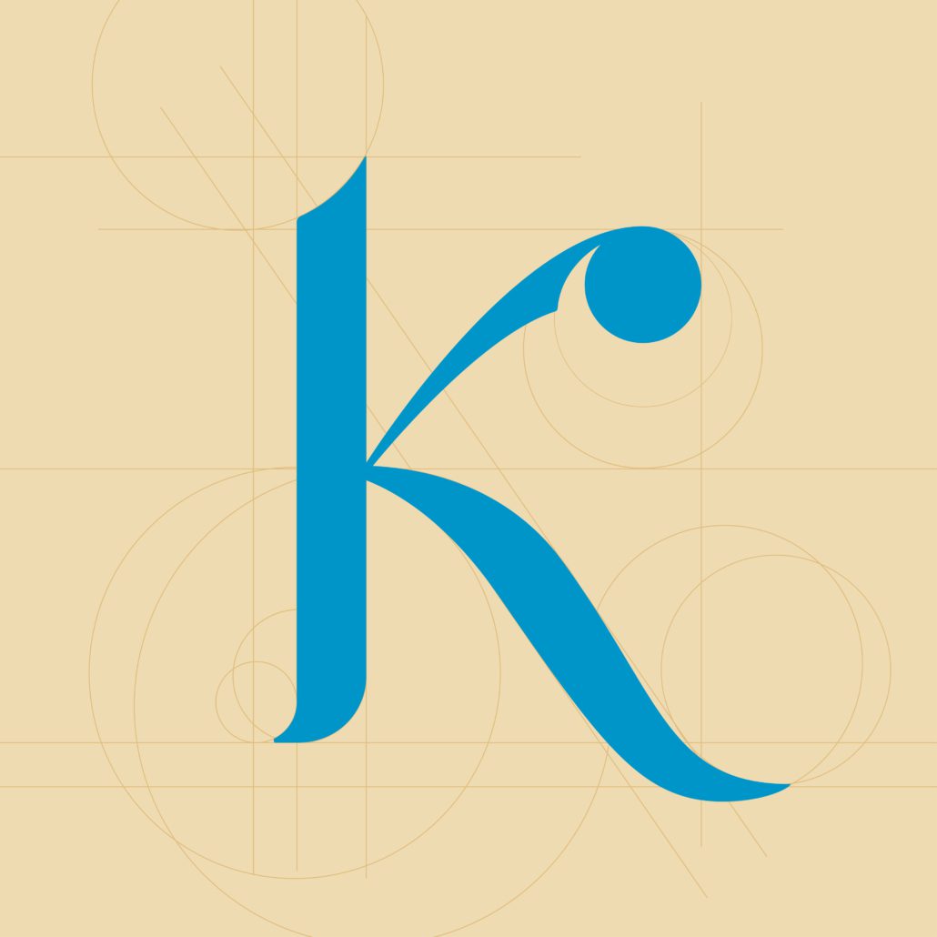
K
Tim
One of my favorite aspects of the 36 Days of Type project was that it gave us freedom within a rigid structure. That sounds like a contradiction but it’s not—the project was completely open-ended, with no direction or client feedback, but at the same time, the content was inflexible (the letter of the day), the timeframe was limited (one letter each day) and as a team we also chose to limit ourselves to a common color palette. Freedom within constraints can lead to remarkably creative solutions.
For some of my letters I tried to build a formal letter shape, conforming to typographic traditions and crafted for legibility and grace. This K is an example. After looking at other K shapes in a variety of fonts and calligraphy I identified some of the geometric “bones” that I wanted to build my K around.
In other letter explorations, I chose a more conceptual approach. I thought it would be fun to build the letter P shape out of large, oversized pixels. In the animated version of this “P is for Pixels” composition, I created a digital sort of shimmer by slowly fading each block between a few different values of blue.
X
Brady
I love projects that require a series of explorations around the same prompt. Eventually your typical approach to the problem starts to feel tired and uninspired and you are forced to try something you might not normally consider. 36 Days of Type was that sort of project for me (even in just the 7 or so iterations I completed as part of our team approach).
Part way through my initial explorations began to lose their initial spark and I started looking around my environment at home for inspiration. We have a variety of patterned fabrics and other materials around the house, from curtains to coasters, and while studying them one evening I started to imagine how those patterns would look in motion. One pattern in particular happens to feel very much like a grid of geometric letter X’s.
Once I tested the idea with X, I wondered about the same concept applied to a different pattern-letter combination. It was interesting approaching the problem from the other direction the second time around, starting with a particular letter or number and trying to discover it in an already existing pattern.
You can see the whole set from the MJM design team on our Instagram account or by watching the video below!
https://mattjensenmarketing.com/wp-content/uploads/2018/06/MJM-36-days-of-type-grid-2018-for-blog.jpg383676Alison Raaenhttps://mattjensenmarketing.com/wp-content/uploads/2019/09/mjm-logo-nav.pngAlison Raaen2018-06-19 20:50:212019-09-05 22:03:50Designers Tackle the 36 Days of Type 2018
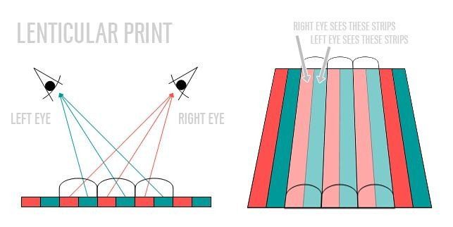
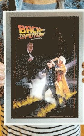
Remember the old plastic-covered photographs you’d pull from a cereal box that would replicate motion or animation when tilted back and forth? This method of printing is actually referred to as lenticular printing. It creates this effect by using separate images or frames broken up into bars and pushed together as one single image. A transparent lenticular sheet added overtop the final sandwiched image actively isolates the different images when viewed from different angles and generates the impression of fluid animation.
The idea of lenticular printing fell into our lap as the most dynamic way to bolster the invite for the upcoming Vance Thompson Vision symposiums. The theme of this year’s symposium is Back to the Future, so this allowed us to explore and meet the middle ground of Drew Struzan’s masterful original poster work for the beloved film series and the illusion of animation through lenticular prints. We melded these concepts together to create an irregular yet striking print guaranteed to capture the eye of any invitee.
Lenticular printing is an effective concept for a number of reasons, the main being the appearance of animation or video. People have been using and appreciating video for more than a century. But the caveat of the medium is that it nearly always needs some source of power and a screen to function properly. Though brief (a few frames), lenticular prints allows video and animation to bypass this hurdle and creates organic animation powered by your own perspective.
Lenticular also opens up a world of possibilities for designers beyond animation. It creates an opportunity for truly dynamic typography and illustration. It can reveal different information or elements singularly within the same composition. For example, if there is a train stop that needs to provide travel information to passengers passing through the platform. They understand that passengers coming from one direction of the platform need different information than that of the passengers approaching from the opposite side. With the use of lenticular printing, a single sign could provide both parties with the information relevant to them based their different perspectives.
Lenticular printing presents a number options to designers and creatives, many of which remained untapped. Whether for the printed illusion of animation or information control within compositions, it provides a number of interesting solutions. We’ve been enthused by our first foray into the medium and hope to implement it again soon.
Car advertising can run the gamut of wonderfully genius to utterly divisive. On one end of the spectrum, you’ll find the endearing message present in Porsche’s 2006 ad “Through Children’s Eyes” that boasts the child-like wonder that a luxury sports car can conjure up. On the other end is the ad campaign that Chevrolet has been running for the past couple years showing “authentic” reactions to new models of vehicles and industry awards they have earned. The irony here is that the reactions have been edited so neatly that any actual earnestness that should be present is gutted for time and content. This is where Subaru has consistently deviated with their advertising in their history.
Subaru first entered the US market in the 60s with the 360. This vehicle was known for its efficiency but not exactly for its aesthetic. That’s putting it lightly. The car was a major eyesore. But this is where Subaru did something brilliant with their marketing. Instead of sugarcoating the benefits of the car, they steered into the skid. Literally.
“Because it’s cheap and ugly, a little Subaru goes a long way to make you happy”
Their ad campaign at the time actually stated that their car was “cheap and ugly”. That’s a brave statement to make about your product. But the draw is still there. Even though people get a chuckle out of it today, the commercials are honest in a way that advertising is usually not. Only a few brands have been able to capture the same truly authentic message.
A good example of another car company that has taken from Subaru’s retro playbook is Smart’s ForTwo Offroading commercial from 2013. This ad shows how poorly Smart’s vehicle performs in an off-road setting. It thuds into an unfortunately placed rock and is brought to a punctual halt by a shallow creek. But Smart doesn’t care. That isn’t where their machine thrives anyhow. It transitions to an urban setting and a larger vehicle passing over a parking spot that is slightly too small to fit in. Then the Smart car bulldozes in and takes the spot with ease. All of this is accompanied with some delightfully dated nu-metal for a humorous edge. But the same message is there. Everything has its cons, but you’re better off knowing them upfront.
“Smart reveals that the hero doesn’t need to win all of the time, but just needs to win in the end.”
Now it’s worth auditing Subaru’s strategy in the modern age, where high-angle shots of cars driving down stretches of roads or dirt at high speeds with pulsing synth and a deep-voiced narrator dominate the industry. They currently are running a broad campaign called “Love” that focuses on the people using the car and the how it benefits them, not just on a logistic level but on an emotional one as well. The specs of the cars themselves are rarely touched on in an intrepid move by Subaru.
A fantastic example of this is their Impreza 2017 ad “Moving Out”. This commercial tells the story of a boy growing up before his parent’s eyes and heading to college with the family car. The vehicle itself takes a back seat to the people that own it as a toddler packs his bag to leave for school and by the time he reaches the car, he has grown into a man. It really tugs at the heartstrings in a very Hallmark movie-esque way. The dog aging from a puppy to a grey-jowled hound is the cherry on top.
This is only one of many of the ads in this touching campaign that Subaru has been running. While admittedly more refined, it does having something in common with the “cheap and ugly” roots of Subaru’s American marketing. The emphasis isn’t so much the car itself, but what the car will do for you, the people around you, and your wallet. That’s a welcomed fresh perspective in the automotive industry that other brands can and have learned from.
Keep on keeping on, Subaru. The roads ahead are clear.
https://mattjensenmarketing.com/wp-content/uploads/2017/07/Subaru-Ad-Blog-Photo.jpg5671000Joel Jochimhttps://mattjensenmarketing.com/wp-content/uploads/2019/09/mjm-logo-nav.pngJoel Jochim2017-07-13 08:00:372021-06-02 13:58:36Subaru: A History of Advertising Excellence
I confess that we designers and creatives tend to obsess about our tools — the ones we have and the ones we could have. While these tools undoubtedly aid us in our work, there’s one simple, free tool that can be more effective in helping with work efficiency than anything you could spend money on: organization.
Cluttered and disorganized environments cause more stress and wasted time. They also cause the output of a workspace is to be more unpredictable in terms of quality and quantity. With this in mind, organization can be a topic that is difficult to quantify. That’s where the 5S Visual Management System comes into play. Developed in Japan, the 5S System thoroughly analyzes any workspace to show what areas need strengthening in terms of visual management.
The 5S Visual Management System
The system breaks the aspects of organization down into five categories to be examined and controlled in order. The sections are Sort (Seiri), Set in Order (Seiton), Shine/Clean (Seiso), Standardize (Seiketsu), and Sustain/Discipline (Shitsuke).
Sort seperates what is necessary and what isn’t. It has also been called “The fine art of throwing away junk.”
Set in Order takes the necessary and places it in its rightful spot—making sure that it is easily accessible.
Shine/Clean makes certain that properly placed items are clean. If there’s a persistent source of dirt, find and remove it.
Standardize involves creating an easy system of repeated tasks that will measure and maintain the organization of the workspace currently.
Sustain/Discipline takes the repeated tasks of upkeep and turns them into habits for everyone involved. This step will take the longest amount of time, but with simple motivation it is very achievable.
Results
The 5S Visual Management System has proven to be an effective way of taking a workspace and moving it to the next level in terms of efficiency. Some of the world’s largest companies even implement it into their spaces. As MJM has recently moved into its new location, this is definitely something we are working towards to keep our area effective and continue creating great work.


 The theme of this year’s Design Camp was “Inside Out” and the goal was for everyone to put it all on the table—personally, professionally and creatively. As a classic reserved Midwesterner, my first reaction when I heard this was, “No, thank you.” But as I listened to the speakers and presenters share their stories, the more I started to think that maybe I do have a story of my own to tell. I have always shied away from doing personal work, believing that my purpose as a designer could only be derived by creating things for other people. But the presentations left me questioning the assumption that creating something for myself is inherently incompatible with creating things for other people.
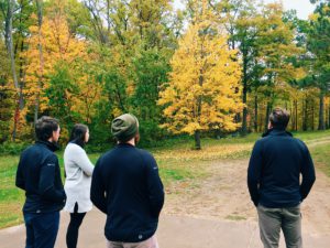
 I have one core or foundational belief about creativity. It’s that new ideas are simply new combinations of familiar things. This concept of combinatorial creativity is only reinforced by conferences like Design Camp. It’s incredibly invigorating to spend a weekend retreat with like-minded designers and thinkers, getting inspired by the journey others have taken and the things they’ve learned along the way.