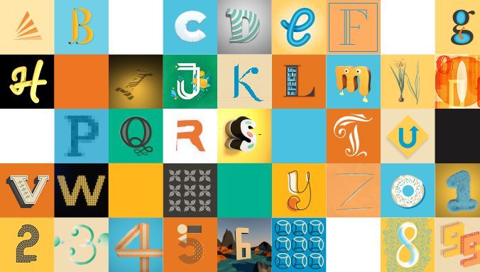
Designers Tackle the 36 Days of Type 2018
#36DaysofType
Each day a new character, and in our case, a new designer as we passed around the alphabet to explore type, animation, illustration, storytelling and more. Designers and illustrators around the world participated in 36 Days of Type by posting to instagram and connected with the #36DaysOfType hashtags. We decided to tackle the challenge as a team this April and May. Repetition invites creativity and crafting. We also invited the opportunity to try new techniques. We stuck (somewhat) to our original color palette and prescribed dimensions and dove in.
Each designer chose their favorite letter and gave some background. (Check out this reference for a quick guide on technical type terms.)
C
Joel
I always appreciate projects like 36 Days of Type for creating opportunities to try new tools and solutions in a design setting. I used much of that opportunity to explore computer-generated three-dimensional design and animation. While there are quite a few examples of this in the library of type we created, this “Inflatable C” is one of my favorite results of that exploration. While it’s quite minimal, it shows off some of the new options that the third dimension can create for designers like convincing depth in the subject and a more robust use of simulated physics. Along with all of that, this piece just makes me think of summer.
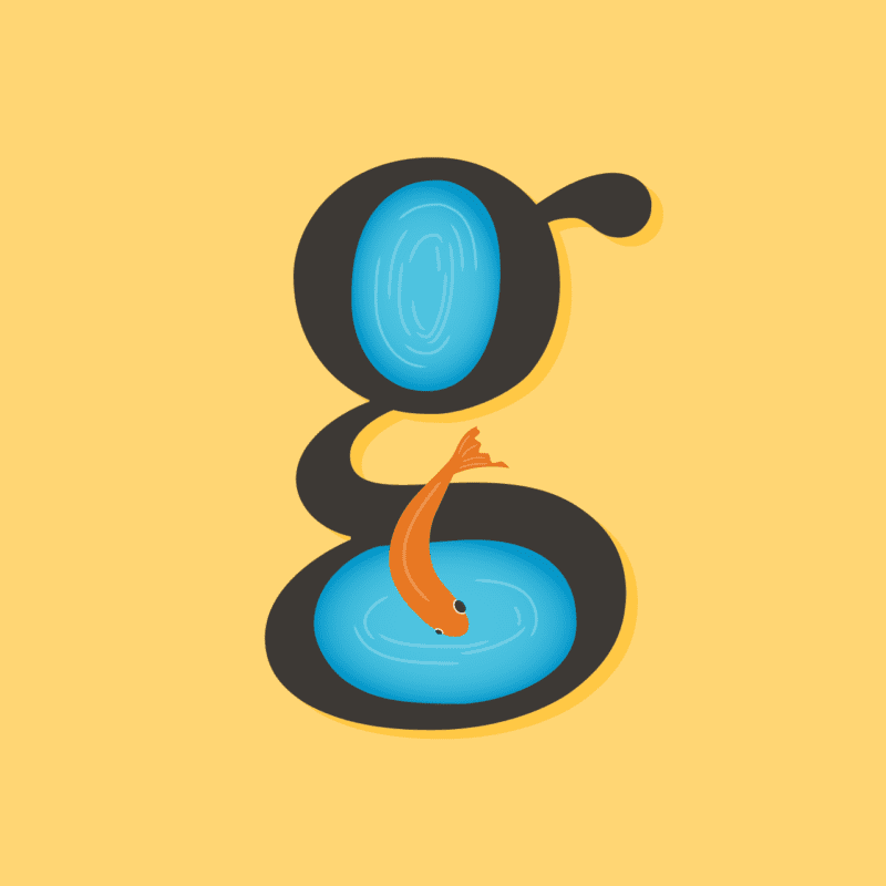
G
Kirstie
The double-story (or looptail) “g” is one of my all-time favorite letterforms. Even though it’s mostly superfluous, difficult to write and unrecognizable to the majority of population, I love how it seems to capture all of the personality of a typeface and its designer. For this illustration, I wanted to take full advantage of the letterform and do something playful to link the two counters. The shapes reminded me of pools of water, so I turned them into little ponds and, in the name of the letter “g,” added a goldfish leaping between the two. It’s a quirky little fish at home in a quirky little letter.
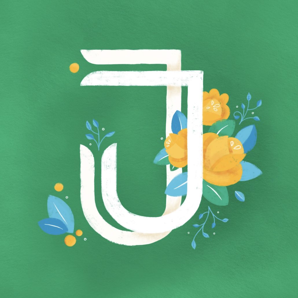
J
Alison
I think the most interesting part of a capitalized J is its arm. Many sans serif fonts do away with it for simplicity’s sake, but I like the way it can balance the otherwise asymmetrical form. I started with a grid paper sketch to articulate my idea. On paper I could visualize how to fit the two scoops of each J shape together and experiment with softly curved terminals. Then I moved to the Procreate app for iPad. I used a chalky brush to give body to the letter, and then used the eraser tool to define the edges and corners. Procreate allows layers so I could add illustrated florals between the tall, narrow J and the more squat, overreaching J tucked in where I wanted—and still have each piece editable. I fit organic shapes and ornaments in and around the ribbons to complete the bright composition.
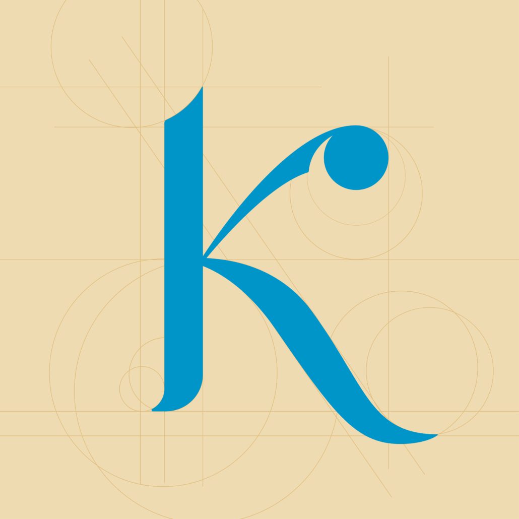
K
Tim
One of my favorite aspects of the 36 Days of Type project was that it gave us freedom within a rigid structure. That sounds like a contradiction but it’s not—the project was completely open-ended, with no direction or client feedback, but at the same time, the content was inflexible (the letter of the day), the timeframe was limited (one letter each day) and as a team we also chose to limit ourselves to a common color palette. Freedom within constraints can lead to remarkably creative solutions.
For some of my letters I tried to build a formal letter shape, conforming to typographic traditions and crafted for legibility and grace. This K is an example. After looking at other K shapes in a variety of fonts and calligraphy I identified some of the geometric “bones” that I wanted to build my K around.
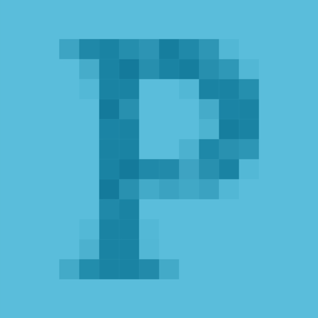
In other letter explorations, I chose a more conceptual approach. I thought it would be fun to build the letter P shape out of large, oversized pixels. In the animated version of this “P is for Pixels” composition, I created a digital sort of shimmer by slowly fading each block between a few different values of blue.
X
Brady
I love projects that require a series of explorations around the same prompt. Eventually your typical approach to the problem starts to feel tired and uninspired and you are forced to try something you might not normally consider. 36 Days of Type was that sort of project for me (even in just the 7 or so iterations I completed as part of our team approach).
Part way through my initial explorations began to lose their initial spark and I started looking around my environment at home for inspiration. We have a variety of patterned fabrics and other materials around the house, from curtains to coasters, and while studying them one evening I started to imagine how those patterns would look in motion. One pattern in particular happens to feel very much like a grid of geometric letter X’s.
Once I tested the idea with X, I wondered about the same concept applied to a different pattern-letter combination. It was interesting approaching the problem from the other direction the second time around, starting with a particular letter or number and trying to discover it in an already existing pattern.
You can see the whole set from the MJM design team on our Instagram account or by watching the video below!
Alison is a graphic designer and social media lead at Matt Jensen Marketing.


